Best AI Tools for Exploring Visual Styles for an App (2026)
Use Mowgli for full-app styles, Midjourney or Krea for mood, tweakcn for tokens, and Stitch or Lovable for UI variations.
Quick answer: choose by where the style needs to land
Use Mowgli when you need to compare styles on your real app content and apply the winner across a multi-screen product. Use Midjourney or Krea to establish mood, Mobbin to study shipped apps, tweakcn to create implementation-ready shadcn/ui tokens, and Google Stitch or Lovable to compare generated UI directions.
The key is to test each direction on a difficult real screen. A style that only works on a sparse hero is not yet a product style.
Choose by output:
- Complete multi-screen app: Mowgli offers 16+ directions, previews four selected styles on an actual app screen, then applies the chosen direction to every screen and state.
- Mood and visual language: Midjourney first, Krea second. Both help define color, texture, lighting and atmosphere, but their images are not editable UI.
- Shipped-product references: Mobbin for apps, Land-book for websites and Dribbble for broad visual ideas or finding designers.
- Paste-ready theme tokens: tweakcn for shadcn/ui. Realtime Colors and Huemint help define palette and font roles.
- One-screen UI variations: Google Stitch generates one to five options from a selected screen.
- Three directions before building: Lovable presents three HTML and Tailwind previews.
- Existing Figma libraries and attached references: Figma Make can work from designs, images, PDFs and synchronized library guidance.
Quick picks: use Mowgli for styles on your own screens, with Stitch plus DESIGN.md as the runner-up workflow. Use Midjourney for mood, Mobbin for app references, tweakcn for CSS-ready themes, Stitch for free single-screen variations and Lovable for three directions before a website build.
We make Mowgli. Competitor details below come from official documentation, pricing pages and public galleries.
What visual style exploration should produce
Style exploration should produce several meaningfully different product looks before you commit to full-screen production. Each option should differ across four axes:
- Typography: font families, scale and hierarchy.
- Color: background, text, primary, secondary and accent roles.
- Density: airy layouts through compact, data-heavy interfaces.
- Shape: radii, borders, shadows, pills and sharp edges.
The useful outcome is not an attractive image. It is a selected direction expressed as reusable tokens and validated across multiple screens.
A poster, landing-page hero or sparse dashboard can hide weak decisions. Dense lists, settings, forms, tables, empty states and errors expose them. Rank tools by how much translation remains between their output and the interface you intend to ship.
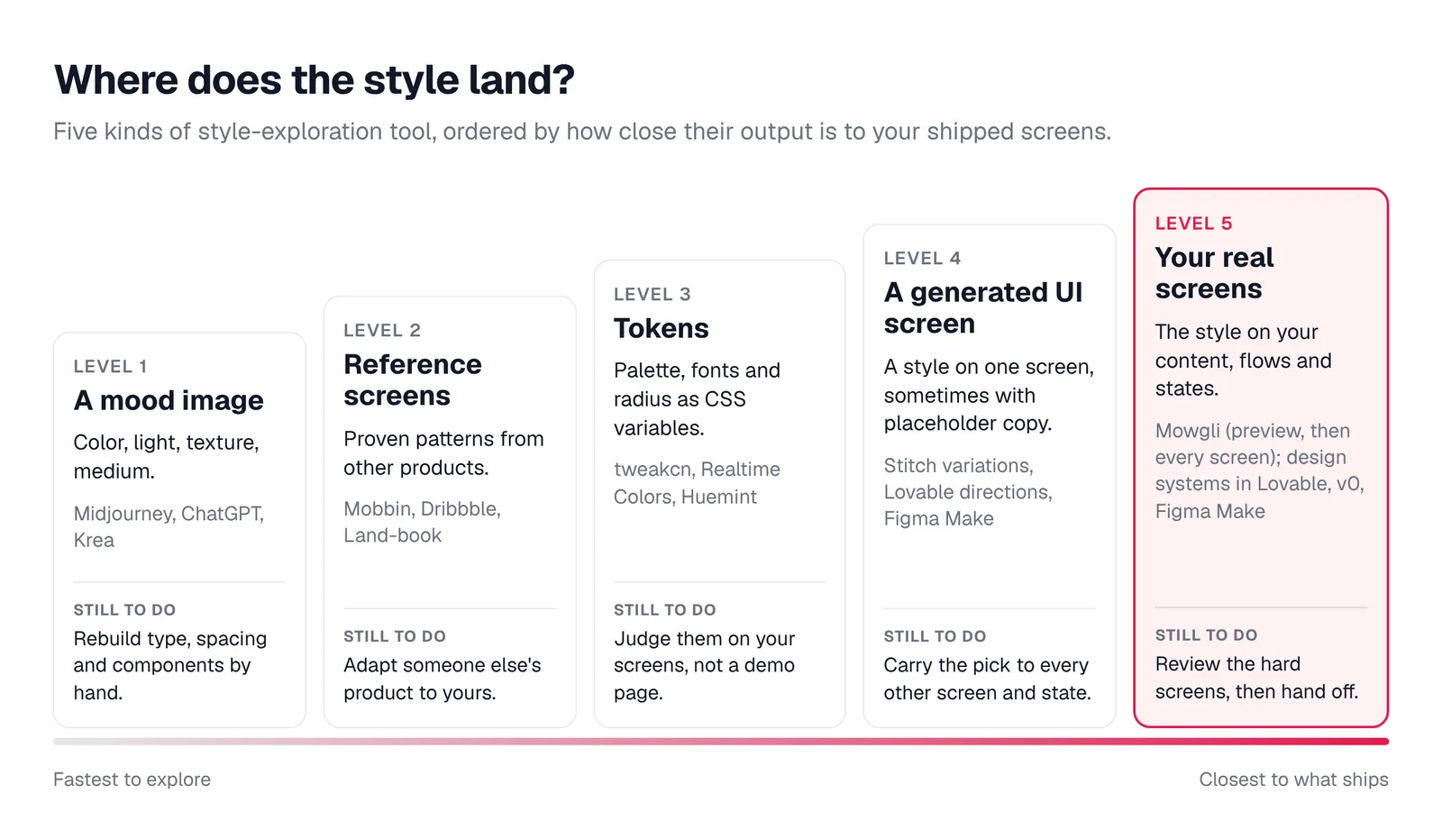
Caption: The further right a tool sits, the less translation work is left between the style and your app.
How to explore app styles in about an hour
Start with a five-line brief:
- Product and platform.
- Audience.
- Core job.
- Three desired adjectives.
- One anti-reference, such as avoiding a purple SaaS gradient.
The anti-reference matters because it rules out familiar defaults. See why AI-built apps look the same for more ways to make your brief specific.
Request three or four genuinely different directions. Require changes to typography, color, density and shape. A palette swap on the same layout does not count as another direction.
Next, render the hardest real screen. Choose the densest list, longest form, largest table, empty state or error state. Supply actual names, figures, labels and edge cases.
Combine options deliberately. You might retain one direction's typography, move to another's palette and adopt a third option's compact density. State what to keep and what to change instead of asking for a vague blend.
Finally, lock the choice into CSS variables or a DESIGN.md file. Validate it on three more screens before scaling production.
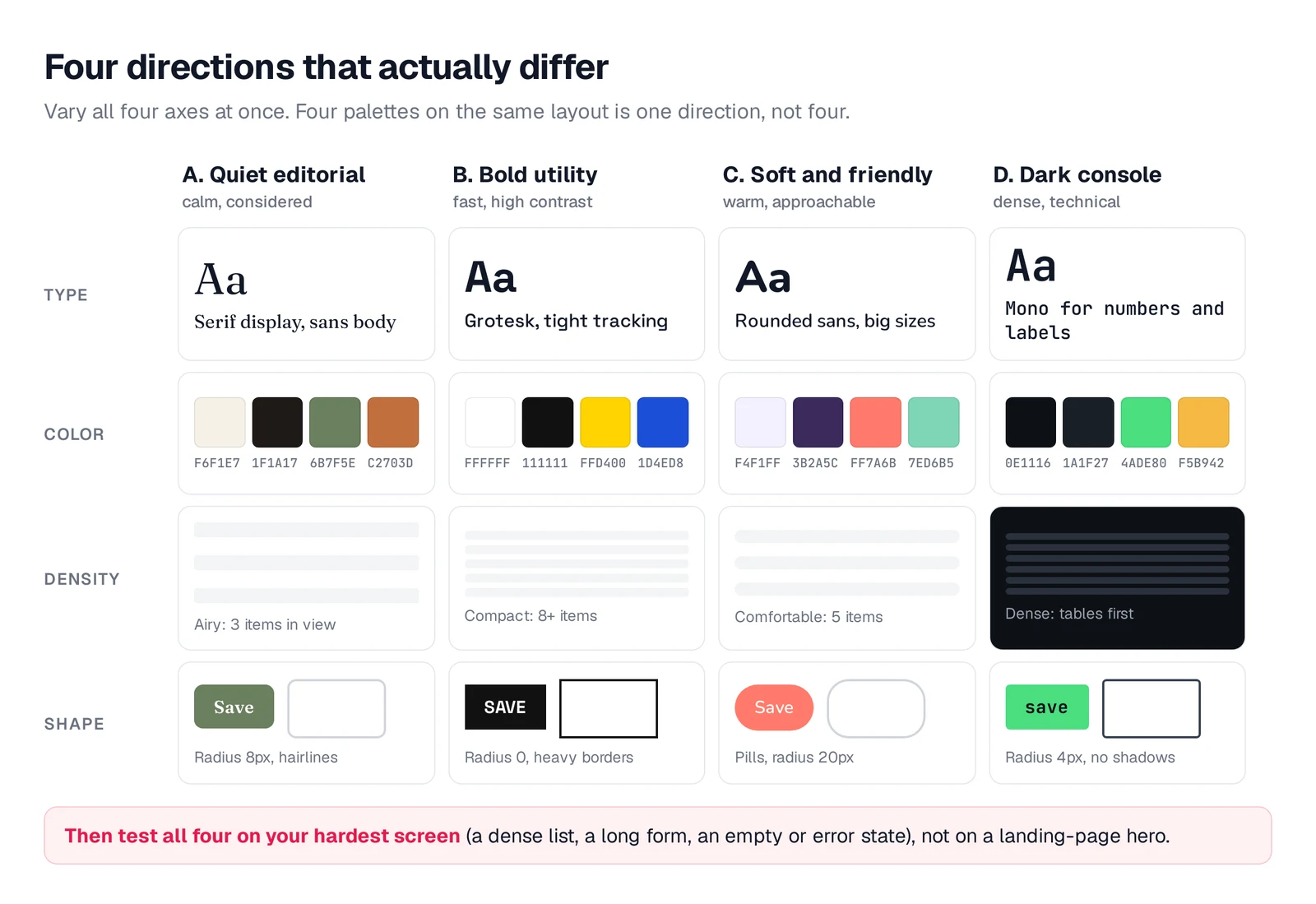
Caption: Four example directions that differ on every axis, not just color.
Paste this into Stitch, Lovable, Figma Make, ChatGPT, Claude Code, Codex, Cursor or another coding agent:
Propose 4 visual directions for [product], a [mobile/web/desktop] app for
[audience] whose core job is [job]. Make them differ on four axes, not just color:
- Type: one serif-led, one grotesk, one rounded sans, one mono or condensed
- Color: 4-6 named colors with hex values each; one direction must be dark
- Density: at least one airy and one compact, data-dense direction
- Shape: one sharp (0-4px radius) and one soft (16px+ radius or pills)
Render each direction on this screen with this real content:
[paste the content of your hardest screen: real names, numbers, long labels,
and its empty state].
For each direction give a name, a one-line reason it fits the product, and its
tokens: colors with roles, fonts with sizes, radius and spacing scale.
Do not use Inter, purple gradients or a centered hero over three cards.
Check that the longest actual name, price and label fit. Confirm that 10+ rows remain scannable and numeric columns align. Inspect empty, error and loading states with the app-state checklist. Body text should meet WCAG's 4.5:1 minimum contrast. When applicable, test both themes using this light and dark mode guide.
This process gives you fewer but stronger choices. The goal is multiple design directions before committing, not a gallery of near-duplicates.
Mowgli: choose a style on real screens, then design the whole app
Mowgli is the category winner when the required output is a complete multi-screen app rather than a mood image or isolated concept.
Its questionnaire turns your product idea into a PRD and spec covering journeys, constraints and the data model. You can then explore 16+ moodboard styles, select four directions and preview each one on an actual screen from the app. Natural-language instructions, a hex code or reference screenshots can steer the style through style steering.
After selection, Mowgli generates 30+ screens and states on an infinite canvas. You can iterate through chat, inspect version history, create a click-through prototype and export to Figma, React and Tailwind, or coding agents through MCP.
In one habit-tracker example, four choices appeared on the Today screen in two states. The selected Soft Linen Sage direction then carried through 12 screens and 46 states. In a marketplace example, the same camera-rental listing appeared as Editorial Studio, Quiet Premium, Darkroom Modern and Analog Warmth.
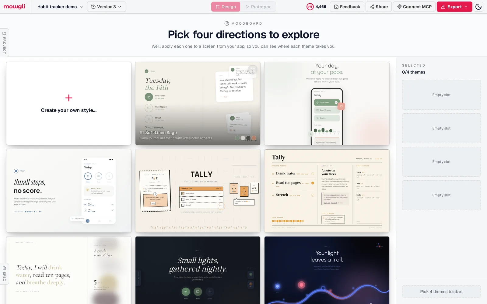
Caption: The moodboard for our habit tracker demo: 16 directions built on the app's real habits and copy.
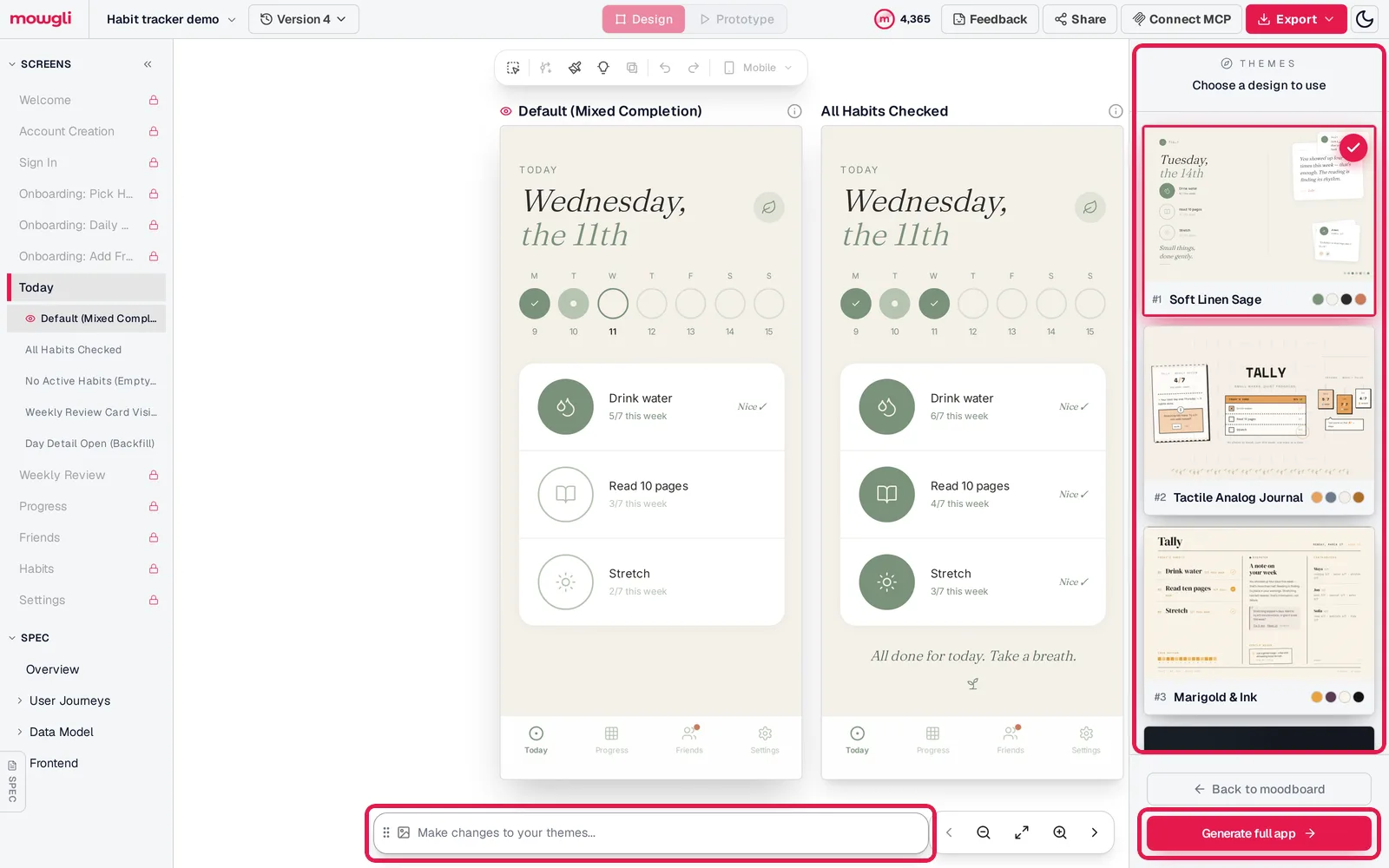
Caption: The preview step: four themes on the app's own Today screen, a chat box to adjust them, and Generate full app.
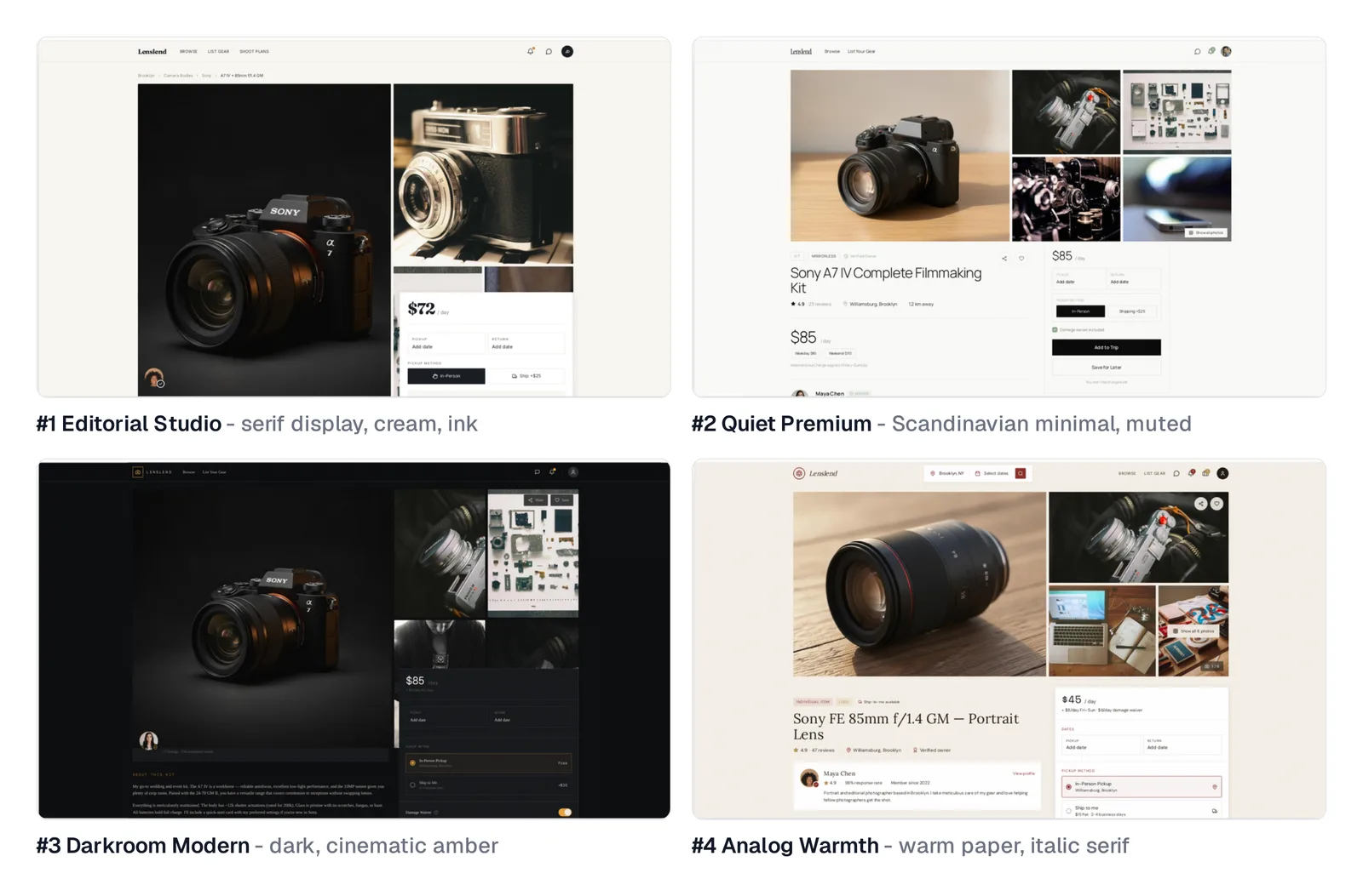
Caption: The same step for a web marketplace demo: one listing page in the four picked directions.
Caption: Switching between the four proposed themes on the marketplace listing screen. Screen recording.
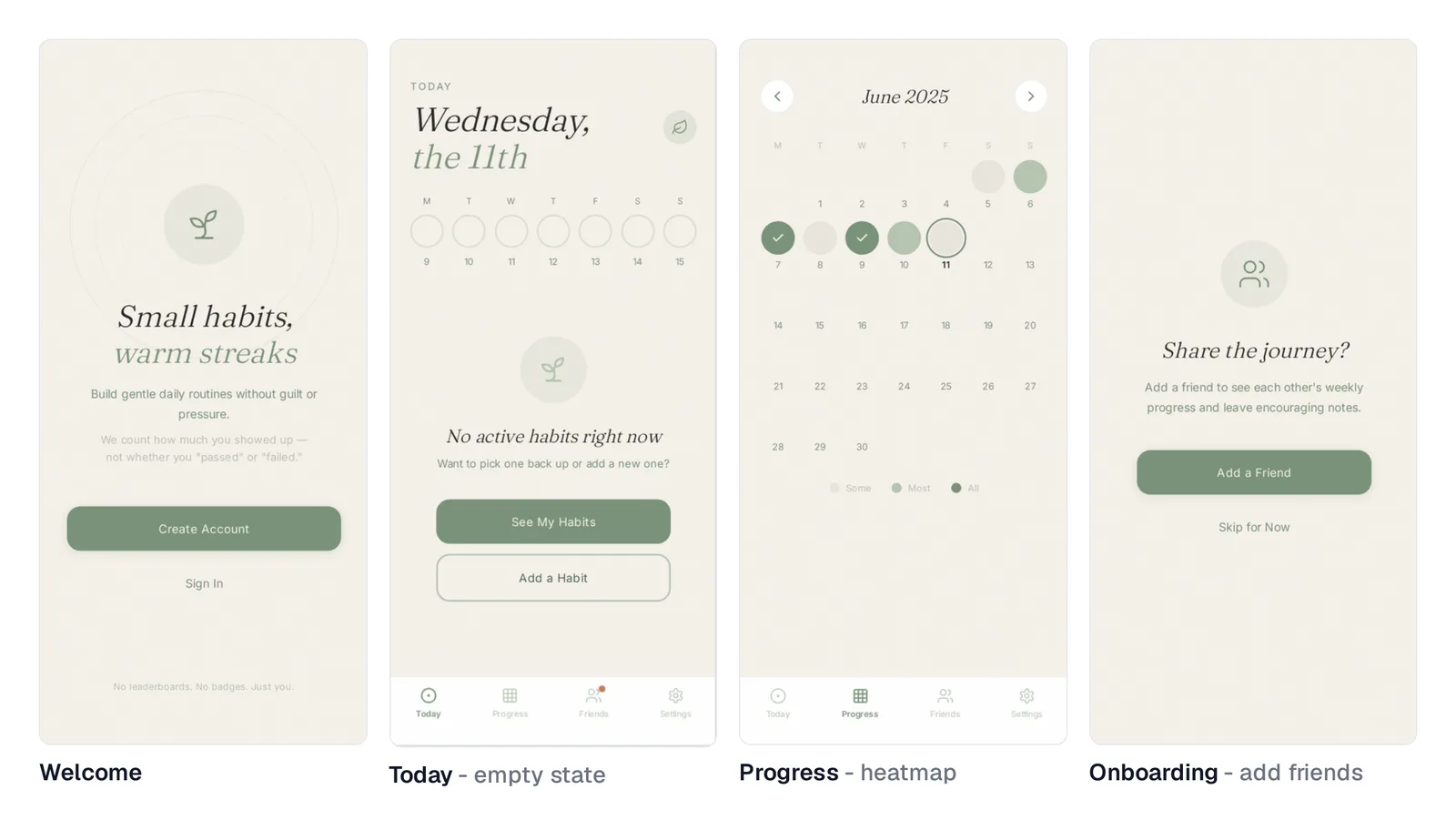
Caption: The chosen theme on four other screens of the same app, generated after the preview step.
For an existing product, import Figma or let Claude Code, Codex, Cursor or another coding agent push the codebase through the agent skill or MCP. The design can then return to code through the two-way handoff. Read how the moodboard works or redesign your app.
Mowgli designs and prototypes; to host and ship, you hand off to a builder or coding agent (Claude Code, Codex, Cursor, Lovable).
Free to start (300 credits); credit packs from $12; plans from $15/mo.
You can explore 16+ styles for your own app idea or follow the full moodboard, preview, build flow.
Image-first tools for mood and art direction
Image-first tools work best before a team can articulate the desired feel. They make color, light, texture and imagery discussable. You must still translate the result into typography, components, layouts and tokens.
Midjourney
Midjourney is the best fit for aligning a team around a mood before UI design. Style Reference transfers colors, medium, textures and lighting rather than subjects. The --sw parameter runs from 0 to 1000 and defaults to 100.
Moodboards turn selected images into a reusable style applied through --p. Each prompt produces four images. Style weight is not available with Moodboards.
The output remains raster imagery, not layers, components or code. Basic costs $10/mo, or $8/mo billed yearly. Standard is $30/mo, Pro is $60/mo and Mega is $120/mo. There is no website free trial, although the niji journey mobile app has a limited trial.
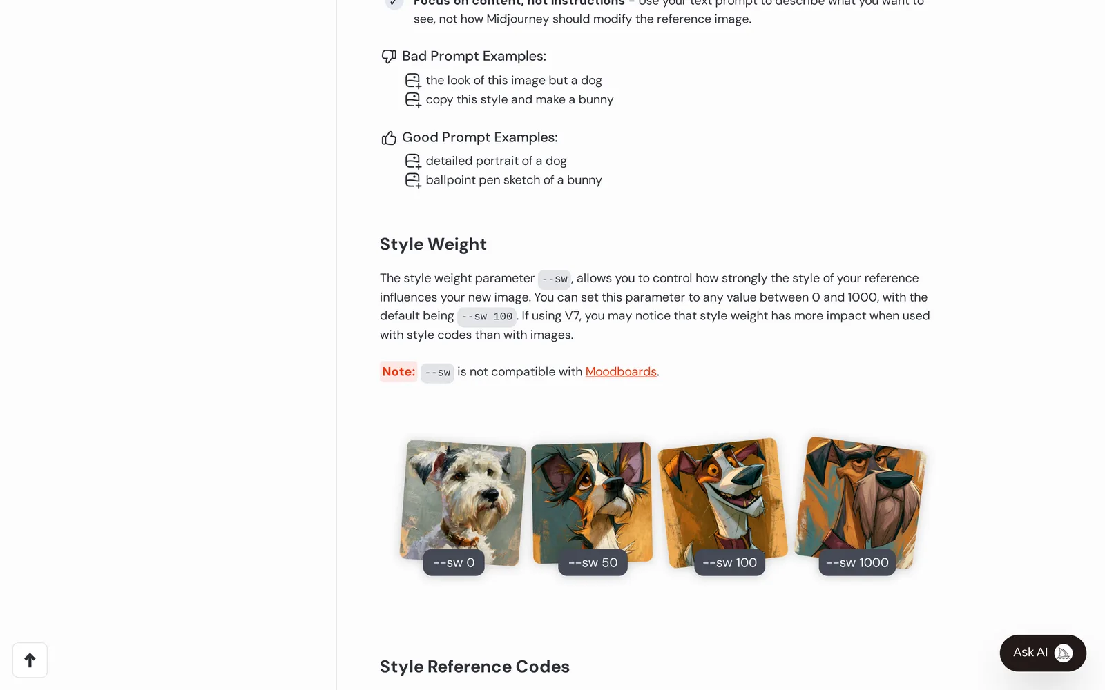
Caption: Source: Midjourney website (docs.midjourney.com, Style Reference), captured October 2026.
ChatGPT images
ChatGPT images suit non-designers who want to turn plain-language adjectives into visible concepts. Describe the direction, inspect the result and refine it through follow-up messages.
The imagery still needs rebuilding in a UI design or code tool. ChatGPT is free with limited image creation. Plus costs $20/mo.
Krea
Krea is useful when the visual language must extend into marketing art or in-app imagery. Its Moodboards accept up to 250 images. Krea 2 analyzes their style and uses it to guide later image generation.
It produces images and video rather than UI components. The free plan includes 100 compute units per day. Pro costs $21/mo billed yearly and includes 20,000 units per month. Max costs $63/mo billed yearly.
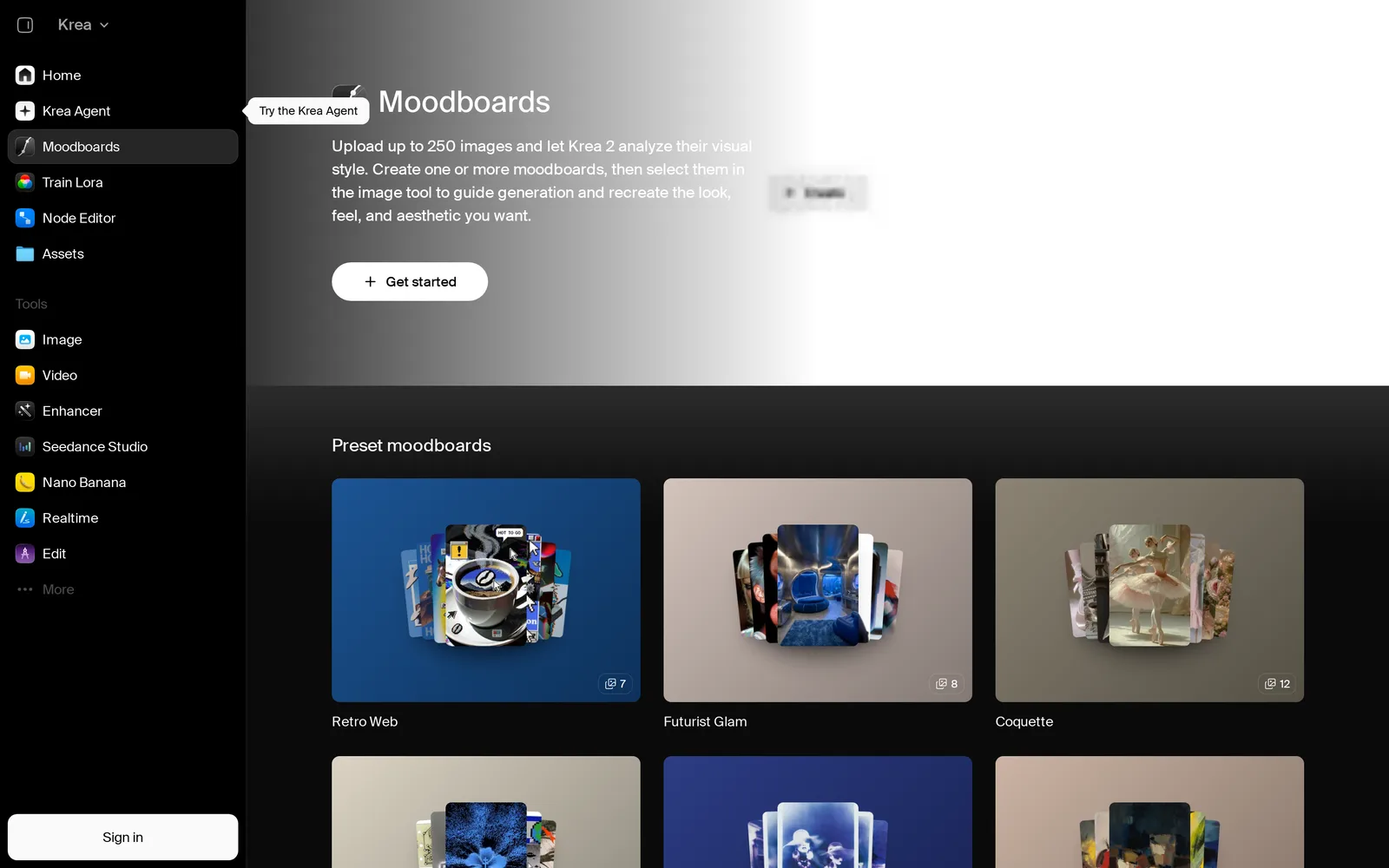
Caption: Source: Krea website (krea.ai/moodboards), captured October 2026.
Inspiration libraries for proven patterns
Reference libraries show designs that exist in shipped products or public portfolios. Borrow patterns and principles rather than copying one product's entire identity.
Mobbin
Mobbin calls itself "the design reference library for apps and sites" and lists 621,500 shipped screens, with new examples added every week. Use it to inspect real screens, flows and animations. Pro includes Deep Search and an MCP server for coding agents.
Access is free with limits. Pro costs $10/mo billed yearly, while Team costs $16 per member each month billed yearly.
Dribbble
Dribbble covers brands, websites, mobile UI and dashboards. It is also useful when you want to identify and hire the creator of a reference.
Browsing is free. Its Pro tiers focus on designers marketing their services.
Land-book
Land-book is the better reference library for marketing and landing pages adjacent to an app. Its hand-picked gallery is updated daily and includes color and section filters, boards and copy-to-Figma support.
It is free to browse. The professional plan costs $9/mo.
UI-native tools for generated screen variations
UI-native tools render directions as interfaces. Compare them by content fidelity, option count, product-wide propagation and export format.
Google Stitch
Google Stitch is the best free option for variations of an already generated screen. It can create one to five alternatives per run from the selected screen.
Creative Range controls the degree of change. Refined retains more structure, while Creative changes the layout and theme more substantially. Edit Theme covers light or dark mode, accent color, corner radius and font. Its redesign vocabulary includes Bento Grid, Editorial, Swiss Style and Glassmorphism.
Stitch can extract a design system from a URL and import or export DESIGN.md. Code export is HTML and CSS with Tailwind, not React components. Applying the selected-screen changes across the rest of a product remains a separate consistency task. See this Stitch multi-screen consistency guide.
Stitch is free, with a daily credit limit that resets at midnight UTC. Read the full Google Stitch comparison.
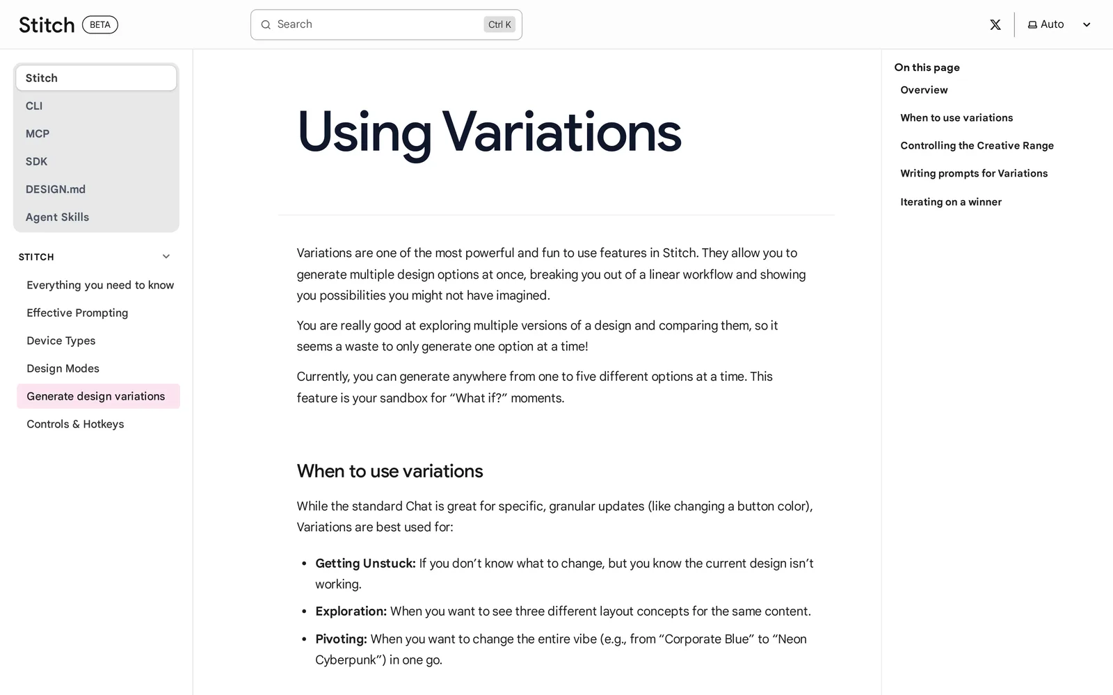
Caption: Source: Google Stitch website (stitch.withgoogle.com/docs), captured October 2026.
Lovable
Lovable works well for founders already building there who want alternatives before full production. Its design guidance presents three HTML and Tailwind directions side by side and allows up to six refinements. Existing-project prompts can also request alternatives, including multiple hero-section options. Design guidance consumes no extra credits.
The previews use generic copy and image placeholders. According to its FAQ, dashboards, admin panels, internal tools and games skip design guidance.
The free plan includes 5 daily credits, up to 30 per month. Pro costs $25/mo. If an existing build still feels generic, use this de-slopification pass or read the Lovable comparison.
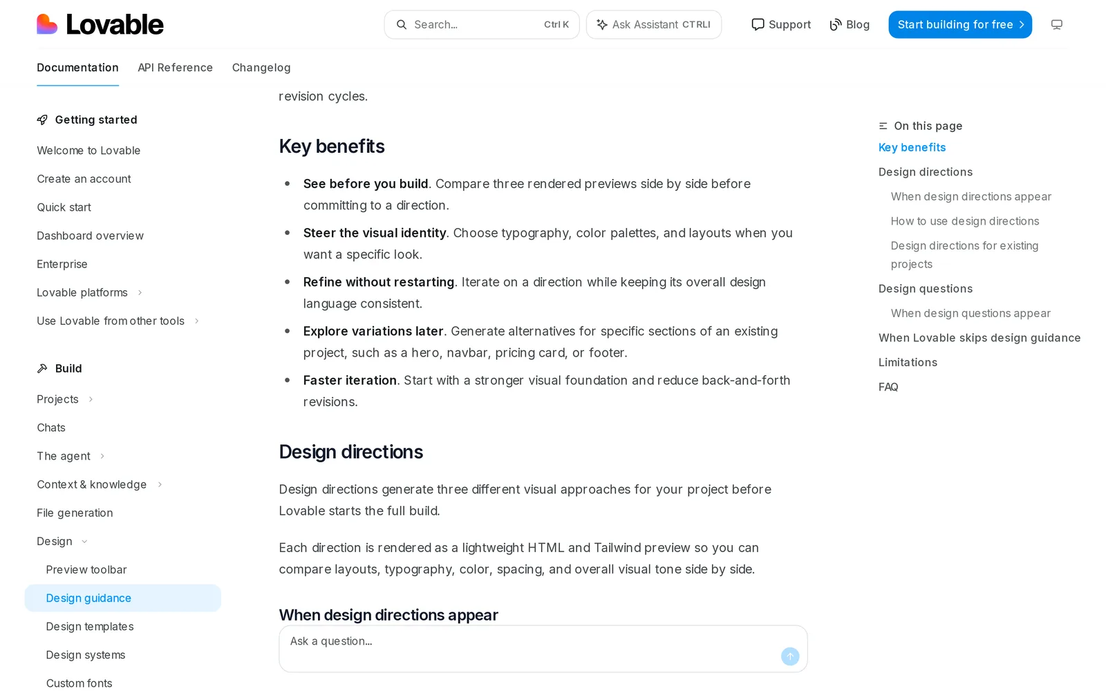
Caption: Source: Lovable website (docs.lovable.dev), captured October 2026.
Figma Make
Figma Make suits teams with existing Figma libraries, moodboards and reference frames. It creates prompt-based prototypes and apps within Figma and accepts attached designs, images and PDFs.
Make kits synchronize npm packages, library styles and guidelines. Generated output can be copied to the Figma canvas as editable layers. It returns one result per prompt, and the Make page does not list a side-by-side direction feature, so alternatives require more prompts. Figma examples place "Change the font" at about 30+ credits.
Starter includes 150 AI credits per day, up to 500 per month. Professional costs $16/mo per Full seat billed yearly and includes 3,000 AI credits per month. See the Figma Make comparison.
Theme generators for implementation-ready tokens
Theme generators convert a selected direction into colors, fonts and radius values. Their previews use sample UI rather than your product's real screens.
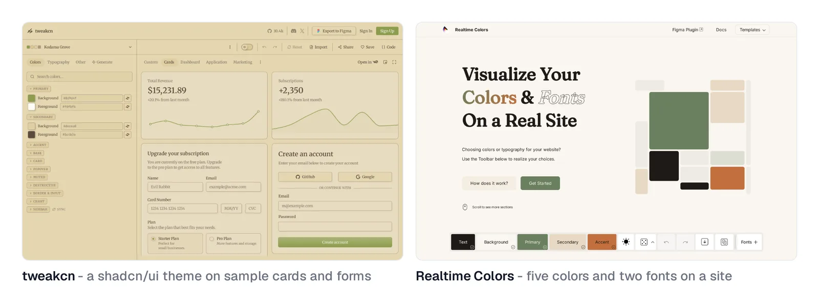
Caption: Source: tweakcn and Realtime Colors websites, captured October 2026.
tweakcn
tweakcn is the strongest option for React, Tailwind and shadcn/ui projects, including v0 and Lovable apps. This open-source editor previews themes on cards, dashboards, apps and marketing pages. v0's legacy design-system guide references it.
You can generate a theme from text, while Pro also supports image-based themes. Export CSS variables in OKLCH or HSL for Tailwind v3 or v4, then check contrast inside the tool. Its shadcn/ui variable set and sample components define the preview context.
The free plan includes 5 AI-generated themes and 10 saved themes. Pro costs $8/mo.
Realtime Colors
Realtime Colors quickly tests five color roles: text, background, primary, secondary and accent. It also pairs two fonts and shows them in a realistic website preview.
Exports include CSS, SCSS and .png, and a Figma plugin is available. The tool is free.
Huemint
Huemint generates palettes based on how each color will be used in the final design. Use the creativity slider, lock colors you want to retain and copy the resulting hex values.
It is free. Its public API is restricted to non-commercial use.
Side-by-side comparison
Prices are from each vendor's pricing page, October 2026.
| Tool | Output and landing point | Options | Export | Free access | Paid from |
|---|---|---|---|---|---|
| Mowgli | Styles, then full app on real screens | 16+ styles; four previews | React + Tailwind, Figma, MCP | 300 credits | $12 packs; $15/mo plans |
| Midjourney | Images for mood | Four per prompt | No code, tokens or Figma | App trial only | $10/mo |
| ChatGPT | Images for mood | Per message | No code, tokens or Figma | Limited | $20/mo |
| Krea | Images and video for mood | Not documented | No code, tokens or Figma | 100 units/day | $21/mo yearly |
| Mobbin | Shipped-screen references | n/a | Reference library | Limited | $10/mo yearly |
| Dribbble | Portfolio references | n/a | Reference library | Free browsing | n/a for browsing |
| Land-book | Website references | n/a | Copy to Figma | Yes | $9/mo |
| Google Stitch | One generated UI screen | One to five | HTML/CSS, DESIGN.md | Daily limit | Free |
| Lovable | Previews, then app | Three | Code through full build | 5 credits/day | $25/mo |
| Figma Make | Prototype or app | One per prompt | Code and Figma layers | Starter credits | $16/mo yearly |
| tweakcn | Theme tokens on samples | One theme | CSS variables and Figma | 5 AI themes | $8/mo |
| Realtime Colors | Palette and fonts on samples | One palette | CSS and SCSS | Free | Free |
| Huemint | Palette on sample templates | Per click | Hex values | Free | Free |
Verdict: best tool for each visual-style job
For a complete multi-screen product, choose Mowgli. It lets you compare real-screen previews, then carries the selected direction through every screen and state.
For an existing product, use Mowgli Redesign with input from Figma or a codebase pushed through Claude Code, Codex, Cursor or another coding agent.
When the mood is still undefined, start with Midjourney or Krea. Carry the selected image into a UI tool using screenshots as visual references.
For evidence from shipped products, choose Mobbin for apps and Land-book for websites. For shadcn/ui implementation, use tweakcn to create CSS variables. For free single-screen alternatives, use Google Stitch with Creative range first, then narrow the result with Refined. For a website already being built in Lovable, compare its three pre-build directions.
Whatever tool you choose, decide on the hardest real screen, not the most attractive hero. AI design does not have to look AI-generated when the direction is specific and tested against real product constraints.
FAQ
What are the best AI tools for exploring app visual styles?
Mowgli is best for applying a style across a complete multi-screen app. Use Midjourney or Krea for mood, Stitch or Lovable for generated UI directions and tweakcn for shadcn/ui tokens. Choose according to the final artifact you need, not image quality alone.
Can Midjourney design app UI?
Midjourney produces UI-like images rather than editable interfaces. Use --sref or Moodboards to retain a visual language, then rebuild or reference the selected direction in a UI design or code tool.
How many app design directions should I explore?
Explore three or four meaningfully different directions. Lovable provides three, Mowgli previews four and Stitch supports up to five per variation run. Testing fewer options on difficult screens is more useful than collecting many near-duplicates.
Is there a free AI tool for UI style variations?
Google Stitch is free with a daily limit and generates one to five variations per run. Mowgli is free to start with 300 credits, tweakcn includes 5 free AI themes, and Realtime Colors and Huemint are free palette tools.
How do I keep one visual style consistent across every app screen?
Convert the chosen direction into CSS variables or DESIGN.md, then verify it on dense, empty, error and loading states. Mowgli can generate every screen and state in the selected style, while product-wide chat edits can correct later drift.
How do I test whether an app style will work?
Test the style with real content on the densest or most awkward screen. Check long labels, 10+ rows, aligned figures, state coverage and 4.5:1 body-text contrast. Validate the result on three more screens before full production.
Sources
- Midjourney getting started guide
- Midjourney Style Reference
- Midjourney Moodboards
- Midjourney plans
- Midjourney free trials
- ChatGPT pricing
- ChatGPT Plus
- Krea Moodboards
- Krea pricing
- Mobbin
- Mobbin pricing
- Dribbble Pro
- Land-book Pro
- Google Stitch variations
- Google Stitch overview
- Google Stitch design modes
- Google Stitch announcement
- Lovable design guidance
- Lovable subscription plans
- Lovable pricing
- Figma Make
- Figma pricing
- Figma AI credits
- tweakcn
- tweakcn pricing
- v0 legacy design systems guide
- Realtime Colors
- Huemint about
- WCAG contrast minimum
- Mowgli pricing
- Mowgli moodboard
- Mowgli style steering
- Mowgli Redesign
- Introducing the Mowgli moodboard
- Moodboard, preview, build
- Why AI-built apps look the same
- DESIGN.md for coding agents
- App empty, error and loading states
- Light and dark mode in AI design
- Exploring multiple design directions
- Google Stitch multi-screen consistency
- Google Stitch comparison
- Fixing a generic Lovable app
- Lovable comparison
- Figma Make comparison
- Screenshots as visual references
- AI design creativity and moodboards
- Editing app design through chat