Why Every AI-Built App Looks the Same: 15 Tells and Fixes
AI-built apps converge on common defaults. Replace the palette, typography, cards, copy and motion, then choose a visual direction before generating.
AI-built apps look the same because language models reproduce frequent front-end patterns from training data, while framework and starter defaults reinforce them. The result is familiar: Tailwind indigo, Inter, a centered hero, two buttons, three cards, uniform radii and soft shadows.
Fix the existing interface first. Replace its tokens, layouts, copy and motion, then choose a product-specific visual direction before generating more UI. That manual pass works with any stack. When you need to redesign every screen and state together, Mowgli can apply one selected direction across the whole app.
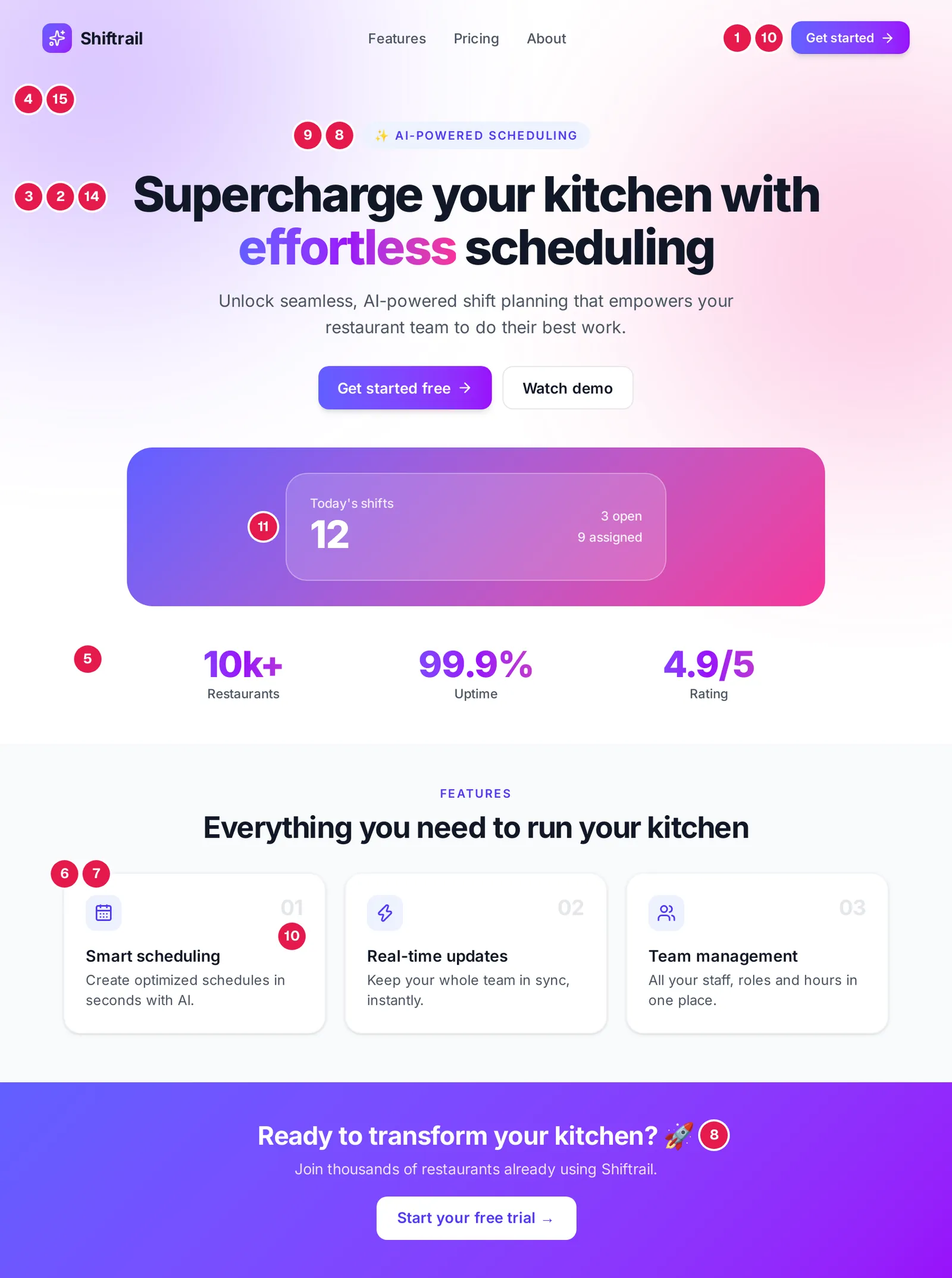
Caption: The default, annotated; numbers match the list below. We rendered it from Tailwind v4's real default values.
The 15 tells at a glance
| # | Tell | Root cause | Fix |
|---|---|---|---|
| 1 | Indigo or purple gradients | Tailwind UI's bg-indigo-500, copied everywhere | Palette from the product; reset --color-* |
| 2 | Gradient text on one word | A three-class Tailwind pattern | One color; size and weight for emphasis |
| 3 | Inter, Geist or system-ui everywhere | Starter-template defaults | Fonts chosen for the subject; a 3x+ size jump |
| 4 | Centered hero, two buttons, three cards | The stock SaaS landing layout | Left-align; show the product itself |
| 5 | Big-number stats strip | The default hero follow-up | One real number, or none |
| 6 | Identical rounded cards, same shadow | shadcn Card + shadow-sm | One primary block; rules, not boxes |
| 7 | Icon in a tinted square on every card | lucide-react ships with shadcn | Icons only where they label an action |
| 8 | Emoji as icons | Cheapest icon in one file | Delete them |
| 9 | ALL-CAPS eyebrow over every heading | Template chrome | Delete; write a specific heading |
| 10 | 01/02/03, middle dots, arrows on buttons | Template chrome | Numbers for sequences; verbs on buttons |
| 11 | Glassmorphism and blurred blobs | One class each | Solid surfaces |
| 12 | Near-black with one neon accent | The "techy" default | Tinted dark neutrals, no glow |
| 13 | Cream, serif display, terracotta | The 2026 default | Palette from the subject |
| 14 | "Supercharge your workflow" copy | The average SaaS sentence | Name the user, the job, a number |
| 15 | Fade-up on every section | Scroll-reveal snippets | One entrance; motion on actions |
Why AI-generated apps all look alike
AI slop in UI is a default-looking interface produced without art direction. Its individual choices may be usable. The combined pattern reveals that none of them came from the product.
Training frequency is the first cause. Safe, broadly used choices dominate web examples. Anthropic calls the result distributional convergence: "Safe design choices - those that work universally and offend no one - dominate web training data. Without direction, Claude samples from this high-probability center."
Framework defaults amplify it. Adam Wathan summarized one example: "I'd like to formally apologize for making every button in Tailwind UI bg-indigo-500 five years ago, leading to every AI generated UI on earth also being indigo".
Vague prompts add another push toward the average. "Modern," "clean" and "beautiful" describe no product, audience or visual source.
The defaults also change. December 2025 guidance warned against Inter and purple gradients on white. By June 2026, newer clusters included cream with serif and terracotta, near-black with an acid accent, and broadsheet layouts. September added the "SaaS-card kit" and "template chrome." Removing one cliche can expose the next one.
The 15 tells, and how to remove each one
Use Shiftrail, an invented restaurant-kitchen scheduling product, as the example. Its replacement direction is a kitchen-ticket rail built from steel grey, ink, signal amber and Archivo. "The skill" below means Anthropic's current frontend-design SKILL.md.
1. Indigo and purple gradients
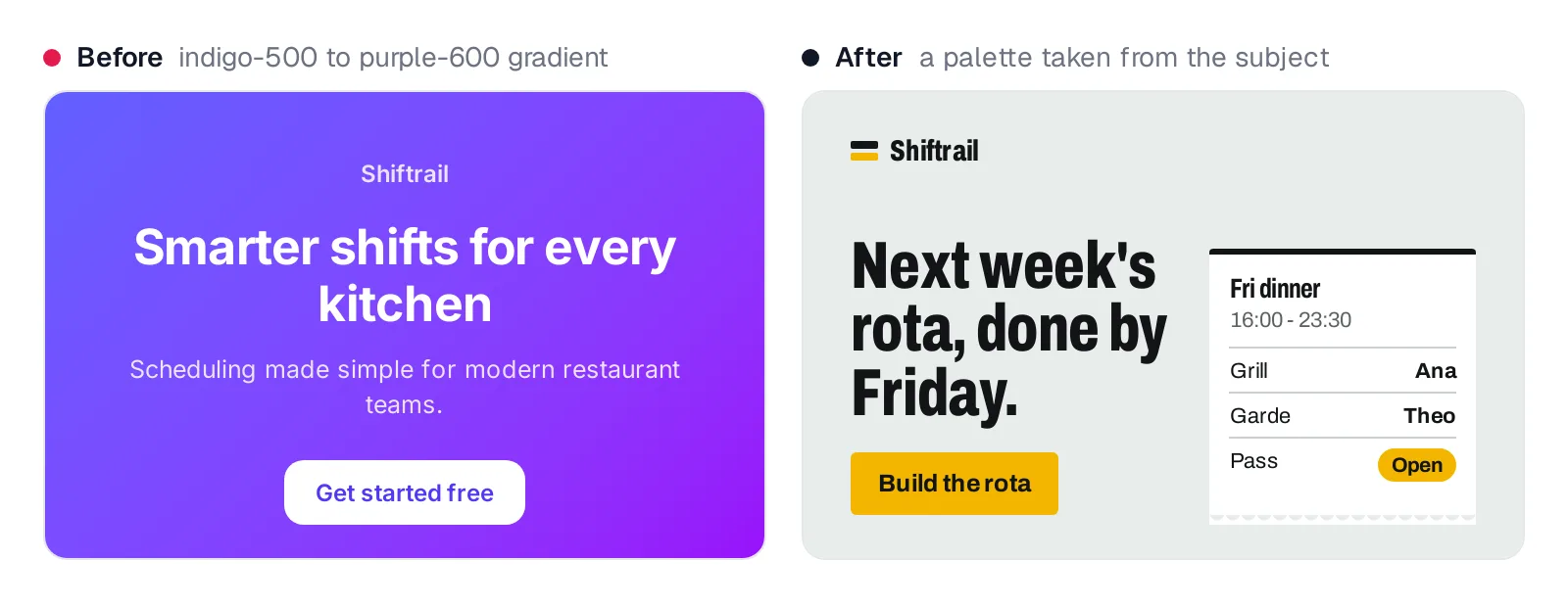
Caption: from-indigo-500 to-purple-600 vs a palette from a kitchen pass.
Widely copied Tailwind UI buttons and easy gradient utilities make this the clearest tell. Derive colors from the product's physical or conceptual world. Then reset Tailwind's color namespace so default palette classes stop compiling.
@theme {
  --color-*: initial; /* bg-indigo-500 no longer exists */
  --color-steel: oklch(94% 0.004 175);
  --color-ink: oklch(19% 0.005 250);
  --color-signal: oklch(81% 0.167 84);
}
2. Gradient text on one headline word
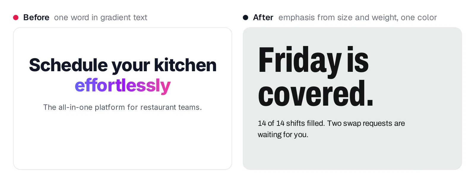
Caption: Emphasis from size and weight, not color.
This effect requires only three common Tailwind classes. Use one text color and build hierarchy through size, width and weight.
<!-- before -->
<span class="bg-gradient-to-r from-indigo-500 to-purple-600 bg-clip-text text-transparent">effortlessly</span>
<!-- after -->
<h1 class="font-display text-7xl font-extrabold leading-none">Friday is covered.</h1>
3. Inter, Geist or system-ui everywhere
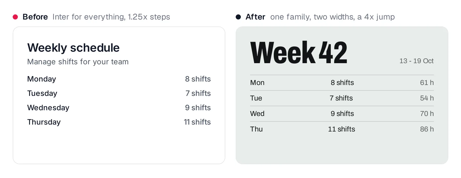
Caption: Same content; one family, two widths, a 4x jump.
Inter appeared in create-next-app v14.2.0, while the current template imports Geist. Banning one popular face can simply redirect generation toward another. Choose one or two families from the subject, assign explicit roles, and use the skill's recommended "Size jumps of 3x+, not 1.5x".
@theme {
  --font-sans: "Archivo", ui-sans-serif, sans-serif;
  --font-display: "Archivo", ui-sans-serif, sans-serif;
  --font-display--font-variation-settings: "wdth" 72; /* condensed cut */
}
4. Centered hero, two buttons, three feature cards
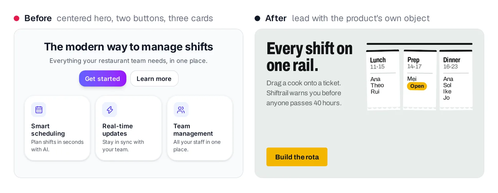
Caption: The hero shows the product's own object.
This is the stock SaaS composition. Consider left alignment and open with the most characteristic object in the product's world: a rota, map, invoice or equivalent. Shiftrail uses hanging shift tickets instead of a generic feature grid.
5. The big-number stats strip
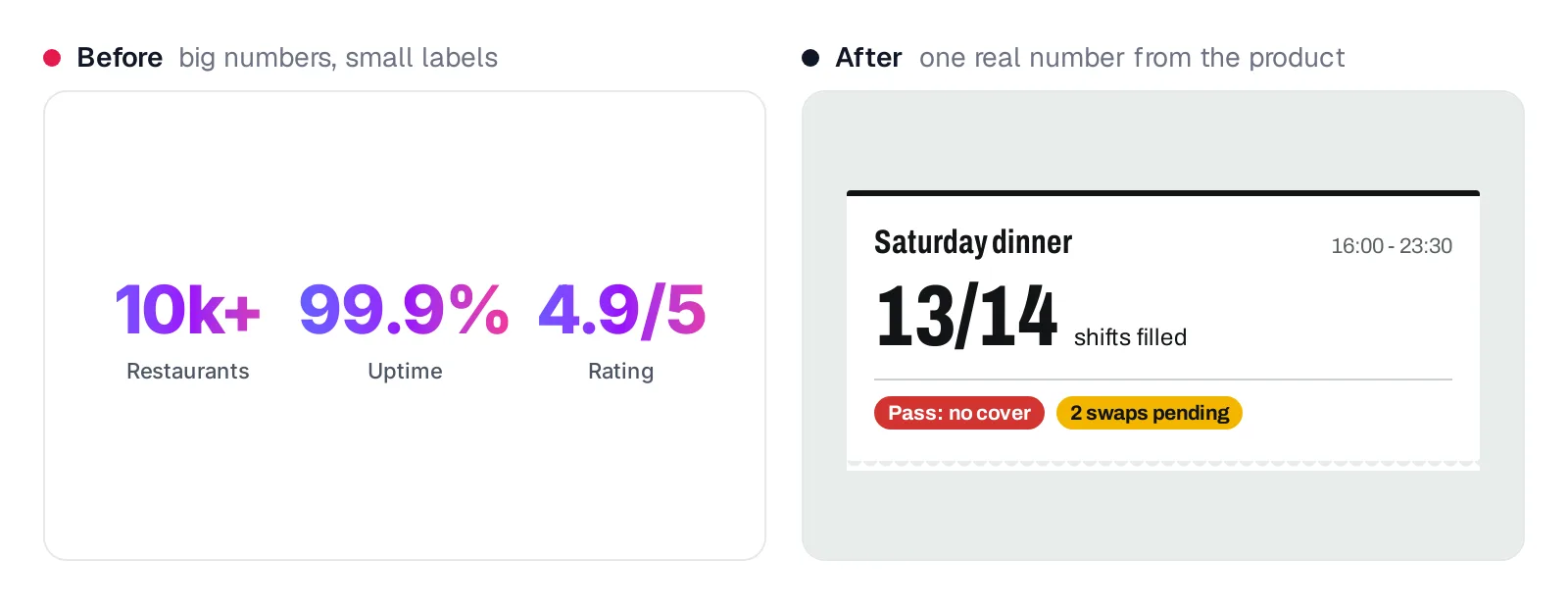
Caption: One number the product actually knows.
The default hero follow-up pairs large figures with small labels and gradient accents. Use one product-derived number, such as 13 of 14 shifts filled. If no meaningful figure exists, remove the strip.
6. Identical rounded cards with the same shadow
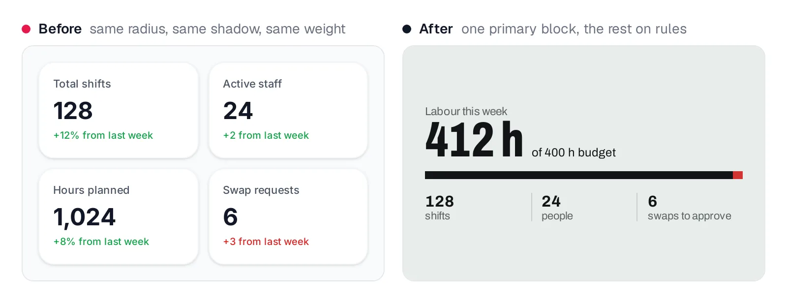
Caption: One primary number, the rest on rules.
The "SaaS-card kit" applies one radius and shadow-sm to every block. Enlarge the primary item, separate secondary information with rules, assign radii by role and reserve shadows for overlays.
@theme {
  --radius-*: initial;
  --radius-ticket: 2px;
  --radius-control: 3px;
  --radius-pill: 999px;
  --shadow-*: initial;
  --shadow-overlay: 0 12px 32px oklch(19% 0.005 250 / 0.18);
}
7. An icon in a tinted square on every card
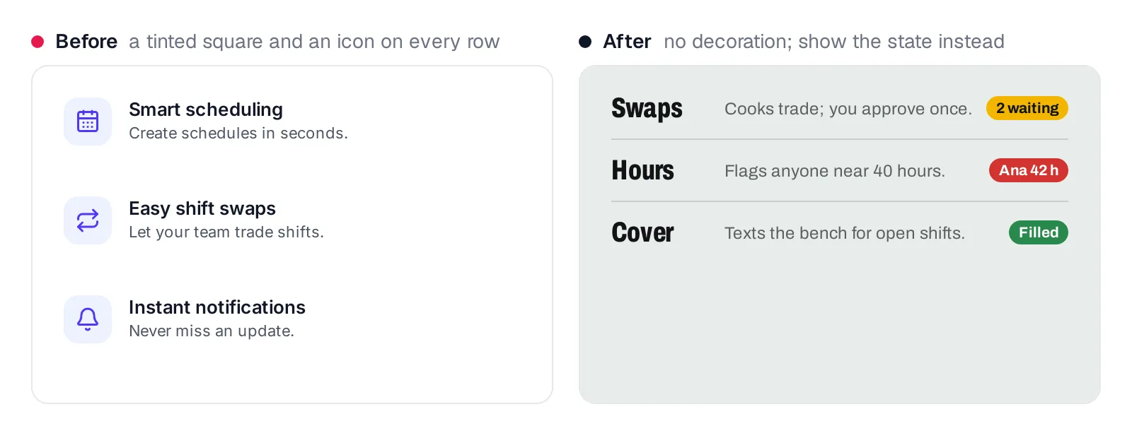
Caption: The status chip carries information; the icon didn't.
shadcn/ui adds lucide-react and sets Lucide as its icon library. Remove decorative icons. Keep icons that label actions or communicate information, and standardize functional icons with strokeWidth={1.5}. Phosphor and Tabler offer different visual characters.
8. Emoji as icons
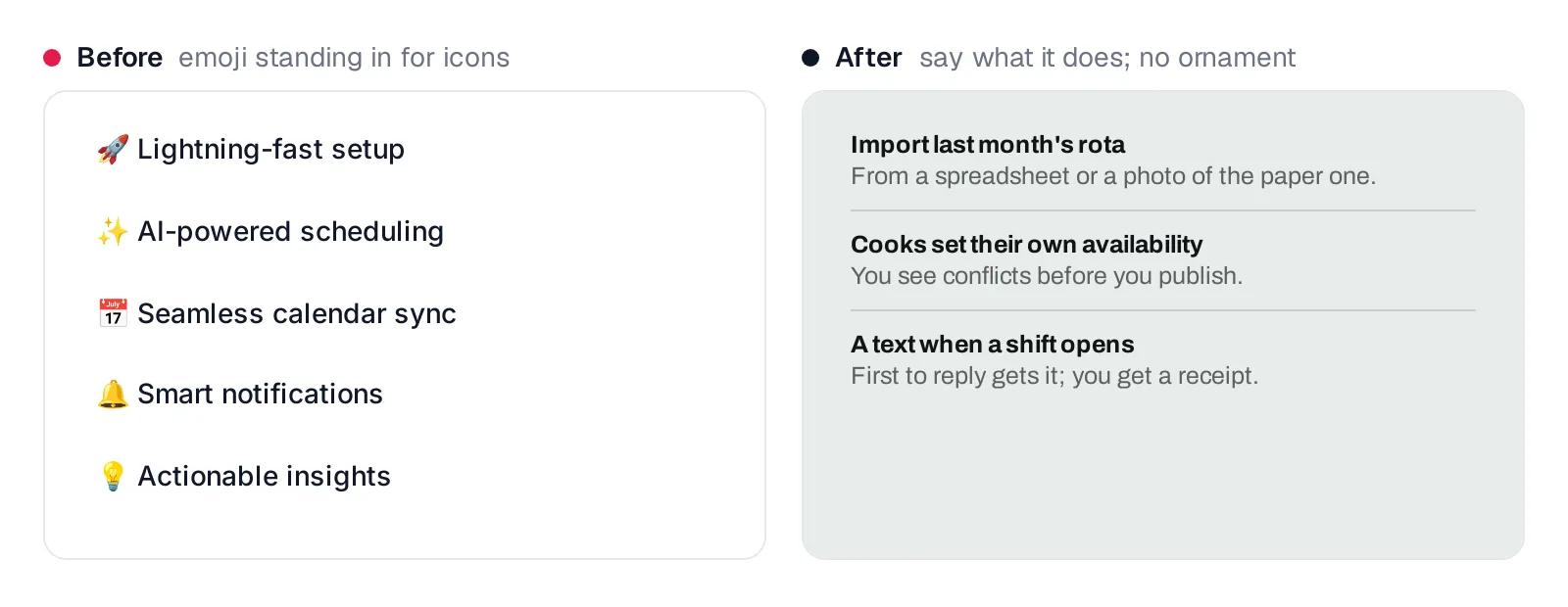
Caption: Say what it does instead.
Emoji require no asset or import, so they appear often in generated single-file interfaces. Delete decorative emoji. Make the opening words of each item state the feature's meaning.
9. An ALL-CAPS eyebrow above every heading
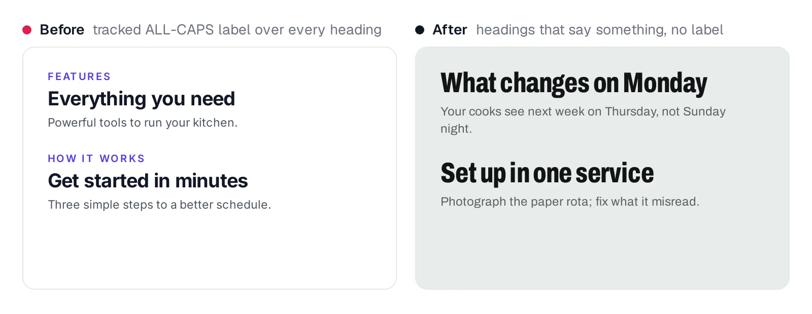
Caption: A heading that says something needs no label.
Repeated uppercase tracking-widest labels are template chrome. Remove them and replace generic headings with specific ones, such as "What changes on Monday."
10. Template chrome: 01/02/03, middle dots, arrows on buttons
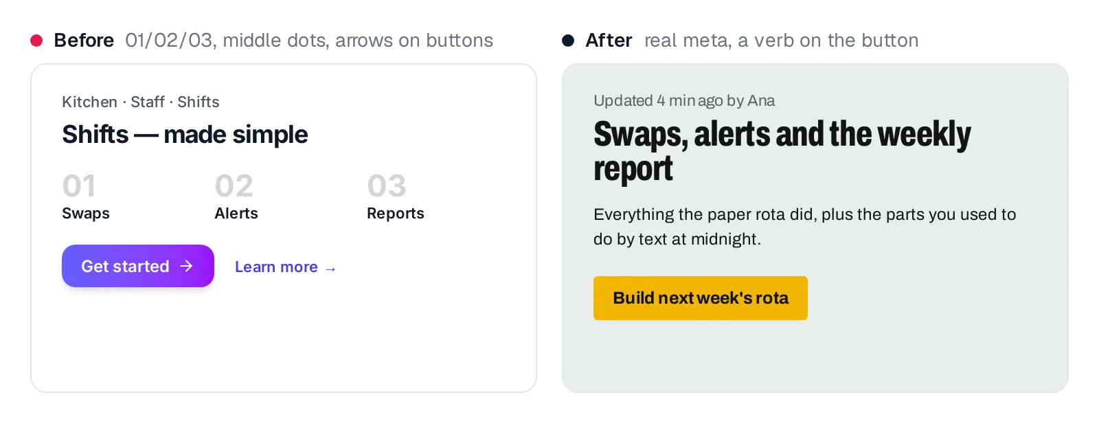
Caption: Real metadata and a verb on the button.
Reserve numbers for actual sequences. Write metadata naturally. Replace decorative arrows and vague CTAs with a verb plus its object, such as "Build next week's rota."
11. Glassmorphism and blurred gradient blobs
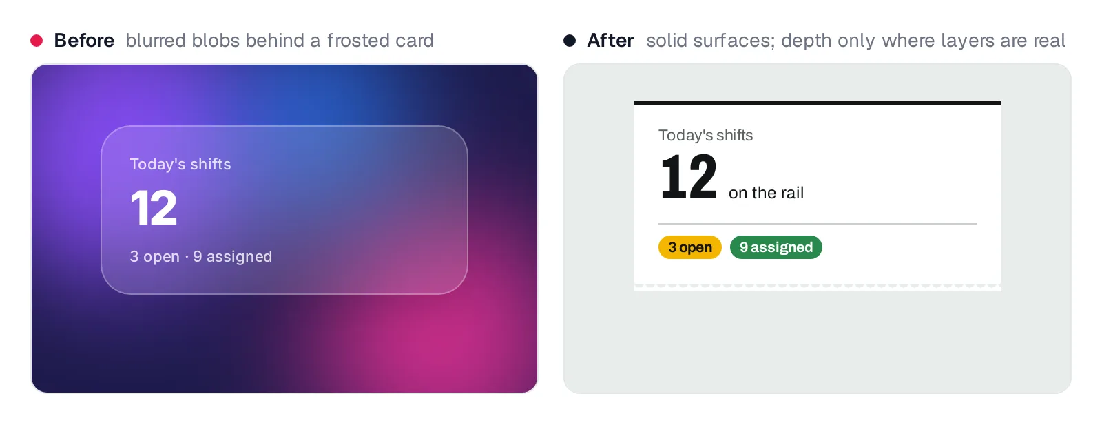
Caption: Solid surfaces; depth only where layers are real.
backdrop-blur and blur-3xl turn atmosphere into one-class effects. Prefer solid surfaces. Use translucency only for a real layer over content, such as a sheet over a map.
12. Near-black with one neon accent
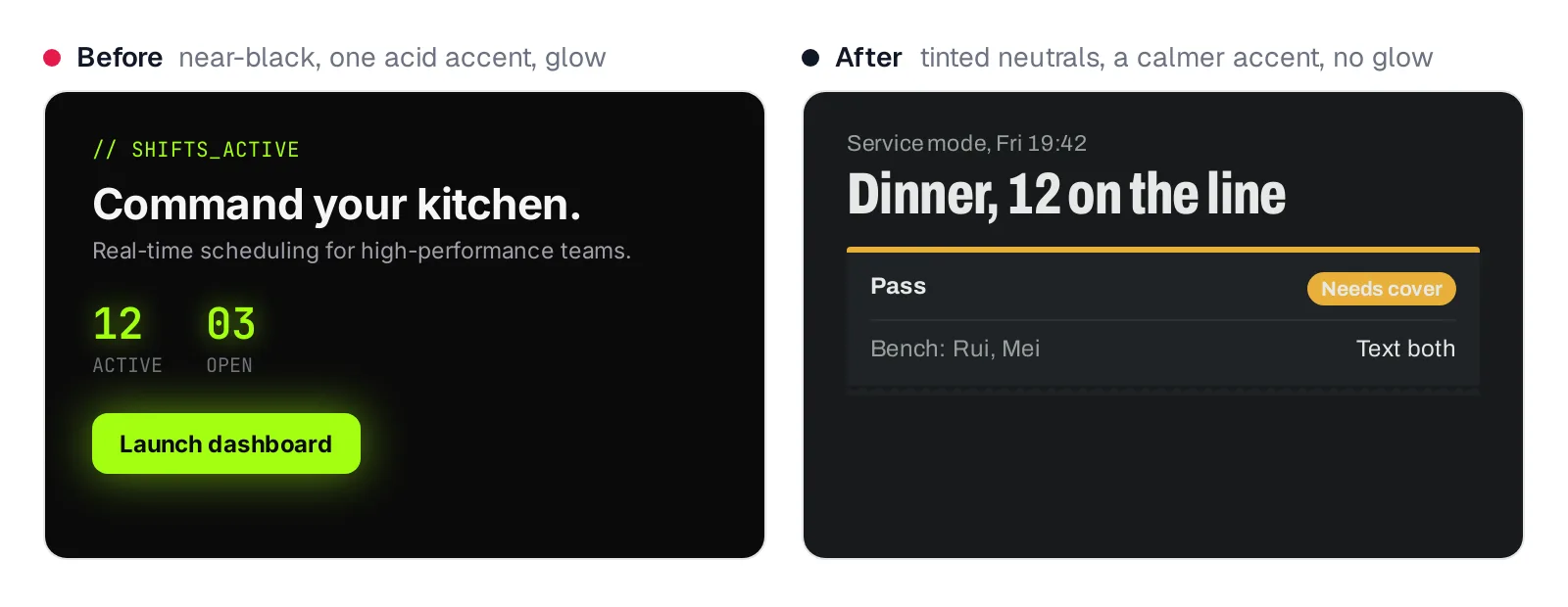
Caption: Dark mode chosen for a reason: a kitchen during service.
Dark mode should follow context. Tint neutrals toward the chosen hue, lower accent chroma and remove decorative glow. Shiftrail uses it for service mode. See how context should shape dark mode.
.dark {
  --color-steel: oklch(21.5% 0.006 237);
  --color-paper: oklch(25.3% 0.008 240);
  --color-ink: oklch(93% 0.003 150);
  --color-signal: oklch(79% 0.144 82);
}
13. Cream, a serif display and a terracotta accent
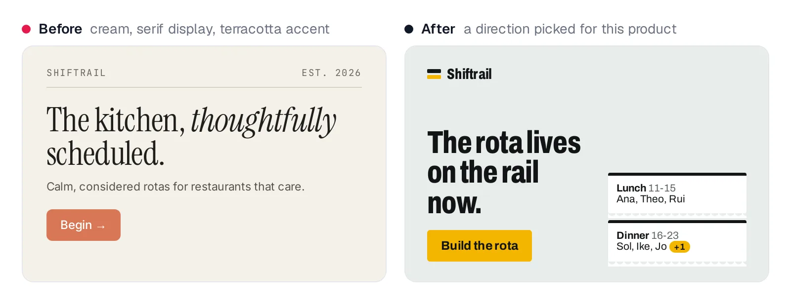
Caption: Swapping purple for cream is still a default.
A warm cream near #F4F1EA, high-contrast serif and clay accent near #D97757 became another cluster. A prohibition list is not a direction. Derive the palette from the product.
14. Copy that fits any product
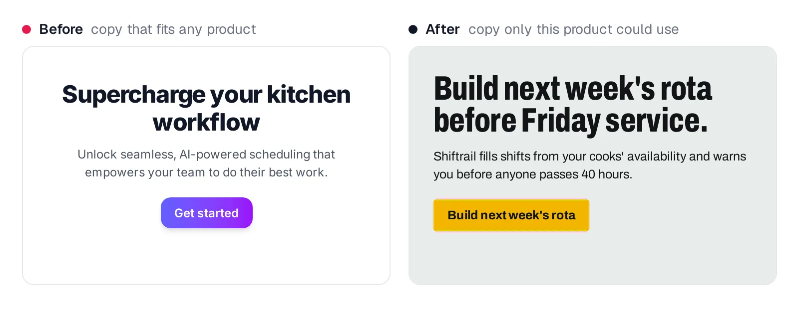
Caption: Copy only this product could use.
Generic SaaS phrases fit any landing page. Name the user, job and a meaningful number. Make each CTA say exactly what happens. See how to write real interface copy.
15. Fade-up on every section, lift on every card
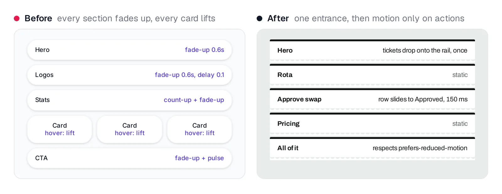
Caption: One entrance, then motion only in answer to an action.
Repeated fade-and-slide entrances became another generated default after earlier guidance encouraged staggered reveals. Use one coordinated load moment, then motion that explains an action's result. Respect prefers-reduced-motion.
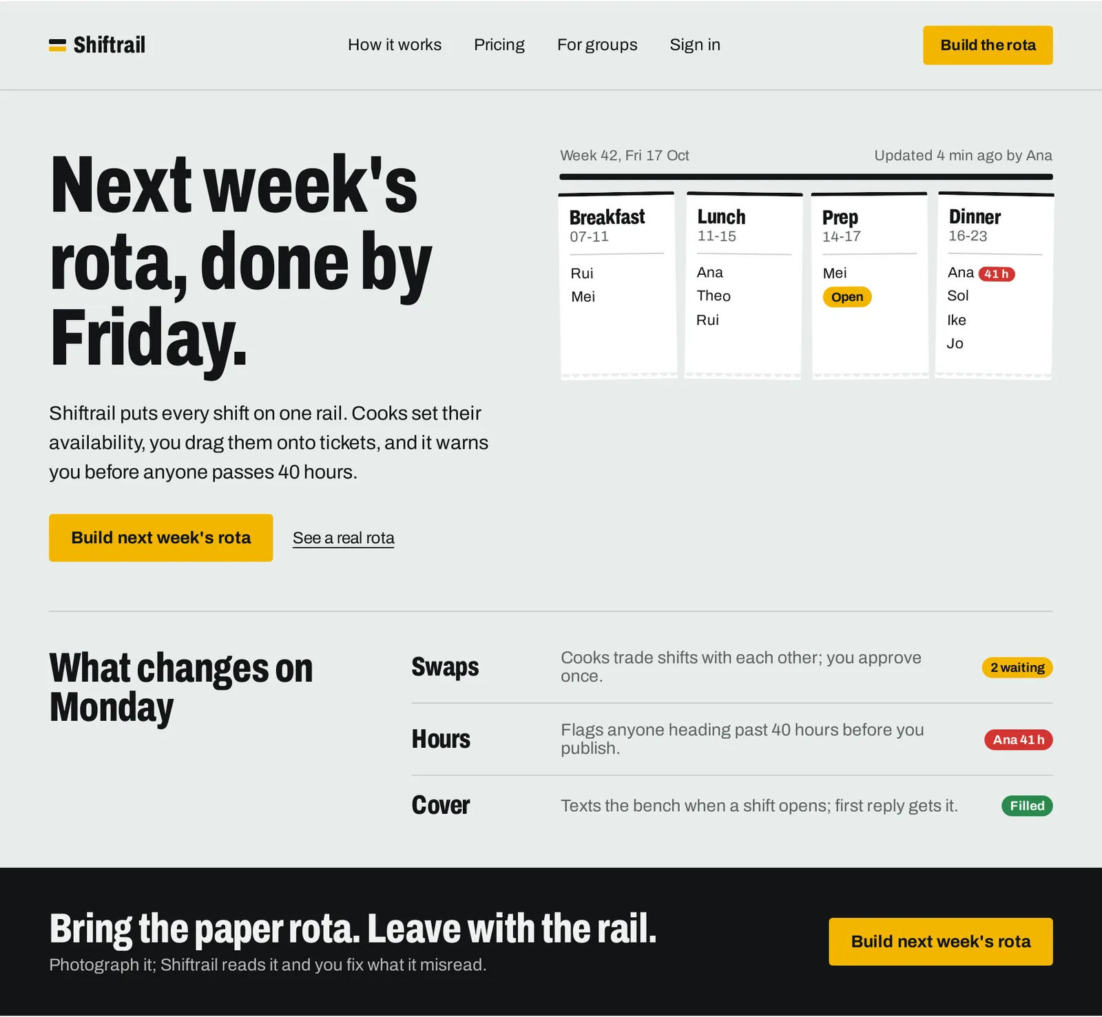
Caption: The page from the top of this post with all 15 fixes applied.
Generic design also appears through missing states. Use the empty, error and loading states checklist to inspect the whole product, not only its happy path.
Token-level fixes for React + Tailwind v4 and shadcn/ui
Components inherit their visual language from tokens. Fix those tokens once to remove repeated defaults across the interface.
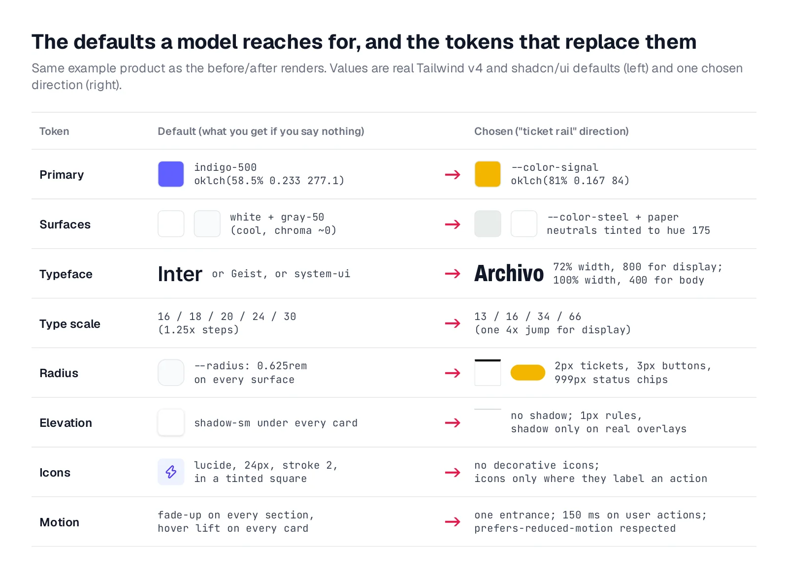
Caption: Every value on the left is a real Tailwind v4 or shadcn/ui default.
Replace the Tailwind theme instead of extending it
Reset default namespaces and define semantic, product-specific tokens. With shadcn/ui, test resets against its @theme inline mapping because a reset can clear mapped tokens. Add explicit mappings where needed.
@import "tailwindcss";

@theme {
  --color-*: initial;
  --color-steel: oklch(94% 0.004 175);   /* page */
  --color-paper: oklch(100% 0 0);        /* surfaces */
  --color-ink: oklch(19% 0.005 250);     /* text */
  --color-muted: oklch(49% 0.01 180);
  --color-rule: oklch(85% 0.007 175);
  --color-signal: oklch(81% 0.167 84);   /* primary action */
  --color-late: oklch(57% 0.195 27);     /* danger */
  --color-fresh: oklch(56% 0.127 152);   /* success */

  --font-sans: "Archivo", ui-sans-serif, sans-serif;
  --font-display: "Archivo", ui-sans-serif, sans-serif;
  --font-display--font-variation-settings: "wdth" 72;

  --radius-*: initial;
  --radius-ticket: 2px;
  --radius-control: 3px;
  --radius-pill: 999px;

  --shadow-*: initial;
  --shadow-overlay: 0 12px 32px oklch(19% 0.005 250 / 0.18);
}
Write the palette in OKLCH
Tailwind v4 and shadcn/ui use OKLCH. Its lightness, chroma and hue controls make it practical for building related tokens. Shiftrail keeps neutral chroma between 0.004-0.01. Use the free OKLCH picker to tune values.
Map shadcn/ui variables to the chosen tokens
shadcn/ui components consume variables such as --background and --primary, while --radius controls the radius scale. Map them deliberately instead of accepting the starter theme.
:root {
  --radius: 0.25rem;
  --background: oklch(94% 0.004 175);
  --foreground: oklch(19% 0.005 250);
  --card: oklch(100% 0 0);
  --card-foreground: oklch(19% 0.005 250);
  --primary: oklch(81% 0.167 84);
  --primary-foreground: oklch(19% 0.005 250);
  --muted: oklch(90% 0.005 175);
  --muted-foreground: oklch(49% 0.01 180);
  --border: oklch(85% 0.007 175);
  --ring: oklch(19% 0.005 250);
  --destructive: oklch(57% 0.195 27);
}
Preview and guard the theme
tweakcn previews shadcn/ui tokens on live components and exports CSS. Start from your selected direction, not an unrelated preset.
Add a pre-commit check so default classes do not return:
if grep -rnE "(indigo|violet|purple)-[0-9]{2,3}|bg-clip-text|backdrop-blur|tracking-widest" src; then
  echo "Default-style classes found. Use theme tokens instead."; exit 1
fi
Choose a visual direction before generating
A ban list removes options but does not provide a coherent replacement. Define a positive direction with a name, 4-6 named colors, typefaces with explicit roles, a layout concept, one product-specific visual principle and a compact token system.
Start from the subject matter, real objects, user environment, information density and core workflow. Compare several directions using the same real product content. That exposes meaningful differences instead of differences caused by changing the example. See the workflow for exploring multiple design directions.
Manual workflow with Claude Code, Codex, Cursor or another coding agent
Before requesting code, describe the product, audience and core job. Ask for three materially different directions, including differences in palette, typography, density and layout. Require each proposal to explain its origin in the product's subject. Apply the ban list, then choose one.
Before writing UI code, propose 3 visual directions for [product] used by
[audience] for [core job]. Make them genuinely different in palette, type,
density and layout. For each: a name, 4-6 named hex or OKLCH colors,
typefaces and their roles, a one-sentence layout concept, and what in the
product's subject it comes from. Check each against this ban list and
revise any part that matches: [paste the ban list below]. Wait for my pick.
For implementation details, use the Claude Code UI design workflow, place the same rules in AGENTS.md with Codex for frontend design, or follow the guide for a generic Lovable, Bolt or v0 app. For an existing product, redesign the vibe-coded app without rebuilding it.
Redesign every screen and state with Mowgli
We make Mowgli.
Mowgli fits when you need to choose a direction before redesigning the whole app. A short questionnaire becomes a product spec. Its moodboard presents 16+ directions based on the product's content, and style steering accepts a description, hex code or reference screenshots.
You select four directions, preview them on a real screen, then generate 30+ screens and states in the chosen direction.
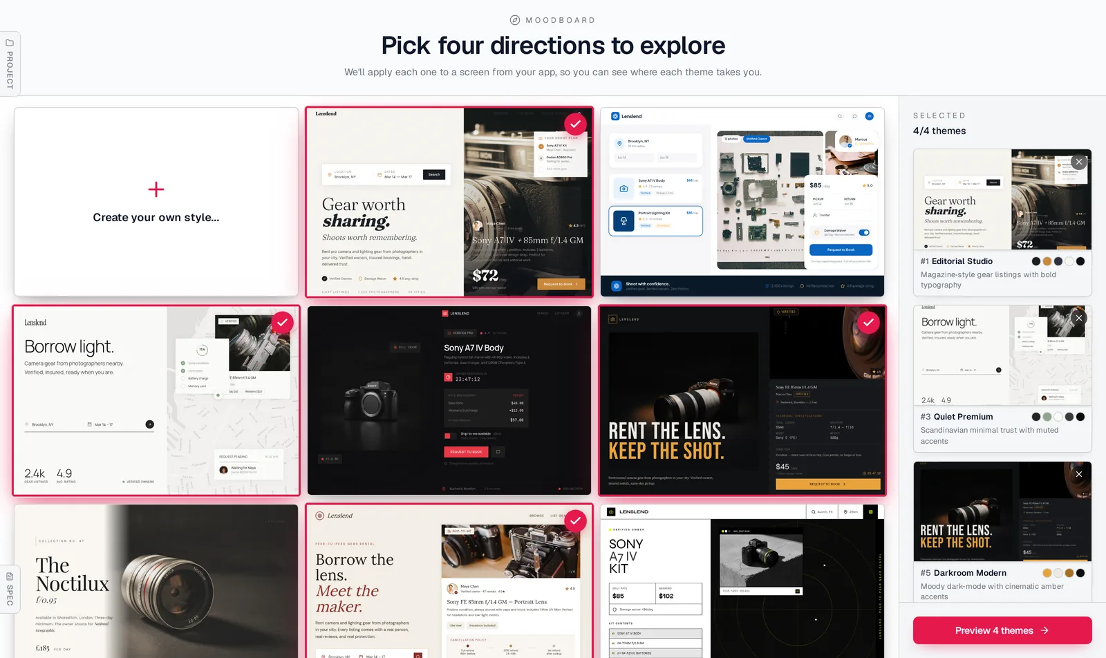
Caption: Mowgli's moodboard for a camera-gear rental marketplace, four directions selected.
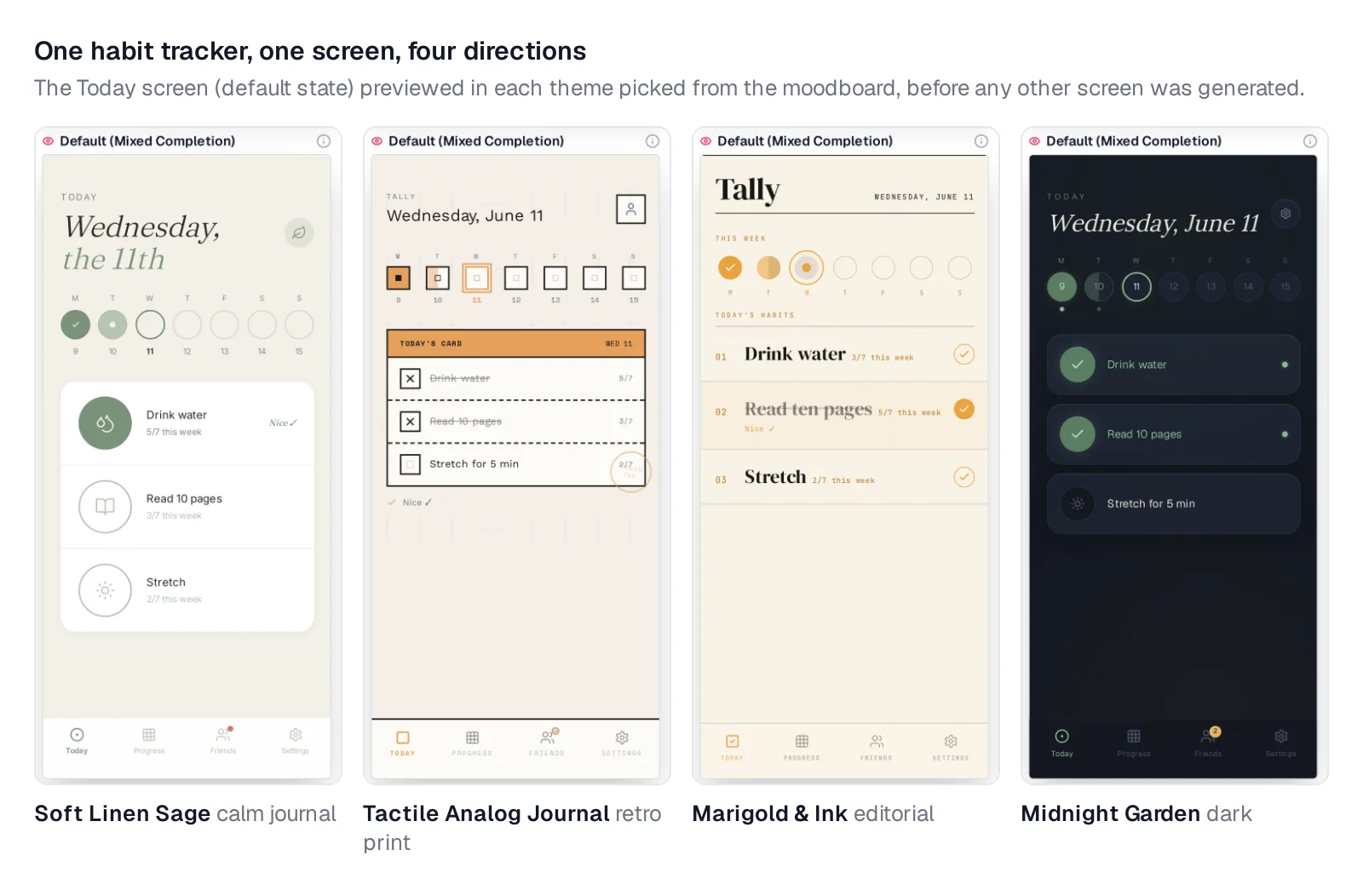
Caption: One habit tracker screen in four directions, previewed before the rest of the app was generated.
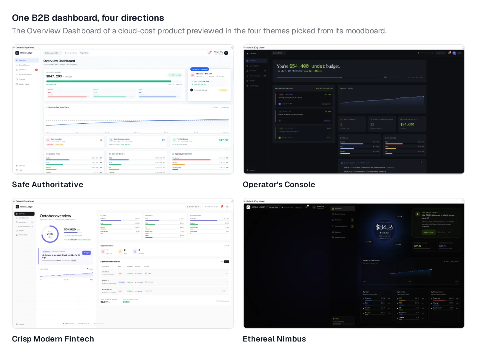
Caption: The same step for a B2B cloud-cost dashboard.
Screens export as React + Tailwind with lucide-react icons, so the earlier token fixes remain applicable. Claude Code, Codex or Cursor can pull every screen and state into the codebase through Mowgli's MCP server.
For an existing app, a coding agent can push current screens into Mowgli, apply the moodboard process and sync the redesign back. See the redesign path for vibe-coded products.
Mowgli designs and prototypes; to host and ship, you hand off to a builder or coding agent (Claude Code, Codex, Cursor, Lovable). Free to start (300 credits); credit packs from $12; plans from $15/mo. You can also try the moodboard or read why we built it.
The ban list: copy into DESIGN.md, CLAUDE.md or AGENTS.md
Record the selected direction beside the restrictions. Include state coverage, responsive behavior, focus and reduced motion, and require the coding agent to ask when the direction does not cover a decision.
## Visual direction (fill in before any UI work)
- Name: [direction name]
- Colors: [4-6 named OKLCH or hex values, with roles]
- Type: [display face + weight/width], [body face]; scale with one 3x+ jump
- Layout: [one sentence; alignment; density]
- Principle: [the one thing that makes this product look like itself]
- Tokens live in: src/styles/theme.css (no raw hex, no default palette classes)

## Never (AI tells)
1. Indigo, violet or purple, or multi-hue gradients, unless the brand color is one
2. Gradient or multicolor text; a single highlighted word in a headline
3. Inter, Roboto, Arial or bare system-ui as the only typeface; Geist or Space Grotesk by reflex
4. A centered hero over three icon cards; the hero shows the product itself
5. A stats strip of big numbers with small labels; invented metrics
6. Grids of identical cards with one radius and one shadow
7. An icon in a tinted square on every card
8. Emoji in headings, buttons, labels or as icons
9. Uppercase tracked labels above headings
10. 01/02/03 on non-sequences; middle-dot meta strings; arrows appended to buttons
11. Frosted glass cards and blurred color blobs as decoration
12. Near-black with one neon accent, glows, monospace labels (unless asked)
13. Cream background + serif display + terracotta accent (unless asked)
14. "Supercharge", "unlock", "seamless", "empower", "revolutionize", "all-in-one"
15. Fade-up on every section; hover lift on every card

## Always
- Every screen has default, loading, empty and error states
- Buttons are a verb plus an object; the confirmation uses the same verb
- One element is the memorable thing; everything else stays quiet
- Respect prefers-reduced-motion; visible keyboard focus; works at 390px
- If the direction doesn't cover something, ask instead of inventing
Rules constrain choices but do not fully specify layout. Read why DESIGN.md is not enough.
Verdict
Start by replacing default tokens and removing the 15 tells from the existing interface. Then define a positive direction rooted in the product before generating more UI.
Use the prompt and ban list with Claude Code, Codex, Cursor or another coding agent for the manual route. Use Mowgli when every screen and state needs to be explored and redesigned together.
Your final check is simple: product-specific palette and typography, a real product object in the hero, meaningful hierarchy instead of repeated cards, concrete copy, complete loading, empty and error states, and motion tied to user actions.
FAQ
Why do all AI-generated websites use purple gradients?
Frequent training examples and framework defaults make purple gradients probable. Tailwind UI's widely copied buttons used bg-indigo-500, and models reproduce that recurring code pattern.
Why does AI always use the Inter font?
Inter appeared in common starters such as create-next-app. Banning it alone may shift output to another frequent default, so name a product-appropriate family and assign its role.
How do I make an AI-designed app not look like AI slop?
Replace the palette, type, radius, shadow and component tokens. Remove the 15 recurring tells, rewrite generic copy, select a specific direction before generation, and verify loading, empty and error states.
Why does AI keep making my frontend look like a Bootstrap template?
Common defaults from Tailwind, shadcn/ui, Lucide and repeated card layouts produce the template effect. Remap the theme, establish product-specific hierarchy and typography, and remove decorative cards and icons. tweakcn can preview and export shadcn/ui token changes.
What should I put in DESIGN.md, CLAUDE.md or AGENTS.md?
Include the direction name, 4-6 colors with roles, type roles, layout concept, defining product principle and token-file location. Add the 15-item ban list plus requirements for states, focus, reduced motion and 390px behavior.
Which AI design tool lets me choose a direction before designing every screen?
Mowgli presents 16+ directions, previews four on a real screen and generates every screen and state in the selected direction. It exports React + Tailwind and connects to Claude Code, Codex or Cursor over MCP.
Sources
- Anthropic on improving frontend design through skills
- Anthropic frontend-design SKILL.md
- Anthropic frontend-design skill, earlier revision
- Anthropic frontend-design skill, later revision
- Anthropic frontend-design version history
- Adam Wathan on Tailwind indigo
- Tailwind theme variables
- Tailwind font families
- Tailwind v4 default theme
- shadcn/ui theming
- shadcn/ui manual installation
- Next.js v14.2.0 app template
- Current Next.js app template
- Lucide stroke width
- Phosphor Icons
- Tabler Icons
- tweakcn
- OKLCH color picker
- Mowgli style steering
- Mowgli export to code
- Mowgli moodboard
- Mowgli pricing
- Redesign a vibe-coded product
- Dark mode in AI design
- Real copy, not lorem ipsum
- Empty, error and loading states
- Exploring multiple design directions
- Claude Code UI design workflow
- Codex for frontend design
- Fix a generic Lovable app
- Redesign a vibe-coded app without rebuilding
- Why we built the Mowgli moodboard
- DESIGN.md for AI coding agents