Lovable App Looks Generic? A 30-Minute De-Slopification Pass
Make a generic Lovable app unique in 30 minutes: replace its theme, typography, icons, card-heavy layouts, copy and missing UI states.
The 30-minute answer
Keep your working routes, data and backend. Replace the decisions that create the generic look: color, type, shape, depth, icons, hierarchy, copy and interface states.
Use this order:
- Pick one visual direction.
- Replace the theme tokens.
- Normalize radius, borders and shadows.
- Change fonts and icons.
- De-card the busiest page.
- Rewrite template copy.
- Add empty, loading and error states.
- Record the rules for later prompts.
The common tells are a slate palette, 0.625rem radius, Lucide icons, Inter, a gradient hero, three equal cards and icons inside colored circles. Lovable's own prompting examples include Font is "Inter", "soft gradients," "three horizontally aligned cards," "soft shadows" and cards that "lift on hover."
None of those choices is inherently wrong. The generic result comes from repeating them together without relating them to the product. See why every AI-built app looks the same for the broader pattern.
Find your Lovable stack and theme file
Check when the project was created and find its global stylesheet before editing components.
| Your project | Where the tokens live | Color format | Fonts load from |
|---|---|---|---|
| Created on or after May 13, 2026 (June 22 on Enterprise): TanStack Start | src/styles.css: the :root block plus @theme inline | OKLCH, Tailwind CSS 4 | src/routes/__root.tsx (the links array) |
| Older React + Vite project | src/index.css: the :root block, plus tailwind.config.ts | HSL triplets (the file header says "All colors MUST be HSL") | index.html or the top of src/index.css |
If you are uncertain, ask Lovable: "What stack is this project on?"
Shared defaults in components.json can include "baseColor": "slate" and "iconLibrary": "lucide".
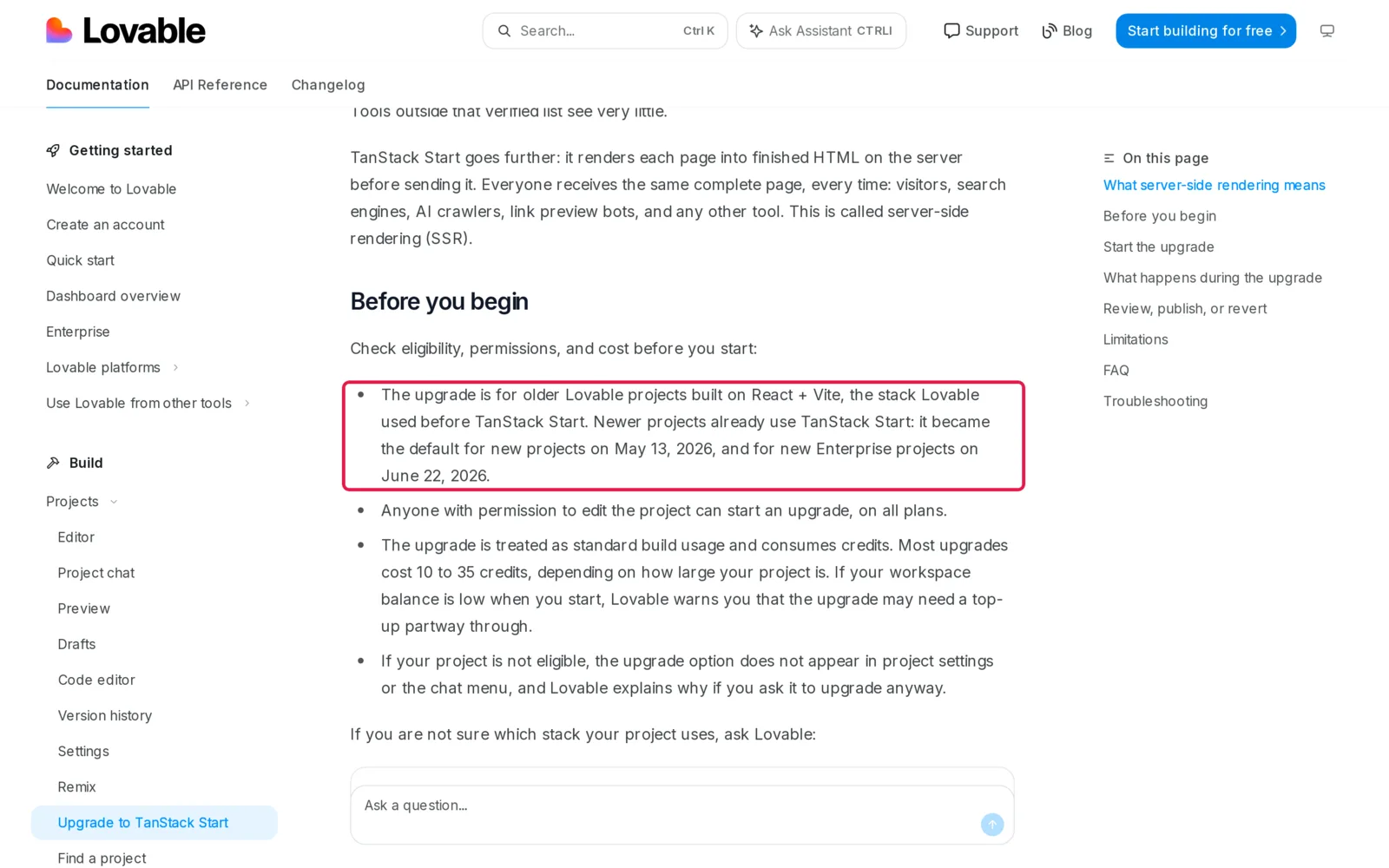
Caption: TanStack Start became the default for new Lovable projects on May 13, 2026. Source: Lovable docs, captured October 2026.
You have three editing routes. The Code tab is available on paid plans, and saving direct edits does not use credits. The Free editor is read-only. Git sync works on all plans and is two-way: commits to the synced branch appear in Lovable. A project-chat prompt costs credits according to complexity; Lovable prices its "Make the button gray" example at 0.50 credits.
Minutes 0-4: Choose one coherent direction
Define the direction through five connected decisions: color, type, shape, depth and icons.
| Direction | Fits | Color | Type | Shape and depth | Icons |
|---|---|---|---|---|---|
| A. Ledger | Dashboards, admin, B2B, finance | White, ink, one cobalt signal | IBM Plex Sans, IBM Plex Mono for numbers | 4px radius, hairlines, no shadows | Tabler, 1.5 stroke |
| B. Almanac | Marketplaces, booking, content, community, wellness | Stone paper, forest green | Newsreader headings, Instrument Sans body | 6px radius, soft low shadow | Phosphor Light |
| C. Sticker | Consumer, habits, learning, creator tools | White, ink, electric blue, sunflower | Bricolage Grotesque headings, Figtree body | 14px radius, black outlines, hard offset shadow | Phosphor Bold |
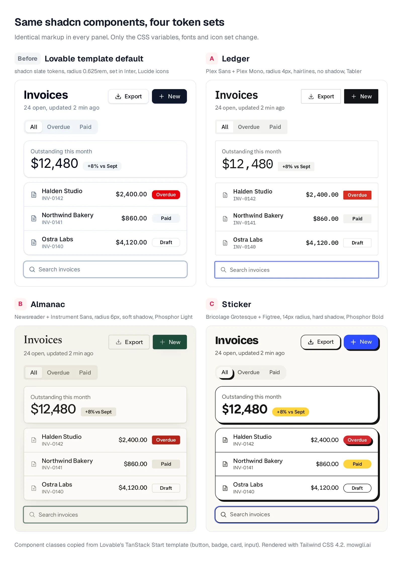
Caption: Identical markup in all four panels, using the component classes from Lovable's template. Only the CSS variables, fonts and icons change. Rendered with Tailwind CSS 4.2.
If none fits, write a four-line brief: who uses the app, one desired adjective, one rejected adjective, and a reference outside software. Add the one number or action each screen exists to support.
For one section, ask Lovable for "three options for the hero section." Existing-project design directions provide three previews. Dashboards and internal tools skip this step. For a wider method, see exploring multiple design directions.
Minutes 4-10: Replace the shadcn color tokens
Theme tokens propagate through the component system. bg-primary reads --primary, while border reads --border. Updating variables changes buttons, inputs, badges, charts and sidebars together.
For TanStack Start, edit the OKLCH values in the :root block of src/styles.css, then keep the matching mappings in @theme inline. Do not scatter replacement colors through page files.
Use this prompt when applying a complete TanStack Start direction:
Replace the :root block in src/styles.css with exactly the CSS below.
Then append the @theme inline and @layer base blocks at the end of the file.
Do not change any component or page files and do not add colors anywhere else.

[paste one direction's block here]
For older React and Vite projects, use the HSL values below inside :root:
/* Ledger (older React + Vite projects): inside :root in src/index.css */
--radius: 0.25rem;
--background: 0 0% 100%;
--foreground: 216 12% 8%;
--card: 0 0% 100%;
--card-foreground: 216 12% 8%;
--popover: 0 0% 100%;
--popover-foreground: 216 12% 8%;
--primary: 216 12% 8%;
--primary-foreground: 0 0% 100%;
--secondary: 60 10% 94%;
--secondary-foreground: 216 12% 8%;
--muted: 60 10% 94%;
--muted-foreground: 216 5% 38%;
--accent: 229 100% 96%;
--accent-foreground: 230 76% 44%;
--destructive: 4 74% 49%;
--destructive-foreground: 0 0% 100%;
--border: 60 8% 88%;
--input: 60 6% 81%;
--ring: 231 91% 56%;

/* Almanac (older React + Vite projects): inside :root in src/index.css */
--radius: 0.375rem;
--background: 45 27% 94%;
--foreground: 45 7% 11%;
--card: 45 33% 98%;
--card-foreground: 45 7% 11%;
--popover: 45 33% 98%;
--popover-foreground: 45 7% 11%;
--primary: 155 43% 21%;
--primary-foreground: 45 31% 95%;
--secondary: 43 24% 89%;
--secondary-foreground: 48 6% 15%;
--muted: 43 24% 89%;
--muted-foreground: 42 7% 38%;
--accent: 97 23% 89%;
--accent-foreground: 155 43% 21%;
--destructive: 4 76% 40%;
--destructive-foreground: 0 0% 100%;
--border: 42 20% 83%;
--input: 42 17% 77%;
--ring: 155 43% 21%;

/* Sticker (older React + Vite projects): inside :root in src/index.css */
--radius: 0.875rem;
--background: 45 29% 97%;
--foreground: 0 0% 8%;
--card: 0 0% 100%;
--card-foreground: 0 0% 8%;
--popover: 0 0% 100%;
--popover-foreground: 0 0% 8%;
--primary: 232 100% 59%;
--primary-foreground: 0 0% 100%;
--secondary: 47 100% 62%;
--secondary-foreground: 0 0% 8%;
--muted: 51 20% 93%;
--muted-foreground: 45 5% 32%;
--accent: 48 100% 86%;
--accent-foreground: 0 0% 8%;
--destructive: 359 67% 50%;
--destructive-foreground: 0 0% 100%;
--border: 0 0% 8%;
--input: 0 0% 8%;
--ring: 232 100% 59%;
Retain existing sidebar and chart lines in older projects, or ask Lovable to derive them. For dark mode, use: "Derive the .dark block in src/styles.css from the new :root tokens, keeping WCAG AA contrast. Don't touch components."
Review buttons, focus rings and destructive badges. Button text contrast is 18.4:1 for Ledger, 8.8:1 for Almanac and 5.9:1 for Sticker. Muted text on the page is at least 5.3:1. The cited WCAG AA threshold is 4.5:1.
Minutes 10-13: Standardize radius, borders and shadows
Lovable's template Card uses rounded-xl ... shadow; Button uses rounded-md ... shadow; Input uses shadow-sm. Because rounded-xl equals --radius plus 4px, changing only --radius does not normalize every component.
In @theme inline, pin the radius scale and route shadow through shadow-2xl to --shadow-card, --shadow-control and --shadow-overlay. This also catches page-level shadow-lg.
Ledger uses 4px corners, hairlines and no shadows except popovers. Almanac uses warm borders, 6-10px corners, one soft low card shadow and minimal control shadow. Sticker uses black outlines, a hard 4px offset shadow and an active tab that inherits it. For Sticker's 2px outlines, ask Lovable to add border-2 to Card, Button and Input.
Older Tailwind 3 projects use rounded-lg for Card, which already follows --radius. Configure shadows under boxShadow in tailwind.config.ts.
In the page and feature components (not src/components/ui), remove
bg-gradient-to-* backgrounds, gradient text, hover:-translate-y-* lifts,
and rounded-2xl / rounded-3xl overrides on cards and buttons.
Use the component defaults from the theme instead. Keep layout, copy
and logic exactly as they are.
Minutes 13-17: Load a deliberate font pair
For TanStack Start, add font links to the links array in src/routes/__root.tsx, after appCss. Include only the direction you chose.
{ rel: "preconnect", href: "https://fonts.googleapis.com" },
{ rel: "preconnect", href: "https://fonts.gstatic.com", crossOrigin: "anonymous" },
// A. Ledger
{ rel: "stylesheet", href: "https://fonts.googleapis.com/css2?family=IBM+Plex+Sans:wght@400;500;600&family=IBM+Plex+Mono:wght@400;500&display=swap" },
// B. Almanac
{ rel: "stylesheet", href: "https://fonts.googleapis.com/css2?family=Newsreader:opsz,[email protected],400..600&family=Instrument+Sans:[email protected]&display=swap" },
// C. Sticker
{ rel: "stylesheet", href: "https://fonts.googleapis.com/css2?family=Bricolage+Grotesque:opsz,[email protected],600..800&family=Figtree:[email protected]&display=swap" },
In an older project, put the same URL in a link tag in index.html, then extend the Tailwind theme:
fontFamily: {
  sans: ['"Instrument Sans"', "ui-sans-serif", "system-ui", "sans-serif"],
  display: ["Newsreader", "Georgia", "serif"],
},
Remove remaining Inter imports. For Almanac, prompt: "Use Newsreader 500 for h1-h3 and Instrument Sans for everything else. Remove Inter. Don't change sizes, colors or layout." For Ledger, apply font-mono to numbers and IDs.
Minutes 17-19: Thin or replace the icons
The lowest-effort change keeps Lucide and reduces its stroke width:
/* end of src/styles.css: thinner Lucide icons across the app */
@layer base {
  svg.lucide { stroke-width: 1.5; }
}
Swap libraries one page at a time:
On the Dashboard page only, replace lucide-react icons with
@phosphor-icons/react (use the closest equivalent, weight "light",
same size). Remove any colored circle or square behind icons.
Don't change anything else.
For Ledger, use Tabler through @tabler/icons-react with stroke={1.5}. Almanac and Sticker use Phosphor. IconContext.Provider can set Phosphor's default weight app-wide. Remove decorative colored circles behind icons in every direction.
Minutes 19-24: De-card the busiest page
Tokens change how cards look. Layout determines whether content should be carded at all. Start with the page people open most often.
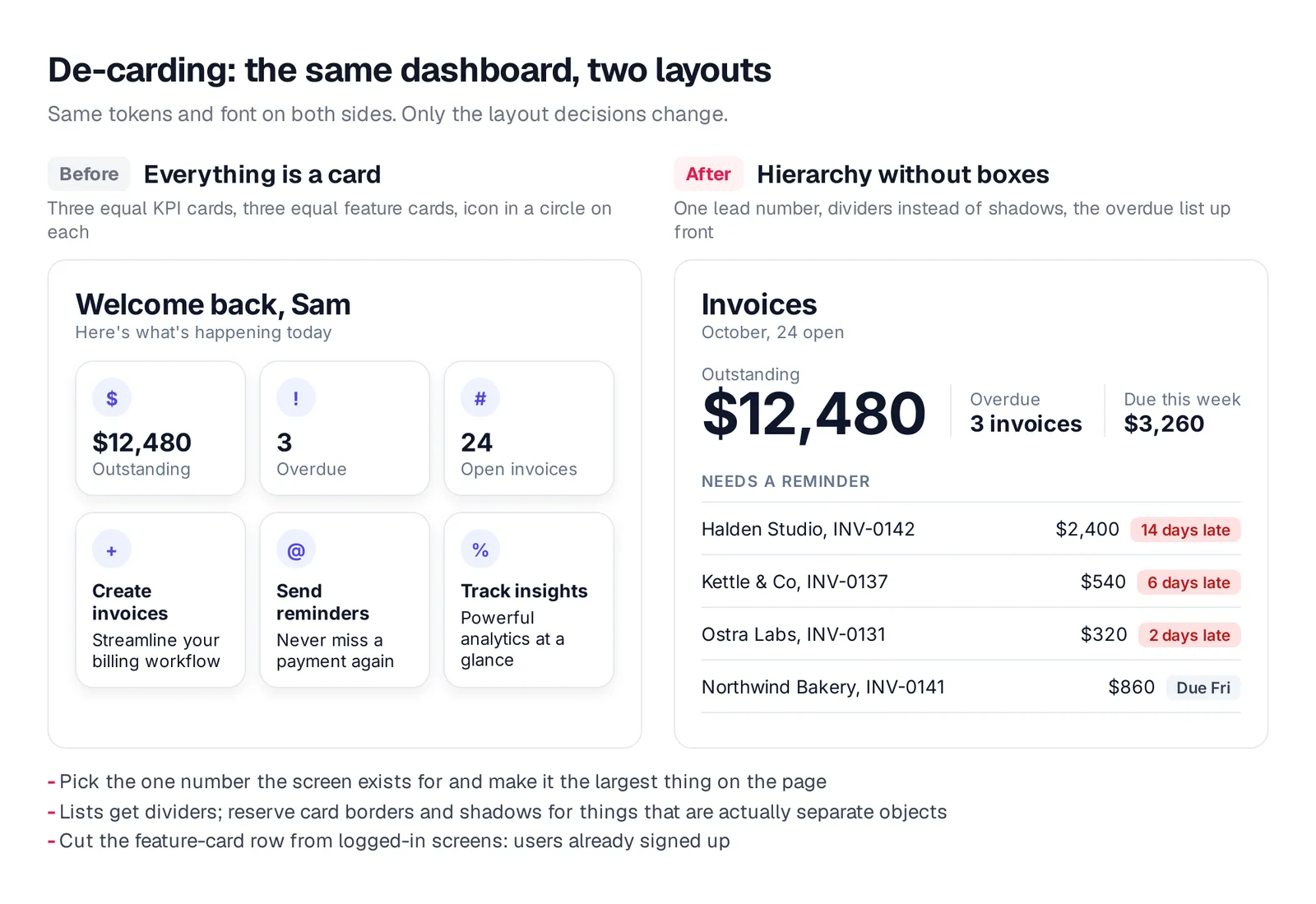
Caption: Same tokens and font on both sides. Only the layout decisions change.
On the Dashboard page, remove the row of three equal stat cards.
Show the most important number (Outstanding) as large text without
a card, with Overdue and Due this week as smaller inline stats
separated by thin vertical dividers. Turn the list below into rows
separated by border-b dividers instead of individual cards.
Keep the data, logic and colors as they are.
Make one number or action dominant on each screen. Use divider rows for lists. Reserve equal feature-card rows for marketing pages rather than logged-in product screens.
Minutes 24-27: Replace template copy
Replace abstract claims such as "Streamline your workflow." Work on one surface at a time so you can judge the result in context.
Inline text editing in Lovable's preview toolbar can fix individual labels. Each account gets 100 free edits, and each edit returns 24 hours after use.
Rewrite the copy in the landing page hero only. The product: [who it's
for and the outcome, one sentence]. Headline: the outcome in under
8 words. Do not use streamline, supercharge, seamless, unlock or
all-in-one. Subheadline: one sentence with a concrete detail (a number,
a time, a named integration). Primary button: a verb plus an object,
like "Send your first invoice". Don't change layout or styles.
Use realistic names, amounts and dates. They expose spacing and truncation problems that placeholder text hides. Read more about why real copy beats lorem ipsum.
Minutes 27-30: Add the missing interface states
Start with the main list. Give its empty, loading and failure cases the same attention as its populated state.
Add three states to the invoices list on the Dashboard page:
1) Empty: one sentence on what will appear here and a primary
   button "Create your first invoice".
2) Loading: skeleton rows that match the real row layout, not a spinner.
3) Error: an inline message "Couldn't load invoices" with a Retry button.
Use the existing tokens and components. Don't change anything else.
Later, expand this into a screen-by-state matrix using the empty, error and loading states checklist.
Lock the direction into Lovable
Store the rules under Project settings -> Knowledge. Knowledge supports up to 10,000 characters and is always included in context. You can instead add a root AGENTS.md, which Lovable's agent always reads.
Design direction: Almanac (editorial, calm, trustworthy).
- Colors: theme tokens only (bg-background, bg-card, bg-primary,
  text-muted-foreground, border). No hex values, no gradients.
- Type: headings use font-display (Newsreader 500); body Instrument Sans. No Inter.
- Shape: rounded-md, rounded-lg or rounded-xl only. No rounded-2xl or rounded-3xl.
- Depth: the Card default shadow only. No shadow-lg/xl, no hover lift.
- Icons: @phosphor-icons/react, weight light. No icons inside colored circles.
- Layout: one primary number or action per screen. Lists use divider rows.
  No three-card feature rows on logged-in pages.
- Copy: concrete nouns and numbers. Never: streamline, supercharge,
  seamless, unlock, all-in-one.
- States: every list has empty, loading (skeleton) and error (retry) states.
Redesign every screen and state with Mowgli
The manual pass works well when you can edit the theme and a few important pages directly. Mowgli is the better fit when the working Lovable app needs one consistent redesign across the whole multi-screen product. We make Mowgli.
Connect the Lovable project to GitHub and clone the repository. In Claude Code, Codex, Cursor or another coding agent, install the Mowgli agent skill:
npx skills add mowgli-ai/skills
The Mowgli MCP fallback is https://app.mowgli.ai/mcp.
Push the codebase into the design tool. It generates editable designs and a product spec inferred from the code. Open the project menu, choose Redesign, explore the moodboard, upload references, mix styles and select one direction.
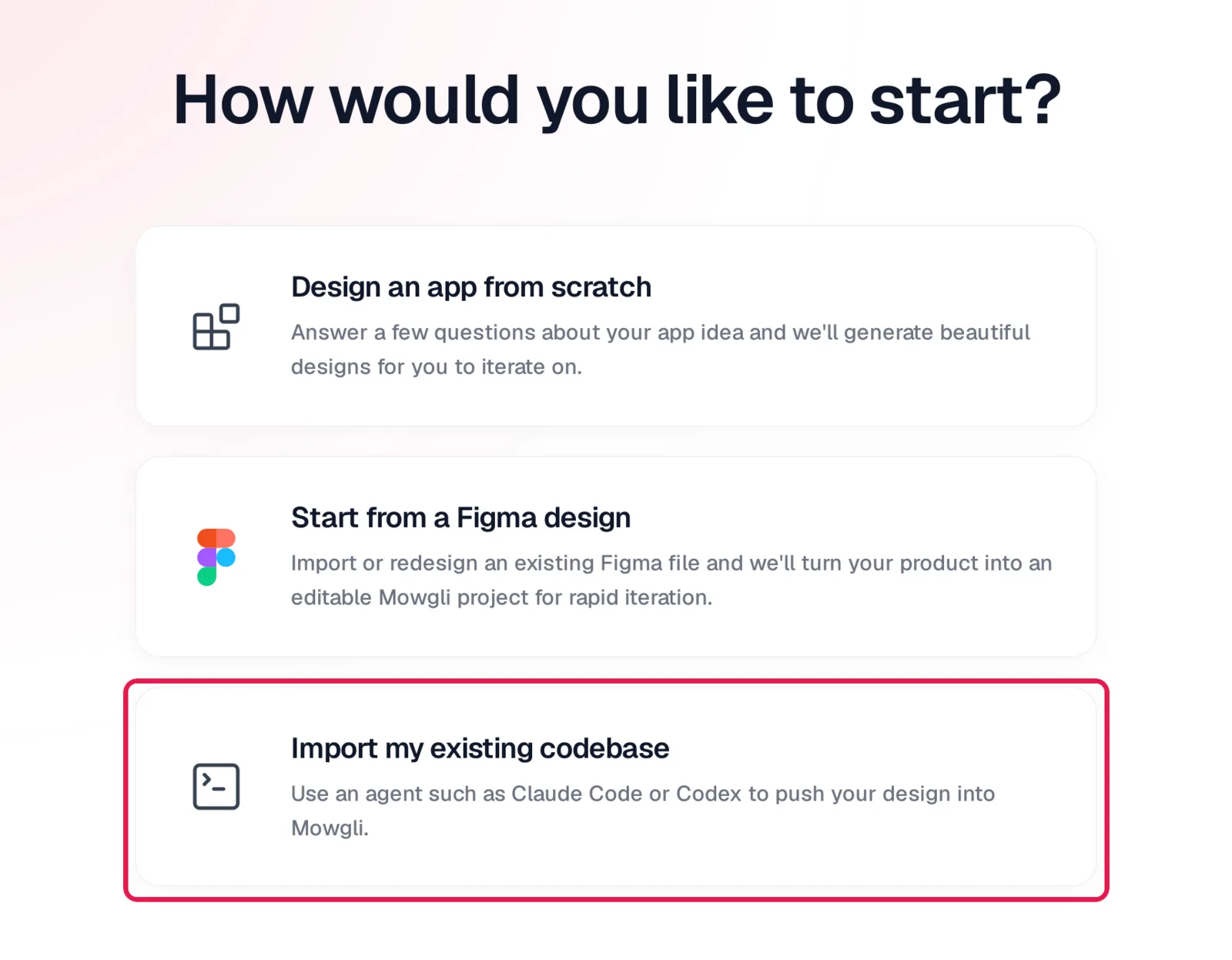
Caption: Import my existing codebase hands the push to Claude Code, Codex, Cursor or another coding agent.
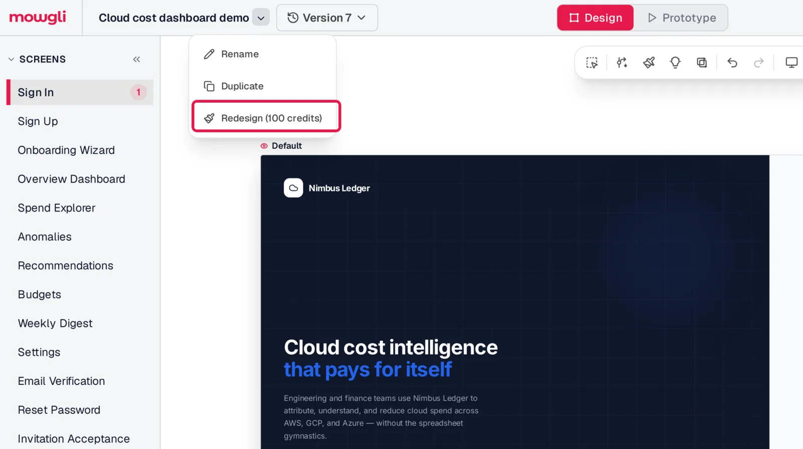
Caption: Redesign sits in the project menu.
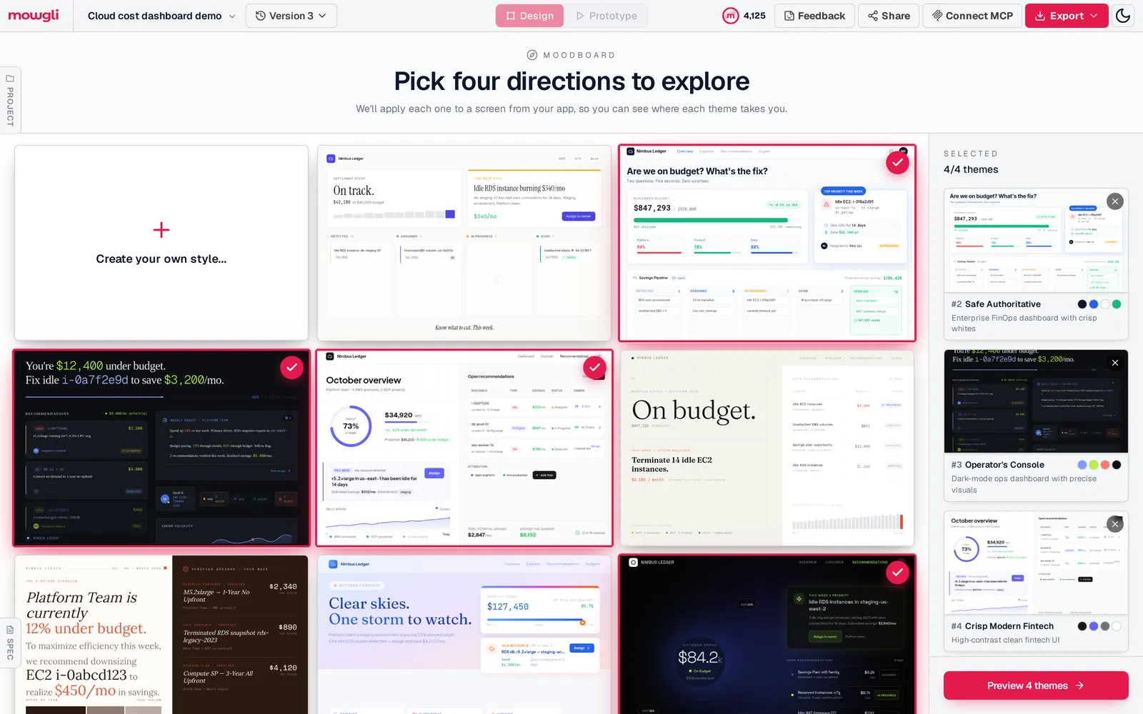
Caption: A moodboard for a SaaS dashboard: different directions, not palette swaps.
Apply the direction to every screen and state. Empty, loading and error states appear beside the other states on the infinite canvas. Each screen is a React + Tailwind component, and a single state prop switches its states.
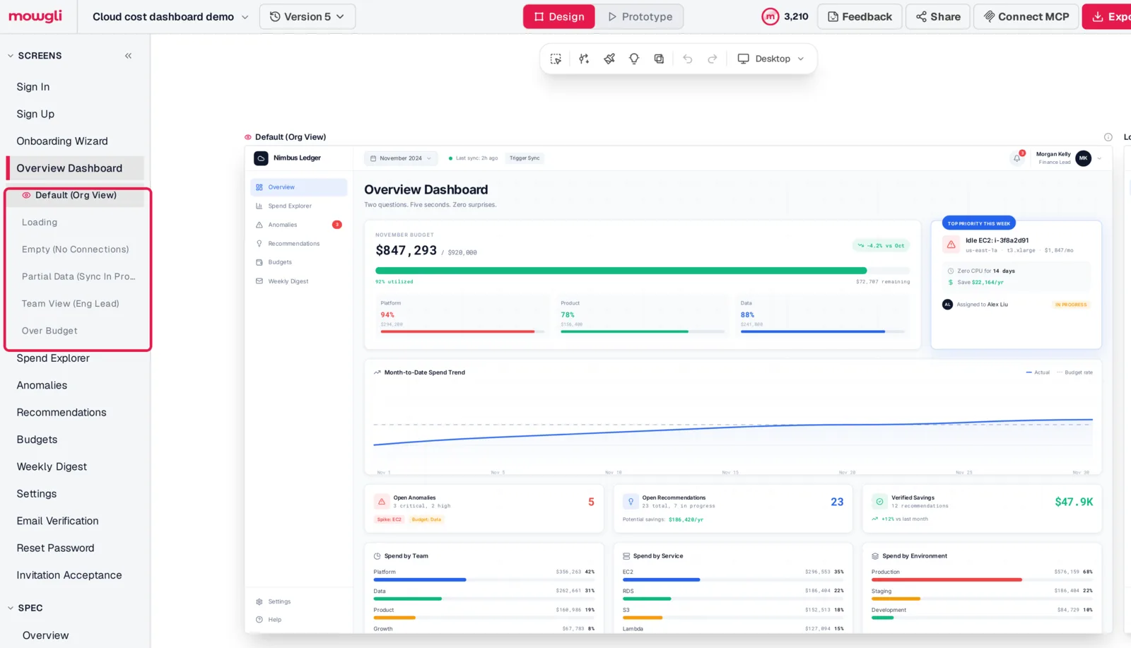
Caption: One screen and its states in a Mowgli project.
Refine the result by chat. Pull it back into the code, review the diff and push it to the synced branch. Lovable reads the GitHub commit while the routes, data and backend stay in place.
Lovable uses credits only when it does work in project chat, so a redesign delivered through a GitHub commit uses no Lovable build credits.
Free to start (300 credits); credit packs from $12; plans from $15/mo.
Mowgli designs and prototypes; to host and ship, you hand off to a builder or coding agent (Claude Code, Codex, Cursor, Lovable).
For the full workflow, read how to redesign a vibe-coded app without rebuilding it.
Which route should you take?
Choose by scope.
The DIY 30-minute pass is best when you want direct control over one app and can edit its theme and key pages. Token, radius, typography and icon changes can be direct file edits. Knowledge or AGENTS.md helps later prompts preserve the result.
Mowgli is best when one visual direction must reach every screen and state. You can inspect the whole app together before syncing the code back.
Lovable design directions are best for options on one section. They provide three previews, up to six refinements and no extra credit cost. Dashboards and internal tools skip this step.
| Tool | What it does for a generic Lovable app | Scope |
|---|---|---|
| Mowgli | Redesigns every imported screen in one direction, with states | Whole app; syncs back to the Lovable repo through Git |
| Lovable design directions | Three previews for one section, up to six refinements | One section; dashboards and internal tools skip it |
| Lovable preview toolbar | Select or draw on the preview, then describe the change | One element at a time; Select and Draw use credits; 100 free text edits |
| Lovable Design systems | Reusable tokens and components across projects | Paid plans (Lovable) |
| tweakcn | Open-source visual theme editor for shadcn/ui, with presets | Tokens only: no layout, copy or states |
| Figma into Lovable | Plugin, Figma MCP or .fig upload (Lovable) | Needs a finished Figma design |
Prices are from each vendor's pricing page, October 2026.
See Mowgli vs Lovable for a direct comparison, or compare Lovable vs Bolt vs v0.
FAQ
Why does my Lovable app look like every other AI app?
It likely combines the same common defaults and prompt habits. The usual starting point includes shadcn/ui, slate tokens, 0.625rem radius and Lucide, followed by Inter, gradients, three-card rows and icon circles. Replace coordinated system and layout decisions rather than replacing the component library.
How do I make my Lovable app look less AI-generated?
Choose one design direction, then update its tokens, radius, shadows, fonts and icons. De-card the busiest screen, replace vague copy, add empty, loading and error states, and save the rules in Knowledge or AGENTS.md.
Where are the theme colors in a Lovable project?
They are in src/styles.css for TanStack Start projects created since May 13, 2026, using OKLCH. Older React and Vite projects keep HSL triplets in src/index.css, with related configuration in tailwind.config.ts.
Can I change my Lovable theme without spending credits?
Yes. Direct code saves do not use credits. Use the Code tab on paid plans; on Free, edit through GitHub, where Git sync works on all plans.
Will replacing Lovable's theme tokens break my app?
CSS-variable changes leave application logic and data untouched. Review hard-coded page colors, buttons, focus rings, destructive badges and dark mode. Keep the changes reversible through Git and Lovable's synced branch.
How do I redesign every screen of a Lovable app consistently?
Push the codebase into Mowgli with Claude Code, Codex, Cursor or another coding agent. Choose a moodboard direction, apply it to every screen and state, pull the redesign back, review the diff and push it to the branch Lovable reads.
Sources
- Upgrade to TanStack Start
- Lovable design guidance
- Lovable prompting example
- Lovable preview toolbar
- Lovable custom fonts
- Lovable code mode
- Lovable credits and usage
- Lovable Knowledge
- Lovable GitHub integration
- Lovable Design systems
- Lovable Figma integration
- shadcn/ui theming
- Tailwind CSS theme variables
- Lucide
- Tabler Icons
- Phosphor Icons
- tweakcn
- Lovable
- Claude Code
- Codex
- Cursor
- Mowgli agent skill
- Mowgli
- Mowgli MCP
- Mowgli pricing