Lovable vs Bolt vs v0 for Designing an App: 2026 Comparison
Design every screen first, then choose Lovable for design directions, v0 for visual edits and Figma, or Bolt for native Expo apps.
Design the complete app before choosing Lovable, Bolt or v0 when visual consistency matters. Then choose the builder by job: Lovable for comparing three directions before a web build, v0 for detailed visual controls and whole-file Figma imports, or Bolt for native iPhone and Android apps through Expo. If you start building before defining the screens, states and visual system, you make product-wide design decisions one prompt at a time.
Lovable vs Bolt vs v0: the short answer
Lovable, v0 and Bolt can all build multi-page products. The important difference is where each tool gives you design control.
Lovable offers three rendered directions, short design questions or a direct build. v0 provides Design Mode controls for typography, spacing, borders, radius and shadows, plus whole-file Figma import on paid plans. Bolt supports native iOS and Android projects through Expo and offers preset design systems.
For complete product design, use a design-first workflow: questionnaire -> PRD/spec -> moodboard -> every screen and state -> interactive prototype -> builder handoff. Mowgli handles that workflow and produces React + Tailwind screen references for implementation. We make Mowgli.
Feature, limit and competitor-price claims below come from vendor documentation. This comparison does not assign a quality score from a test brief.
Quick picks
Choose by the design job you need to complete:
- Every screen and state before implementation: Design the product first, then hand its spec and React + Tailwind references to Lovable, Bolt or v0.
- Compare visual directions before building: Pick Lovable for three rendered directions or a sequence of design questions.
- Set typography, spacing, borders, radius and shadows after building: Pick v0. Design Mode is available on Free.
- Build from an existing multi-screen Figma file: Pick v0 on a paid plan. It imports pages, frames, variables, components and assets.
- Build a native iPhone and Android app: Pick Bolt for its Expo workflow and app-store publishing paths.
- Start from a preset design system: Pick Bolt for options including shadcn, Material UI and Chakra.
- Bring a coded design system: Pick v0 or Lovable. v0 verifies the system through a starter app. Lovable checks generations for raw colors and one-off values.
If an existing product already looks generic, start with a manual audit. Decide what must change in its hierarchy, typography, spacing, color and interaction patterns. The guides to fixing a generic Lovable app and redesigning a vibe-coded app without rebuilding cover that process. You can then redesign every screen and state together.
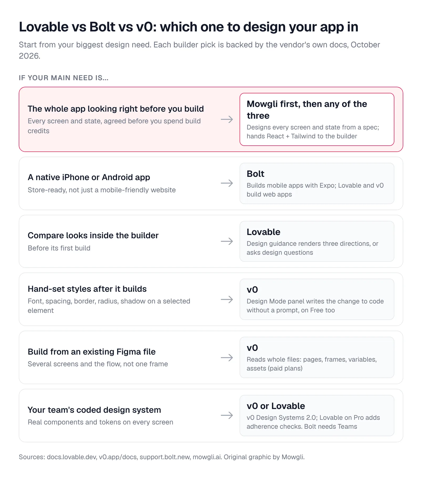
Caption: Start from your biggest design need. Original graphic based on each vendor's docs, October 2026.
Lovable vs Bolt vs v0 at a glance
| Lovable | v0 | Bolt | |
|---|---|---|---|
| Best for | Comparing directions before a web build | Detailed visual edits and Figma files | Native mobile apps and preset systems |
| Starting stack | React, Tailwind, TanStack Start and shadcn/ui | Next.js, Tailwind CSS and shadcn/ui | Project-dependent JavaScript framework |
| Pre-build steering | Three directions, questions or direct build | Chat planning, screenshots, Figma or Paper | Plan Mode, enhanced prompts, Figma frame or Google Stitch |
| Visual editing | Element selection, inline text and annotations | Typography, color, spacing, borders, radius and shadows | Text, color, font size, alignment and opacity |
| Native mobile | No | No | Yes, through Expo |
| Free allowance | 5 daily build credits, up to 30/month | 7 messages/day | 1M tokens/month, 300K/day |
| Paid from | Pro at $25/mo | Plus at $30/user/mo | Pro at $25/mo |
| Export | Two-way GitHub, GitLab or Bitbucket sync; Pro download | Two-way GitHub sync and local export | GitHub sync and project download |
Prices are from each vendor's pricing page, October 2026.
Lovable for comparing directions before the first build
Lovable builds full-stack web apps from chat. Its default stack since May 13, 2026 is React and Tailwind on TanStack Start, with shadcn/ui components.
Its design guidance can render three HTML and Tailwind directions side by side. You can refine them up to six times, answer short design questions instead, or build directly when your prompt already specifies fonts, colors and brand direction.
After the build, the preview toolbar lets you select elements, edit text inline and draw annotations. Connected design systems can flag raw colors and one-off values, then retry the generation.
The design step is skipped for dashboards, admin panels, internal tools and games. Direction previews use generic copy and image placeholders. Lovable does not generate React Native projects; app-store packaging requires a PWA or Capacitor workflow outside the product. Selection and drawing actions consume credits as prompts, while inline text editing is free up to 100 edits per 24 hours.
Free includes 5 daily build credits, capped at 30 per month. Pro costs $25/mo for 100 credits. Business costs $50/mo and adds design templates. Lovable's pricing example says "Make the button gray" costs 0.50 credits.
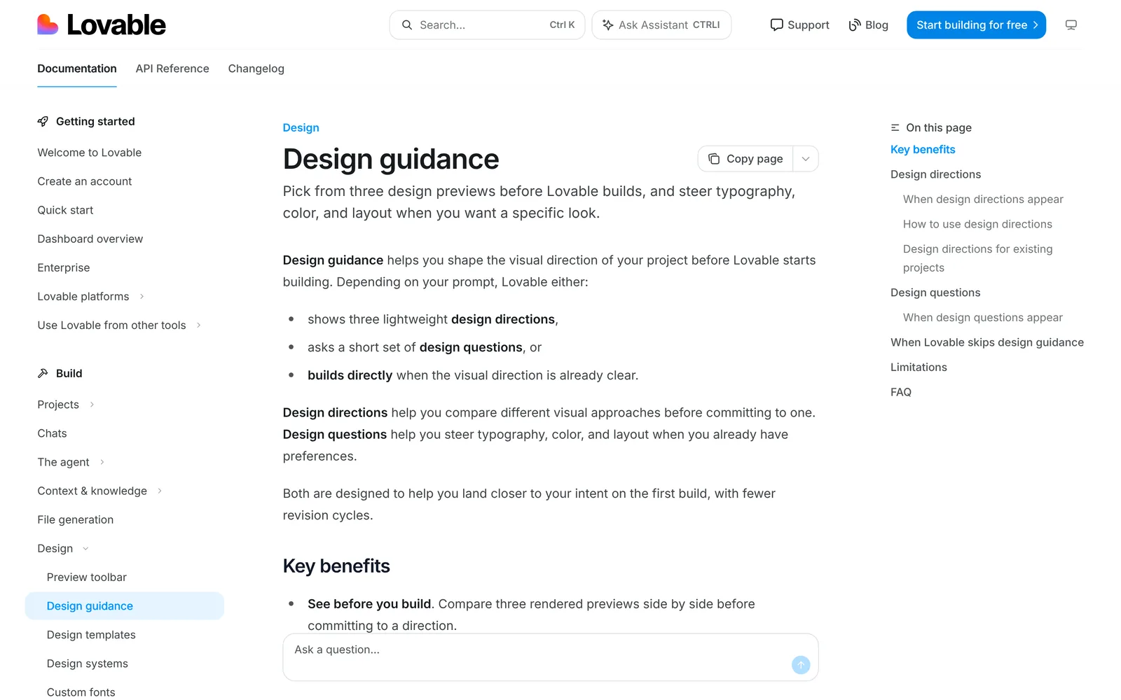
Caption: Design guidance shows three directions, asks design questions, or builds directly. Source: Lovable docs, captured October 2026.
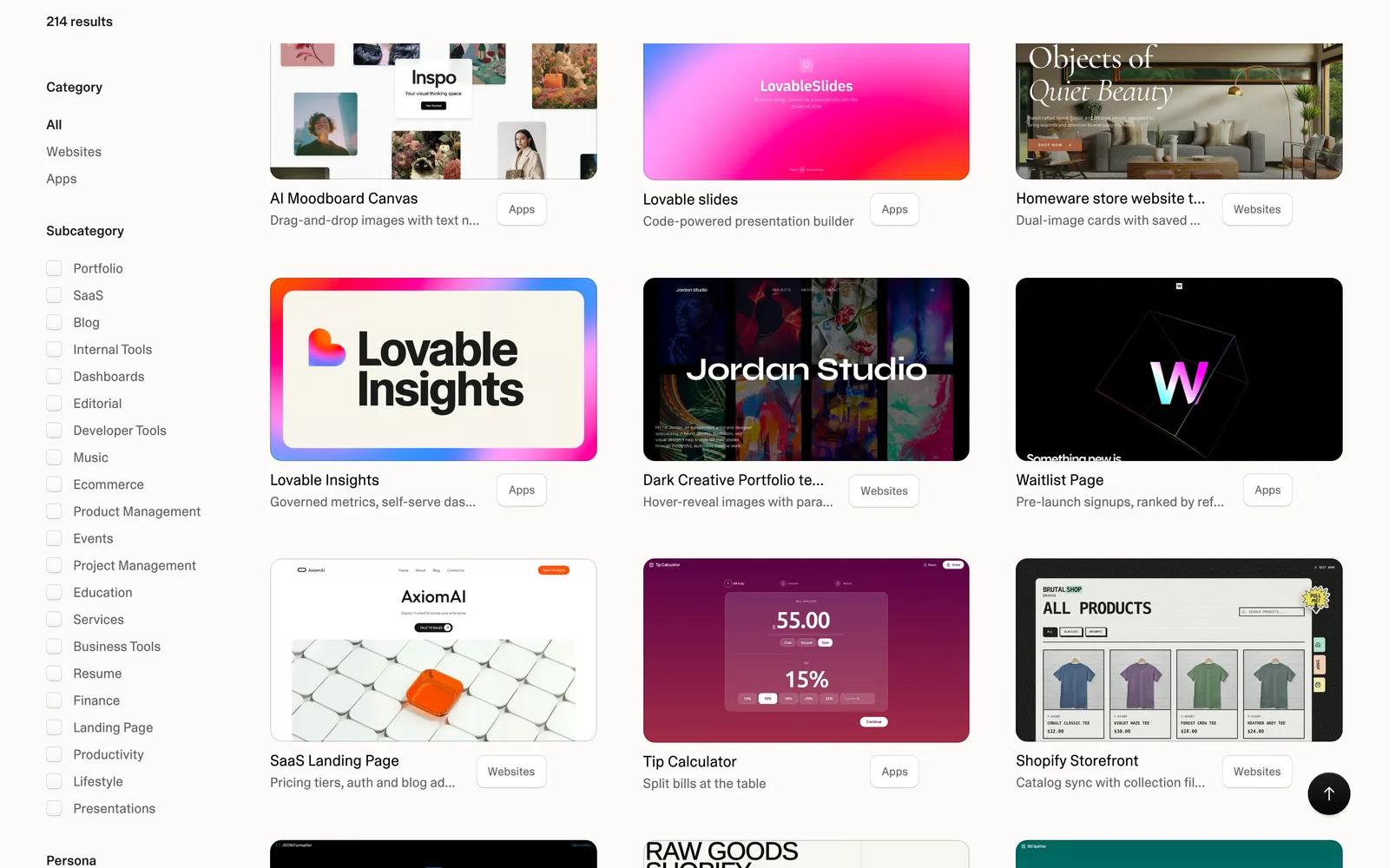
Caption: Lovable's public template gallery (community projects, not a test result). Source: Lovable website, captured October 2026.
v0 for Design Mode and whole-file Figma import
v0 builds full-stack Next.js applications for Vercel. Its default stack is Next.js, Tailwind CSS and shadcn/ui.
Design Mode lets you select an element in the live preview and change its font, weight, line height, letter spacing, color, margin, padding, border, radius, opacity and box shadow. The controls understand Tailwind values. Applying an edit writes it to source as a revertable version.
Design Mode is available on Free, but only on the latest chat version and not on mobile viewports.
Paid plans can import a whole Figma file, including pages, frames, variables, components and assets. Design Systems 2.0 accepts repositories, npm packages, Figma and documentation, then creates a starter app for review before you save the system.
v0 supports other libraries, but recommends its default stack for better results. It creates mobile-responsive web apps rather than native iOS or Android projects.
Free has a 7-message daily limit, and new users receive a one-time $5 in credits. Plus costs $30/user/mo, with $30 in monthly credits and $2 in daily login credits. Business costs $100/user/mo. Usage is token-based, and unused monthly credits expire after 65 days.
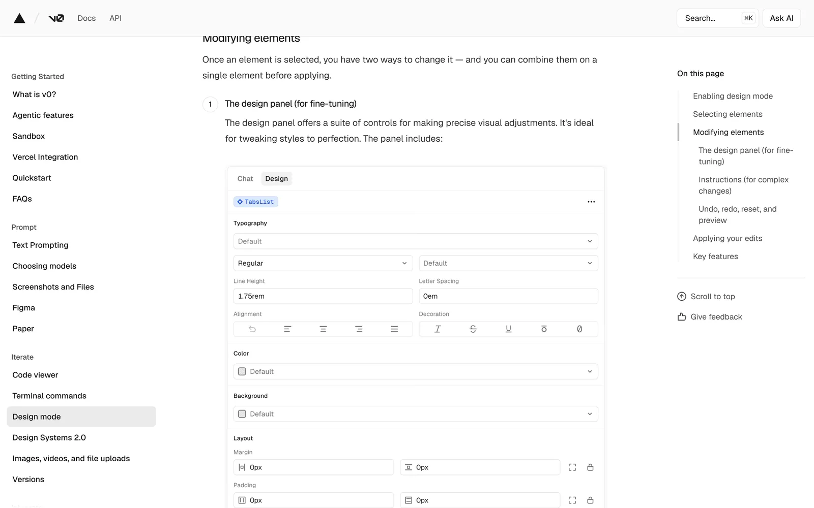
Caption: v0's Design Mode panel edits typography, color, spacing, borders and shadows. Source: v0 docs, captured October 2026.
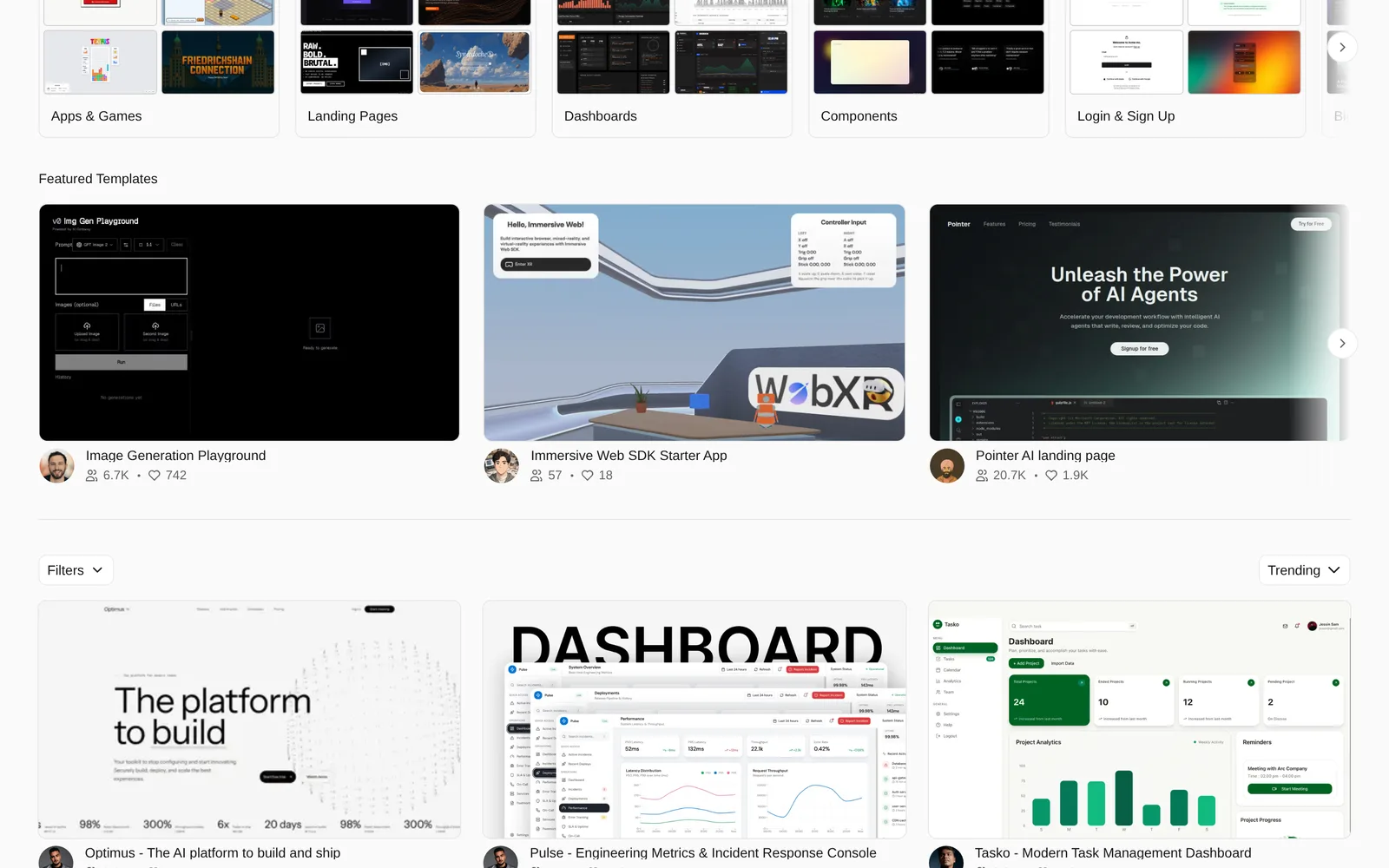
Caption: v0's community template gallery (community projects, not a test result). Source: v0 website, captured October 2026.
Bolt for native mobile apps and preset design systems
Bolt builds websites, web apps and mobile apps in the browser. It chooses a JavaScript framework for each project, including React and Vue.
Put "mobile app" in the initial prompt to trigger an Expo project for iOS, Android and web. Bolt documents publishing paths for TestFlight, the App Store and Google Play.
Its Select tool changes text, colors, font size, text style, alignment and opacity. Visual edits remain free until you save the batch, and batching consumes fewer tokens than submitting separate edits. Spacing, borders and radius require a prompt rather than the visual toolbar.
Bolt offers preset systems including shadcn, Material UI and Chakra. A custom design system requires a paid Teams plan, takes 45 to 60 minutes to set up and produces a Storybook. Figma import works one frame at a time through Anima. Google Stitch export attaches screenshots and HTML.
Free includes 1M tokens per month with a 300K daily cap. Pro costs $25/mo starting at 10M tokens. Teams costs $30 per member per month. Stock images are used by default; AI image generation and editing require a paid plan.
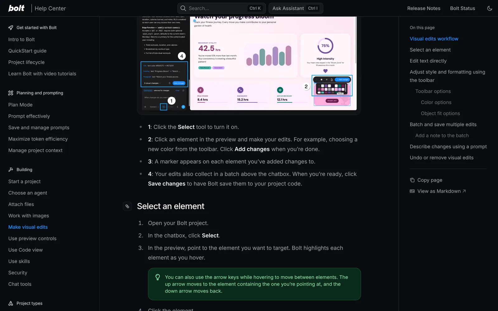
Caption: Bolt's Select tool batches visual edits and saves them to code in one go. Source: Bolt help center, captured October 2026.
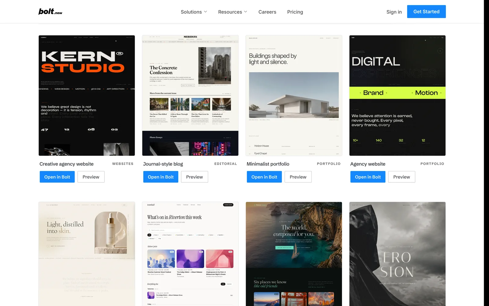
Caption: Bolt's template marketplace (working projects, not a test result). Source: Bolt website, captured October 2026.
Lovable vs v0 vs Bolt by design job
Starting look
v0 starts with Next.js, Tailwind CSS and shadcn/ui. Lovable uses shadcn/ui components, a slate palette and Lucide icons. Bolt lets you select a preset design system.
There is no universal winner for initial appearance. Your prompt, brand inputs and chosen direction determine the result. If defaults dominate the interface, read why AI-built apps look the same.
Steering before the first build
Choose Lovable when you want to compare three rendered alternatives and refine them up to six times. v0 can derive layout, colors and components from screenshots. Bolt's Plan Mode can suggest design improvements before implementation.
Visual editing after the build
Choose v0 when you need direct controls for spacing, borders, radius and shadows. Choose Bolt when you want to batch color and typography changes without consuming tokens until saving. Lovable's selected-element and drawing edits count as prompts.
Design systems
Choose v0 when you want to verify a GitHub, npm, Figma or documentation-based system through a starter app. Choose Lovable when you want generation-time checks for raw colors and one-off values. Choose Bolt when a browsable generated Storybook fits the team's workflow.
Lovable supports public repositories or uploaded files on Pro and higher, with an npm wrapper on Enterprise. Bolt requires a paid Teams plan for a custom system.
Figma and adjacent inputs
Choose v0 for a multi-screen Figma file. It treats the imported screens as one application and also supports Paper links.
Lovable accepts designs through its plugin, Figma MCP in the desktop app or a .fig upload. The plugin requires a Dev seat or higher. A .fig upload transfers tokens and structure but does not recreate the design.
Bolt accepts one Figma frame at a time through Anima. Pick it when your source is Google Stitch and you want one-click input.
Pages and states
All three tools support multi-page apps, but you must request non-default states explicitly. Lovable recommends that you "include sensible empty, loading, and error states." v0 recommends "Implement loading states and user-friendly error messages."
Create a state matrix before implementation. List each screen and its default, empty, loading, error and relevant success states. The guide to designing empty, error and loading states provides a starting structure.
Design every screen first with Mowgli, then build
Lovable's own guidance says, "Design is a foundation, not a polish layer... If you leave it for later, you will be fighting a default look across the whole app." Bolt documents a Google Stitch-first workflow, while v0 supports Figma files containing the product's screens and states.
A complete design-first workflow starts with a short questionnaire covering the audience, flows and edge cases. It produces a PRD/spec with user journeys, constraints and a data model, followed by a moodboard with 16+ styles and style steering.
The product can then be mapped as 30+ screens and states on an infinite canvas, including empty, loading and error cases. Each screen is a React + Tailwind component. Chat iteration, version history and a click-through prototype keep the screens connected as decisions change.
For more context, see why you should design before building and why vibe coding needs a PRD.
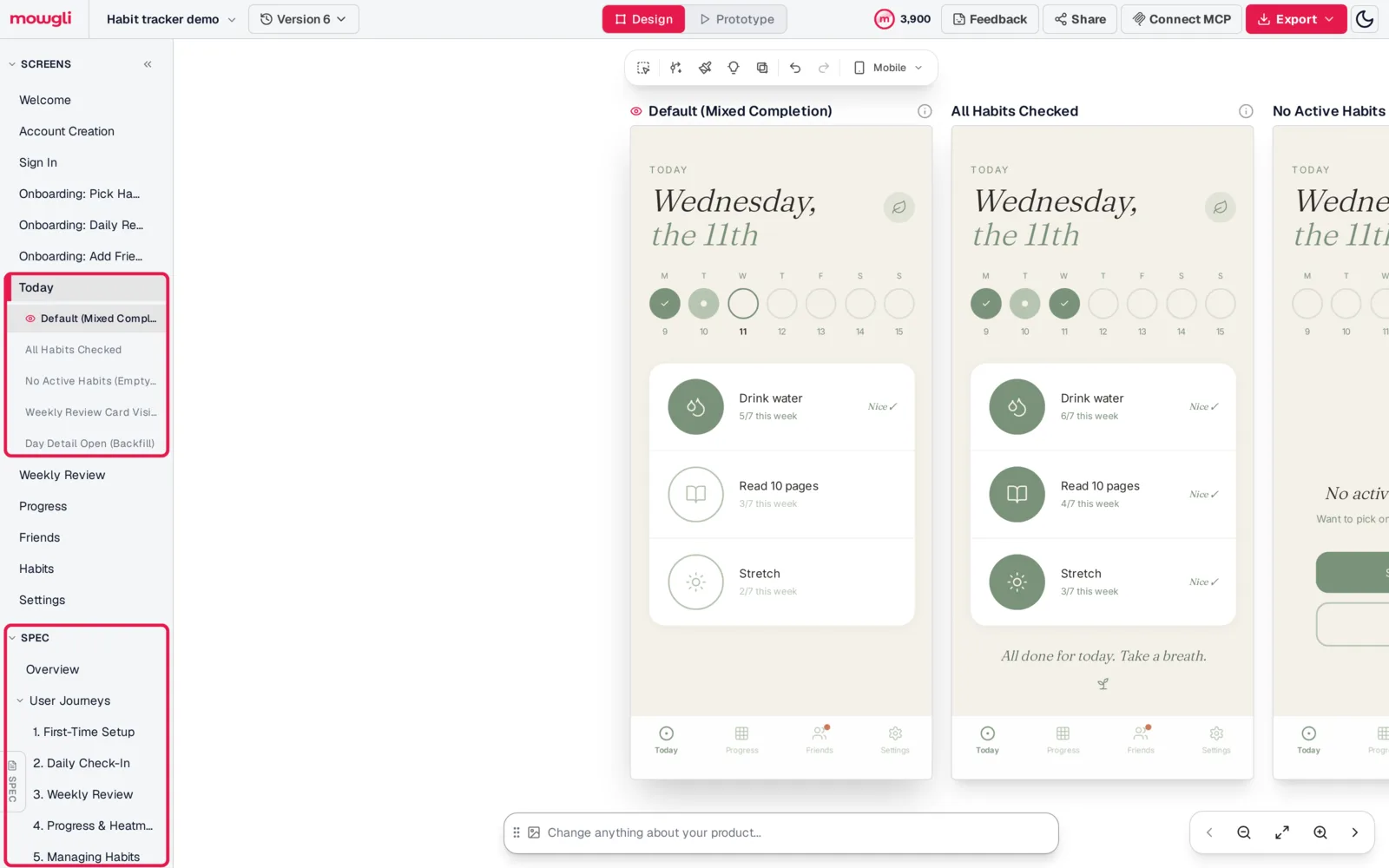
Caption: One screen with five states, and the spec it was designed against, before any build credits are spent. Mowgli habit tracker demo project.
You have three handoff options:
- Export an AI package containing
SPEC.md, React + Tailwind screen references and build instructions. v0 accepts.zipfiles up to 10 MB on Free and 50 MB on paid plans. Lovable lists.zipcontents but does not extract them, so attach the required screen files, up to 10 per message, and pasteSPEC.mdinto chat. Bolt does not accept.zipattachments; attach.tsxand.mdfiles or add them through Code view. Its limit is 5 files per message on Free and 20 on paid plans. - Generate a dedicated Lovable prompt or Bolt prompt.
- Connect a coding agent. Mowgli has an MCP server, CLI and agent skill, so Claude Code, Cursor and Codex can read every screen, its states and the product spec, and push code changes back into the design.
Builders can then sync implementation through GitHub. See how the coding-agent connection works.
Mowgli designs and prototypes; to host and ship, you hand off to a builder or coding agent (Claude Code, Codex, Cursor, Lovable).
Pricing: Free to start (300 credits); credit packs from $12; plans from $15/mo.
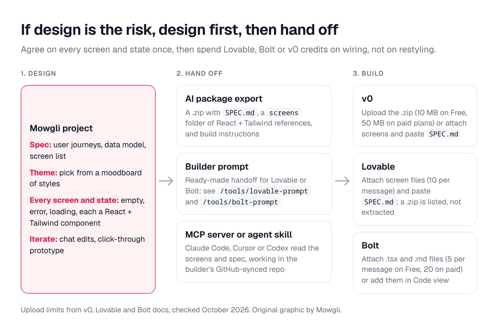
Caption: One design, three routes into the builder. Upload limits from each vendor's docs, October 2026.
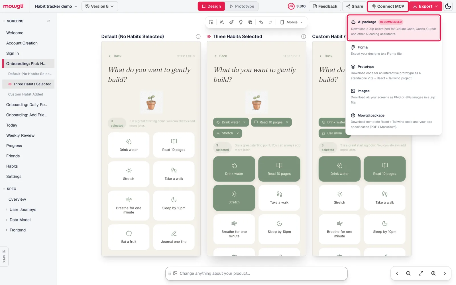
Caption: The AI package and the Connect MCP button are the two main handoff paths.
Verdict
Design every screen and state first when whole-product coherence is the priority. Then hand the spec and React + Tailwind references to the builder that matches the implementation job.
Choose Bolt for a native iPhone or Android app using Expo, TestFlight, the App Store and Google Play. Choose Lovable to compare three visual directions and make up to six refinements before the first build. Choose v0 for direct typography, spacing, border, radius and shadow controls, or for whole-file Figma import on paid plans.
For an existing component library, choose v0 when starter-app verification matters or Lovable when you want checks for raw colors and one-off values during generation.
For an app that already looks generic, make the audit and redesign decisions manually first. Then redesign its screens and states together and sync the resulting implementation changes through GitHub.
FAQ
Which is best for designing an app: Lovable, Bolt or v0?
Lovable is best suited to comparing pre-build design directions, v0 to detailed post-build visual controls and whole-file Figma imports, and Bolt to native Expo apps. For complete product design before implementation, design every screen and state first, then use the builder that fits the platform.
Is v0 better than Lovable for UI design?
v0 is the better fit for direct control over fonts, spacing, borders, radius and shadows after generation. Lovable is the better fit for comparing three rendered directions before generation. Both start from Tailwind CSS and shadcn/ui.
Can Lovable, Bolt or v0 build a native mobile app?
Bolt can build native iOS and Android apps through Expo. Lovable builds web apps, with PWA or external Capacitor packaging as separate paths. v0 builds mobile-responsive web apps.
Which is cheapest: Lovable, Bolt or v0?
Lovable and Bolt both start their paid individual plans at $25/mo, while v0 Plus starts at $30/user/mo. All three offer free plans. Bolt visual edits remain free until saved, and Lovable design directions do not consume extra credits.
Should I design my app before using Lovable, Bolt or v0?
Yes, when consistent visual direction and complete screen states matter. Define the spec, flows, visual system and empty, loading and error states before implementation. A whole-product design workflow can supply the prototype and React + Tailwind references for the chosen builder.
Can I use an existing Figma design with Lovable, Bolt or v0?
Yes, but the import scope differs. v0 accepts whole files or frame links on paid plans. Lovable supports a plugin, desktop Figma MCP and .fig uploads, although .fig does not recreate designs. Bolt imports one Figma frame at a time through Anima.
Sources
- Lovable pricing
- Lovable subscription plans
- Lovable design guidance
- Lovable preview toolbar
- Lovable design systems
- Lovable design templates
- Lovable Figma integration
- Lovable project chat
- Lovable TanStack Start upgrade
- Lovable publishing
- Lovable idea-to-app guide
- Lovable templates
- v0 pricing
- v0 pricing documentation
- v0 Design Mode
- v0 Design Systems 2.0
- v0 Figma import
- v0 Paper support
- v0 screenshot prompting
- v0 images and videos
- v0 text prompting
- v0 FAQs
- v0 templates
- Bolt pricing
- Bolt token limits
- Bolt visual edits
- Bolt design-system introduction
- Adding a Bolt design system
- Bolt Figma integration
- Bolt Google Stitch integration
- Bolt Expo integration
- Bolt file uploads
- Bolt image support
- Bolt Plan Mode
- Bolt glossary
- Bolt templates
- Expo
- shadcn/ui
- Paper
- Figma
- Anima
- Google Stitch
- Mowgli
- Mowgli pricing
- Mowgli code export
- Mowgli MCP