AI Design Tools That Export Clean React + Tailwind Code (2026)
Compare Mowgli, Subframe, v0, Flowstep and Figma converters by React + Tailwind output, states, sync, scope and price.
The short answer: best tool by job
Pick Mowgli when you need a whole app designed and exported screen by screen, including its states. Pick Subframe for deterministic components synced into an existing React repository. Pick v0 for a runnable Next.js application built with shadcn/ui and Tailwind. Pick Flowstep for a short linked flow.
Google Stitch exports HTML and CSS rather than React components. Builder.io Visual Copilot, Locofy and Anima fit a different starting point: converting designs that already exist in Figma.
We make Mowgli.
| If you need... | Pick | Why |
|---|---|---|
| The whole app designed, every screen and state as code, synced with your repo | Mowgli | One .tsx per screen with a state prop, SPEC.md, two-way sync over MCP |
| Components synced into an existing React + Tailwind repo | Subframe | Deterministic codegen, CLI sync, theme exported as Tailwind config |
| A runnable Next.js app with branches and PRs | v0 | Next.js + shadcn/ui + Tailwind, GitHub sync |
| A short flow as React + Tailwind files | Flowstep | One component file per screen, navigation wired in |
| A prototype built on your own design system | Magic Patterns | Design-system presets, GitHub sync, MCP |
| Free visual exploration you will rebuild anyway | Google Stitch | Free daily credits, HTML + Tailwind, Figma export |
| Designs that already exist in Figma | Builder.io Visual Copilot, Locofy, Anima | Convert frames to React + Tailwind and other stacks |
What clean React + Tailwind export should contain
"React + Tailwind export" can describe five materially different deliverables: a whole app exported screen by screen, synchronized design-system components, a runnable application, a short linked flow, or existing Figma frames converted into code.
Choose that output shape before comparing tools.
Clean output is output you can review and merge without first reverse-engineering it. Look for typed React components, Tailwind classes compatible with your theme, a known icon library, explicit empty and loading behavior, and a clear boundary around what the export includes.
Before merging, check:
- Framework and TypeScript compatibility.
- Styling and token strategy.
- Reuse of components.
- Icon dependencies.
- Empty, loading, error and success coverage.
- Repository synchronization or export mechanism.
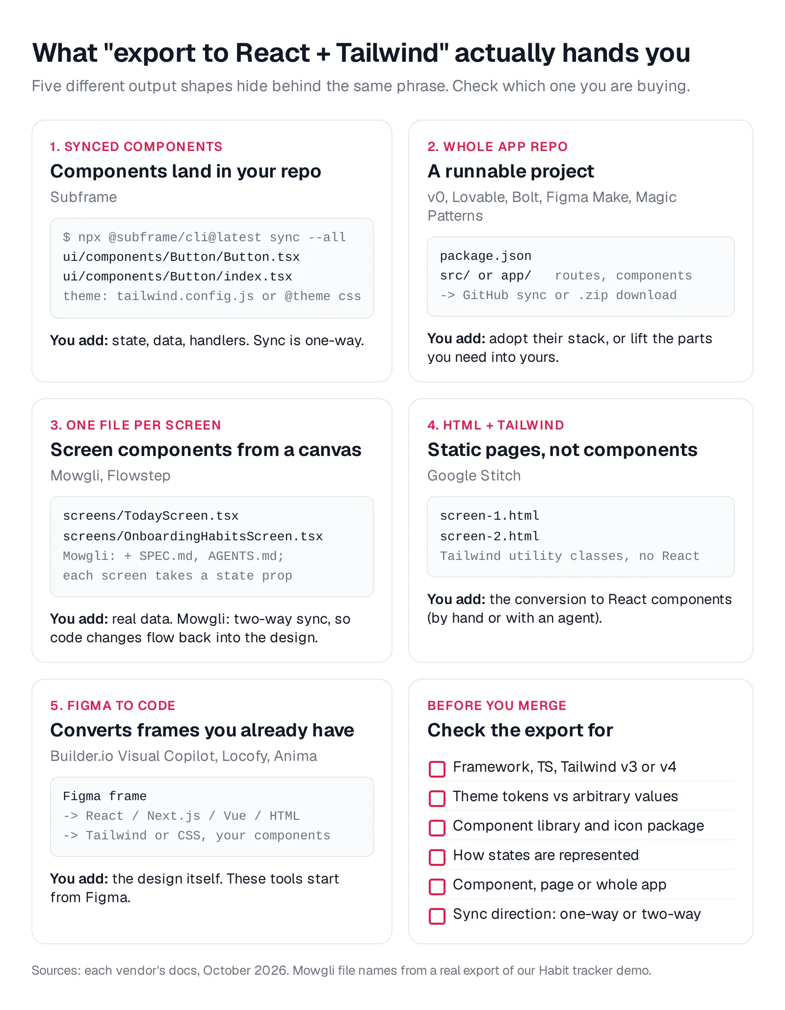
Caption: The five shapes "export to React + Tailwind" can take, plus the pre-merge checklist; vendor documentation compiled October 2026.
React + Tailwind export formats compared
| Tool | Output | Framework | Styling | Multi-screen? | States? | Export path |
|---|---|---|---|---|---|---|
| Mowgli | One .tsx per screen + SPEC.md | React (TSX), lucide-react | Tailwind utility classes | Yes, whole product | Yes, a single state prop per screen | Two-way sync via MCP/skill/CLI; AI package (zip), Figma, images |
| Subframe | Synced components + page code | React + TypeScript | Tailwind 3.4+ with theme tokens (config or v4 @theme) | Pages grouped on canvases | Component hover/active/focus; empty/error as separate pages | CLI sync, copy code, MCP, Vite zip for prototypes |
| v0 | Full app | Next.js, React, TypeScript | Tailwind + shadcn/ui | Yes, multi-route | Only if you prompt for them | GitHub branch + PR, Vercel deploy, API zip, MCP |
| Flowstep | One component per screen | React (JSX) | Tailwind | Up to 6 screens per prompt | Empty/error screens via MCP expand-design | Copy, ZIP, MCP (export needs a paid plan or trial) |
| Magic Patterns | Prototype project | React 18 + TypeScript, Vite on export | Tailwind v3 or a preset library | Yes, routed pages | Not built in | ZIP, GitHub sync, copy as prompt, MCP, Figma |
| Google Stitch | Screen HTML | HTML/CSS (no React) | Tailwind support | Yes, linked screens | Not documented | Copy code, Figma, AI Studio, Antigravity, MCP/SDK |
| Lovable | Full-stack app | TanStack Start (new apps) or React + Vite | Tailwind | Yes | Not built in | Two-way Git sync, ZIP (paid), MCP |
| Bolt | Full-stack app | Chosen per project (React, Vue...) | Not fixed; shadcn, MUI, Chakra presets | Yes | Not built in | GitHub, ZIP, bolt.host |
| Figma Make | App or prototype | React by default, any framework since July 2026 | Tailwind + shadcn/ui supported | Yes | Not built in | ZIP, one-way GitHub push, Figma MCP |
| Builder.io Visual Copilot | Code from Figma frames | React, Vue, Svelte, Angular, Qwik, Solid, HTML, more | Tailwind, CSS, Emotion, Styled Components | Per frame | From your Figma file | Figma plugin, CLI into your repo |
| Locofy | Code from Figma | React, Next.js, Gatsby, Vue, Angular, HTML, React Native | Tailwind, CSS Modules, CSS-in-JS | Per project | From your Figma file | Export, GitHub, VS Code, MCP |
| Anima | Code from Figma, URL or prompt | React (JSX or TSX) | Tailwind with generated tailwind.config | Playground apps | From your Figma file | Figma plugin, one-way GitHub push, MCP |
Prices are from each vendor's pricing page, October 2026.
Best for designing a whole multi-screen app - Mowgli
Mowgli fits when you want to design the complete product before implementation. It places every screen and state on an infinite canvas, then exports one React + Tailwind component per screen alongside the product specification.
The workflow starts with a short questionnaire -> product spec or PRD -> visual themes and moodboard -> full generation. A project can contain 30+ screens and states, including empty, error and loading states. You can revise them through chat, inspect version history and connect them as an interactive prototype.
A habit tracker export shows the structure concretely:
- A 12-screen mobile app.
- A 948-line
SPEC.mdcovering user journeys, the data model and frontend. AGENTS.mdandCLAUDE.md.- Twelve
.tsxfiles containing 2,646 lines. - 46 named states across the screens.
- A shared
stateprop andlucide-reacticons.
The README states that screen files make "no assumptions about the shape of the data, state management, backend, or coding style."
import React from "react";
import * as Icons from "lucide-react";

export interface ScreenProps {
  state: string;
}

/**
 * States:
 * - default: No habits selected, counter at 0, Continue disabled
 * - habitsSelected: Three habits selected, counter at 3, Continue enabled
 * - customHabitAdded: Custom habit visible in selected area, counter includes it
 */
const OnboardingHabitsScreen: React.FC<ScreenProps> = ({ state }) => {
  // ...
  const getHabitState = (index: number) => {
    if (state === "default") return false;
    if (state === "habitsSelected") return index < 3;
    if (state === "customHabitAdded") return index < 2;
    return false;
  };
  // ...
  const renderContinueButton = () => {
    const enabled = state !== "default";
    return (
      <div className="px-6 mt-8 pb-8">
        <button
          disabled={!enabled}
          className={`w-full py-4 rounded-[16px] text-[14px] font-['Inter'] font-medium tracking-wide transition-all ${
            enabled
              ? "bg-[#7A9279] text-[#F5F1EA] shadow-[0_2px_12px_rgba(122,146,121,0.2)]"
              : "bg-[#B5C4B0]/30 text-[#B5C4B0] cursor-not-allowed"
          }`}
        >
          Continue
        </button>
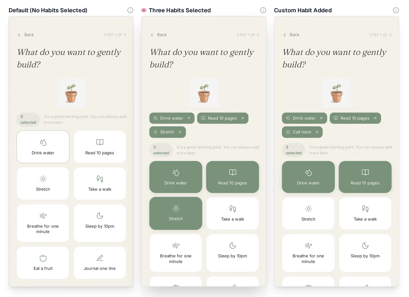
Caption: Habit onboarding component rendered on the Mowgli canvas for default, habitsSelected and customHabitAdded.
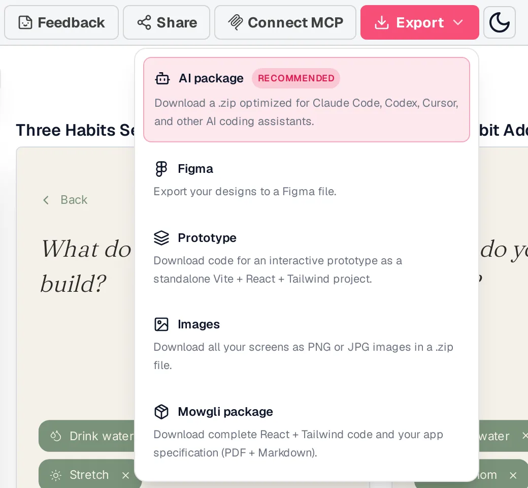
Caption: Mowgli export options; standalone Vite + React + Tailwind prototype and packages containing per-screen files plus the spec.
You can import an existing codebase through Mowgli MCP or the agent skill, redesign it on the canvas, pull designs into code and push later code changes back. The MCP server is https://app.mowgli.ai/mcp; install the skill with npx skills add mowgli-ai/skills. The skill source is available in the Mowgli skills repository, and the CLI package is mowgli-cli.
Coding agents can read SPEC.md, frontend.xml and one <ScreenId>.tsx file per screen. Synced versions record a change summary and commit hash.
Mowgli designs and prototypes; to host and ship, you hand off to a builder or coding agent (Claude Code, Codex, Cursor, Lovable).
Free to start (300 credits); credit packs from $12; plans from $15/mo. See more about exporting to code and designing complete app screens.
Best for synced React components - Subframe
Subframe fits an existing React + Tailwind repository that needs shared design-system components. Its code generation is deterministic, with "no LLM involved."
It produces React + TypeScript using @subframe/core, described as "a thin wrapper around Radix." Components expose typed variants, use theme classes such as bg-brand-600, and include Feather icons through @subframe/core. Themes export through Tailwind v3 configuration or a Tailwind v4 theme.css file with @theme.
// Subframe docs: exported page (excerpt; docs highlight markers removed)
function SignInPage() {
  return (
    <div className="flex h-full w-full flex-col items-center justify-center bg-white">
      ...
          <span className="text-heading-2 font-heading-2 text-default-font">Welcome</span>
          <span className="text-body font-body text-subtext-color">Login or sign up below</span>
      ...
        <Button
          className="h-10 w-full flex-none"
          variant="brand-secondary"
          size="large"
          icon="FeatherMail"
          onClick={(event: React.MouseEvent<HTMLButtonElement>) => {
            // TODO: Implement email sign in
          }}
        >
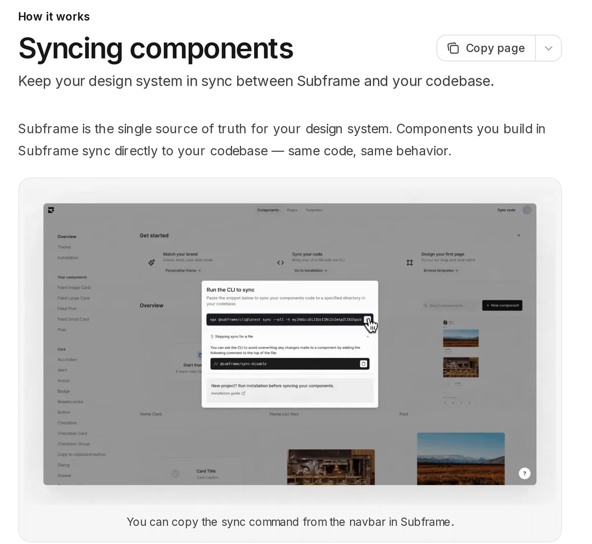
Caption: Source: Subframe website (docs.subframe.com), captured October 2026.
Run npx @subframe/cli@latest sync --all to sync components. Generated code lives in paths such as Button/Button.tsx, while an editable index.tsx wrapper remains available. Add // @subframe/sync-disable to prevent overwrite. Its MCP endpoint is https://mcp.subframe.com/mcp.
The output is presentational. It does not supply state management or business logic, and exported pages include TODO handler stubs. Sync is one-way, and the documentation advises avoiding prototypes larger than about six designed screens.
The free plan includes one project and limited AI credits. Pro costs $20 per editor per month.
Best for a short linked flow - Flowstep
Flowstep fits work that is larger than one component but smaller than a complete product. One prompt can generate up to six screens.
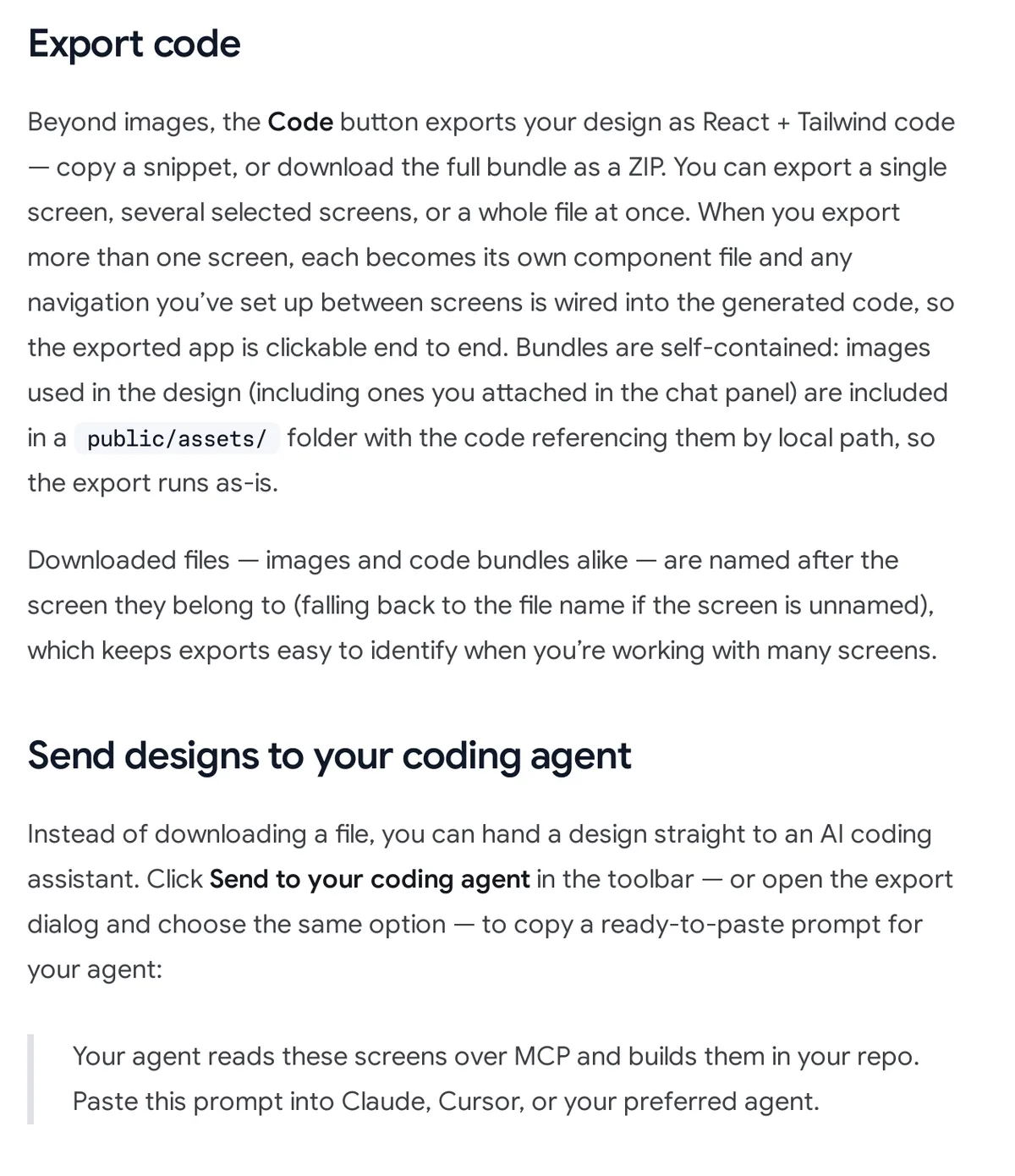
React + Tailwind export creates one component file per screen, includes configured navigation and stores images in public/assets/. Through MCP, expand-design can add error_state and empty_state follow-on screens.
<div className="bg-white text-zinc-950 w-full h-fit">
  <div className="flex p-6 flex-col gap-6">
    <div className="flex pt-4 justify-between items-center">
      <ArrowLeft className="size-5 text-[#71717b]" />
      <span className="font-semibold text-zinc-950 text-lg leading-7">
        World Clock
      </span>
      <Plus className="size-5 text-[#2b7fff]" />
    </div>
Caption: Source: Flowstep website (docs.flowstep.ai), captured October 2026.
Flowstep also supports Figma frame import and copy-and-paste export to Figma. Code, Figma and image exports require a paid plan or three-day trial. Starter begins at $15 per month for 80 messages, billed per seat; the free plan has limited messages.
Best for a prototype using a design system - Magic Patterns
Magic Patterns is suited to multi-page React prototypes that use an existing design-system preset or npm package. Its presets include shadcn/ui, Chakra, Mantine and MUI.
A ZIP export is a standalone Vite project using React 18, TypeScript, Tailwind CSS v3, lucide-react, framer-motion, react-router-dom and recharts. It uses hardcoded mock data and local useState for controlled inputs. GitHub provides two-way synchronization into a React + Vite template.
Connect MCP with claude mcp add --transport http magic-patterns https://mcp.magicpatterns.com/mcp. Figma export is also available.
The documentation calls the result "a high-fidelity prototype, not production code." Loading, error and empty states are not built in. GitHub sync and MCP require a paid plan.
The free tier includes monthly credits. Starter costs $20 per seat per month, or $17 billed annually, with 1,000 credits. Business costs $100 per seat per month.
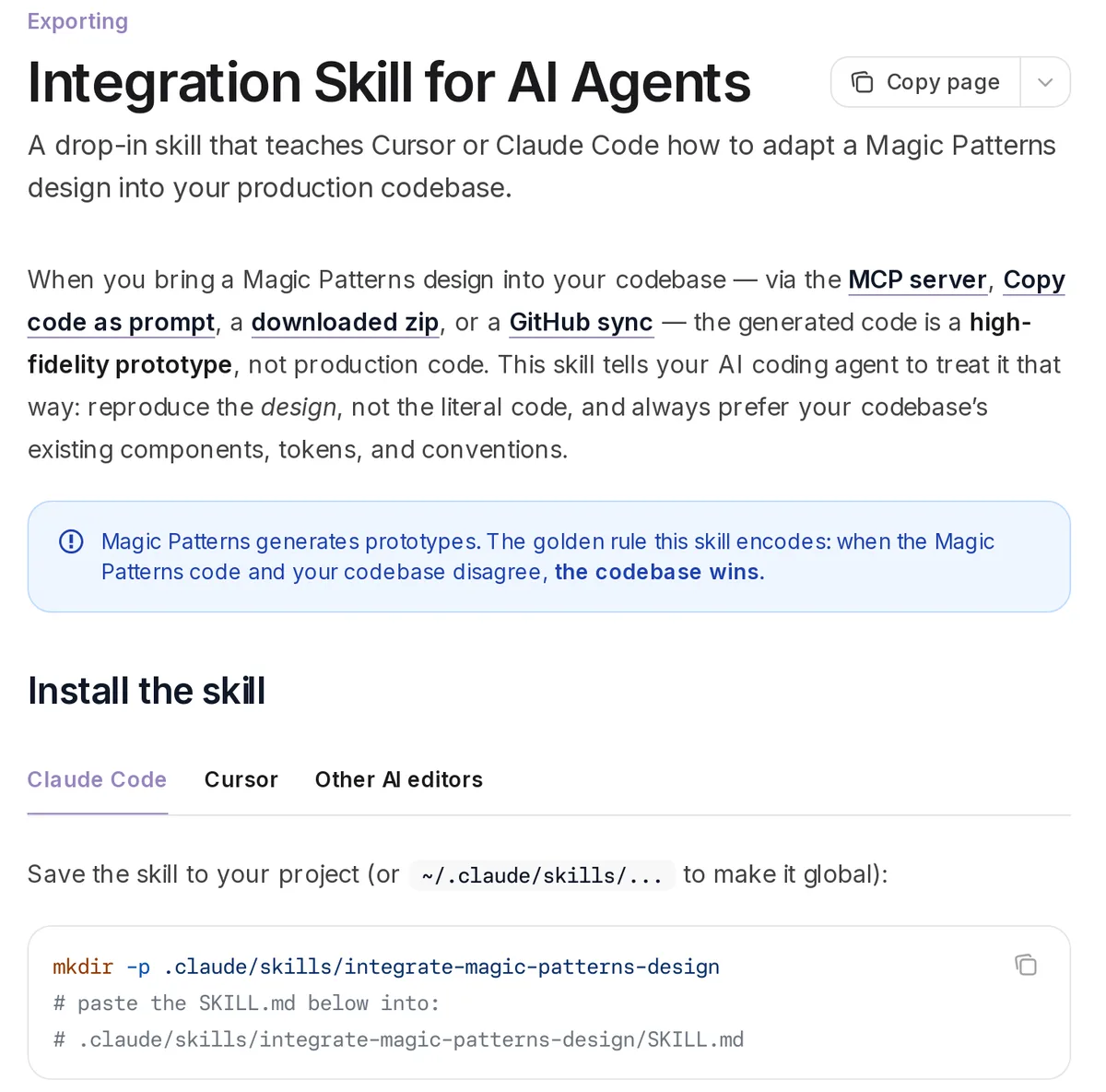
Caption: Source: Magic Patterns website (magicpatterns.com/docs), captured October 2026.
Best prompt-to-app builders
Prompt-to-app builders produce running projects rather than design files. You either adopt the generated stack or extract selected pieces. See the fuller Lovable vs Bolt vs v0 comparison.
v0 - Next.js, shadcn/ui and GitHub PRs
v0 fits a deployable Next.js application when your team accepts shadcn/ui defaults. New chats begin with Next.js, React, TypeScript, Tailwind CSS and shadcn/ui. It can produce multi-route UI and backend logic, but you must request loading and empty states.
Handoff includes a working GitHub branch, pull request, Vercel deployment, API ZIP and MCP server. The code viewer is read-only. Its documentation says v0 is "trained on the default implementations of the shadcn/ui components and may struggle with any customizations."
Free includes seven messages per day. Plus costs $30 per user per month and includes $30 in monthly credits. Business costs $100 per user per month.
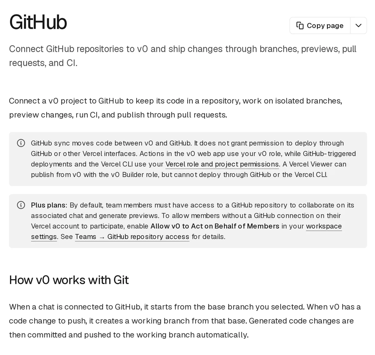
Caption: Source: v0 website (v0.app/docs), captured October 2026.
Lovable - full-stack app with two-way Git sync
New Lovable apps created since May 13, 2026 use TanStack Start; older apps use React + Vite. Both use Tailwind. Git synchronization is two-way on every plan, while ZIP download requires a paid plan.
Lovable states that it "does not offer a choice of framework or database." Free includes five daily credits, capped at 30 monthly. Pro costs $25 per month and Business costs $50. Read more about how Lovable compares.
Bolt - project-selected framework
Bolt chooses the framework per project and offers Chakra, Material UI and shadcn presets. Its GitHub integration pulls external changes every 30 seconds. You can use Export -> Download ZIP or host through bolt.host.
Free includes 1M tokens per month and 300K daily. Pro costs $25 per month.
Figma Make - React by default, flexible framework
Figma Make uses React by default and has supported any framework since July 2026. Point-and-edit supports Tailwind and shadcn/ui.
Full or Dev seats can download a ZIP. GitHub handoff is a one-way push. See how Figma Make compares.
Google Stitch exports HTML, not React
Google Stitch exports semantic HTML and CSS with Tailwind support. It does not export React components directly.
Its SDK exposes the rendered HTML and image:
const html = await screen.getHtml();
const imageUrl = await screen.getImage();
For React, a coding agent can read the design through MCP and perform the conversion. Google's Antigravity codelab scaffolds a React and Tailwind project, while the official stitch-skills repository includes react-components.
Stitch is useful for free visual exploration or as a Figma starting point. It supports linked multi-screen prototypes, Figma export with Auto Layout, AI Studio, Antigravity, MCP, an SDK and DESIGN.md. UI state handling is not documented.
Stitch is free, with a daily credit limit that resets at midnight UTC. See the guide to Stitch multi-screen consistency.
Best Figma-to-React + Tailwind converters
Use a converter when the design is already complete in Figma. State coverage then depends on what your Figma file contains. See Figma to code tools and the Figma import guide.
Builder.io Visual Copilot
Visual Copilot targets React, Vue, Svelte, Angular, Qwik, Solid and HTML. Styling options include Tailwind, CSS, Emotion, Styled Components and Styled JSX. Builder CLI can reuse components, libraries and styles already present in your repository.
The free plan is available. Pro costs $24 per user per month with 500 Agent Credits.
Locofy
Locofy converts Figma into React, Next.js, Gatsby, Vue, Angular, HTML/CSS or React Native. It supports CSS, CSS Modules, Tailwind CSS and CSS-in-JS, and generates reusable components with props.
Its seven-day trial includes 2,000 LDMtokens. Hobby costs $40 per month and Pro costs $80. GitHub integration is listed on Enterprise.
Anima
In the Anima Figma plugin, select React -> jsx/tsx -> Tailwind. It generates React JSX or TSX plus a tailwind.config derived from Figma tokens. GitHub push is one-way, and MCP is available.
Free includes five code generations. Starter costs $20 per seat per month and Pro costs $40.
How to evaluate and merge an exported UI
First, count arbitrary color values:
grep -rhoE '\[#[0-9A-Fa-f]{3,8}\]' src | sort | uniq -c | sort -rn
A small set is easier to map into theme tokens. A large set should trigger a design-system consistency review before merging.
Next, verify that empty, loading, error and success states remain reachable. Use the empty, error and loading states checklist rather than checking only the default screenshot.
Then review dependencies and integration points. Convert wildcard icon imports to named imports where appropriate. Reuse repository components, replace generated handlers and mock data, and preserve the visual result while connecting real state and data.
Give Claude Code, Codex, Cursor or another coding agent a precise task:
Read
screens/OnboardingHabitsScreen.tsxand its section inSPEC.md. Rebuild it as a production component insrc/features/onboarding/. Map its colors, spacing and type to tokens from our Tailwind theme, use named lucide-react imports, reuse our existing Button and Input components, and turn each value of thestateprop into real state so every state stays reachable. Keep the rendered result visually identical.
Using Claude Code, Codex or Cursor for the handoff
Give the coding agent one screen component and the relevant product-spec section. Ask it to map tokens, reuse existing components and connect real application state. Build and verify one user journey at a time.
The Mowgli AI-ready package includes AGENTS.md. The agent interviews you, creates IMPLEMENTATION_PLAN.md, then implements the product journey by journey. As an alternative, MCP gives the agent direct access to screens, states and the specification. Two-way sync can push later code changes back into the design.
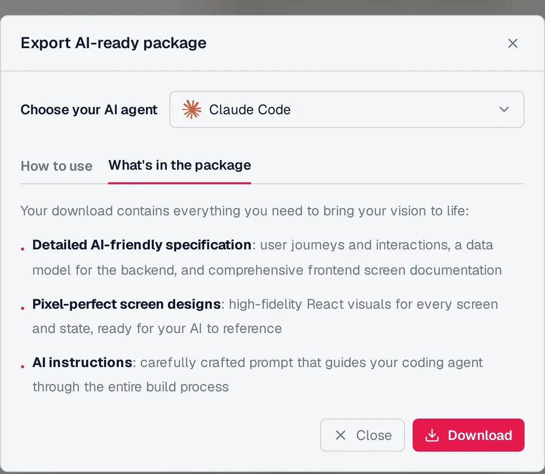
Caption: Mowgli AI-ready package for Claude Code, Codex and Cursor: product spec, per-screen React designs and agent instructions.
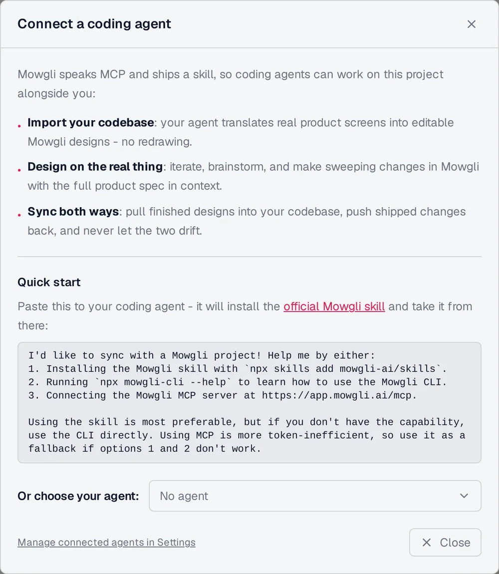
Caption: Coding-agent connection options: npx skills add mowgli-ai/skills, CLI or MCP server for two-way sync.
Continue with the design handoff guide, MCP servers for UI design and Mowgli MCP documentation.
Verdict: which React + Tailwind exporter to choose
Choose Mowgli for a whole product with every screen and state, one React + Tailwind file per screen, a spec-first workflow and two-way synchronization with Claude Code, Codex, Cursor or another coding agent.
Choose Subframe for deterministic design-system components inside an existing React + Tailwind repository. Choose v0 for a deployable Next.js app when shadcn/ui and a branch-and-PR workflow fit your team.
Choose Lovable or Bolt for a full-stack generated app when you will adopt its stack. Choose Flowstep for a linked flow of up to six screens per prompt. Choose Magic Patterns for a prototype based on a design-system preset or package.
Choose Google Stitch for free visual exploration with HTML output. Choose Builder.io Visual Copilot, Locofy or Anima when the finished design already exists in Figma.
FAQ
Which AI design tool exports clean React + Tailwind code?
Mowgli is the fit for a whole product's screens and states. Subframe is suited to deterministic components in an existing repository, v0 to a complete Next.js app, and Flowstep to a short linked flow.
Does Google Stitch export React code?
No. Its official output is HTML and CSS with Tailwind support. React requires a conversion step through a coding agent, MCP or a tool such as Google's react-components skill.
Does v0 export React and Tailwind?
Yes. New chats begin with Next.js, React, TypeScript, Tailwind CSS and shadcn/ui. You can synchronize through GitHub or download through the API.
Can AI convert a Figma file to React and Tailwind?
Yes. Builder.io Visual Copilot, Locofy and Anima support React + Tailwind conversion. Builder.io and Locofy also target other frameworks, including Vue and Angular.
Which AI design tool exports every app screen and state?
Mowgli generates the whole product and exports each screen as a React + Tailwind component with one state prop. The habit tracker example contains 12 screens and 46 states. Flowstep can add separate empty and error screens through MCP.
Which tools sync code changes back?
Mowgli provides two-way synchronization between a codebase and its design through MCP, an agent skill or CLI. Lovable provides two-way Git synchronization for its generated app without a separate design file, while Stitch describes a two-way MCP loop. Subframe component sync, Figma Make GitHub push and Anima GitHub push are one-way.
Sources
- Mowgli
- Mowgli app
- Mowgli MCP server
- Mowgli skills repository
- Mowgli pricing
- Mowgli export to code
- Mowgli MCP
- Mowgli app screens
- Figma to code
- Subframe code generation
- Subframe design to code
- Subframe component synchronization
- Subframe installation
- Subframe theme export
- Subframe pages
- Subframe pricing
- v0 documentation
- v0 design systems
- v0 FAQs
- v0 GitHub integration
- v0 MCP server
- v0 pricing
- Flowstep export formats
- Flowstep MCP tools
- Flowstep design generation
- Flowstep pricing documentation
- Flowstep pricing
- Magic Patterns integration skill
- Magic Patterns GitHub sync
- Magic Patterns MCP server
- Magic Patterns pricing
- Google Stitch
- Stitch SDK
- Stitch skills
- Google Stitch introduction
- Google Stitch updates
- Stitch and Antigravity codelab
- Lovable FAQ
- Lovable glossary
- Lovable code mode
- Lovable Git sync
- Lovable pricing
- Bolt glossary
- Bolt Git integration
- Bolt FAQ
- Bolt pricing
- Figma Make with React
- Figma Make GitHub push
- Figma Make troubleshooting
- Builder.io Visual Copilot options
- Builder.io CLI
- Builder.io pricing
- Locofy Figma to React
- Locofy pricing
- Anima Tailwind export
- Anima GitHub integration
- Anima MCP
- Anima pricing