Google Stitch Multi-Screen Consistency: Why Screen 2 Drifts
Set a default DESIGN.md, define navigation rules, reuse an anchor screen and fixed preamble, then standardize - or use one spec and theme for a whole app.
The short answer
To keep Google Stitch screens consistent, establish the system before screen 2. Make DESIGN.md the project default, add navigation and header rules, perfect one anchor screen, reuse a fixed prompt preamble, and standardize the complete set against the anchor.
These steps reduce drift. They do not guarantee that every screen will preserve the same structure.
Use Stitch for free, fast concepts and short flows. For a whole app whose screens and states must share one structure, define that structure once in a product spec and generate everything from one theme. That is the job Mowgli is designed to handle.
What Google Stitch does well
Google Stitch is a free AI UI design tool from Google Labs. Google launched it in May 2025.
You can start with text, sketches or screenshots. Stitch generates high-fidelity screens and can produce one to five variations at once. You can arrange screens on an infinite canvas, connect them into click-through prototypes, export to Figma with "properly structured Auto Layouts," or export HTML.
Its developer workflow includes an MCP server, SDK, CLI and 13 agent skills. Google announced the expanded canvas workflow in March 2026.
Stitch fits two jobs particularly well: exploring UI concepts quickly and preparing short flows for Figma or HTML. It is free, with a daily credit limit that resets at midnight UTC. It is available to users aged 18 and older in countries where Gemini is available.
The relevant limits are multi-screen consistency and code format. Native exports are HTML and CSS rather than framework components, although Google's react-components skill can convert screens to React. Stitch also remains a Google Labs beta, so its models and features change.
The multi-screen consistency problem, in users' words
Reports in the Google AI Developers Forum Stitch category show a recurring pattern.
In May 2025, one user wrote, "I had to remind it to use a consistent navigation bar and header." Google replied, "Consistency is indeed our main area of focus right now." The same thread describes a basic shared-interface problem rather than a small color mismatch.
In January 2026, a user working with "a few dozens of screens" reported different icon sets and completely different navigation structures. The drift appeared even when several screens came from one prompt.
A March 2026 report described differing details despite generating multiple pages in one prompt and providing DESIGN.md. In April, a component-reuse request named TabBar, navigation bar, custom icons, logos, colors, corner radius and typography hierarchy.
Google said it was "working on improving multi-screen context" on March 12, 2026, and "dedicatedly working on multi-page consistency" on April 1, 2026.
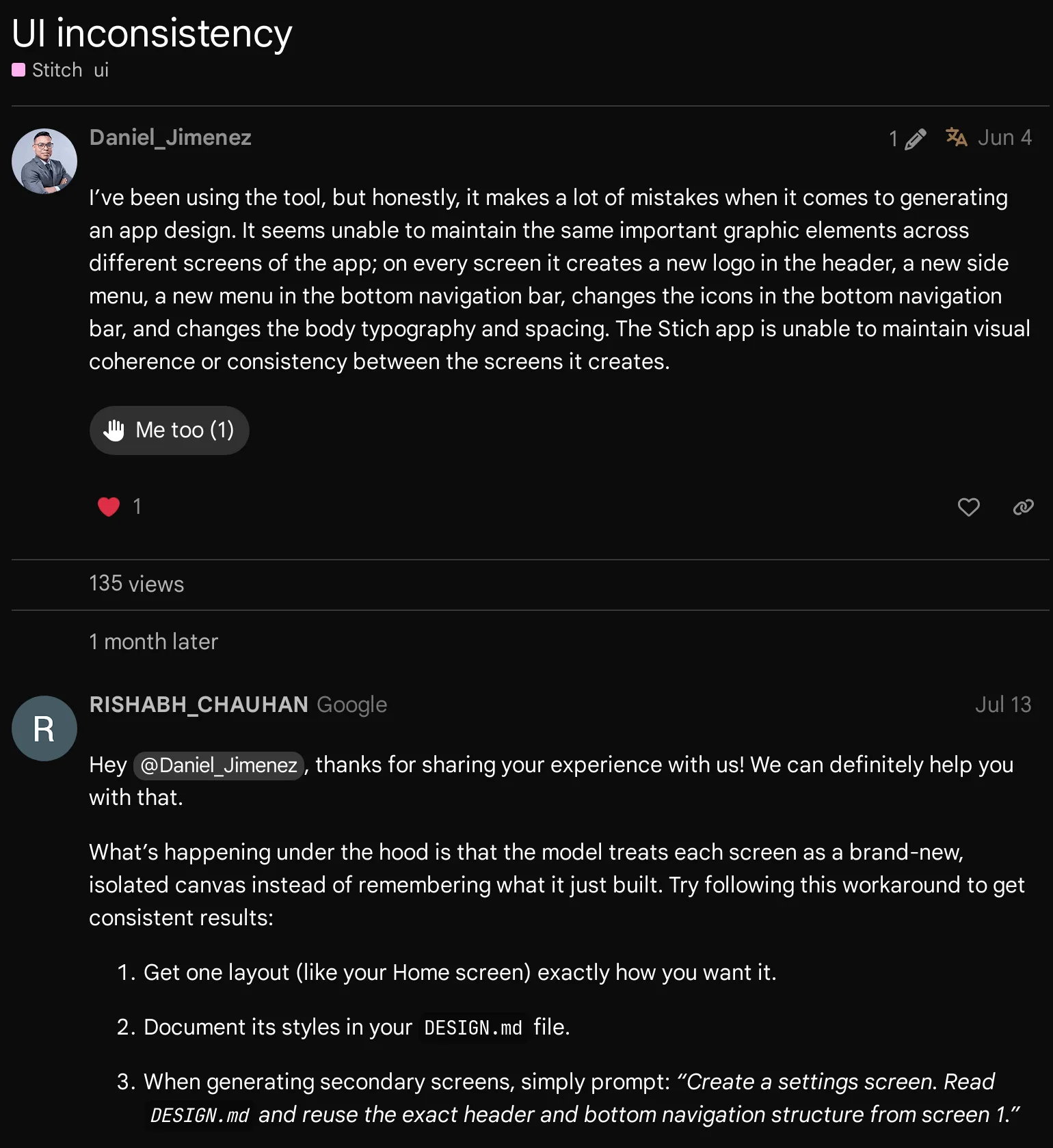
Caption: Google's July 2026 reply explains the drift. Source: Google AI Developers Forum, captured October 2026.
Why screen 2 doesn't match screen 1
First, Stitch generates screens as isolated canvases. Google explains that "the model treats each screen as a brand-new, isolated canvas instead of remembering what it just built." The MCP method generate_screen_from_text receives a project, prompt, device type and model. Its documented inputs do not include a dedicated "match screen 1" field.
Second, design tokens do not fully describe structure. DESIGN.md covers colors, typography, radius, spacing and component styles. Google's documentation says, "Without it, each screen stands alone. With it, they look like they belong together." But you must still specify navigation membership, logo placement and icon-set choice.
Third, unspecified choices invite reinterpretation. Google's prompting guide recommends detailed prompts and explicit do-not-change instructions. If you do not want dark mode, block it in the first prompt.
Fourth, late defaults do not repair earlier work. The DESIGN.md usage documentation states, "Existing screens are not retroactively updated."
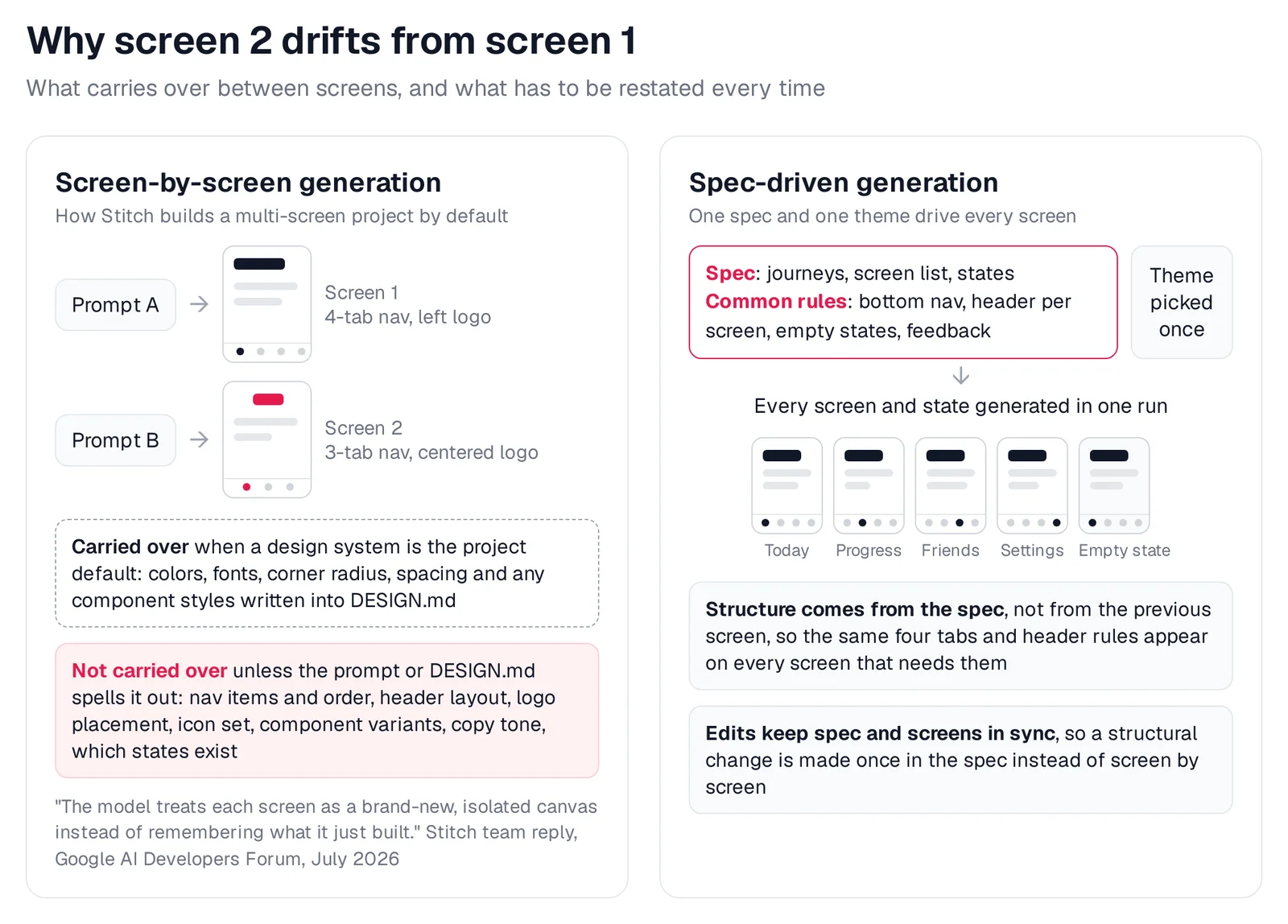
Caption: Tokens travel between Stitch screens; structure has to be restated. A spec keeps the structure in one place.
How to keep Google Stitch screens consistent
1. Set the design system before screen 2
Create DESIGN.md from a vibe prompt, a URL or brand image, a manual definition, or a codebase through the extract-design-md skill. Google's instructions cover each route.
Make it the project default before generating later screens. New screens inherit its tokens. Apply it individually to screens you created earlier.
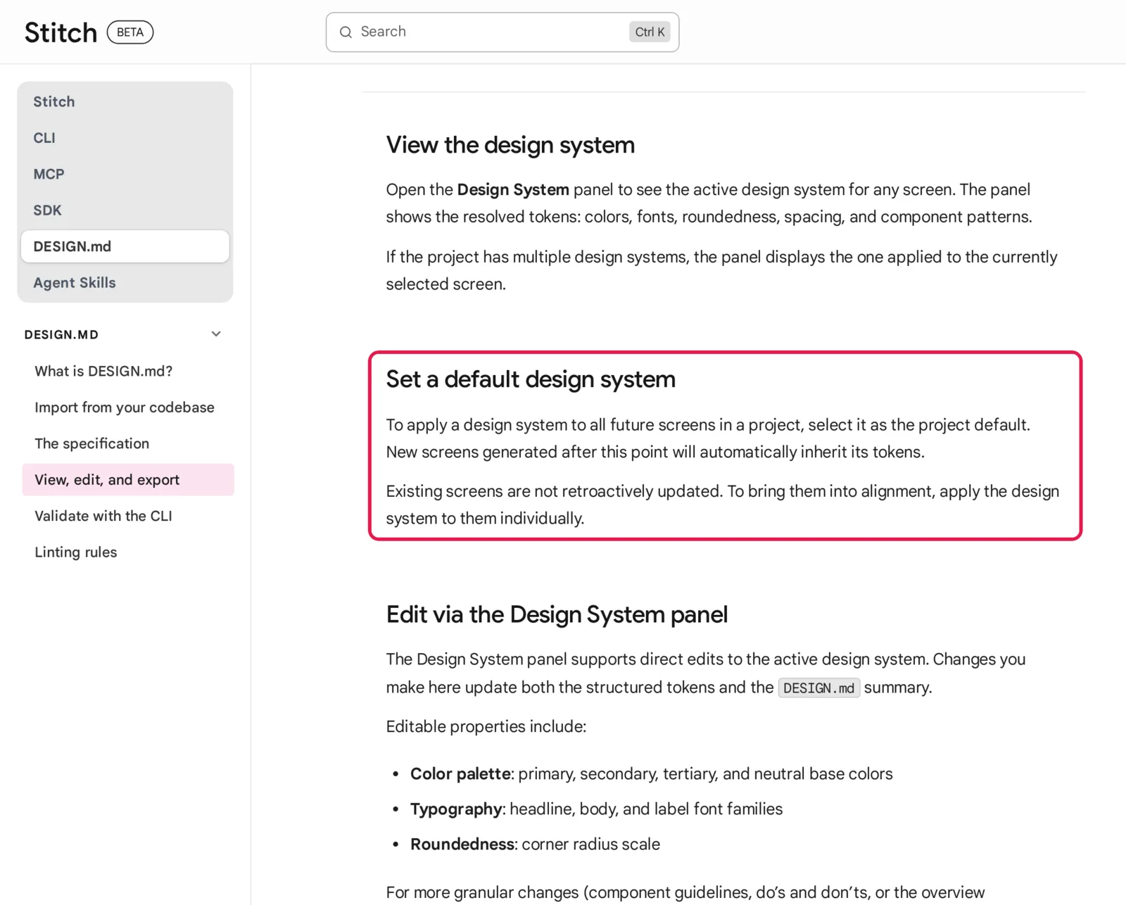
Caption: Set the default first; earlier screens need the design system applied one by one. Source: Google Stitch docs, captured October 2026.
2. Put navigation and header rules into DESIGN.md
Do not stop at hex codes and corner radii. Use the Components and Do's and Don'ts sections defined in the DESIGN.md specification.
## Components
- **Bottom navigation**: 4 tabs in this order: Today, Progress, Friends, Settings.
  Icon above a 12px label. Active tab uses the primary color, others neutral.
  Tab screens never add, remove or reorder tabs.
- **Header**: screen title top-left in the headline serif. No logo on tab screens.
  Pushed screens: back chevron top-left, title below it.
- **Cards**: white surface, 16px radius, no shadow, 16px padding.
- **Primary button**: full width, 48px tall, primary fill, 12px radius.

## Do's and Don'ts
- Do reuse the exact header and bottom navigation on every tab screen.
- Don't switch to dark mode, change fonts or swap the icon set on any screen.
See DESIGN.md for AI coding agents for a broader implementation guide.
3. Build one anchor screen and point every prompt to it
Perfect a representative screen such as Home. Record its visual and structural rules in DESIGN.md, then name it in every later prompt.
Create a settings screen. Read DESIGN.md and reuse the exact header and bottom navigation structure from screen 1.
4. Start every prompt with the same preamble
Google's stitch-loop skill places a "DESIGN SYSTEM (REQUIRED)" block at the top of each page prompt. Its documentation identifies omitted DESIGN.md context as a common cause of visual drift.
KEEP IDENTICAL TO THE HOME SCREEN (do not change):
- Bottom navigation: 4 tabs, Today / Progress / Friends / Settings, same icons and order. Active tab: [this screen]
- Header: title top-left in the headline serif, no logo, no extra icons
- Colors, fonts, radius and spacing: from DESIGN.md only. Light mode.
- Cards: white, 16px radius, no shadow. Primary buttons: full width, 48px
SCREEN: [name]
CONTENT: [what this screen shows and does]
5. Generate related screens together, then inspect them
Batch closely related screens such as Login, Register and Forgot password. Stitch's FAQ says you can generate related screens within one project.
Treat the batch as a draft, not a consistency guarantee. One user reported that "90% of the pages were matched, except for the core navigation structure" in a forum discussion.
6. Run a standardize pass
Select the relevant screens with Shift + Click. Use Google's suggested instruction: "standardize the headers and tabs across all these to match Screen 1."
Apply the design system to any screen created before you set the default. Use Direct Edit for remaining element-level discrepancies.
7. Use Edit Theme and Refined variants for visual changes
Edit Theme controls mode, accent color, radius and font. Use it when the whole set needs the same visual change.
Choose the Refined variation range when you want to preserve structure. The Creative range may restructure the layout.
8. Use MCP tools from Claude Code, Codex, Cursor or another coding agent
After completing the MCP setup, use apply_design_system to apply a system to one or more screens. Use edit_screens to edit a list of screen IDs. Google's documented example is, "Add a navigation bar to these screens."
The stitch-loop skill also maintains consistent headers and footers.
npx plugins add google-labs-code/stitch-skills --scope project --target claude-code
See MCP servers for UI design for the wider workflow.
Multi-screen consistency checklist
Place every screen side by side at the same zoom. Audit shared UI before handing the work to Figma, code or a builder.
| Check | Compare across every screen | Fix instruction |
|---|---|---|
| Navigation | Same items, order, icons and position; correct active state | "Use the exact bottom navigation from Home; set [tab] active" |
| Logo and header | Logo size and placement; title style; back pattern on pushed screens | "Match the Home header; no logo on tab screens" |
| Type scale | One font per role; same size for titles, section labels, body | "Screen titles use the headline style from DESIGN.md" |
| Spacing | Page margins, card padding, gaps between sections | "Use 16px page margins and 16px card padding" |
| Color tokens | Same primary, background and status colors; same light or dark mode | "Use only DESIGN.md colors; light mode" |
| Component variants | One style per role for buttons, cards, inputs, chips; one corner radius | "Restyle buttons to match the Home primary button" |
| Icons and imagery | One icon set and stroke weight; one illustration style | "Use the same outline icon set as the navigation" |
| Copy tone | Same voice, same case, same label for the same action | "Use sentence case; the save action is always 'Save'" |
| States | Empty, loading and error states follow one pattern | "Empty states: one icon, two lines, one button" |
Use the screen x state matrix and checklist to catch states missing from the canvas.
You can also give the complete screenshot set to Gemini or Claude with this prompt:
These are screenshots of screens from one app. Compare them with each other, not with best practice.
List every difference in navigation (items, order, icons, active state), header and logo, font families
and sizes per role, spacing, colors, component styles (buttons, cards, inputs, chips), icon style,
copy tone and labels, and empty/loading/error states. For each difference, name the screens, say which
version most screens use, and write a one-line fix instruction.
The structural fix: one spec and one theme
The manual workflow works by repeating and checking shared rules. A spec-driven workflow changes where those rules live.
Stop redeclaring structure screen by screen. Write one product spec that defines user journeys, the screen inventory, screen states, shared navigation and header rules. Pair that spec with one selected visual theme.
Every generated screen then reads from the same product structure and visual direction. Spec-driven app development explains how the spec connects design and implementation.
Mowgli generates every screen from the same spec
We make Mowgli.
Mowgli is an AI design tool that designs every screen of your app. It fits whole products whose navigation, headers and states must stay aligned across every screen.
A short questionnaire becomes a product spec, or PRD, covering user journeys, product constraints and the data model. The spec stays synchronized with the design. You select from a moodboard of 16+ styles and can steer the style before generation.
Mowgli generates every screen and state on an infinite canvas. A project can include 30+ screens and states, including empty and error states. You can iterate through chat, restore work through version history and connect screens into a click-through prototype.
For example, a habit tracker's Common spec section can define its bottom navigation, tab headers, empty-state pattern and feedback messages once. Today uses a date header, Progress uses a month, Friends uses "Friends," and Settings uses the user's first name. All four keep the same serif and four-tab navigation. See every screen a habit tracker app needs.
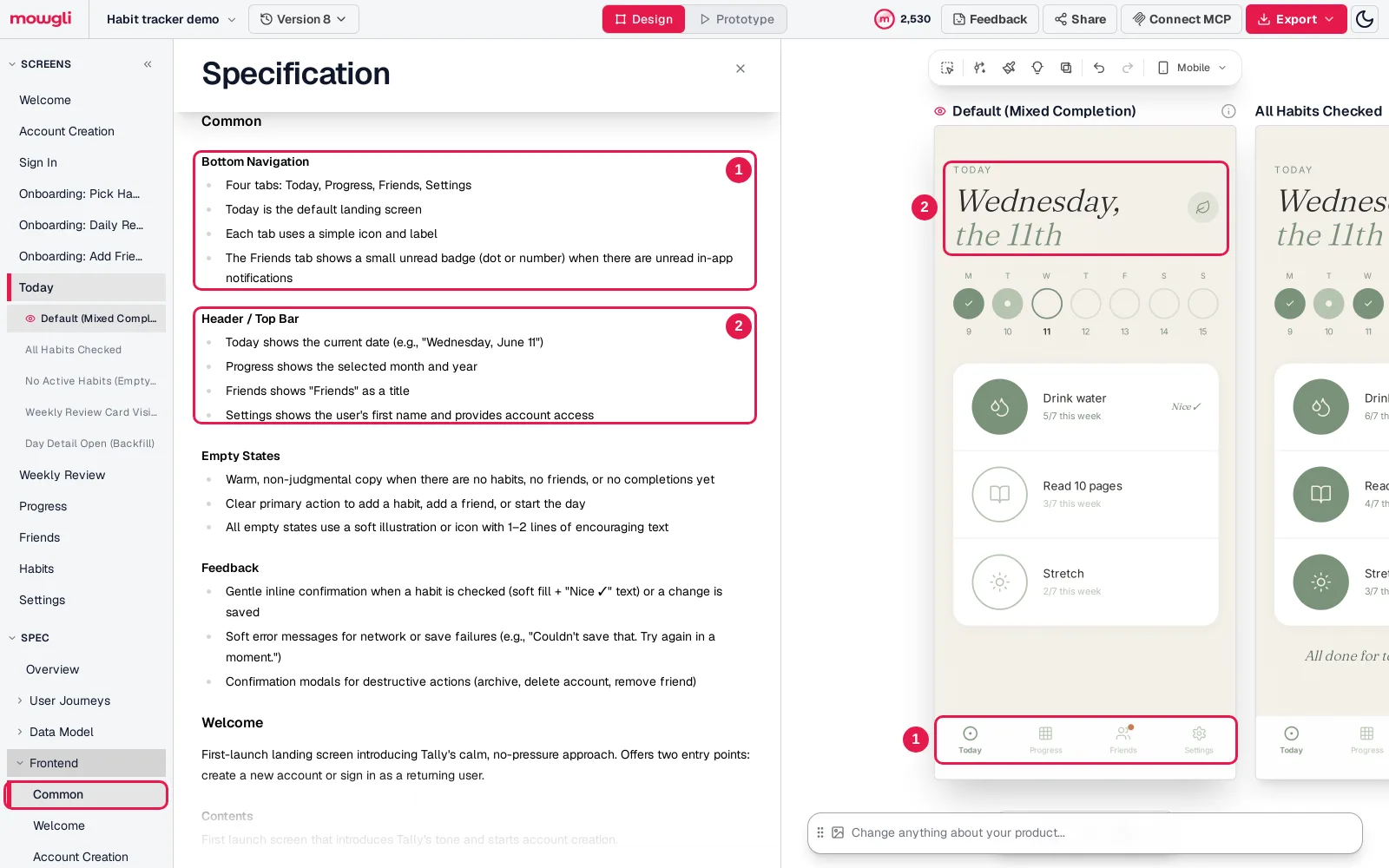
Caption: The spec's Common rules (1 bottom navigation, 2 header) and the Today screen built from them. Mowgli Habit tracker demo.
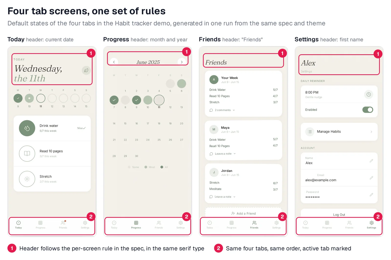
Caption: Same navigation, header rules and theme across the four tabs. Mowgli Habit tracker demo.
The same approach applies to desktop products. A cloud cost dashboard can specify that it "uses a left sidebar for primary navigation and a top bar for global context." Overview Dashboard, Spend Explorer, Budgets and Weekly Digest then follow that common rule.
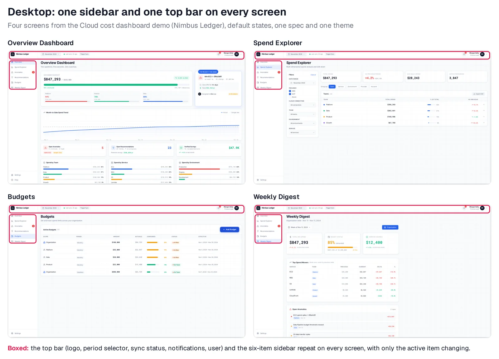
Caption: One top bar and one sidebar across four screens. Mowgli Cloud cost dashboard demo.
Mowgli is built for founders, PMs and designers planning mobile, web or desktop products before Figma or code handoff. Shared navigation and header rules enter the spec before generation. One chosen theme applies across the app. Chat edits can target one element or the whole product's look.
Export to Figma or React + Tailwind. Connect Claude Code, Codex, Cursor or another coding agent through MCP, CLI or the agent skill.
Mowgli designs and prototypes; to host and ship, you hand off to a builder or coding agent (Claude Code, Codex, Cursor, Lovable).
Free to start with 300 credits; credit packs from $12; plans from $15/mo.
You can also explore app screens from a description, spec-driven design and the full Mowgli vs Google Stitch comparison.
Google Stitch or Mowgli?
| Google Stitch | Mowgli | |
|---|---|---|
| Best for | Free, fast UI concepts and short flows | Whole multi-screen apps from a spec |
| How screens are made | One prompt per screen or batch | Every screen and state in one run from the spec |
| Shared across screens | Design system tokens (DESIGN.md) | Spec rules (navigation, headers, states) plus one theme |
| Free plan | Free, daily credit limit | Free to start, 300 credits |
| Paid from | Free | Credit packs from $12; plans from $15/mo |
| Figma | Export with Auto Layout | Import and export |
| Code export | HTML and CSS with Tailwind | React + Tailwind |
| Coding agents | MCP server, SDK, CLI, skills | MCP server, CLI, agent skill |
Prices are from each vendor's pricing page, October 2026.
Choose Mowgli when you need to generate a full multi-screen app design and every screen and state must share one product structure from the beginning.
Choose Google Stitch for free, fast concepts across one to five screens.
Choose Stitch's extract-design-md skill or Claude Design when an existing codebase already contains the design system. See the five-way comparison.
Choose Lovable or v0 when you need a running application rather than design-only output. The AI app design tools ranking separates these jobs.
Verdict
Google Stitch is the best choice here for free exploration across one to five screens. Set a default DESIGN.md, build one anchor screen, reuse a fixed preamble and run a standardization pass.
Mowgli is the best choice here when a whole app's screens and states must match. One spec and one theme replace repeated screen-by-screen structural instructions.
Whichever route you take, run the consistency checklist before handing the work to Figma, code or a builder.
FAQ
Why does Google Stitch change my design on every screen?
Google describes each screen as a new, isolated canvas. The default design system carries colors, fonts, radius and spacing, but navigation, headers, logos and icon rules require explicit DESIGN.md or prompt instructions.
How do I keep Google Stitch screens consistent?
Set DESIGN.md as the default before screen 2. Add navigation and header rules, reuse one anchor-screen preamble, standardize the complete set, and audit navigation, typography, spacing, components and states side by side.
Does DESIGN.md fix Google Stitch consistency?
DESIGN.md is strongest for shared tokens such as colors, typography, radius and spacing. Existing screens are not updated retroactively, and structural rules still require explicit documentation and an anchor screen. A March 2026 report describes remaining differences even with DESIGN.md present.
Is Google Stitch free in 2026?
Yes, Stitch is provided free of charge. Its daily credit limit resets at midnight UTC, and it is available to users aged 18 and older in countries where Gemini is available.
What are Google Stitch's main limitations?
Its main limitations for this workflow are recurring multi-screen consistency reports, plus prompt-fidelity and manual-editing concerns described in this June 2026 thread. Native output is HTML and CSS with Tailwind, while Google's react-components skill can convert screens to React.
What is a good Google Stitch alternative for full app flows?
Mowgli generates every screen and state from one spec and one theme. Outputs include Figma, React + Tailwind and access for coding agents over MCP. See Mowgli vs Google Stitch. For a running app with a backend, consider Lovable or v0.
Sources
- Google Stitch
- Stitch overview
- Stitch prompting guide
- Stitch variants
- DESIGN.md overview
- Using DESIGN.md
- DESIGN.md specification
- DESIGN.md instructions
- Stitch MCP setup
- Stitch MCP reference
- Stitch skills reference
- Build in a loop
- Google Developers Blog launch announcement
- Google Labs Stitch canvas announcement
- Google Labs DESIGN.md announcement
- Google Labs Stitch updates
- Google AI Developers Forum Stitch category
- Initial consistency feedback
- Design-system consistency discussion
- Style consistency discussion
- Conversational flow consistency discussion
- Template control report
- Project-level component reuse request
- Google explanation of isolated canvases
- June 2026 design-work discussion
- Mowgli
- Mowgli pricing
- Spec-driven design
- Mowgli moodboard
- Chat with your design
- App screens tool
- Mowgli vs Google Stitch