DESIGN.md for AI Coding Agents: Free Template and What It Misses
Use DESIGN.md for exact tokens, then add every screen and state, a behavior spec, token linting, and visual tests to stop AI agents inventing UI.
The short answer: give the agent three layers
DESIGN.md is not enough. Give Claude Code, Codex, Cursor or another coding agent three inputs: DESIGN.md for exact visual tokens, complete designs for every screen and state, and SPEC.md for behavior, copy and data rules.
Then add one standing instruction: if those sources do not cover a decision, ask instead of inventing it.
Keep the result enforceable. Generate code tokens from DESIGN.md, fail lint when code uses off-token values, and screenshot-test every state. Assign one owner to each layer so an edit has a clear source of truth.
For a complete multi-screen app, Mowgli is the clearest fit: it makes the spec, screens, states and React + Tailwind available to Claude Code, Codex, Cursor or another coding agent. We make Mowgli.
| Your situation | Hand the agent | Add this so it stops guessing |
|---|---|---|
| One screen to build today | A screenshot of each state | DESIGN.md for exact values |
| A brand, but no screens yet | DESIGN.md (template below) | Designed screens and states before the agent codes |
| Designers own Figma, with Dev seats | Figma MCP + Code Connect | A SPEC.md for flows, copy and edge cases |
| The whole app, every state, synced both ways | Mowgli over its skill or MCP: React + Tailwind per screen, SPEC.md | DESIGN.md tokens the agent maps the styles to |
| Free screens one at a time | Google Stitch: HTML per screen plus a DESIGN.md | A screen list with states |
| Code already drifting from the design | Token lint + screenshot tests (any design source) | One owner per layer, and a way back |
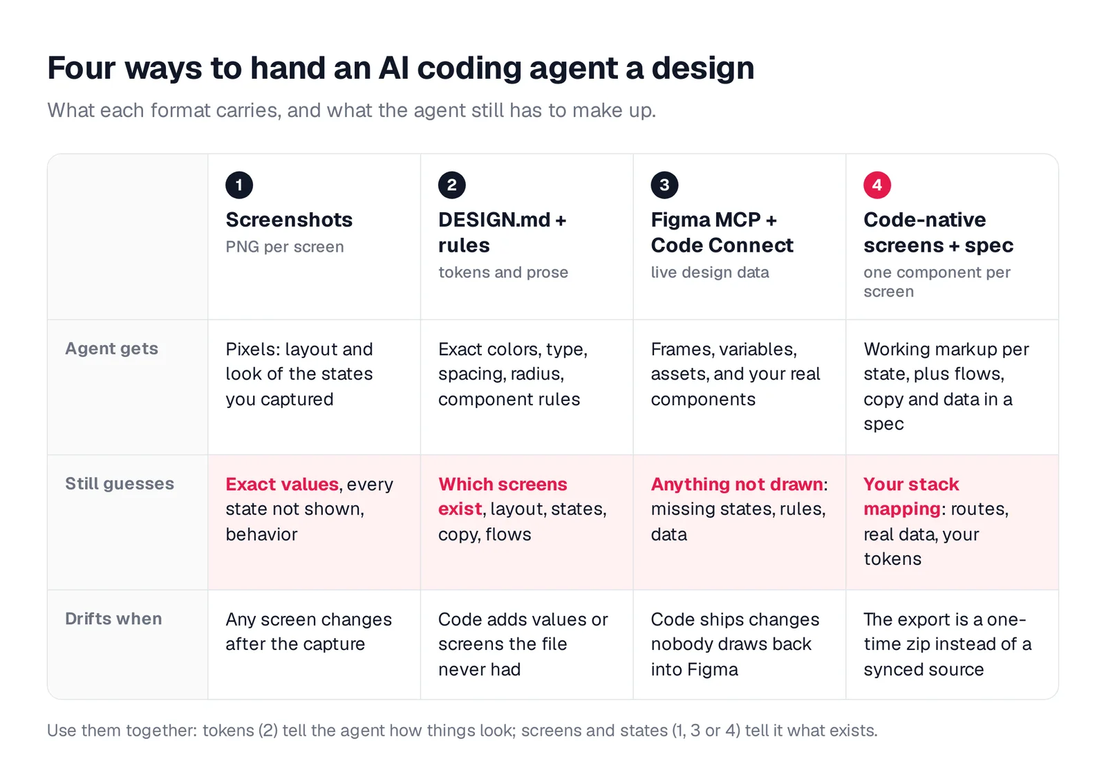
Caption: The four formats side by side. The pink row is what the agent fills in on its own.
What is DESIGN.md?
DESIGN.md is a plain-text design-system format for coding agents. Its YAML front matter defines colors, typography, rounding, spacing and components. Its Markdown body explains how and why to use them.
The Google Labs specification is Apache-2.0 licensed, uses version "alpha" and has 28,000+ GitHub stars. Its CLI can lint the file and export either Tailwind tokens or W3C design tokens.
The format has eight ordered sections: Overview, Colors, Typography, Layout, Elevation & Depth, Shapes, Components, and Do's and Don'ts. Tools preserve unknown sections, so you can add project-specific guidance without losing it.
Google Stitch calls DESIGN.md "the design counterpart to AGENTS.md." Every Stitch project export includes one. The getdesign.md library, created by VoltAgent, contains 550+ DESIGN.md "analyses" of well-known sites. Use those files to study structure, not to copy another company's brand.
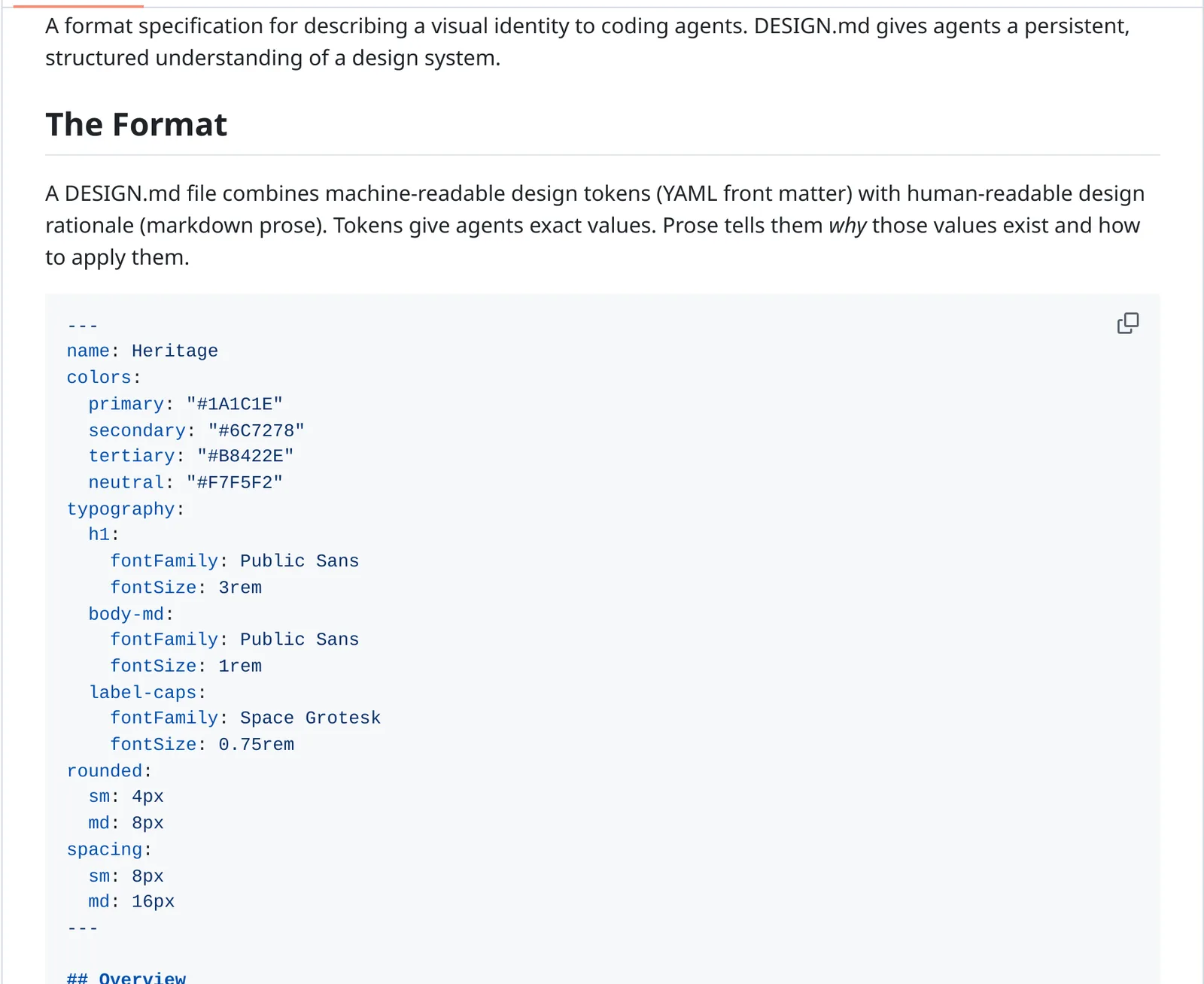
Caption: Tokens in front matter, rationale in prose. Source: google-labs-code/design.md on GitHub, captured October 2026.
What DESIGN.md misses
DESIGN.md describes visual identity. It does not provide a screen inventory, the layout of each screen, state triggers, product flows, behavior, final copy or data rules.
That gap matters because an interface can follow the brand while still inventing product decisions.
For a habit tracker, DESIGN.md can define how empty states look. SPEC.md must define the trigger, exact copy, actions and destinations:
2.5.1. If all habits are paused or archived (no active habits), Today shows a warm prompt: "No active habits right now. Want to pick one back up or add a new one?" with two action buttons: "See My Habits" (navigates to the Habits screen) and "Add a Habit" (navigates to AddEditHabit for a new habit).
Use an empty, error and loading states checklist to find these missing decisions before implementation.
Written guidance is also context, not enforcement. Claude Code treats CLAUDE.md as context rather than enforced configuration. Cursor makes the same distinction and recommends, "Use a linter instead," for copied style-guide rules. Put guidance in the agent's context, then make violations fail in tooling.
How Claude Code, Cursor and Codex load DESIGN.md
None of these agents loads DESIGN.md automatically. Connect the file through the agent's instruction system.
| Agent | Reads automatically | How to bring in DESIGN.md | Watch out for |
|---|---|---|---|
| Claude Code | CLAUDE.md; AGENTS.md when there's no CLAUDE.md (v2.1.277+) | @DESIGN.md import in CLAUDE.md, expanded at launch (up to 4 hops) | Target under 200 lines per CLAUDE.md; imports still cost context |
| Cursor | .cursor/rules/*.mdc, AGENTS.md (root and nested) | A rule scoped with globs that tells the agent to read DESIGN.md | @DESIGN.md in a rule isn't inlined; plain .md files in .cursor/rules are ignored; keep rules under 500 lines |
| Codex | AGENTS.md chain: ~/.codex, then repo root down to the working directory; AGENTS.override.md wins | An instruction in AGENTS.md to read DESIGN.md before UI work | Combined instructions stop at 32 KiB (project_doc_max_bytes) |
For Claude Code, import both design and product context:
# CLAUDE.md
@DESIGN.md
@SPEC.md
See the full Claude Code UI design workflow.
For Cursor, create a scoped rule:
---
globs: src/**/*.tsx, src/**/*.css
alwaysApply: false
---

- Before any UI change, read @DESIGN.md (tokens, components, states, ban list).
- Theme tokens only. No raw hex, no arbitrary values such as p-[13px].
- Every screen implements default, loading, empty and error states.
- If DESIGN.md and the screen designs don't cover something, stop and ask.
For Codex, put the contract in the applicable AGENTS.md:
## UI work
- Read DESIGN.md before changing any UI. Its tokens are the only allowed values.
- Screens and states live in design/screens/. Behavior and copy live in SPEC.md.
- If none of them cover what you need, stop and ask. Never invent a screen,
  state or piece of copy.
- Before you say done: npm run lint && npx playwright test
For more setup detail, see Codex for frontend design and getting designs into Cursor.
Four ways to give a coding agent a design
1. Screenshots
Screenshots give the agent layout, hierarchy and approximate styling.
design/screens/today--default.png
design/screens/today--empty.png
design/screens/today--error.png

Prompt: Build the Today screen from design/screens/today--*.png, one state
per file. Take colors, type and spacing from DESIGN.md tokens, not from the
pixels. If a state has no image, don't invent it: list it and ask me.
The agent still lacks exact values, uncaptured states, behavior and guarantees across screens. Screenshots also become stale after design changes. Use them for one-off implementation or a small number of screens.
2. DESIGN.md and rules files
This combination supplies exact reusable tokens, component rules and ban lists. It still does not describe the screen inventory, layouts, states, copy or flow.
Stitch warns that "Existing screens are not retroactively updated" when DESIGN.md changes. Treat the file as the styling layer for screen designs stored elsewhere, not as a complete handoff.
3. Figma MCP + Code Connect
Figma MCP can give an agent frame context, React + Tailwind by default, variables, a screenshot and assets. Code Connect maps Figma components to production components, encouraging reuse of elements such as Button.
Implement this frame: <link to the Figma frame>. Use Code Connect
components first, then src/components/ui. Read the variables with
get_variable_defs and map them to our theme tokens; no raw values.
Before coding, list every state this screen needs that isn't drawn
in the file, and ask me about each one.
The agent still lacks undrawn states, complete flows, business rules and the data model. Starter plans and View or Collab seats receive 20 tool calls a month. Code Connect requires a Dev or Full seat on Organization or Enterprise. See the MCP servers for UI design guide.
4. Code-native screens plus a spec
Code-native handoffs provide one component per screen, selectable states and a product spec containing flows, copy and the data model.
{state === "reviewCardVisible" && renderReviewCard()}
Options include Storybook, Mowgli with React + Tailwind per screen and SPEC.md, Stitch with HTML per screen, and a Claude Design handoff bundle.
The coding agent must still connect routes, real application data and project tokens. A one-time export can become stale when code changes, so preserve a return path to the design source. Read more about why designs should be code and design handoff to coding agents.
Free DESIGN.md template
This template uses YAML tokens followed by the eight standard sections in their required order. It adds three practical extensions: States, Source of truth, and When this file does not cover something.
The values describe a habit tracker. Replace every value with your own. The first pass had two component pairs below WCAG AA, at 4.42:1 and 4.25:1. Running npx @google/design.md lint against the corrected version produces 0 errors and 0 warnings.
---
version: alpha
name: Tally
description: Mobile habit tracker. Calm, warm, zero guilt. Replace every value below with yours.
colors:
  primary: "#4F6650"
  on-primary: "#F5F1EA"
  secondary: "#7A9279"
  tertiary: "#C97B5A"
  neutral: "#F5F1EA"
  surface: "#FFFFFF"
  on-surface: "#2B2A26"
  muted: "#B5C4B0"
  outline: "#E8E4DD"
  error: "#B3261E"
typography:
  headline-display:
    fontFamily: Fraunces
    fontSize: 40px
    fontWeight: 300
    lineHeight: 1.1
  headline-md:
    fontFamily: Fraunces
    fontSize: 22px
    fontWeight: 400
    lineHeight: 1.25
  body-md:
    fontFamily: Inter
    fontSize: 15px
    fontWeight: 400
    lineHeight: 1.5
  body-sm:
    fontFamily: Inter
    fontSize: 13px
    fontWeight: 400
    lineHeight: 1.45
  label-md:
    fontFamily: Inter
    fontSize: 12px
    fontWeight: 500
    lineHeight: 1.2
    letterSpacing: 0.15em
rounded:
  sm: 10px
  md: 12px
  lg: 16px
  xl: 20px
  full: 9999px
spacing:
  xs: 4px
  sm: 8px
  md: 16px
  lg: 24px
  xl: 32px
  screen-x: 24px
components:
  button-primary:
    backgroundColor: "{colors.primary}"
    textColor: "{colors.on-primary}"
    typography: "{typography.body-md}"
    rounded: "{rounded.full}"
    height: 48px
    padding: 16px
  button-secondary:
    backgroundColor: "{colors.surface}"
    textColor: "{colors.primary}"
    rounded: "{rounded.full}"
    height: 48px
  card:
    backgroundColor: "{colors.surface}"
    textColor: "{colors.on-surface}"
    rounded: "{rounded.lg}"
    padding: 20px
  card-highlight:
    backgroundColor: "{colors.primary}"
    textColor: "{colors.on-primary}"
    rounded: "{rounded.lg}"
  chip-selected:
    backgroundColor: "{colors.primary}"
    textColor: "{colors.on-primary}"
    rounded: "{rounded.full}"
  chip-idle:
    backgroundColor: "{colors.outline}"
    textColor: "{colors.on-surface}"
    rounded: "{rounded.full}"
  input:
    backgroundColor: "{colors.surface}"
    textColor: "{colors.on-surface}"
    rounded: "{rounded.md}"
    height: 48px
  input-error-text:
    backgroundColor: "{colors.surface}"
    textColor: "{colors.error}"
  page:
    backgroundColor: "{colors.neutral}"
    textColor: "{colors.on-surface}"
  check-done:
    backgroundColor: "{colors.secondary}"
    size: 28px
  badge:
    backgroundColor: "{colors.tertiary}"
    size: 8px
  divider:
    backgroundColor: "{colors.outline}"
    height: 1px
  hint:
    backgroundColor: "{colors.muted}"
    textColor: "{colors.on-surface}"
---

# Tally design system

## Overview

Calm, warm, unhurried. A paper journal, not a fitness dashboard. Generous
whitespace, one idea per screen, encouraging copy. Mobile first (390x844),
single column, bottom tab bar with 4 tabs.

## Colors

- **Primary (#4F6650):** deep sage. The one main action per screen, links, focus rings.
- **Secondary (#7A9279):** sage. Check marks, filled dots and progress. Not for text.
- **Tertiary (#C97B5A):** clay. Used sparingly: unread badges and one accent per screen.
- **Neutral (#F5F1EA):** linen page background. Never pure white pages.
- **On-surface (#2B2A26):** ink for all body text. Never pure black.
- **Error (#B3261E):** inline error text only. Never red X marks for missed days.

## Typography

Fraunces (display, light or italic) for screen titles only. Inter for everything
else. Sizes come from the tokens; no other sizes. Sentence case everywhere
except label-md, which is the only uppercase style.

## Layout

8px rhythm with a 4px half step. Screen side padding 24px. Content max width
390px on mobile, 640px centered on tablet and desktop. Lists are single column;
never put feature cards in a 3-column grid.

## Elevation & Depth

Mostly flat. Cards use one soft shadow (0 2px 16px, ink at 4% opacity). Sheets
and modals use one stronger shadow. No other shadows, no glows, no gradients.

## Shapes

Pills (full) for buttons and chips, 16px cards, 12px inputs, 20px sheets.
Do not mix sharp and rounded corners on one screen.

## Components

Reuse src/components/ui before creating anything. Icons: lucide-react only,
1.5px stroke. Check circles are 28px. Buttons are 48px tall. Bottom sheet for
anything that is not a full screen.

## Do's and Don'ts

- Do use primary for one action per screen.
- Do write empty states as: what is missing, why it matters, one action.
- Don't use purple, indigo or blue-to-purple gradients, or gradient text.
- Don't use emoji as icons, or arrows appended to every button label.
- Don't use a centered hero with three identical cards.
- Don't use raw hex or arbitrary values in components; tokens only.
- Don't use red, crosses or "streak lost" language for missed days.

## States

Every screen implements: default, loading (skeleton in the final layout),
empty (what is missing + one action), error (what happened + retry), and
success feedback. Forms add validation errors. Destructive actions add a
confirm step. Screen-specific states are listed in the screen inventory.

## Source of truth

- Tokens: this file. src/styles/theme.css is generated from it; never edit by hand.
- Screens and states: design/screens/ (one file per screen, one entry per state).
- Behavior, copy and data: SPEC.md.

## When this file does not cover something

Stop and ask. Do not invent a new color, size, radius, shadow, component,
screen, state or piece of copy. List what is missing and propose 2 options
that use existing tokens.
Lint and export it with:
npx @google/design.md lint DESIGN.md
npx @google/design.md export --format css-tailwind DESIGN.md > src/styles/theme.css
Tailwind v4 output uses @theme, with values such as --color-primary: #4f6650;, --text-body-md: 15px; and --radius-lg: 16px;. Those tokens produce utilities including bg-primary rounded-lg. Use json-tailwind for Tailwind v3 or dtcg for W3C design tokens.
A specific token system also helps avoid the defaults described in why every AI-built app looks the same.
How to keep design and code in sync
Drift can start with one raw color, a code-only copy edit or one undesigned screen. Every route into code needs a check, and code-first changes need a route back to the design source.
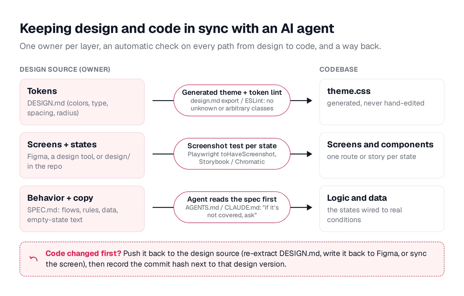
Caption: One owner per layer, a check on the way into code, and a path back when code changes first.
1. Make off-token values fail lint
In Tailwind v4, resetting a namespace to initial removes defaults such as bg-red-500. Import only the generated project theme afterward.
/* src/styles/app.css */
@import "tailwindcss";
@theme {
  --color-*: initial;
}
@import "./theme.css"; /* generated from DESIGN.md */
Add eslint-plugin-better-tailwindcss to reject unknown classes and arbitrary values:
// eslint.config.js
import betterTailwind from "eslint-plugin-better-tailwindcss";
import { defineConfig } from "eslint/config";
import { parser } from "typescript-eslint";

export default defineConfig([
  {
    files: ["src/**/*.tsx"],
    languageOptions: { parser, parserOptions: { ecmaFeatures: { jsx: true } } },
    plugins: { "better-tailwindcss": betterTailwind },
    settings: { "better-tailwindcss": { entryPoint: "src/styles/app.css" } },
    rules: {
      "better-tailwindcss/no-unknown-classes": "error",
      "better-tailwindcss/no-restricted-classes": ["error", {
        restrict: [{ pattern: "\\[([^\\[\\]]*?)\\](?!:)", message: "Arbitrary value: use a DESIGN.md token." }]
      }]
    }
  }
]);
The result is actionable:
src/components/HabitCard.tsx
  5:39  error  Unknown class detected: bg-indigo-500   better-tailwindcss/no-unknown-classes
  5:58  error  Unknown class detected: text-white      better-tailwindcss/no-unknown-classes
  6:21  error  Arbitrary value: use a DESIGN.md token  better-tailwindcss/no-restricted-classes
  6:36  error  Arbitrary value: use a DESIGN.md token  better-tailwindcss/no-restricted-classes

4 problems (4 errors, 0 warnings)
After the namespace reset, white also needs a declared token. Require the coding agent to run lint before declaring the task complete.
2. Lint and diff DESIGN.md in CI
The lint command exits with code 1 on errors. The diff command exits with code 1 on regressions.
git show origin/main:DESIGN.md > DESIGN.base.md
npx @google/design.md lint DESIGN.md
npx @google/design.md diff DESIGN.base.md DESIGN.md
Also regenerate theme.css in CI and fail if it differs from the committed file. That prevents manual edits to generated tokens.
3. Screenshot-test every state
Give each state a preview URL or Storybook story, then compare it with a Playwright baseline.
// tests/states.spec.ts
import { test, expect } from "@playwright/test";

const screens: Record<string, string[]> = {
  today: ["default", "allHabitsChecked", "noActiveHabits", "reviewCardVisible"],
  progress: ["default", "dayDetailOpen"],
};

for (const [screen, states] of Object.entries(screens)) {
  for (const state of states) {
    test(`${screen} / ${state}`, async ({ page }) => {
      await page.setViewportSize({ width: 390, height: 844 });
      await page.goto(`/preview/${screen}?state=${state}`);
      await expect(page).toHaveScreenshot(`${screen}-${state}.png`, { fullPage: true });
    });
  }
}
The first run creates baselines. Later runs fail on visual changes. Approve an intentional change with npx playwright test --update-snapshots. Generate baselines in the same environment as CI because rendering varies by operating system.
For Storybook, run npx storybook@latest add @chromatic-com/storybook; each story becomes a visual test. Build the complete screen x state matrix before capturing it.
4. Give each layer one owner
Use DESIGN.md for tokens and generated theme.css for code output. Never edit that generated file manually. Keep screens and states in the design source, and put behavior, copy and data in SPEC.md.
You can add a Claude Code PreToolUse hook for harder enforcement. The same ownership model fits spec-driven app development.
5. Push code-first changes back
Maintain a shared version baseline between the design and code.
Stitch's /stitch skill can "extract and sync a DESIGN.md" from code. Figma write tools such as generate_figma_design can place code UI back on the canvas. With Mowgli, Claude Code, Codex, Cursor or another coding agent can push an existing codebase into the design project and pull updated designs back through MCP, the agent skill or CLI.
Mowgli for a complete multi-screen app handoff
Mowgli fits when you need to design a whole multi-screen app from a product spec, including every screen and state, with two-way access for coding agents.
Mowgli is an AI product-design tool. A short questionnaire becomes a product spec (PRD); Mowgli then proposes visual themes and generates every screen of the app on an infinite canvas (30+ screens, including empty and error states). You iterate by chat, click through a prototype, and export to Figma, React + Tailwind, or coding agents via MCP.
Start by describing the product, importing Figma or importing an existing codebase through the agent skill or MCP. The questionnaire covers users, flows and edge cases. The resulting spec includes user journeys, constraints and the data model, and stays synchronized with the design.
You can choose among 16+ styles with style steering, generate every screen and state, iterate through chat, inspect version history and use interactive prototypes. Export the result to Figma, React + Tailwind or an AI-ready package.
The agent-facing project contains SPEC.md for the pitch, user journeys and data model; frontend.xml for screens and states; and one <ScreenId>.tsx file per screen. Each screen uses React + Tailwind, lucide-react icons and one state prop. The canvas renders real code.
Mowgli has an MCP server, CLI and agent skill, so Claude Code, Cursor and Codex can read every screen, its states and the product spec, and push code changes back into the design.
The MCP server is available at app.mowgli.ai/mcp, uses Streamable HTTP and is listed in the official MCP Registry as io.github.mowgli-ai/mowgli. Install the agent skill with npx skills add mowgli-ai/skills, or use the mowgli-cli npm CLI.
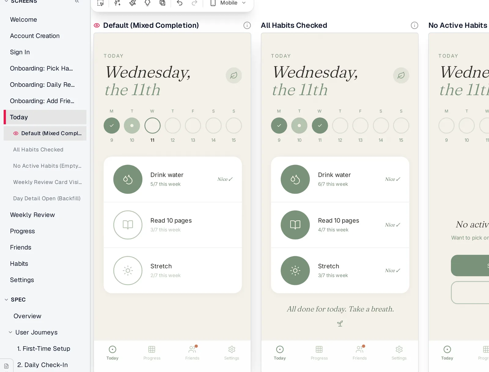
Caption: The habit tracker demo in Mowgli: screens, states and spec in one project. Captured October 2026.
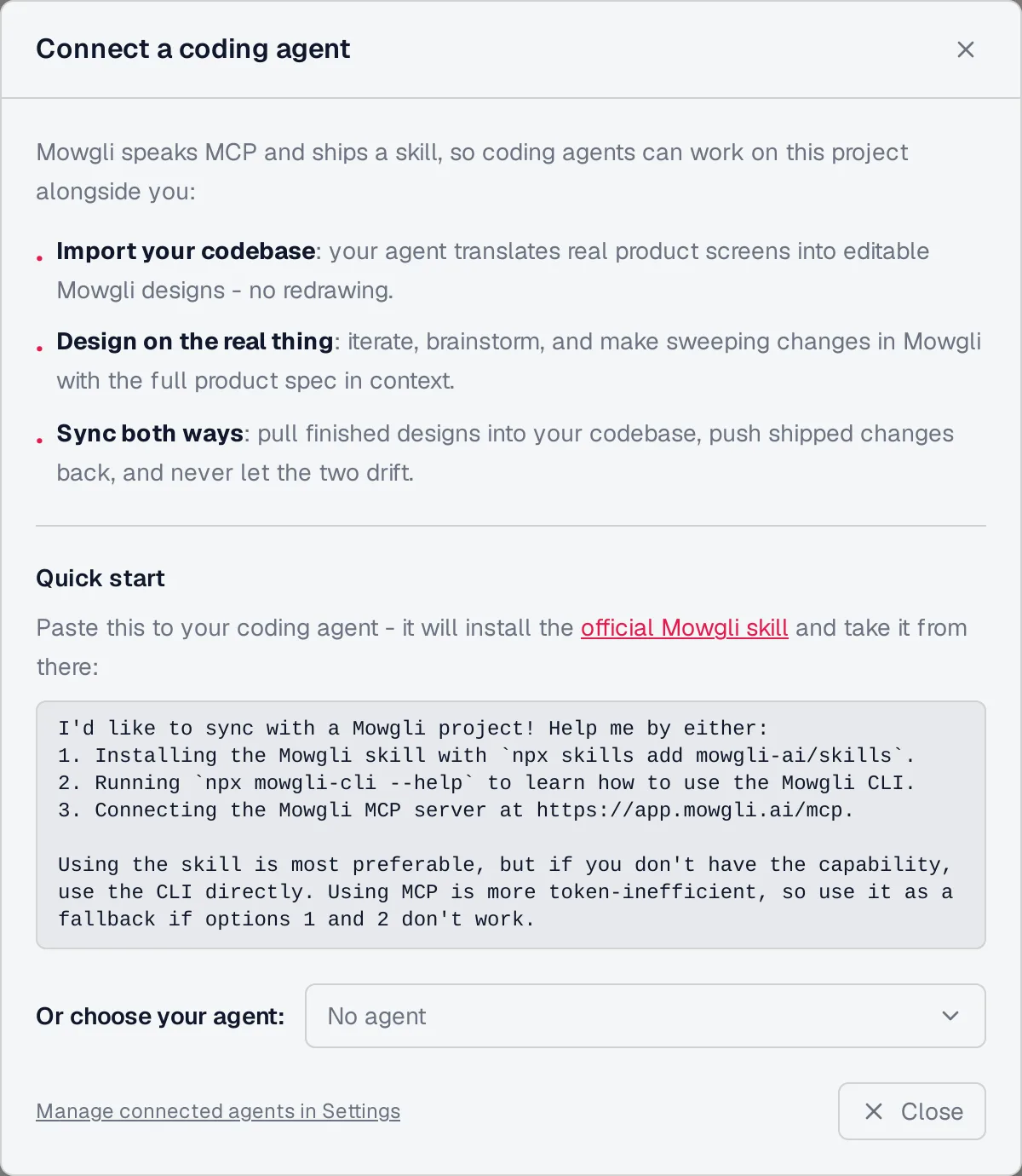
Caption: Mowgli's Connect a coding agent dialog (captured October 2026).
Use these prompts to make the version boundary explicit:
Design -> code:
Read the Mowgli project "Habit tracker": SPEC.md, frontend.xml and each
screen's .tsx. Implement them screen by screen in this repo, mapping each
screen's styles to tokens from DESIGN.md (ask me before adding a new token).
Wire each Mowgli state to the data condition the spec describes. Run lint
and the screenshot tests, then record this commit in the version metadata.

Code -> design:
Since the commit recorded in the latest Mowgli version, which screens
changed? Push those source files (and the components and theme they import)
into the Mowgli project so the screens, frontend.xml and SPEC.md match the
code. Then record the new commit hash on the resulting version.
Mowgli designs and prototypes; to host and ship, you hand off to a builder or coding agent (Claude Code, Codex, Cursor, Lovable).
Free to start (300 credits); credit packs from $12; plans from $15/mo.
See Mowgli MCP, the Mowgli agent skill, spec-driven design and the workflow for pushing an existing codebase in.
Verdict
DESIGN.md is necessary when you want exact, reusable design tokens, but it cannot define a complete product interface by itself.
A dependable handoff needs DESIGN.md, every screen in every state, SPEC.md, an "ask, don't invent" instruction, token linting and visual regression tests.
Use screenshots for isolated implementation. Use Figma MCP and Code Connect when the product is owned in Figma. Use code-native screens when agents need an executable handoff. Use Mowgli for a whole multi-screen app whose spec, screens and states must be available to Claude Code, Codex, Cursor or another coding agent in both directions.
FAQ
Is DESIGN.md enough to stop an AI coding agent inventing UI?
No. DESIGN.md governs visual tokens and rules, so you must add every screen and state, a behavior and copy spec, and an instruction to ask about gaps. Enforce the tokens with linting instead of relying only on context files.
How do I use DESIGN.md with Claude Code?
Import DESIGN.md from CLAUDE.md with @DESIGN.md. Import @SPEC.md beside it, then add lint and screenshot tests to the definition of done.
How do I use DESIGN.md with Cursor?
Add a scoped .cursor/rules/*.mdc rule that tells Cursor to read DESIGN.md. Put non-negotiable constraints in the rule body because @DESIGN.md is not inlined, and keep rules under 500 lines.
How do I use DESIGN.md with Codex?
Tell Codex to read DESIGN.md from the applicable AGENTS.md. Keep screens and states in a named design directory, put behavior in SPEC.md, and account for the 32 KiB combined instruction limit.
How do I keep design and code in sync when using AI?
Assign one owner to tokens, screens and states, and behavior and copy. Generate theme code from DESIGN.md, lint off-token values, screenshot-test every state, and push code-first changes back to the design source while preserving a shared version baseline.
What is the best design handoff for a whole app?
Use code-native screens plus a product spec when coding agents need executable designs. Use Mowgli when the job includes every screen and state, 30+ screens and states, a synchronized product spec, and two-way work with Claude Code, Codex, Cursor or another coding agent. Use Figma MCP and Code Connect when the product is owned in Figma and the required frames and states have been drawn.
Sources
- Google Labs DESIGN.md specification
- Design Tokens Format Module 2025.10
- Google Stitch DESIGN.md overview
- Using DESIGN.md in Google Stitch
- Google Stitch CLI overview
- Google Stitch
- getdesign.md
- Claude Code memory documentation
- Claude Code hooks guide
- Cursor rules documentation
- Codex AGENTS.md configuration
- Figma MCP tools and prompts
- Figma MCP access and rate limits
- Figma Code Connect
- Tailwind CSS theme variables
- eslint-plugin-better-tailwindcss
- Playwright visual comparisons
- Storybook visual testing
- Mowgli agent skill source
- Mowgli
- Mowgli MCP server
- Mowgli pricing
- Spec-driven design
- Mowgli MCP
- Mowgli agent skill
- Google Stitch comparison
- Empty, error and loading states
- Claude Code UI design workflow
- Codex for frontend design
- Getting designs into Cursor
- MCP servers for UI design
- Why designs should be code
- Design handoff to coding agents
- Why AI-built apps look the same
- Spec-driven app development
- Redesigning a vibe-coded app without rebuilding