How to Redesign a Vibe-Coded App Without Rebuilding It
Redesign a vibe-coded app safely by changing tokens, components and layouts in batches while preserving logic, then verify it with screenshot and flow tests.
The short answer: redesign the interface, not the app
You can redesign a working vibe-coded app without rebuilding it. Preserve its behavior, then change three visual layers in order: theme tokens, shared components, and screen layouts and copy. Do not alter hooks, state, handlers, data fetching, API calls, routing, authentication, or validation during the visual pass.
Use this six-step process:
- Audit every screen and state.
- Compare three visual directions.
- Lock tokens and shared components.
- Redesign screens in a safe order.
- Verify that behavior is unchanged.
- Ship in batches.
If the problem is limited to color or typography, edit tokens. If two or three screens are weak, redesign them manually in controlled batches. Use Mowgli when every screen and state needs one coherent direction. For an app already hosted on Replit, Replit Design offers a one-pass restyle path.
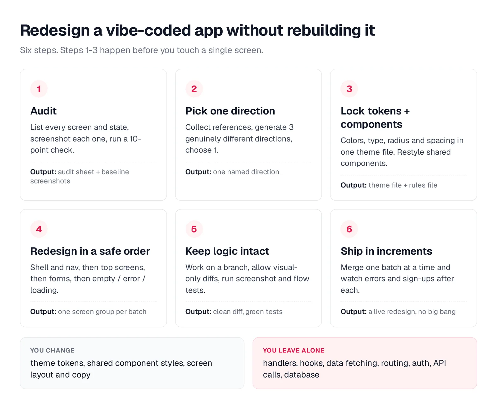
Caption: The whole process. Steps 1-3 happen before you touch a single screen.
Redesign or rebuild? A two-minute check
A redesign changes visual hierarchy, theme, components, layout, and copy while keeping code paths, data, and behavior intact.
Repair or rebuild first when logic, architecture, performance, security, or data integrity is the real problem.
| Redesign if... | Fix or rebuild first if... |
|---|---|
| Sign-up, the core action and payments work end to end | Core flows fail or lose data |
| The data model fits the product | Every new feature fights the schema |
| Complaints are "looks amateur", "confusing", "inconsistent" | Complaints are bugs, security or speed |
| Screens reuse some shared components | Touching one screen breaks three others |
A visual pass cannot repair a broken product foundation.
Step 1 - Audit every screen, state and styling source
Create a complete, screenshotted inventory before editing code. Use Lovable in Plan mode, Bolt in Plan Mode, Cursor Agent, or Replit Agent with Plan on.
Audit this app before a redesign. Do not change any code.
1. List every route and screen. For each: its job in one sentence,
   its component file, and every state it can be in (default, loading,
   empty, error, success, permission denied, long content). Mark the
   states that are not implemented.
2. List where styling lives: theme files, CSS variables, tailwind
   config, and the shared components in components/ui.
3. Count raw hex colors and arbitrary Tailwind values (like p-[13px])
   inside components, and list every font family in use.
Output three tables.
The result should include a route and screen table, a screen-by-state table, and a styling inconsistency table. Use the empty, error and loading states checklist to find states that the happy path hides.
Screenshot every route at phone and desktop widths. Add a storageState login for authenticated routes.
// audit-screens.mjs - run with: node audit-screens.mjs
import { chromium } from 'playwright';
const routes = ['/', '/dashboard', '/projects', '/projects/1', '/settings'];
const browser = await chromium.launch();
for (const width of [390, 1440]) {
  const page = await browser.newPage({ viewport: { width, height: 900 } });
  for (const r of routes) {
    await page.goto('http://localhost:5173' + r, { waitUntil: 'networkidle' });
    await page.screenshot({ path: `audit/${width}${r === '/' ? '_home' : r.replaceAll('/', '_')}.png`, fullPage: true });
  }
}
await browser.close();
Turn each "yes" into a redesign task:
- Does the app use more than two typefaces, or one default face everywhere?
- Are raw hex colors stored inside components instead of theme tokens?
- Is there more than one primary filled button on a screen?
- Does spacing fall outside a 4 or 8 px scale?
- Do cards, inputs, and buttons use inconsistent radii?
- Are cards nested inside cards?
- Is body-text contrast below the WCAG 4.5:1 requirement?
- Is the heading hierarchy flat?
- Are loading, empty, or error states missing?
- Does the layout overflow or break at 390 px?
Keep the screenshots as Step 5 baselines.
Step 2 - Choose one direction from three
Gather three to five reference screens from products familiar to your target users. Mobbin provides a searchable mobile and web screen library; its homepage showed 621,500 in October 2026.
Test directions on the product's hardest screen, not its landing page.
Propose 3 genuinely different visual directions for this app, using the
attached reference screenshots. Show each one on our busiest screen
([Dashboard]), not the landing page. For each: a name, 5-6 named colors
with hex values, a type pairing, corner radius and density, and one
sentence on why it fits [who the users are]. Avoid purple or indigo
gradients, a single default typeface, and a centered hero with three
cards. Do not change the app's code yet.
Compare each direction on a dense dashboard, table, or form. Require named references, exact colors, typography, radius, and density. Reject three palette variations of the same layout. See why AI-built apps look the same and how to approach multiple design directions.
Lovable Design guidance offers three directions when asked to redesign, modernize, or improve an existing site. Existing projects can receive three options per section. A Mowgli moodboard previews styles on the app's real screens.
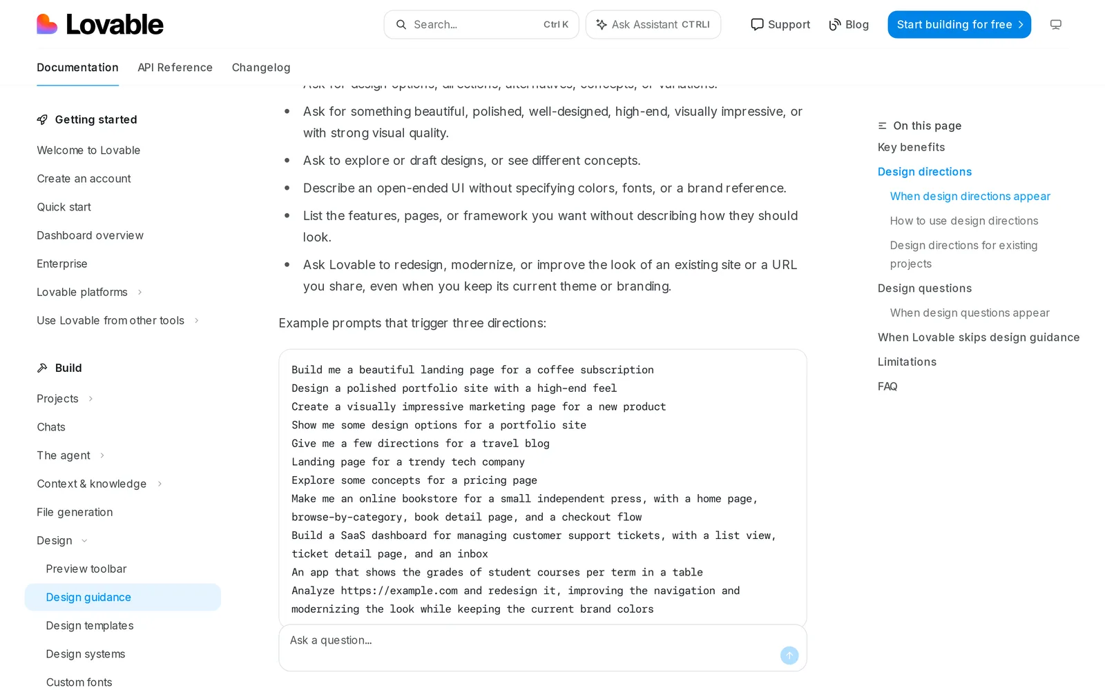
Caption: Lovable's docs list "redesign, modernize, or improve the look" as a trigger for three directions. Source: Lovable website, captured October 2026.
Step 3 - Put the direction into tokens and components
Implement the direction in this order: theme variables, shared component variants, then screen-specific layouts. This creates one theme source and lets reusable components carry the system across the app.
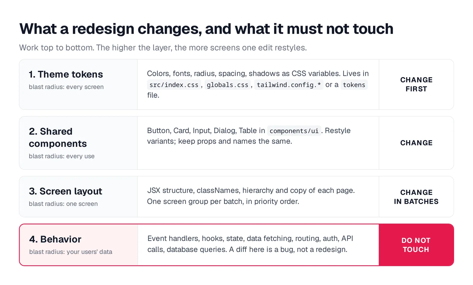
Caption: Work top to bottom. A token edit restyles every screen with zero logic risk.
Check package.json and components.json to identify Tailwind and shadcn/ui. In shadcn/ui, theme variables live under :root and .dark. Relevant tokens include background, foreground, primary, muted, accent, border, ring, and radius.
| Tool | Where the tokens live | Where design rules go | Built-in help |
|---|---|---|---|
| Lovable | CSS variables in src/styles.css for projects since May 13, 2026, or src/index.css plus tailwind.config for older projects | Project settings -> Knowledge, up to 10,000 characters | Design guidance, preview toolbar |
| Bolt | Depends on the stack; inspect tailwind.config.* and the global CSS file | Project settings -> Knowledge, or root agents.md | Select tool visual edits, Plan Mode |
| Cursor | Your stack; with shadcn/ui, the global CSS file | .cursor/rules/*.mdc or AGENTS.md | Design Mode |
| Replit | tokens.json, feeding CSS variables such as src/index.css | DESIGN.md, Skills | Apply a design to an existing app |
Files in .cursor/rules require the .mdc extension. Cursor ignores plain .md files there, so use AGENTS.md when you need plain Markdown.
tweakcn is a visual editor for shadcn/ui tokens with component previews and CSS export.
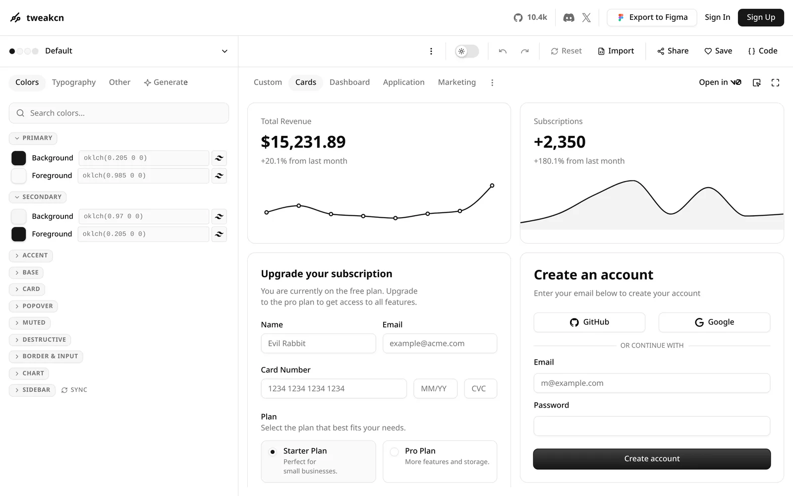
Caption: tweakcn edits shadcn/ui tokens and previews them on cards, forms and charts. Source: tweakcn website, captured October 2026.
Apply the chosen direction to the theme only. Edit [src/index.css] and
[tailwind.config.ts]: update the CSS variables (background, foreground,
primary, secondary, muted, accent, destructive, border, input, ring,
radius) and the font families. Keep the variable names and the color
format the file already uses. Then restyle the variants in components/ui
(button, card, input, badge, table, dialog) to use the tokens. Do not
change component props or names, or any file outside these two places.
Save this persistent rule as .cursor/rules/design-system.mdc, Lovable Knowledge, Bolt agents.md, or Replit DESIGN.md.
---
description: Design system and redesign guardrails for all UI work
globs: src/**/*.tsx,src/**/*.css
alwaysApply: false
---
# Design system (source of truth: src/index.css)
- Colors: theme tokens only (bg-background, text-foreground, bg-primary).
  No raw hex or arbitrary color values in components.
- Type: [Display face] for h1-h2, [Body face] for everything else.
  Scale 12 / 14 / 16 / 20 / 24 / 32.
- Spacing on a 4 px grid. Radius from var(--radius) and its scale only.
- One primary button per screen. No cards inside cards.
- Reuse components/ui before creating anything new.
# Redesign guardrails
- Visual changes only: never modify hooks, state, handlers, data
  fetching, routing, auth, validation or API calls during a restyle.
- Every list and data view has loading, empty and error states.
Rules help, but DESIGN.md is not enough without tokens, reusable components, and verification.
Step 4 - Restyle screens in a safe order
Establish reusable patterns before touching high-risk forms.
| Order | What | Why |
|---|---|---|
| 1 | App shell: nav, sidebar, header, page container | Appears on every screen and fixes consistency fastest |
| 2 | The 2-3 most-used screens: home, main list, detail | Covers where users spend their time |
| 3 | Forms that create data: sign-up, onboarding, checkout | Highest logic risk, so patterns should settle first |
| 4 | Empty, error, and loading states | The audit shows which are missing |
| 5 | Settings, admin, everything else | Lower-traffic screens can follow established patterns |
Use one prompt per screen or tightly related group.
Restyle [ProjectsPage] to follow the design rules and the attached target.
Visual changes only: JSX structure, classNames, layout and copy. Do not
change hooks, state, handlers, data fetching, routing, validation or API
calls. If a visual change seems to need one, stop and ask. Add loading,
empty and error states using the data flags that already exist. List
every file you changed.
For small edits, use the Lovable preview toolbar, Bolt Select tool, Cursor Design Mode with Cmd + Shift + D, or Replit Visual Editor. Bolt Select is free until saved, and Replit direct edits use no AI credits.
Replit also supports a whole-app path. Select a Design frame, choose Build..., then apply it to an existing app. Agent creates a checkpoint before rewriting the styling. Replit describes applying a saved design system as "a real rebuild" of the styling layer and shows a time and credits warning first.
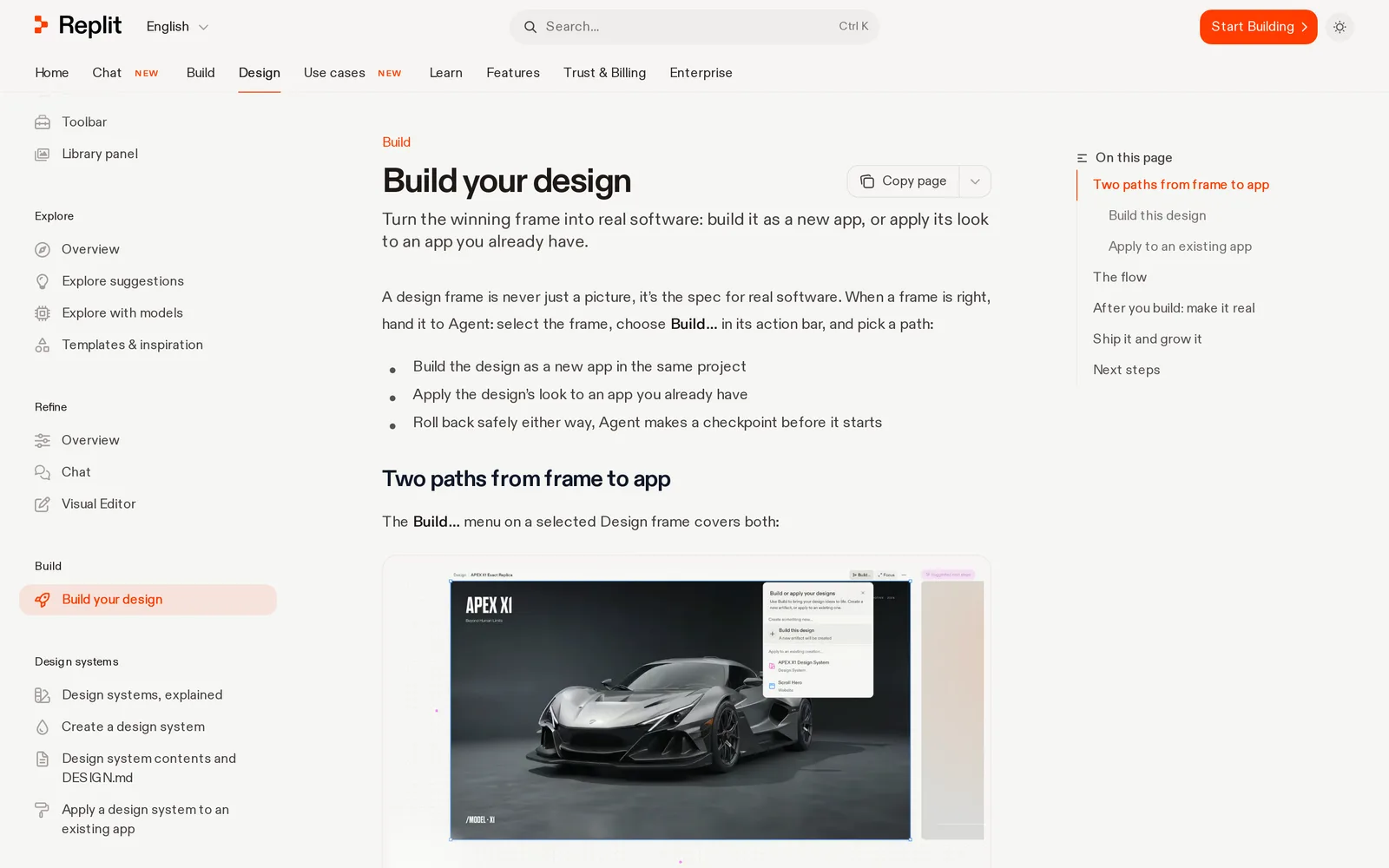
Caption: Replit Design can apply a frame's look to an app you already built. Source: Replit website, captured October 2026.
Step 5 - Prove the logic stayed intact
Work on a branch. Lovable syncs and edits one GitHub branch at a time, selected in GitHub settings. Bolt creates branches from its GitHub menu. Replit provides a Git pane, Agent checkpoints, and Rollback here. Cursor uses standard git.
A visual-only diff should mostly contain layout, markup, copy, and className changes. Review anything involving state, effects, queries, requests, handlers, or navigation.
git diff main -U0 -- src | grep -E '^[+-]' \
  | grep -E 'useEffect|useState|useQuery|fetch\(|axios|supabase|onClick=|onSubmit=|navigate\(|router\.'
Create screenshot baselines on main, then run them on the redesign branch. Untouched screens should match. For intentionally redesigned screens, accept the new baselines with npx playwright test --update-snapshots. Playwright's toHaveScreenshot() saves the first baseline and reports later visual differences.
// tests/screens.spec.ts
import { test, expect } from '@playwright/test';
const routes = ['/dashboard', '/projects', '/projects/1', '/settings'];
for (const r of routes) {
  test(`screen ${r}`, async ({ page }) => {
    await page.goto(r);
    await page.mouse.move(-1, -1);
    await expect(page).toHaveScreenshot({
      fullPage: true,
      maxDiffPixels: 100,
      mask: [page.locator('[data-dynamic]')], // timestamps, avatars, charts
    });
  });
}
Before Step 3, ask Claude Code, Codex, Cursor or another coding agent to write three to five outcome-based flow tests. Cover sign-up, creating the core object, editing it, and paying when relevant. Require the same flows to pass before and after every batch.
Step 6 - Ship the redesign in increments
Merge a batch only after its screenshot and flow tests pass. Release token changes first so old and new screens remain visually related during the transition.
After deployment, watch errors and the main conversion for a day or two. Continue after the batch is stable.
Avoid a redesign branch that stays open for weeks. Lovable, Bolt, and Replit commit during prompting, so long-lived branches accumulate merge conflicts.
Paste-ready kickoff prompts for each builder
For Lovable, use Plan mode with your saved knowledge. See more Lovable prompts and the Lovable de-slopification pass.
I want to redesign this app's look without changing what it does. Follow
the design rules in project knowledge. Plan the work in batches: 1) theme
tokens in the global CSS and tailwind config, 2) components/ui variants,
3) the app shell, 4) [Dashboard, Projects, Project detail], 5) forms,
6) empty, loading and error states. For each batch, list the files you
will touch, and confirm none of them changes Supabase queries, auth,
routing or form validation. Then wait for me to approve batch 1.
For Bolt, use Plan Mode and adapt this Bolt prompt.
Plan only, no code yet. My app works but looks amateur. Using the
rules in agents.md, propose a restyle in batches (tokens, shared
components, shell, top screens, forms, states) and list the files per
batch. Visual changes only: no changes to data, auth or routing.
For Cursor, use Agent with the saved rule. See Cursor prompts and how to get designs into Cursor.
Follow @design-system. Restyle the app shell and [DashboardPage] only.
Visual-only diff. Afterwards run the Playwright screenshot tests and
tell me which screens changed.
For Replit, use Agent with Plan on. Adapt this Replit prompt.
Restyle this app to match DESIGN.md without changing behavior. Start
with the theme tokens and shared components, then the [Dashboard]
screen. Make a checkpoint before each batch and list what changed.
Redesign every screen and state together with Mowgli
Use this path when a working app needs one coherent direction across its entire interface, including loading, empty, error, modal, and dropdown states.
We make Mowgli.
Mowgli turns a product idea into a full multi-screen app design: it writes the spec first, then designs every screen. For an existing product, you import the codebase through Claude Code, Codex, Cursor or another coding agent, explore directions on a moodboard, redesign every screen and state together, and pull approved screens back one at a time.
1. Push the existing codebase into Mowgli
Select Import my existing codebase. For Lovable, Bolt, and Replit apps, sync to GitHub and clone the repository first.
Copy the quick-start prompt from Connect MCP into Claude Code, Codex, or Cursor. It installs the Mowgli skill with npx skills add mowgli-ai/skills. A CLI and MCP server are also available as fallback connections.
The imported project includes editable screens, states, and an inferred spec. The free 300 credits can cover pushing an existing codebase in and making changes.
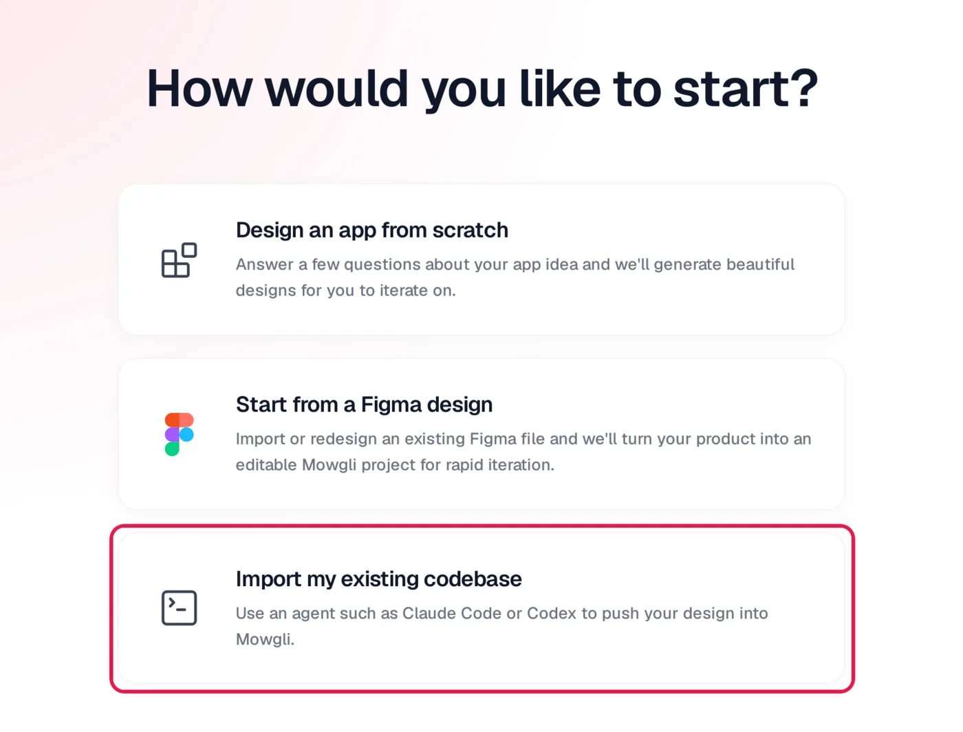
Caption: Starting a Mowgli project from an existing codebase.
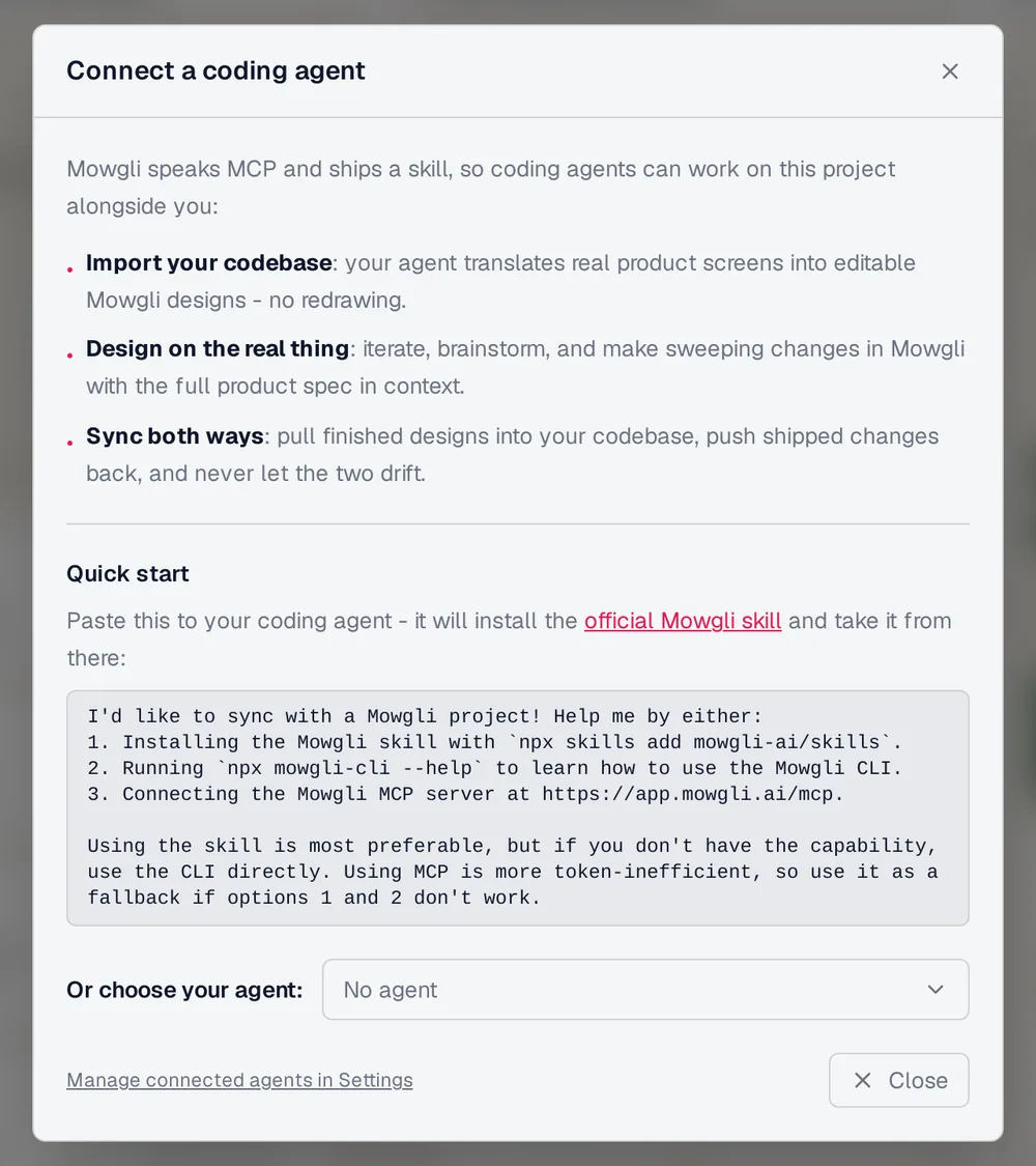
Caption: The Connect MCP dialog gives Claude Code, Codex or Cursor one prompt that installs the skill.
Push this app into my Mowgli project "[name]": every screen with all of
its states (loading, empty, error, modals, dropdowns), and infer the spec
from the routes and data model. Work in small batches of screens.
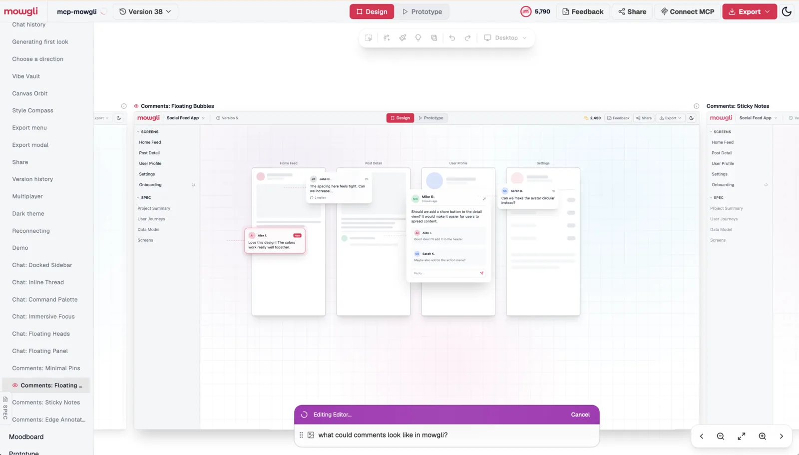
Caption: Mowgli's own product, pushed in from its codebase, used to explore comment UI variants.
2. Explore directions on the moodboard
Open the project menu, choose Redesign, upload references, and mix styles. Preview four directions on a real screen before applying one throughout the app. The full sequence is shown in the redesign flow.
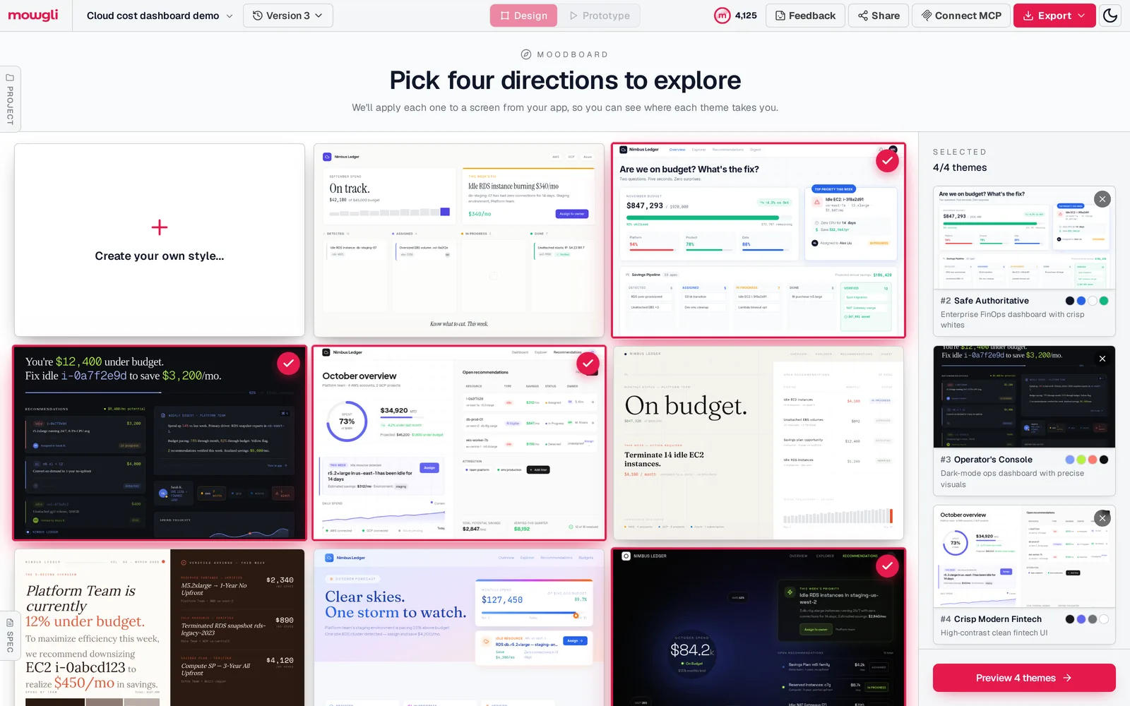
Caption: The moodboard for our cloud cost dashboard demo.
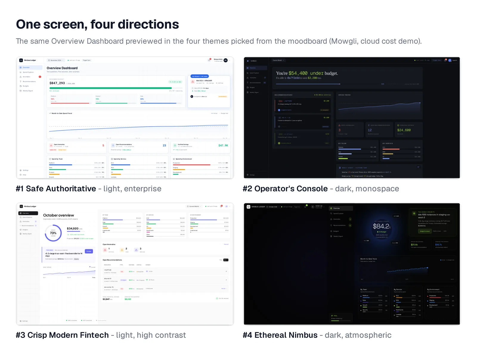
Caption: The demo's dashboard in four directions, previewed before the rest of the app is redesigned.
3. Generate every screen and state
Apply the selected direction across the full app. Include every state found during the audit.
For example, the demo Overview Dashboard includes Loading, Empty, Partial Data, Team View, and Over Budget states. For imported products, request any missing audit states in chat.
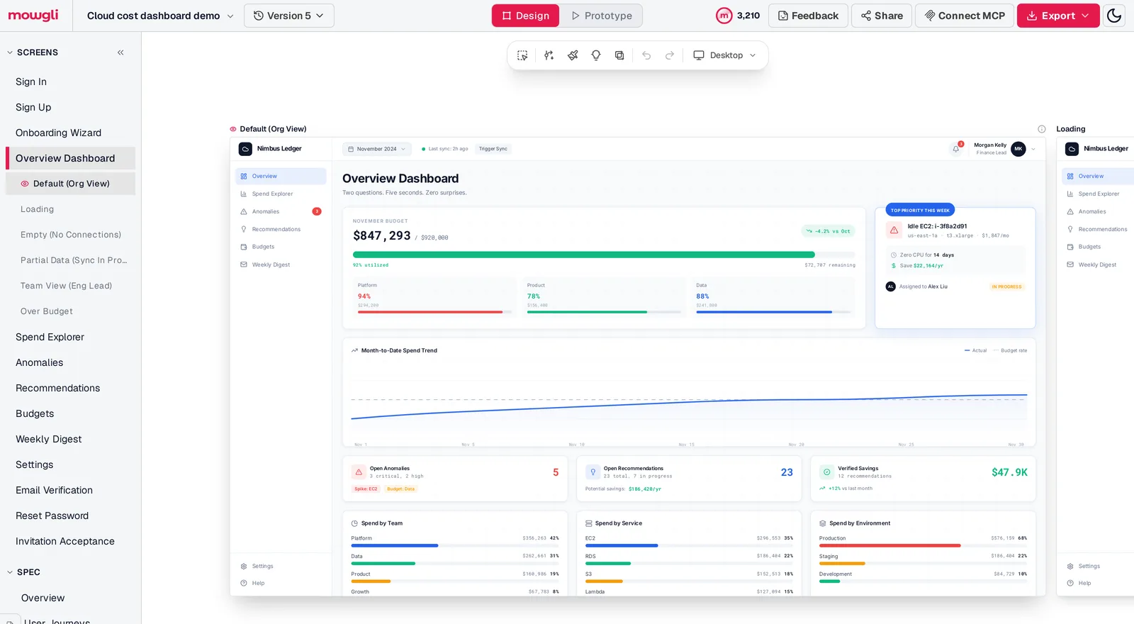
Caption: Every screen and its states in one list, so nothing is skipped.
4. Pull screens back safely
The Mowgli skill diffs design versions, translates the approved change, and records the implementation commit in version metadata. Apply one screen and its states per batch, then repeat the branch, diff, screenshot, and flow checks from Step 5.
Pull the redesigned [Dashboard] screen and its states from Mowgli and apply
them to src/pages/Dashboard.tsx. Visual changes only: keep hooks, handlers,
data fetching and routing as they are. Record the commit in the Mowgli
version metadata.
Mowgli designs and prototypes; to host and ship, you hand off to a builder or coding agent (Claude Code, Codex, Cursor, Lovable).
Free to start (300 credits); credit packs from $12; plans from $15/mo.
Start a redesign of your vibe-coded app, or redesign from a Figma file or codebase.
Tool-by-tool comparison
Different tools fit different redesign scopes. Choose by the size and location of the change.
| Tool | Redesigns an existing app? | How | Watch out for |
|---|---|---|---|
| Lovable | Yes, in place | Design guidance, preview toolbar | Credits per build message; one synced branch |
| Bolt | Yes, prompt by prompt | Plan Mode, Select tool, knowledge | Your own design system needs a Team plan |
| Cursor | Yes, element by element | Agent plus rules, Design Mode | Consistency rests on your tokens and rules |
| Replit | Yes, whole app | Apply a Design frame or design system | Applying a design system is a rebuild |
Mowgli leads the job of redesigning every screen and state from one spec, then syncing the result with coding agents. Use the manual paths for isolated screens or token-only changes.
Verdict
Use a manual pass for token corrections, a few weak screens, or a team that already has a clear target. Work in this order: tokens, components, shell, core screens, forms, and missing states.
Use Mowgli when the full multi-screen app needs one coherent design direction and its states must remain visible together. Claude Code, Codex, Cursor or another coding agent handles the two-way codebase transfer.
In both cases, keep logic outside the redesign diff and verify each batch before shipping.
FAQ
Can you redesign a vibe-coded app without rebuilding it?
Yes, when its core flows and data model already work. Change theme tokens, shared components, and layouts on a branch while preserving handlers, queries, routing, authentication, and validation.
How do I make a Bolt app look professional?
Start with one palette, type pairing, and radius in global CSS and Tailwind configuration. Then update shared components, the app shell, and the top two or three screens. Plan the work in Plan Mode and save the rules in project knowledge or agents.md.
How do I fix an ugly Cursor app without a designer?
Audit every screen and compare three directions on the busiest one. Store tokens in global CSS and rules in .cursor/rules/design-system.mdc, then restyle small groups and use Playwright screenshots to detect unintended changes.
Where are theme colors stored in a Lovable project?
They are stored in src/styles.css for projects created since May 13, 2026 using TanStack Start. Older React plus Vite projects use src/index.css and tailwind.config.
Will redesigning my app break its functionality?
You can reduce the risk with a branch, visual-only diff review, and screenshot regression tests. Keep three to five core flow tests passing before and after each batch.
What AI tool can redesign every screen of an existing app?
Mowgli imports the app through Claude Code, Codex, Cursor or another coding agent, then redesigns every screen and state in one direction. Replit can apply a Design frame to an app hosted in Replit. Use manual editing when only a few screens or theme tokens need work.
Sources
- Lovable Design guidance
- Lovable TanStack Start upgrade
- Lovable design systems
- Lovable Knowledge
- Lovable Plan mode
- Lovable preview toolbar
- Lovable GitHub integration
- Lovable
- Bolt visual edits
- Bolt project settings
- Bolt context management
- Bolt Plan Mode
- Bolt Git integration
- Bolt design systems
- Bolt
- Cursor rules
- Cursor Design Mode
- Cursor
- Replit Build your design
- Replit apply a design system
- Replit DESIGN.md
- Replit Visual Editor
- Replit version control
- Replit Agent
- Replit
- shadcn/ui
- shadcn/ui theming
- tweakcn
- Mobbin
- Playwright
- Playwright visual comparisons
- WCAG minimum contrast
- Mowgli skills repository
- Redesign a vibe-coded product
- Mowgli MCP
- Mowgli moodboard
- Mowgli skill
- Mowgli pricing
- Redesign your app
- Empty, error and loading states
- Why AI-built apps look the same
- Exploring multiple design directions
- DESIGN.md for AI coding agents
- Lovable prompts
- Lovable app redesign guide
- Bolt prompts
- Cursor prompts
- Getting designs into Cursor
- Replit prompts