Bolt App Looks Generic? A 30-Minute De-Slopification Pass
Make a generic Bolt app look professional by remapping its design tokens, cleaning up effects, copy and states, or redesigning every screen in Mowgli.
The fastest way to make a Bolt app look less generic
Keep the working app. Preserve its routes, data, authentication and database behavior, then change the visual layer through shared design tokens and repeated component patterns. In 30 minutes, you can inspect the template, choose one direction, remap its colors and typography, remove stock effects, strengthen the page hierarchy, rewrite vague copy and add missing states.
For an established app with eight or more screens, redesigning every screen and state together in Mowgli is usually the more controlled route.
A generic Bolt interface often combines a gray or cool-neutral base, blue-to-purple gradients, Inter, large radii, heavy shadows, glass panels, hover lifts, Lucide icons inside tinted squares and three equal statistic cards.
These are not implementation failures. Framework defaults provide useful primitives, but they do not define a distinct product direction. The missing decisions are color, typography, shape, depth, layout, copy and state behavior. See why every AI-built app looks the same.
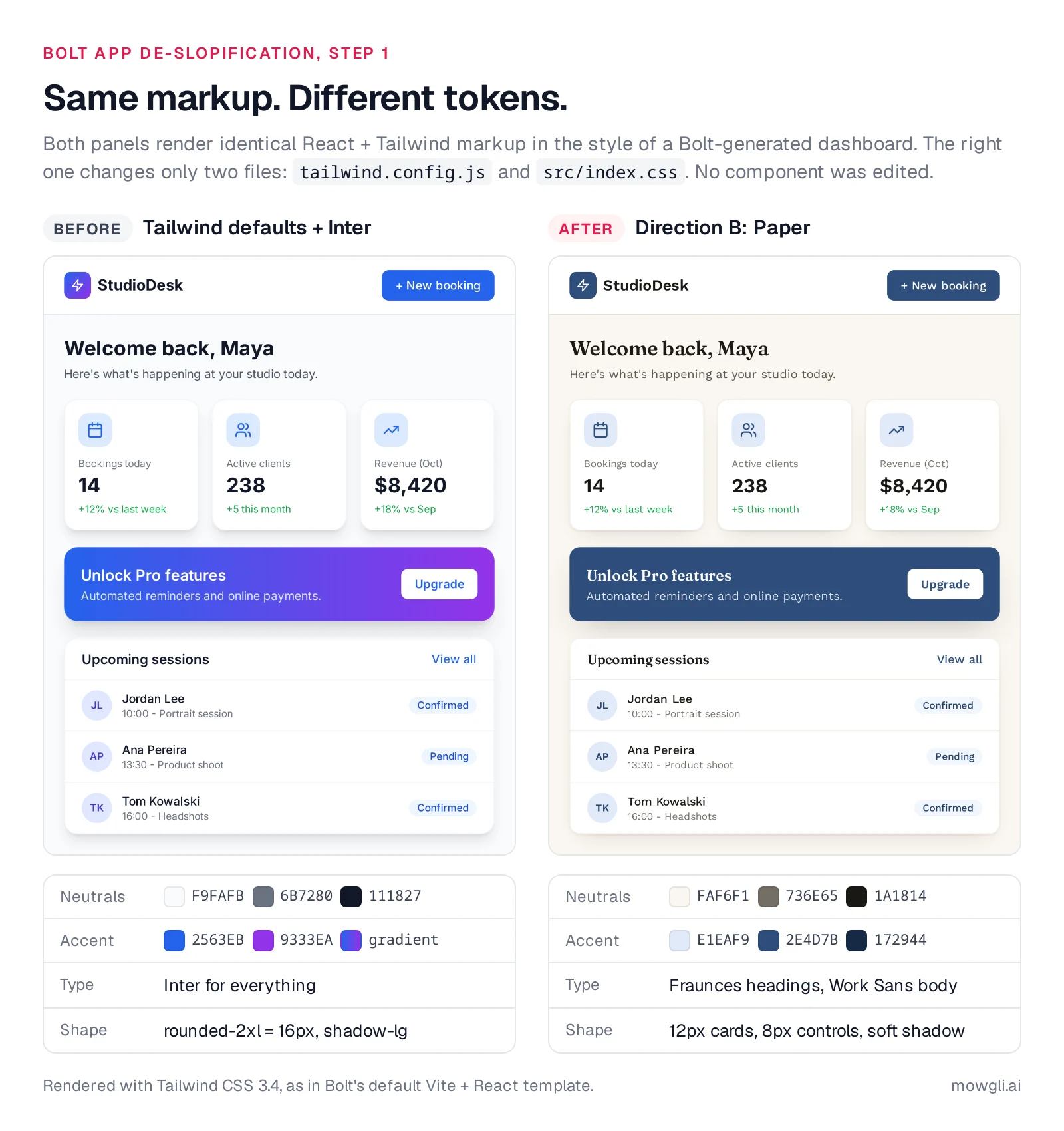
Caption: Identical markup on both sides. The right panel changes only tailwind.config.js and src/index.css. Rendered with Tailwind CSS 3.4.
Check which Bolt template you have
Open Code view with the <> icon. Inspect .bolt/config.json and package.json before changing anything.
.bolt/config.json template | Stack | Where the look lives | Fonts load from |
|---|---|---|---|
bolt-vite-react-ts (most web apps) | Vite + React + Tailwind 3.4 | tailwind.config.js + src/index.css (no tokens by default) | @import at the top of src/index.css, or index.html |
nextjs-shadcn | Next.js + shadcn/ui + Tailwind 3 | app/globals.css (:root HSL tokens) + tailwind.config.ts | next/font/google in app/layout.tsx (Inter) |
bolt-expo | Expo (React Native) | StyleSheet objects in components | not covered here |
A common bolt-vite-react-ts project is named vite-react-typescript-starter. It uses Vite 5, React 18, Tailwind CSS 3.4, lucide-react and often @supabase/supabase-js. Its starting configuration is usually:
/** @type {import('tailwindcss').Config} */
export default {
  content: ['./index.html', './src/**/*.{js,ts,jsx,tsx}'],
  theme: {
    extend: {},
  },
  plugins: [],
};
@tailwind base;
@tailwind components;
@tailwind utilities;
Bolt's .bolt/prompt asks for designs that are "beautiful, not cookie cutter" and says, "Use icons from lucide-react for logos." Those broad instructions still leave the palette, type, shape and depth undefined.
The nextjs-shadcn template uses Next.js 13.5, shadcn/ui, HSL variables, a neutral base and Inter through next/font/google. Expo uses React Native styles, so skip the CSS walkthrough below.
You have Tailwind v4 if tailwindcss is ^4 and src/index.css starts with @import "tailwindcss";.
Editable Code view requires desktop Chromium. Safari Code view is read-only, and Code view is unavailable on mobile. Bolt documents its frameworks and glossary, supported technologies, Code view and Expo integration.
Understand which edits consume Bolt tokens
Start with the free work: direct Code view edits, terminal commands and version-history restores.
| How you edit | Tokens | Source |
|---|---|---|
| Code view (edit, Ctrl+S) | None: "direct edits to your project's existing code for free in Code view, which doesn't use tokens" | Bolt tokens |
| Terminal in Code view | None ("run a cleanup command yourself in Code view, which doesn't use tokens") | Manage context |
| Select tool (visual edits) | Free in the preview; tokens only when you click Save changes; one batch per page | Visual edits |
| Plan Mode | Fewer tokens; no code changes | Plan Mode |
| Build prompt | Tokens; larger projects use more per message | Bolt tokens |
| Version history restore (clock icon) | None | Token efficiency |
Prices are from each vendor's pricing page, October 2026. Bolt Free includes 1M tokens a month with a 300K daily limit. Bolt Pro costs $25/month for 10M tokens with no daily limit. Bolt Teams costs $30 per member per month.
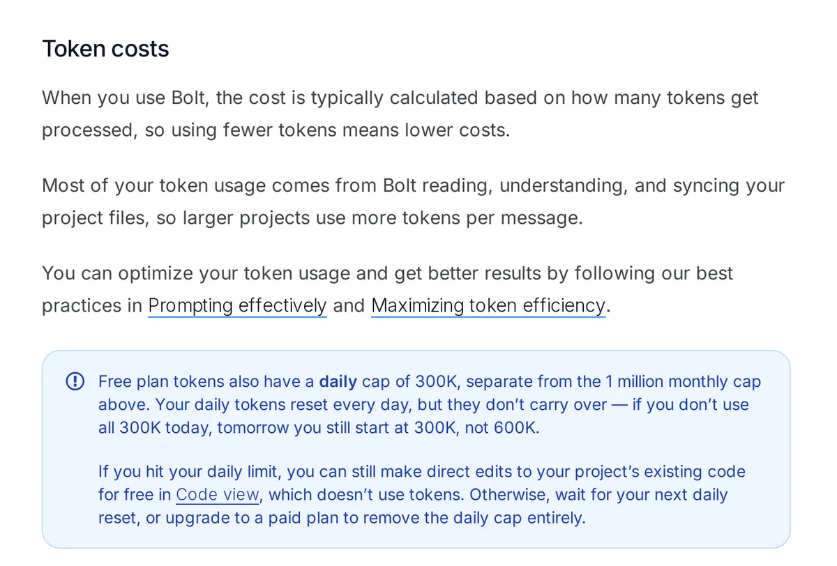
Caption: Prompts get more expensive as the project grows; editing files yourself in Code view is free. Source: Bolt Help Center, captured October 2026.
Minutes 0-6: audit the palette and choose one direction
Count Tailwind palette use under src:
node -e "const fs=require('fs'),path=require('path'),n={};const walk=d=>{for(const f of fs.readdirSync(d)){const p=path.join(d,f);if(fs.statSync(p).isDirectory())walk(p);else if(/\.(jsx?|tsx?)$/.test(f))for(const m of fs.readFileSync(p,'utf8').matchAll(/\b(?:bg|text|border|ring|from|via|to)-([a-z]+)-\d{2,3}\b/g))n[m[1]]=(n[m[1]]||0)+1}};walk('src');Object.entries(n).sort((a,b)=>b[1]-a[1]).forEach(([k,v])=>console.log(v,k))"
Or ask Plan Mode:
Don't change any code. List every Tailwind color palette name used in
class names under src (for example slate, blue, emerald), with how many
times each appears, sorted by count.
Replace the dominant neutral family and one or two decorative accent families. Preserve red, amber and green when they encode error, warning and success.
Choose five things: neutral temperature, accent, type, shape and depth.
| Direction | Fits | Neutrals and accent | Type | Shape and depth |
|---|---|---|---|---|
| A. Graphite | Dashboards, admin, B2B, dev tools | Cool graphite, teal #007D7B | Hanken Grotesk, JetBrains Mono for numbers | 4px controls, 6px cards, hairlines, no shadows |
| B. Paper | Marketplaces, booking, content, wellness, services | Warm paper #FAF6F1, navy #2E4D7B | Fraunces headings, Work Sans body | 8px controls, 12px cards, soft warm shadow |
| C. Poster | Consumer, habits, learning, creator tools | White and ink, magenta #C33681 | Unbounded headings, Albert Sans body | 10px controls, 16px cards, ink outline, hard offset shadow |
White on each accent 600 measures 4.98:1 for Graphite, 8.52:1 for Paper and 5.04:1 for Poster. Muted gray-500 on gray-50 measures 4.51:1, 4.71:1 and 4.54:1 respectively. gray-600 on white reaches at least 7.5:1. All pass WCAG AA.
For a custom direction, answer five questions: Who uses the app every day? What one adjective should it express? What adjective should it reject? What reference outside software fits? Which number or action does each screen support? You can also start by exploring multiple design directions.
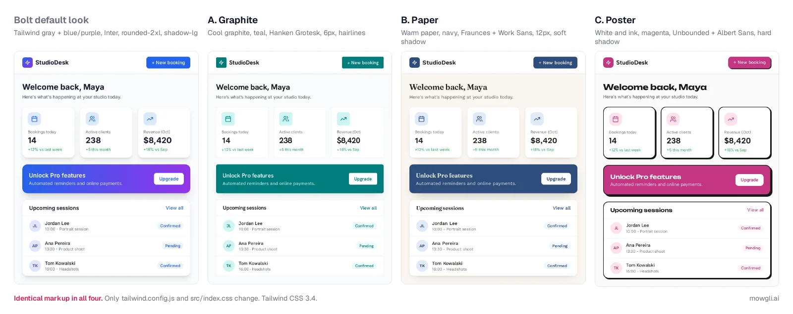
Caption: Identical markup in all four panels. Only tailwind.config.js and src/index.css change. Rendered with Tailwind CSS 3.4.
Minutes 6-13: remap the design tokens
Classes such as bg-blue-600, text-gray-500, rounded-2xl and shadow-lg can inherit a new meaning centrally. A theme.extend remap changes the system without rewriting every component. Even blue-to-purple gradients become nearly flat when both families use one accent ramp.
Preserve existing darkMode, plugins and custom colors. Add brand: ramp('a'), if the audit found a brand palette. Remap emerald or teal only if they are not status colors. Leave rounded-full unchanged.
/** @type {import('tailwindcss').Config} */
// Paste over tailwind.config.js. Keep anything your file already has
// (darkMode, plugins, custom colors): add custom scales below, e.g. brand: ramp('a').
const ramp = (name) =>
  Object.fromEntries(
    [50, 100, 200, 300, 400, 500, 600, 700, 800, 900, 950].map((step) => [
      step,
      `rgb(var(--${name}-${step}) / <alpha-value>)`,
    ])
  );

export default {
  content: ['./index.html', './src/**/*.{js,ts,jsx,tsx}'],
  theme: {
    extend: {
      colors: {
        // neutrals Bolt's generated classes use -> your direction's neutrals
        gray: ramp('n'),
        slate: ramp('n'),
        zinc: ramp('n'),
        neutral: ramp('n'),
        stone: ramp('n'),
        // default accents -> your direction's accent
        blue: ramp('a'),
        indigo: ramp('a'),
        violet: ramp('a'),
        purple: ramp('a'),
      },
      fontFamily: {
        sans: ['var(--font-body)'],
        display: ['var(--font-heading)'],
        mono: ['var(--font-mono)'],
      },
      borderRadius: {
        sm: 'calc(var(--radius-control) - 2px)',
        DEFAULT: 'var(--radius-control)',
        md: 'var(--radius-control)',
        lg: 'var(--radius-control)',
        xl: 'var(--radius-card)',
        '2xl': 'var(--radius-card)',
        '3xl': 'var(--radius-card)',
      },
      boxShadow: {
        sm: 'var(--shadow-control)',
        DEFAULT: 'var(--shadow-card)',
        md: 'var(--shadow-card)',
        lg: 'var(--shadow-card)',
        xl: 'var(--shadow-pop)',
        '2xl': 'var(--shadow-pop)',
      },
    },
  },
  plugins: [],
};
Here is the complete Paper example:
/* B. Paper: the whole src/index.css (keep anything you added below the @tailwind lines) */
@import url('https://fonts.googleapis.com/css2?family=Fraunces:opsz,[email protected],500;9..144,600&family=Work+Sans:wght@400;500;600&display=swap');

@tailwind base;
@tailwind components;
@tailwind utilities;

@layer base {
  :root {
    /* neutrals (R G B): replaces gray, slate, zinc, neutral, stone */
    --n-50: 250 246 241; /* #FAF6F1 */
    --n-100: 244 240 233; /* #F4F0E9 */
    --n-200: 230 225 217; /* #E6E1D9 */
    --n-300: 214 208 198; /* #D6D0C6 */
    --n-400: 164 158 148; /* #A49E94 */
    --n-500: 115 110 101; /* #736E65 */
    --n-600: 89 84 76; /* #59544C */
    --n-700: 69 64 57; /* #454039 */
    --n-800: 42 38 33; /* #2A2621 */
    --n-900: 26 24 20; /* #1A1814 */
    --n-950: 13 11 8; /* #0D0B08 */
    /* accent (R G B): replaces blue, indigo, violet, purple */
    --a-50: 240 246 253; /* #F0F6FD */
    --a-100: 225 234 249; /* #E1EAF9 */
    --a-200: 198 215 241; /* #C6D7F1 */
    --a-300: 163 188 226; /* #A3BCE2 */
    --a-400: 116 148 195; /* #7494C3 */
    --a-500: 71 106 156; /* #476A9C */
    --a-600: 46 77 123; /* #2E4D7B */
    --a-700: 37 64 103; /* #254067 */
    --a-800: 29 51 84; /* #1D3354 */
    --a-900: 23 41 68; /* #172944 */
    --a-950: 12 24 42; /* #0C182A */
    --font-body: "Work Sans", ui-sans-serif, system-ui, sans-serif;
    --font-heading: "Fraunces", Georgia, serif;
    --font-mono: ui-monospace, SFMono-Regular, Menlo, monospace;
    --radius-control: 8px;
    --radius-card: 12px;
    --shadow-control: 0 1px 1px rgb(42 38 33 / 0.05);
    --shadow-card: 0 1px 2px rgb(42 38 33 / 0.06), 0 10px 24px -16px rgb(42 38 33 / 0.28);
    --shadow-pop: 0 16px 40px -16px rgb(42 38 33 / 0.3);
  }
  h1, h2, h3 { font-family: var(--font-heading); font-weight: 600; letter-spacing: -0.01em; }
}
For Graphite, use #007D7B, Hanken Grotesk, JetBrains Mono, 4px controls, 6px cards, hairlines and no card shadows. For Poster, use #C33681, Unbounded, Albert Sans, 10px controls, 16px cards, a 2px ink border and hard offset shadows.
Tailwind v4 needs:
@import "tailwindcss";
@config "../tailwind.config.js";
For nextjs-shadcn, change the HSL variables in app/globals.css and replace Inter in app/layout.tsx:
// app/layout.tsx (Paper shown): replace the Inter import and inter.className
import { Fraunces, Work_Sans } from 'next/font/google';

const body = Work_Sans({ subsets: ['latin'], variable: '--font-body' });
const heading = Fraunces({ subsets: ['latin'], variable: '--font-heading' });

// on <body>:
// className={`${body.variable} ${heading.variable} font-sans`}
Add fontFamily: { sans: ['var(--font-body)'], display: ['var(--font-heading)'] } under theme.extend, then add h1, h2, h3 { font-family: var(--font-heading); } to app/globals.css. These font names are verified for Next 13.5.1; the layout snippet was not build-tested.
If you prefer a Bolt prompt:
Replace tailwind.config.js and src/index.css with exactly the two files
below. Do not change any component or page files and do not add colors,
fonts or shadows anywhere else.

[paste tailwind.config.js]
[paste one src/index.css block]
Save with Ctrl+S. Check the busiest screen, then inspect Light and Dark through More preview controls. Tailwind documents custom colors and functions and directives.
Minutes 13-18: remove stock effects and simplify icons
Use one focused prompt:
In the page and component files under src, remove bg-gradient-to-*
backgrounds and gradient text (bg-clip-text text-transparent), remove
backdrop-blur and see-through "glass" backgrounds (bg-white/10 and
similar), and remove hover:scale-* and hover:-translate-y-* effects.
Use solid gray-* and blue-* classes instead. Replace decorative uses of
cyan, sky, teal, pink and fuchsia with blue-* or gray-*; keep red, amber
and green where they mean error, warning or success. Don't touch
tailwind.config.js or src/index.css. Keep layout, copy and logic exactly
as they are.
State what may change and what must remain unchanged. Use Target file when possible. After a bad result, restore version history instead of stacking repair prompts. Bolt provides guidance on effective prompting and token efficiency.
Graphite and Paper suit thinner Lucide strokes. Poster can retain stroke width 2.
/* end of src/index.css: thinner Lucide icons everywhere */
svg.lucide {
  stroke-width: 1.5;
}
Remove decorative tinted squares and circles behind icons on logged-in screens. To switch from Lucide to Phosphor on one surface:
I'm requesting a new icon package: install @phosphor-icons/react.
On the Dashboard page only, replace lucide-react icons with the closest
Phosphor equivalents (weight "light", same size). Remove the colored
square or circle behind each icon. Don't change anything else.
Minutes 18-23: fix the page hierarchy, not just the colors
A new palette cannot fix a repetitive card grid. Give each screen one dominant number or action. Use divider rows for operational lists and reserve feature-card grids for marketing pages.
On the Dashboard page, remove the row of three equal stat cards. Show
the most important number (Bookings today) as large text without a card,
with Active clients and Revenue as smaller inline stats separated by thin
vertical dividers. Turn the list below into rows separated by border-b
dividers instead of separate cards. Keep the data, logic and colors as
they are.
Minutes 23-26: replace generator-flavored copy
Remove filler such as "Welcome back," "Unlock Pro features" and "Streamline your workflow." Replace it with the user's next decision, a real quantity or a concrete action.
With the Select tool, double-click text, batch the edits and save once. You can change text, color, alignment, size, links, lists, opacity, object fit and video posters. You cannot adjust spacing, radius or shadows there. Preview edits are free; saving consumes tokens.
For a whole landing-page hero:
Rewrite the copy in the landing page hero only. The product: [who it's
for and what they get, one sentence]. Headline: that result in under 8
words. Don't use streamline, supercharge, seamless, unlock, elevate or
all-in-one. Subheadline: one sentence with a concrete detail (a number,
a time, a named integration). Primary button: a verb plus an object,
like "Book your first session". Don't change layout or styles.
Read more about using real copy instead of lorem ipsum.
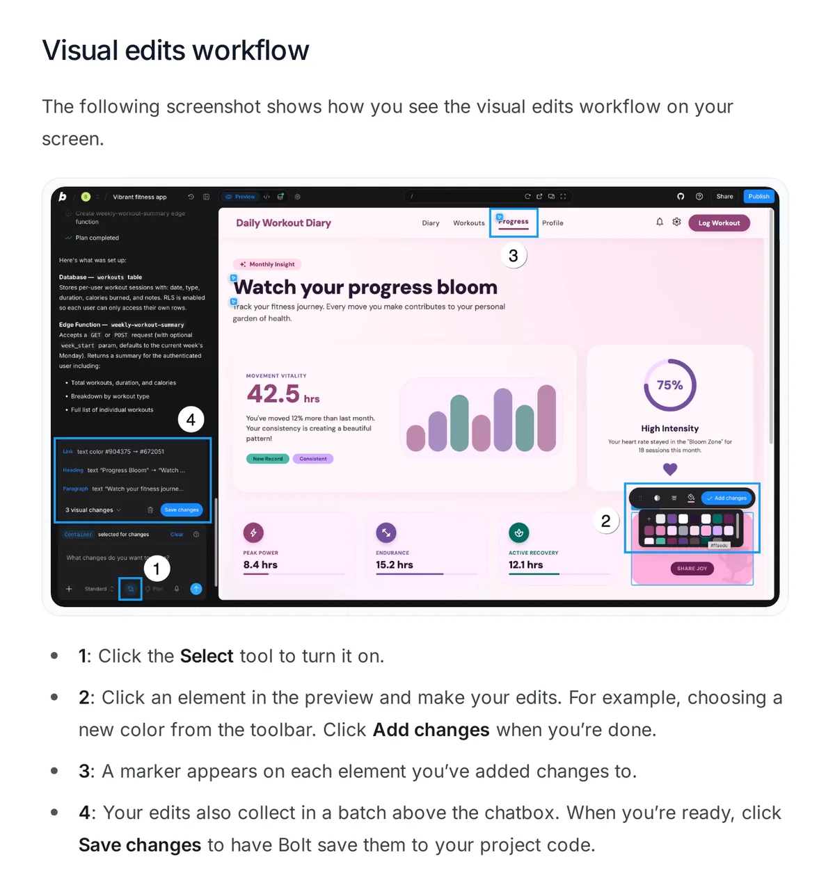
Caption: Select-tool edits collect in a batch and cost tokens only when you save. Source: Bolt Help Center, captured October 2026.
Minutes 26-30: add empty, loading and error states
Generic demos show the populated path. Finished products also explain absence, waiting and failure.
Add three states to the Upcoming sessions list on the Dashboard:
1) Empty: one sentence saying what will appear here, and a primary
   button "Add your first booking".
2) Loading: skeleton rows with the same layout as real rows, no spinner.
3) Error: an inline message "Couldn't load sessions" with a Retry button.
Use the existing gray-* and blue-* classes. Don't change anything else.
Repeat this by screen and component. Track coverage in a screen x state matrix so missing behavior stays visible. Use the empty, error and loading state guide for the full pass.
Lock the design rules into Bolt
Store the direction in Project settings -> Knowledge or in a root agents.md, which Bolt discovers automatically. Lock tailwind.config.js and src/index.css.
Bolt's Web Design Guidelines skill lives under Project settings -> Skills and is off by default. When you use a custom design skill, Bolt advises leaving the curated skill off.
Design direction: Paper (calm, editorial, trustworthy).
- Colors: gray-* for neutrals and blue-* for the accent only (both are
  remapped in tailwind.config.js). red, amber and green only for status.
  No other palettes, no hex values, no gradients, no backdrop-blur.
- Type: headings use the h1-h3 defaults (Fraunces); body is Work Sans.
  Don't import Inter or any other font.
- Shape: rounded-lg for controls, rounded-xl for cards, rounded-full only
  for avatars and pills.
- Depth: shadow-sm on controls, shadow on cards, shadow-xl only on
  popovers and modals. No hover lifts or scale effects.
- Icons: lucide-react with no colored square or circle behind them.
- Layout: one primary number or action per screen. Lists use divider
  rows. No row of three equal cards on logged-in pages.
- Copy: concrete nouns and numbers. Never: streamline, supercharge,
  seamless, unlock, elevate, all-in-one.
- States: every list has empty, loading (skeleton) and error (retry) states.
- Never edit tailwind.config.js or src/index.css unless I ask.
See Bolt's project settings, skills documentation and this guide to a DESIGN.md for AI coding agents.
When to redesign the whole Bolt app in Mowgli
The manual pass fits a focused cleanup. Use Mowgli when the working app has eight or more screens, when empty, loading, error and alternate states need one direction, or when repeated one-screen prompts would create drift.
We make Mowgli.
Mowgli is an AI design tool that designs every screen of your app. You can import an existing codebase through Claude Code, Codex, Cursor or another coding agent, redesign every screen and state on one infinite canvas, then pull the result back into the codebase.
The workflow is:
- Connect the Bolt project to GitHub.
- Create a
redesignbranch. - Import through the Mowgli agent skill, CLI or MCP.
- Choose among 16+ moodboard styles and use style steering.
- Redesign every screen and state.
- Review the code diff.
- Push to GitHub and merge there.
Bolt creates a private repository on main, commits each working change and checks GitHub every 30 seconds. Only the project owner can connect GitHub, and Bolt does not merge branches inside the app. Avoid prompting Bolt while an outside push is landing because simultaneous changes can cause Bolt's version to overwrite the GitHub changes.
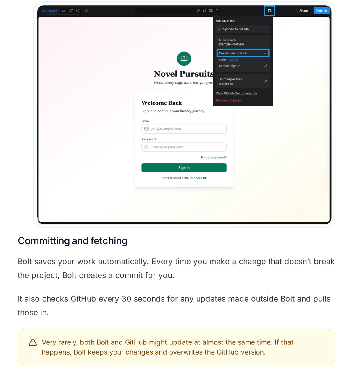
Caption: Bolt commits each working change and pulls outside commits every 30 seconds, which is what lets a redesign made elsewhere land in Bolt. Source: Bolt Help Center, captured October 2026.
Choose "Import my existing codebase," open Connect MCP and paste the quick-start prompt into Claude Code, Codex or Cursor. The agent skill command is npx skills add mowgli-ai/skills. You can also use npx mowgli-cli --help or the MCP endpoint https://app.mowgli.ai/mcp. See the Mowgli agent skill and Mowgli MCP.
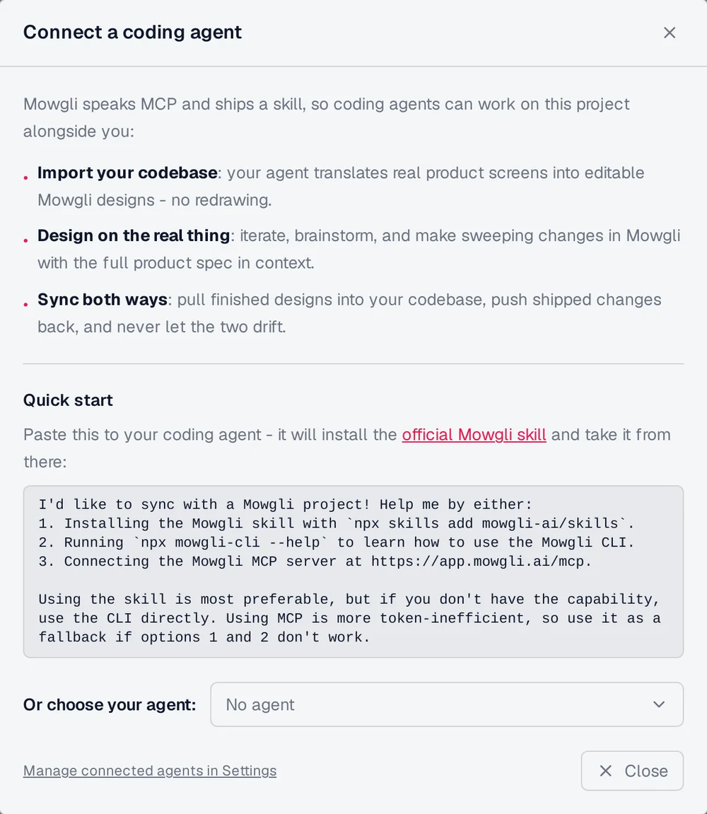
Caption: The quick-start prompt you paste into Claude Code, Codex or Cursor to import the codebase.
The imported project includes SPEC.md for the pitch, journeys and data model; frontend.xml for screens and states; and one <ScreenId>.tsx file per screen. A single state prop switches states. The screens remain editable React and Tailwind, not screenshots.
Choose Redesign, explore moodboard directions, add references, mix or steer directions and preview one on real screens. Add missing states through chat, use version history and prototype the result.
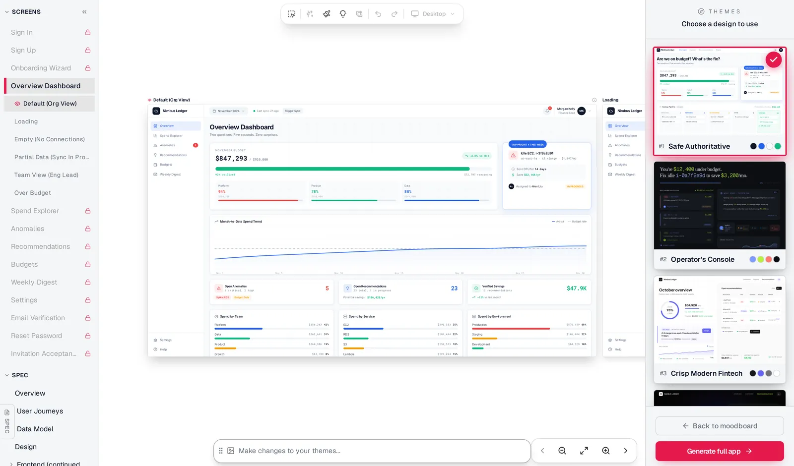
Caption: One direction previewed on a real screen, with the screen's states listed and other directions one click away.
This route preserves the app's routes, Bolt Database, authentication and hosting. Free to start (300 credits); credit packs from $12; plans from $15/mo. The free 300 credits can cover importing a codebase and making changes.
Mowgli designs and prototypes; to host and ship, you hand off to a builder or coding agent (Claude Code, Codex, Cursor, Lovable).
Without GitHub, start from an idea or screenshots and export an AI-ready Bolt prompt package. Bolt does not accept .zip attachments. Attach .tsx and .md files instead. Free accounts allow 5 files per message, while paid plans allow 20. Building the package consumes Bolt tokens.
Redesign your Bolt app in Mowgli.
Which route fits your project?
-
Working app with eight or more screens or incomplete states: use Mowgli.
-
Focused visual cleanup today, with comfort editing two files: use the manual 30-minute pass.
-
Barely started: select Chakra, Material UI or shadcn before the first prompt.
-
Expo project: use a whole-app design workflow or narrowly scoped prompts, and skip the CSS instructions.
Bolt preset systems are selected from the Design system icon before the first prompt. Presets cannot be edited. A custom design system requires a paid Teams plan. For a wider builder comparison, read Lovable vs Bolt vs v0.
Other ways to improve a generic Bolt app
| Tool | What it does for a generic Bolt app | Limits (from vendor docs) |
|---|---|---|
| Bolt Select tool | Text, colors, font size and alignment per element, previewed before saving (docs) | One batch per page; tokens on save; no radius, spacing or shadow controls |
| Bolt preset design systems | Chakra, Material UI or shadcn, picked from the Design system icon before the first prompt (docs) | Preset systems can't be edited; your own design system needs a paid Teams plan |
| Bolt Plan Mode | Design suggestions with your codebase in context, no code changes (docs) | Suggestions; the change is still a Build prompt |
| Google Stitch -> Bolt | Design screens in Stitch, export to Bolt with screenshots, HTML and a prompt (docs) | Rebuilds from designs; see Mowgli vs Google Stitch |
| Figma -> Bolt | Imports a Figma frame through Anima (docs) | One frame at a time; needs a finished Figma design |
| Mowgli | Every imported screen and its states redesigned in one direction, synced back via GitHub | Mowgli designs and prototypes; to host and ship, you hand off to a builder or coding agent (Claude Code, Codex, Cursor, Lovable). |
Related guides cover fixing a generic Lovable app and redesigning a vibe-coded app without rebuilding.
Verdict
A generic Bolt interface usually needs clearer design decisions, not a rebuild.
For a focused fix, remap the central tokens, run one effects sweep, strengthen the page hierarchy, use product-specific copy, add empty, loading and error states, then preserve the rules in Knowledge or agents.md.
For a multi-screen product, use Mowgli to design every screen and state together and sync the redesign back through Claude Code, Codex, Cursor or another coding agent.
FAQ
Why does my Bolt app look like every other AI app?
It looks familiar because common Bolt templates provide Tailwind and Lucide primitives but little product-specific direction. When color, typography, shape and depth remain unspecified, the result tends toward repeated palettes, Inter, gradients, broad shadows and card grids. Read why AI-built apps look the same.
How do I make a Bolt app look professional without rebuilding it?
Keep the routes, logic, authentication and database, then remap tailwind.config.js and src/index.css. Follow with focused changes to effects, hierarchy, copy and states. For eight or more screens, redesign the full screen-and-state system together and sync it back through GitHub.
Can I change my Bolt app design without spending tokens?
Yes. Direct Code view edits, terminal commands and version-history restores do not use tokens. Select edits are free until you save them. Use desktop Chromium because Safari Code view is read-only and Code view is unavailable on mobile.
Where are the colors and fonts in a Bolt project?
In bolt-vite-react-ts, check tailwind.config.js, src/index.css, component Tailwind classes and sometimes index.html. In nextjs-shadcn, check the HSL variables in app/globals.css, the Tailwind configuration and next/font/google in app/layout.tsx. Expo uses React Native StyleSheet objects instead.
How do I stop Bolt from undoing design changes?
Save the rules in Project Knowledge or agents.md, then lock tailwind.config.js and src/index.css. Tell each prompt exactly what it may and may not change.
How do I redesign every screen in an existing Bolt app?
Connect the app to GitHub, create a redesign branch and import the codebase into Mowgli through Claude Code, Codex, Cursor or another coding agent. Choose one moodboard direction, complete the missing states, pull the redesign into the branch and merge through GitHub.
Sources
- Bolt glossary
- Bolt supported technologies
- Bolt Code view
- Bolt tokens
- Bolt token efficiency
- Bolt context management
- Bolt project settings
- Bolt visual edits
- Bolt preview controls
- Bolt Plan Mode
- Bolt prompting guidance
- Bolt skills
- Bolt design systems
- Bolt GitHub integration
- Bolt file uploads
- Bolt Google Stitch integration
- Bolt Figma integration
- Bolt Expo integration
- Bolt pricing
- Tailwind CSS v3 custom colors
- Tailwind CSS functions and directives
- Fraunces
- Hanken Grotesk
- Unbounded
- Lucide
- Phosphor Icons
- Mowgli agent skill
- Mowgli MCP endpoint
- Mowgli
- Mowgli pricing
- Mowgli Skill
- Mowgli MCP
- Mowgli moodboard
- Bolt prompt package
- Redesign a vibe-coded product
- Mowgli vs Google Stitch
- Why AI-built apps look the same
- Lovable vs Bolt vs v0
- Exploring multiple design directions
- Real copy instead of lorem ipsum
- Empty, error and loading states
- DESIGN.md for AI coding agents
- Fix a generic Lovable app
- Redesign a vibe-coded app without rebuilding