AI Tools That Generate React Components From a Description (2026)
Use v0 for prompt-to-component code, shadcn or 21st for registry components, coding agents for repo-native work, and Mowgli for full app designs.
Which AI tool should generate your React component?
Use v0 for a styled React component or block from one prompt. Use 21st to search a large component catalog or generate variants. Use the shadcn/ui CLI and MCP server when you want registry source installed with its dependencies. For code that must follow an existing repository, use Claude Code, Cursor or Codex with repository rules and component sources.
Choose by the size of the requested output:
- A styled component or block: v0
- Searchable components plus AI generation: 21st
- Installable registry code: shadcn/ui
- Repository-native work: Claude Code, Cursor or Codex
- Composition from a company design system: Builder.io or UXPin Forge
- Every screen and state of a product: Mowgli
- A running application: Bolt or Lovable
For multi-screen code export, see AI design tools that export React and Tailwind.
We make Mowgli.
Competitor capabilities come from vendor documentation. Prices are from each vendor's pricing page, October 2026.
| If you need... | Pick | Runner-up | Why |
|---|---|---|---|
| A styled component or block from one prompt | v0 | 21st AI | React, Tailwind and shadcn/ui by default, plus MCP and GitHub pull requests |
| Real components a coding agent installs, not invented JSX | shadcn/ui CLI + MCP | 21st MCP | Writes source and dependencies into your repository |
| A component that follows your repository's conventions | Claude Code, Cursor or Codex + rules | - | Reads your code while rules define props, tokens and tests |
| AI that composes your design system | Builder.io | UXPin Forge | Indexes or connects components, tokens and icons |
| Every screen of a product, with its states, as components | Mowgli | Flowstep | One .tsx file per screen with a state prop, a product spec and two-way code sync |
| A running app rather than a component | Bolt or Lovable | v0 | Produces a full project with Git sync |
Decide the output size before choosing a tool
"Generate a React component" can mean anything from one button to an entire application. Define the unit before evaluating tools.
The basic result is importable React code: usually TypeScript, a props interface, Tailwind markup and explicit component states. A stronger repository workflow also puts files in the correct directory, installs dependencies and reuses existing primitives and tokens.
The scope ladder is:
- Primitive, such as a button or dialog
- Composed component, such as a plan picker
- Block, such as a pricing section
- Screen, such as billing settings
- Multi-screen product
- Running application
Pick by output size and by how the code must enter your repository. A polished standalone result is less useful if it duplicates your button, ignores your tokens or arrives without required dependencies.
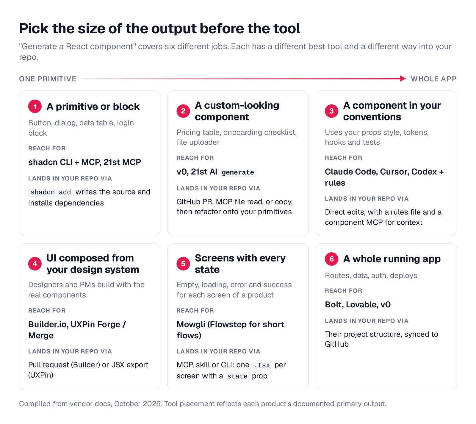
Caption: Six jobs hide behind "generate a React component". Compiled from vendor docs, October 2026.
Best workflow for components inside an existing repository
Claude Code, Cursor or Codex with repository rules
Use Claude Code, Cursor or Codex when the new component must match an established codebase. These coding agents can read existing components, hooks, tests, tokens and conventions. They can update the component, story and test in one pass, and call shadcn, 21st, v0 or another MCP source.
Give the agent three layers of context:
- A rules file for stable engineering constraints
- A component registry or existing source to reuse
- A visual target for composition and styling
Cursor supports auto-attached rules through its rules system. Plain .md files inside .cursor/rules are ignored, so use the supported rule format. Claude Code reads CLAUDE.md as context rather than enforced configuration. Codex reads AGENTS.md before work, as described in the Codex documentation.
For visual direction in Claude Code, the Anthropic frontend-design plugin installs with /plugin install frontend-design@claude-plugins-official. Claude Code also provides /design as a research preview.
See the Claude Code UI design workflow, getting designs into Cursor and the diagnosis of why AI-built apps look the same.
Claude Pro costs $20/month, or $17 billed annually, and includes Claude Code. Cursor Pro costs $20/month. Codex is available with ChatGPT Free, Go at $8/month and Plus at $20/month.
---
globs: src/components/**/*.tsx
alwaysApply: false
---

- Use named exports, not default exports
- Co-locate styles in a module CSS file next to the component
- Keep components under 200 lines. Extract subcomponents into the same
  directory when a file grows beyond that
- Prefer composition over prop drilling. Pass children or render props
  instead of threading data through multiple layers
shadcn/ui CLI, MCP, and registries
shadcn/ui gives you source-code ownership instead of a packaged component dependency. Its add command installs component files and dependencies from the main registry or any compatible registry.
The registry directory listed 430 community registries on October 8, 2026. Install an item with npx shadcn add @<registry>/<component>. Private registries can use authentication headers.
A registry item can specify package dependencies, registry dependencies, files and theme variables:
{
  "$schema": "https://ui.shadcn.com/schema/registry-item.json",
  "name": "hello-world",
  "type": "registry:block",
  "registryDependencies": ["button", "@acme/input-form"],
  "dependencies": ["[email protected]", "motion"],
  "files": [
    {
      "path": "registry/new-york/hello-world/hello-world.tsx",
      "type": "registry:component"
    }
  ],
  "cssVars": {
    "light": { "brand": "oklch(0.205 0.015 18)" },
    "dark": { "brand": "oklch(0.205 0.015 18)" }
  }
}
The MCP server lets an agent search registries and install source. Initialize it for Claude with npx shadcn@latest mcp init --client claude. It also supports cursor, vscode, codex and opencode.
The shadcn skill installs with npx skills add shadcn/ui. The shadcn info --json command reports the framework, Tailwind version, aliases, icon library and installed components. During initialization, init --base selects base, radix or aria accessibility primitives.
You need components.json. Review community code before accepting it because community registries are third-party sources. The tool installs components and blocks, not completed application screens. It is free and MIT-licensed.
See MCP servers for UI design for more registry and agent options.
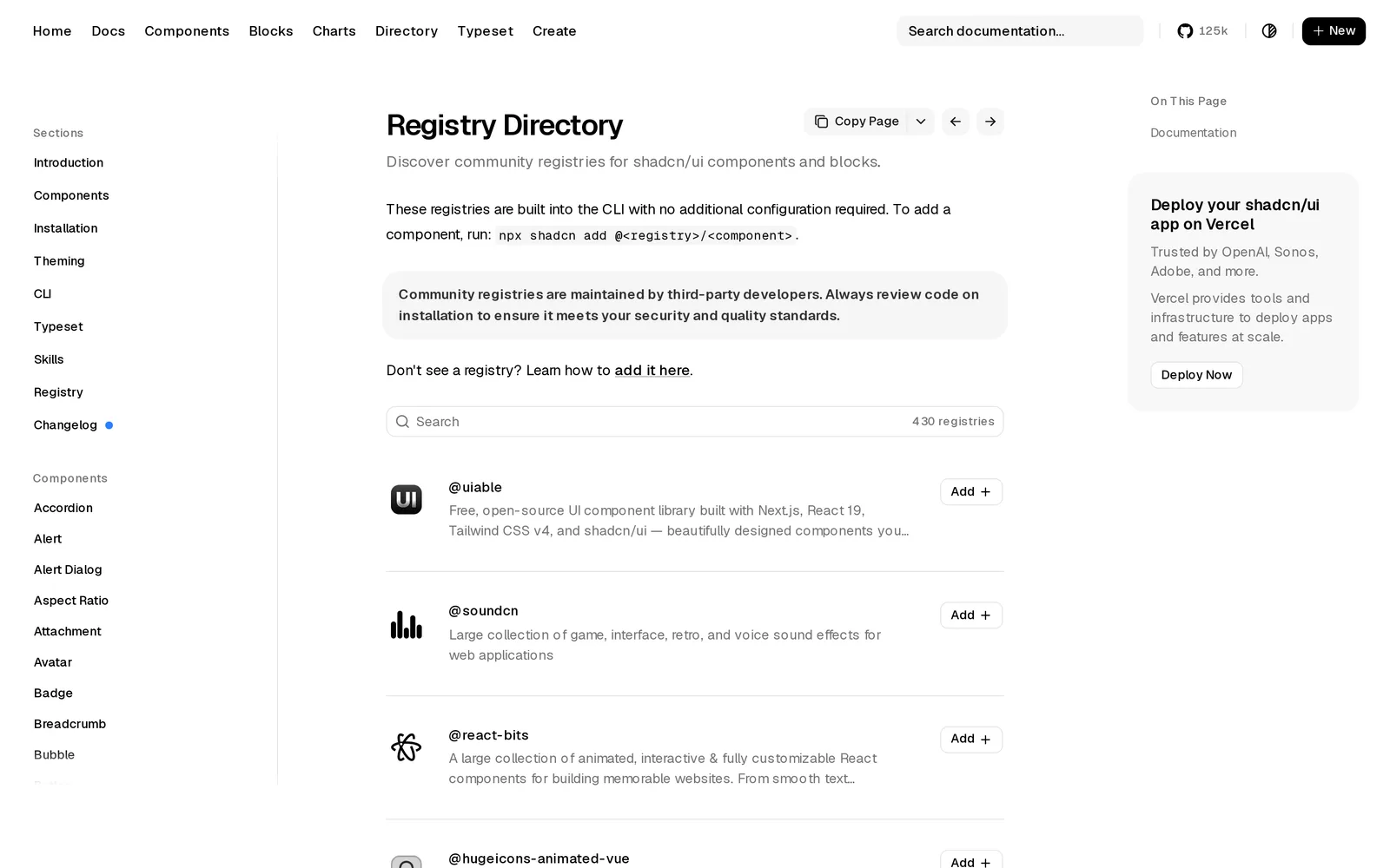
Caption: Source: shadcn/ui website (ui.shadcn.com), captured October 2026.
Prompt-to-component generators
v0 for React, Tailwind, and shadcn/ui
v0 fits a polished component or block, especially when you use Next.js and shadcn/ui. New chats start with Next.js, shadcn/ui and Tailwind CSS, with a live preview. Inputs include text, screenshots, documents and, on paid plans, Figma frames.
GitHub import supports branch-based work and pull requests. Design Systems 2.0 can use a repository, npm package, Storybook or Figma frames, then save the result as a design-system skill. Its verification rule says unverified components, props and tokens should not be used.
The v0 MCP server gives Claude Code or Cursor access. The first connection starts OAuth, and chats.getFiles reads generated source files.
{
  "mcpServers": {
    "v0": {
      "url": "https://v0.app/api/mcp"
    }
  }
}
Vendor documentation warns that the default starter can conflict with an established system's components, tokens, styles or providers. The legacy registry guide also describes possible difficulty with customized shadcn/ui components.
The free plan provides $5 in one-time credits for new users and 7 messages per day. Plus costs $30/user/month, and Business costs $100/user/month. See v0 pricing.
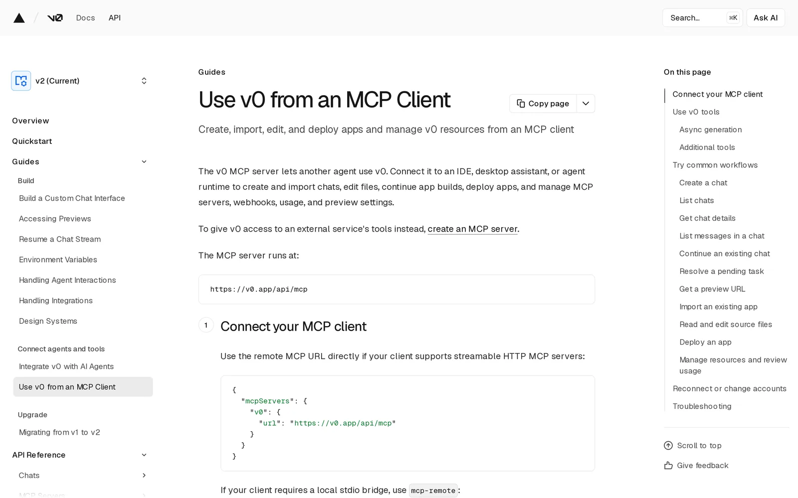
Caption: Source: v0 website (v0.app/docs), captured October 2026.
21st for catalog search and AI variants
21st provides 12,000+ hand-crafted React and Tailwind CSS components, templates and shadcn themes created by design engineers. Its unified 21st MCP replaced Magic MCP, and old Magic API keys were reset.
Initialize the CLI and MCP workflow with npx @21st-dev/cli@latest init --client claude. Other client options include cursor, codex, vscode and devin.
The MCP tools separate four jobs. search performs free metadata search. get_component retrieves paid component code. get_inspiration reranks results using project Design Context, including stack, tokens and prior decisions. generate creates new UI.
Teams can publish components with commands such as 21st publish ./PinList.tsx. Installations include dependencies.
npm i -g @21st-dev/cli
21st login
21st search "pricing table"
21st generate "a pricing table" --variants 3
Free accounts get search and two installs per day. Builder costs $6/month billed yearly or $8 quarterly, with unlimited installs. Builder + AI starts at $15/month billed yearly with 500 credits. See 21st pricing.
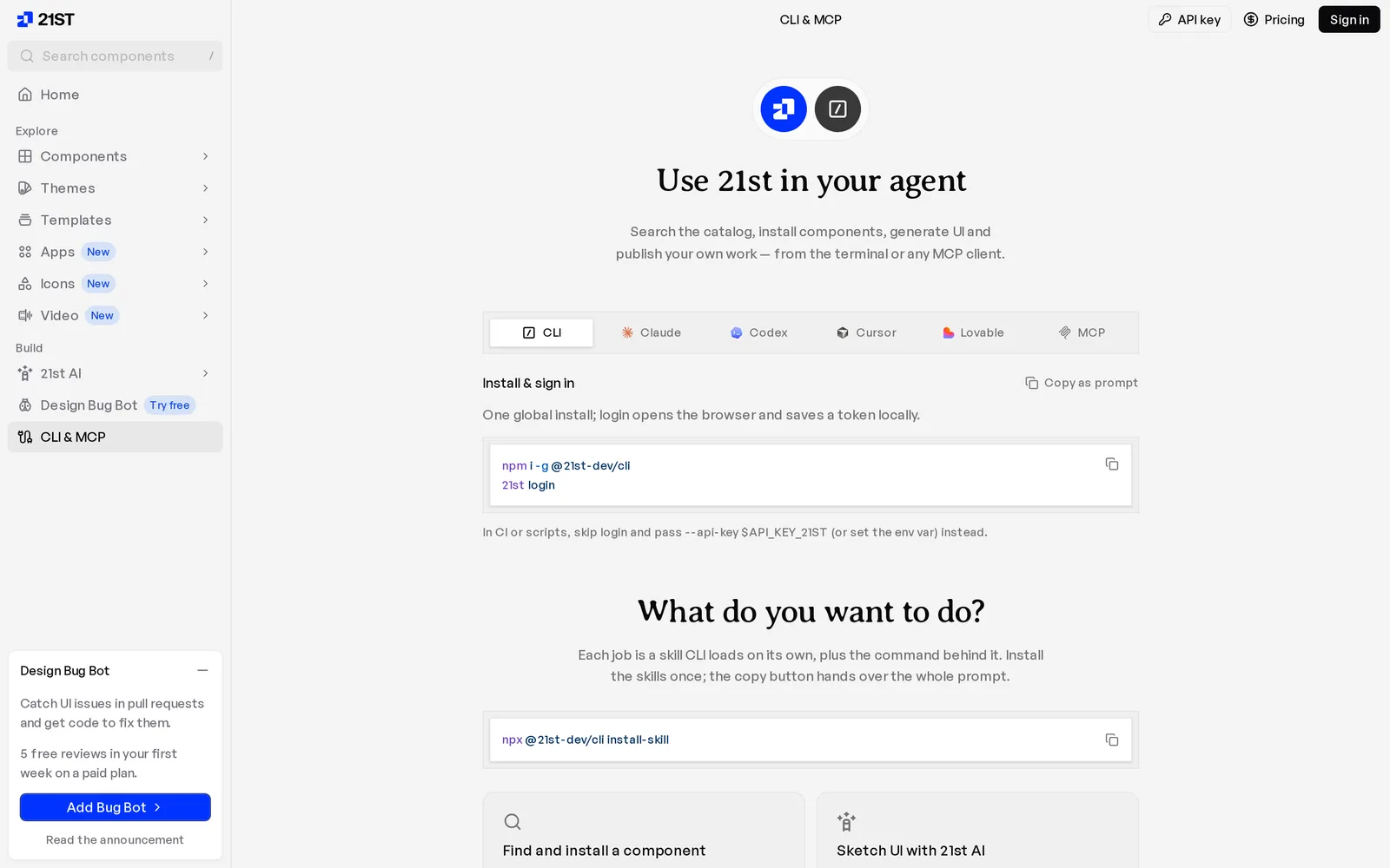
Caption: Source: 21st website (21st.dev/mcp), captured October 2026.
Tools that generate from your existing design system
Builder.io for indexed components and pull requests
Builder.io connects to a repository, indexes its design system, generates changes and submits pull requests. Design system indexing covers components, CSS variables, SASS variables, theme tokens and icon libraries across React, Vue, Svelte and Angular repositories.
The vendor reports that automated discovery typically reaches 70% mapping accuracy. Teams must review mappings. This workflow targets larger teams where product managers and designers generate against production components. Design system indexing is an Enterprise feature.
The free plan includes 60 Agent Credits per month. Pro costs $24/user/month for 500 credits, Team costs $40/user/month, and Enterprise pricing is custom.
npx "@builder.io/dev-tools@latest" index-repo
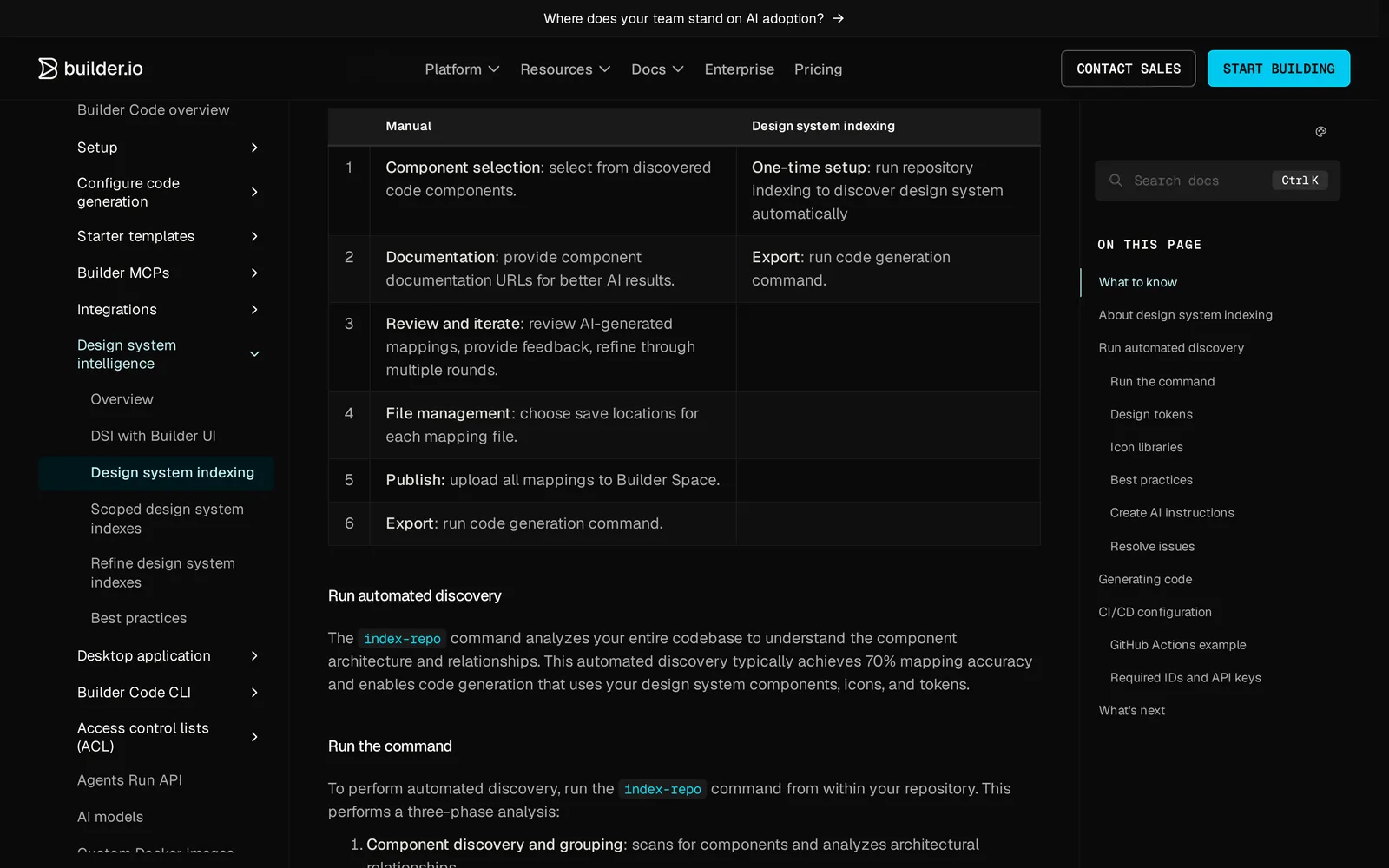
Caption: Source: Builder.io website (builder.io/c/docs), captured October 2026.
UXPin Forge and Merge for composing real React components
UXPin Forge accepts a prompt or screenshot and composes real React components. Built-in libraries include shadcn/ui, MUI, Ant Design and Bootstrap. You can export JSX, copy the result, open it in CodeSandbox or download it.
UXPin Merge connects shared libraries through Git, Storybook or npm. It fits design teams composing layouts from engineering-owned components. Git-based custom libraries require Enterprise, while Storybook requires Growth. Forge composes existing components rather than creating new primitives.
Free includes 50 AI credits and 2 prototypes. Core costs $29/seat/month billed yearly or $49 monthly. Growth costs $40/seat/month billed yearly or $69 monthly. Enterprise is custom, and a 14-day trial is available.
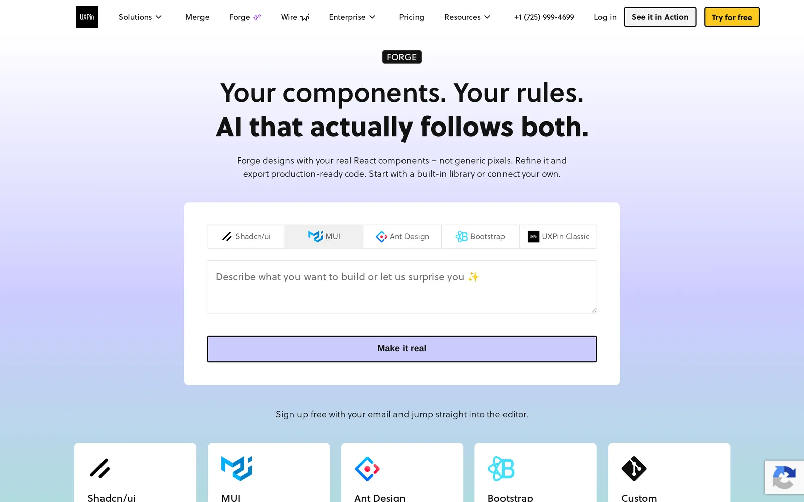
Caption: Source: UXPin website (uxpin.com/forge), captured October 2026.
When the description is a screen or whole product
Mowgli for every screen and state
Use this approach when a "component" request is really a settings screen, onboarding flow or complete product. It designs a full multi-screen product, represents every screen and state as React and Tailwind, and hands the result to Claude Code, Codex, Cursor or another coding agent.
An export contains one .tsx file per screen, Tailwind utilities, lucide-react icons and a single state prop. SPEC.md records the pitch, user journeys and data model. frontend.xml lists screens and states.
A habit tracker export contained 12 screens, 2,646 lines of TSX and 46 named states. Its Today screen documented five states. See the full React and Tailwind walkthrough.
// screens/TodayScreen.tsx from a Mowgli AI package export (excerpt, unedited except elisions)
export interface ScreenProps {
  state: string;
}

/**
 * States:
 * - default: Mixed completion state with header date, week strip ...
 * - allHabitsChecked: All habits checked with warm acknowledgment line below
 * - noActiveHabits: Empty state with warm prompt and two action buttons
 * - reviewCardVisible: Weekly review card at top above habit list
 * - dayDetailOpen: Day detail overlay for backfilling a past day
 */
const TodayScreen: React.FC<ScreenProps> = ({ state }) => {
  // ...
            {state === "reviewCardVisible" && renderReviewCard()}
  // ...
              {state === "noActiveHabits" ? (
                renderEmptyState()
              ) : (
                <>
                  {renderHabitList(state === "allHabitsChecked")}
                  {state === "allHabitsChecked" && renderAcknowledgment()}
                </>
              )}
The MCP server, CLI and agent skill let a connected agent read screens, states and the product specification. Two-way sync records changed content and the commit hash on the design version.
A useful connected-agent task is: "Read TodayScreen and its states. Build the noActiveHabits state as an EmptyState component in src/components/, mapping its styles to our Button and theme tokens."
Mowgli designs and prototypes; to host and ship, you hand off to a builder or coding agent (Claude Code, Codex, Cursor, Lovable).
It is free to start with 300 credits; credit packs start at $12 and plans start at $15/mo. See export to code, connect Claude Code and design handoff to coding agents.
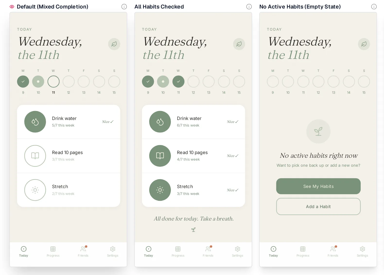
Caption: The same TodayScreen component on the canvas, rendered for default, allHabitsChecked and noActiveHabits.
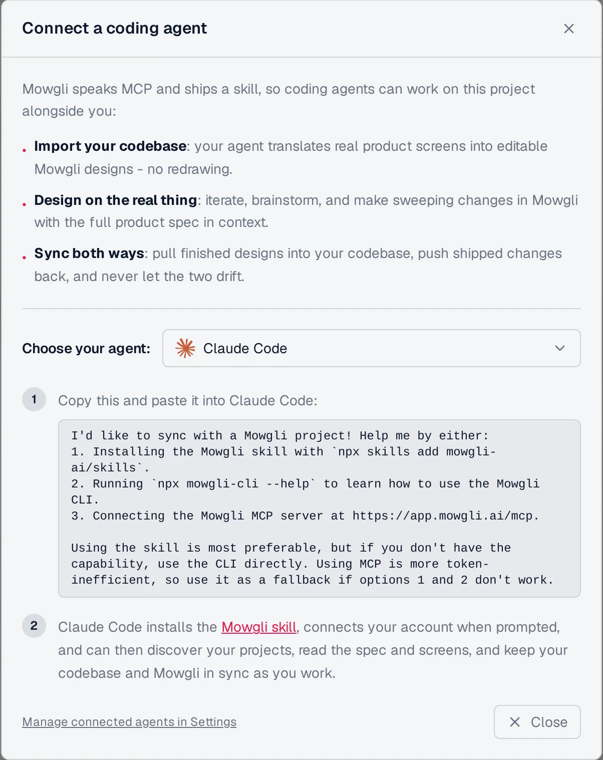
Caption: Mowgli's Connect dialog for Claude Code: skill first, then CLI, then the MCP server at app.mowgli.ai/mcp.
Bolt and Lovable for complete running apps
Use Lovable or Bolt when the deliverable is a running application rather than an isolated component or design.
New Lovable apps use TanStack Start with Tailwind, and all plans provide two-way Git sync. Free includes 5 daily credits, up to 30 per month. Pro costs $25/month.
Bolt selects a framework per project. Free includes 1M tokens per month, and Pro costs $25/month.
See Lovable vs Bolt vs v0 for a project-level comparison.
React component generator comparison
Compatibility with your existing repository matters more than preview quality alone.
Prices are from each vendor's pricing page, October 2026.
| Tool | Generates from a description | Uses your components | Lands in your repo via | Agent access | Free plan | Paid from |
|---|---|---|---|---|---|---|
| v0 | Yes: React + shadcn/ui + Tailwind | Via Design Systems 2.0 skill | GitHub branch + PR, MCP file reads | MCP server | $5 credits, 7 msgs/day | $30/user/mo |
| 21st | Yes through 21st AI, plus 12,000+ catalog items | Design Context reranking; publish your own | CLI install with dependencies | MCP, CLI, skills | Search, 2 installs/day | $6/mo yearly |
| shadcn CLI + MCP | No: installs registry code | Yes, through your registries | shadcn add | MCP, skill | Yes | Free, MIT |
| Claude Code / Cursor / Codex | Yes, inside your repository | Yes, reads your code | Direct edits | Is the agent | Cursor Hobby, Codex Free | $8/mo for Codex Go; $20/mo for Claude Pro or Cursor Pro |
| Builder.io | Yes | Yes, indexed on Enterprise | Pull request | CLI with dev-tools | 60 credits/mo | $24/user/mo |
| UXPin Forge / Merge | Yes, as composed layouts | Built-in libraries; your own through Git on Enterprise | JSX export | Not documented | 50 AI credits | $29/seat/mo yearly |
| Mowgli | Yes, whole screens with states | Yes: codebase import and two-way sync | MCP, skill, CLI, zip | MCP, skill, CLI | 300 credits | Packs from $12; plans from $15/mo |
| Lovable / Bolt | Yes, whole apps | Lovable design systems on paid plans | Git sync | Lovable MCP | Daily credits or tokens | $25/mo |
Write a five-part component specification
A specific prompt prevents most avoidable cleanup. Define these five parts before generating code.
1. Props API
Require an exported TypeScript interface. State which properties are controlled, such as value and onValueChange. Express variants as string unions instead of unrestricted strings.
2. States
List default, selected, disabled, loading, empty and error states. Include overflow, long content and unusually large collections. Use the empty, error and loading states checklist to catch missing product states.
3. Accessibility
Specify the correct role, accessible name, keyboard behavior and visible focus treatment. WCAG 2.2 requires targets of at least 24 by 24 CSS pixels under the applicable target-size criterion and 4.5:1 contrast for applicable text. Read the exact requirements in WCAG 2.2.
4. Tokens
Require semantic theme classes. Explicitly prohibit hex colors, inline styles and arbitrary values such as text-[13px].
5. Dependencies and acceptance criteria
List allowed imports. Require type checks and a story or example for every state. Tell the generator what "done" means, including tests, linting and which files it may change.
Paste-ready prompts for generating React components
Prompt 1 - standalone generator
Build a React component named PlanPicker in TypeScript with Tailwind CSS.

Props (export the interface):
- plans: { id: string; name: string; priceMonthly: number; features: string[] }[]
- value?: string and onValueChange?: (id: string) => void (controlled)
- defaultValue?: string (uncontrolled)
- billing: "monthly" | "yearly"
- disabled?: boolean
- status?: "ready" | "loading" | "error" (default "ready")
- onRetry?: () => void

States to render: default, one plan selected, disabled, loading (skeleton
for 3 cards), empty (plans is empty: short message plus a "Contact sales"
link), error (message plus a Retry button that calls onRetry). Long plan
names must wrap, not overflow.

Accessibility: behave as a radio group (role="radiogroup", each card
role="radio" with aria-checked), arrow keys move the selection, visible
focus ring, every target at least 24x24 px, text contrast at least 4.5:1.

Styling: only semantic theme classes (bg-background, text-foreground,
bg-primary, text-primary-foreground, border-border, text-muted-foreground).
No hex colors, no arbitrary values like text-[13px], no inline styles.
Icons from lucide-react. No other dependencies.

Finish with a demo that renders every state side by side.
Prompt 2 - Claude Code, Cursor, or Codex inside a repository
Add a PlanPicker component in src/components/billing/.

Before writing code: read components.json and src/components/ui/ and list
the primitives you will reuse. If radio-group or skeleton are missing,
install them with the shadcn MCP; do not hand-write primitives that exist
in the registry.

Follow the patterns in src/components/ui/button.tsx: forward className and
merge classes with cn(). Props and states: same as the spec below.
[paste the Props, States and Accessibility sections from Prompt 1]

Tokens: only classes from our theme in src/styles/globals.css. If you need
a color, radius or spacing value that is not there, stop and ask me.

Add a Storybook story per state (or a /dev/plan-picker page if we have no
Storybook). Done when tsc and eslint pass and every state renders. Show me
the diff before touching any file outside src/components/billing/.
Prompt 3 - review generated code before merging
Review this generated component before I merge it. Check and fix, in order:
1. Props: is there an exported TypeScript interface? Are controlled and
   uncontrolled modes both supported? Remove props that are never used.
2. States: list every state it can be in (loading, empty, error, disabled,
   long text, many items). Add the missing ones.
3. Accessibility: correct role and accessible name, full keyboard support,
   visible focus, no click handlers on divs.
4. Tokens: replace hex colors, arbitrary values and inline styles with
   classes from our theme.
5. Dependencies: list every import and replace anything we don't already
   use with what we have.
Report the changes as a checklist.
Put stable requirements in a rules file
Store repeatable requirements in .cursor/rules/components.mdc. The same rules can go in CLAUDE.md or AGENTS.md. See the DESIGN.md guide for maintaining design constraints.
---
globs: src/components/**/*.tsx
alwaysApply: false
---

- Export the component and its Props interface by name.
- Build on primitives in src/components/ui; never re-implement button,
  dialog, select, popover or tooltip.
- Components that load data render loading, empty and error states.
- Use only theme classes from src/styles/globals.css: no hex values,
  no arbitrary values, no inline styles.
- Interactive elements are real buttons, links or inputs, reachable by
  keyboard, with a visible focus ring.
Verdict: choose by job
For a primitive such as a dialog, combobox or data table, use the shadcn CLI or MCP. Let Claude Code, Codex, Cursor or another coding agent install the registry source and dependencies.
For a custom component or block, start with v0. Use 21st generate "..." --variants 3 when comparing several options will help.
For code that must match an existing repository, choose Claude Code, Cursor or Codex with a rules file and shadcn MCP.
For designers or product managers composing layouts from production components, use UXPin Forge. Use Builder.io Enterprise when repository indexing and pull-request delivery fit the team.
For a whole product, use Mowgli to design every screen and state as React and Tailwind files with two-way code synchronization. Plan coverage with a screen by state matrix.
For a running application, use Lovable or Bolt. Use v0 when the project should center on Next.js.
FAQ
What AI tool generates React components from a text description?
v0 is the direct choice for React and Tailwind components built on shadcn/ui. Use 21st for catalog search, installed dependencies and AI-generated variants. Use Claude Code, Cursor or Codex with shadcn MCP when the result must be written directly into an existing repository.
What is the best AI React component generator for an existing codebase?
Claude Code, Cursor or Codex is the best fit because it can read repository rules, existing primitives, tests and tokens. Add shadcn or 21st MCP when the component should come from a known registry instead of newly invented markup.
What happened to 21st.dev Magic MCP?
Magic MCP was replaced by the unified 21st MCP, and old Magic API keys were reset. Set it up with npx @21st-dev/cli@latest init --client claude; alternatives include cursor, codex, vscode and devin.
What is the difference between shadcn MCP and 21st MCP?
shadcn MCP searches and installs from registries configured in components.json, including private registries. 21st MCP searches a 12,000+ component catalog, retrieves code and generates UI using AI credits. The 21st free tier allows two installs per day.
Can AI generate every screen of an app as React components?
Yes. Mowgli designs every screen and state with one React and Tailwind file per screen and a single state prop. The habit tracker example contains 12 screens and 46 states. v0, Lovable and Bolt can generate complete application projects.
How do I stop AI-generated React components from looking generic?
Supply a visual target, repository primitives, semantic tokens, required states and accessibility behavior. Put repeatable constraints in .cursor/rules, CLAUDE.md or AGENTS.md. See why AI-built apps look the same for a deeper diagnosis.
Sources
- v0
- v0 Design Systems 2.0
- v0 MCP server
- v0 Git import
- v0 legacy design systems
- v0 pricing
- 21st
- 21st CLI and MCP
- Magic MCP README
- 21st pricing
- shadcn/ui
- shadcn CLI
- shadcn MCP
- shadcn skills
- shadcn registry directory
- shadcn registry item schema
- shadcn registry namespaces
- shadcn/ui license
- Claude Code overview
- Claude Code memory
- Claude Code updates
- Claude pricing
- Cursor
- Cursor rules
- Cursor pricing
- Codex AGENTS.md documentation
- Codex pricing
- Builder.io
- Builder.io component indexing
- Builder.io design system intelligence
- Builder.io local repository projects
- Builder.io pricing
- UXPin Forge
- UXPin Merge
- UXPin pricing
- Lovable
- Lovable TanStack Start
- Lovable subscription plans
- Bolt
- Bolt pricing
- WCAG 2.2
- Mowgli
- Mowgli skills
- Mowgli pricing
- Mowgli MCP
- Mowgli export to code
- Connect Claude Code
- AI design tools that export React and Tailwind
- MCP servers for UI design
- Claude Code UI design workflow
- Getting designs into Cursor
- Why AI-built apps look the same
- Design handoff to coding agents
- Lovable vs Bolt vs v0
- Empty, error and loading states
- DESIGN.md for AI coding agents
- Mowgli Habit tracker demo project export, October 8, 2026