May 16, 2026
AI Design Doesn't Have to Look AI-Generated
Most AI design tools skip the most important step: letting you actually explore. The moodboard puts your taste and creative instincts back at the centre — before you commit to a single pixel.
There's a recurring complaint in the AI design space that nobody talks about directly, but that shows up in every user conversation, every support thread, every "I tried it and went back to Figma" post.
It goes something like this: the output looks fine, but it looks like AI made it — and there was never a moment where I got to figure out what I actually wanted.
Not bad. Not broken. Just generic. A competent interpretation of a design brief that could have come from any tool, for any product, for any team. The problem isn't that users know exactly what they want and didn't get it. It's that the tool gave them something and called it done — with no process for discovering what they might have wanted, no options to react to, no path to their own taste. The design is finished before the creative conversation even started.
This is the problem we set out to fix with the moodboard.
The missing step in AI design
Every AI design tool in 2026 follows roughly the same workflow: you describe what you're building, the AI generates something, you iterate from there. The generation is fast. The output is often impressive. But the creative steering — the part where your aesthetic instincts, your references, your sense of what the product should feel like — happens either at the very start (a text prompt) or not at all.
A text prompt is a poor medium for conveying design identity. You can write "minimal, warm, high-contrast" and the AI will generate something that technically satisfies all three. But design identity isn't a checklist. It's an accumulation of micro-decisions: this shade of terracotta, not that one. This kind of typography weight, at this scale. The way a button feels slightly unexpected but completely right. These are things you recognise when you see them, not things you can describe before you've seen them.
Every other AI design tool asks you to know your aesthetic before you start. The moodboard assumes you don't — and that's the point.
What exploration actually needs
Real creative exploration has two properties that most AI tools don't support.
The first is low commitment. You need to be able to look at something and say "not this" without having wasted anything. The moment a tool asks you to commit — to a prompt, to a theme, to a layout — before you've seen options, it narrows the creative space prematurely. Good design exploration is cheap iteration: try five things, discard four, understand why the fifth works. Most tools give you one thing, then ask you to refine it. That's not exploration. That's editing.
There's a reason this matters structurally, not just intuitively. Nielsen Norman Group's research on parallel design — exploring multiple distinct directions before selecting one — consistently produces higher usability outcomes than iterating on a single direction from the start. The diverge-then-converge principle is foundational in design methodology: you need range before you need refinement. Skipping the range step doesn't make iteration faster. It makes it shallower, because you're refining something you never fully evaluated against alternatives.
But the deeper problem is that most tools don't even treat visual identity as a decision you make. They assume it. Generate a screen, get a style — some palette, some font pairing, some spacing system — and that becomes your product's look. Nobody chose it. It just emerged from the generation. From that point on, every product iteration is about features, flows, and functionality. The question of taste was never on the table. Your product has an aesthetic, you just didn't pick it.
The second is real context. A reference library of abstract colour swatches and reference images doesn't tell you much about whether a design will work for your product. You need to see the aesthetic applied — your actual app, your actual screens, your actual content — before you can make a judgment. Abstract inspiration is easy; knowing whether it translates is hard. The gap between a beautiful reference image and a functioning UI is where most creative directions fall apart.
These two properties together define what we built: explore freely, then preview before you commit.
Why AI design tools fall flat on creativity
The best design work has always come from a dialogue between the person and the medium. A designer brings intent; the medium responds; the designer reacts; the work evolves. This back-and-forth is where aesthetic decisions become genuine and specific rather than generic and safe.
AI design tools, for the most part, have collapsed this dialogue into a single round-trip. You input. The AI outputs. You either accept or refine. The AI is doing most of the aesthetic decision-making — and because it's optimising for plausibility (outputs that look like "good UI design"), it produces outputs that look like everything else it was trained on. Which is to say: like every other AI-designed product.
This isn't conjecture. A 2025 study published in Cell Patterns found that autonomous AI image generation loops — where AI output feeds back into AI training — converge to just 12 dominant visual motifs, amplifying Western commercial aesthetics and eliminating the variation that makes individual work distinctive. A separate arXiv paper on vibe-coded web design found that AI generation systematically reinforces the conventions of popular frameworks like Tailwind and Bootstrap, producing outputs that are stylistically indistinguishable at scale. The homogenisation is structural, not incidental — it's what happens when you remove human taste from the aesthetic loop entirely.
This is what users mean when they say it looks AI-generated. It's not a technical critique. It's an aesthetic one. The design has no fingerprint. No moment where a human taste made a specific, non-obvious choice. It's competent in the way that a form letter is competent: correct, complete, and entirely anonymous. And from a business perspective, a product that looks like every other AI-designed product is a product with no visual identity — which matters: research consistently shows visual differentiation is one of the primary drivers of brand recognition and consumer preference.
We've had users come to Mowgli specifically because they were tired of the output from other tools — including newer, well-resourced AI design products that launched this year. The complaint is consistent: everything looks the same. The colour palettes feel algorithmic. The typography choices are safe. The layouts are what you'd expect. There's nothing in it that couldn't have been the default.
The moodboard: creative steering before commitment
After your product questionnaire, before a single screen is generated, Mowgli surfaces 16+ design directions tailored to your specific product. Not generic templates. Not colour swatches.
What you actually see are moodboard cards — think of them as vibe cards made by an art director who already knows what you're building. Each card is a fully realised visual direction: real copy pulled from your product, real data structures from your app's context, styled into a complete aesthetic — typography, palette, spacing, visual language, tone — all applied together. "Performance Dark." "Swiss Grid Finance." "Soft Daylight Minimalism." Each one named and described like a creative brief, each one built from your product, not from a generic template.
This is how an art director actually works. They don't hand you a template and say fill it in. They come back with three or four distinct directions, each one already wearing your product's DNA, and ask: which of these is the one? The moodboard mimics this process exactly — but uses AI to supercharge it. Instead of a handful of directions, you get 16+, all generated in seconds, all grounded in your product. We've trained our model to maximally explore different aesthetic directions while staying close to your app's DNA — so the range feels genuinely diverse, not like variations on the same theme, but every direction still feels plausible for what you're actually building.
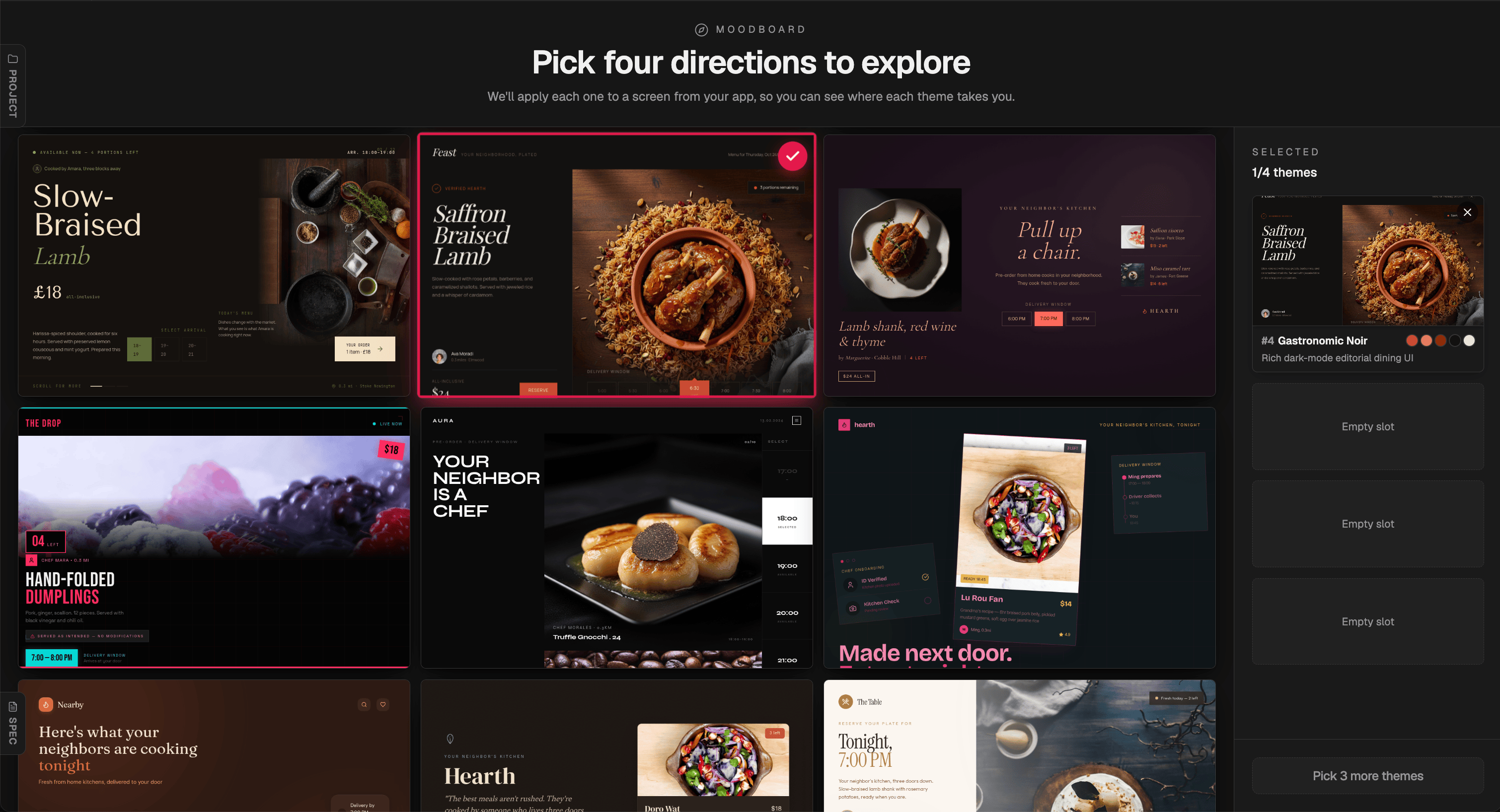
16+ directions generated for a food delivery marketplace. The generation steered toward a dark mode sultry aesthetic — each card a fully realised direction, not a colour swatch or a template.
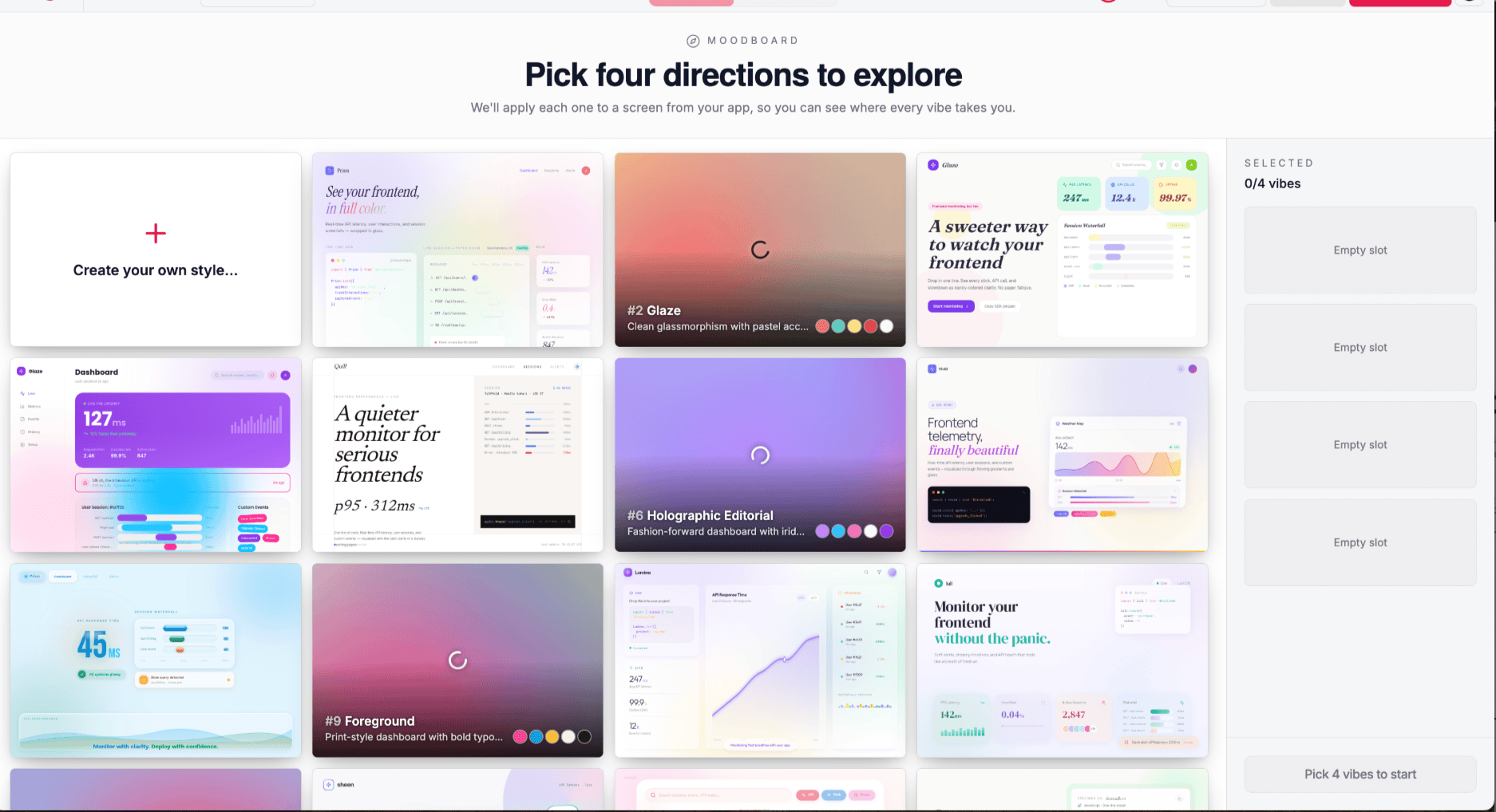
The same moodboard applied to a SaaS monitoring dashboard. Directions range from clean glassmorphism to holographic editorial to dense print-grid.
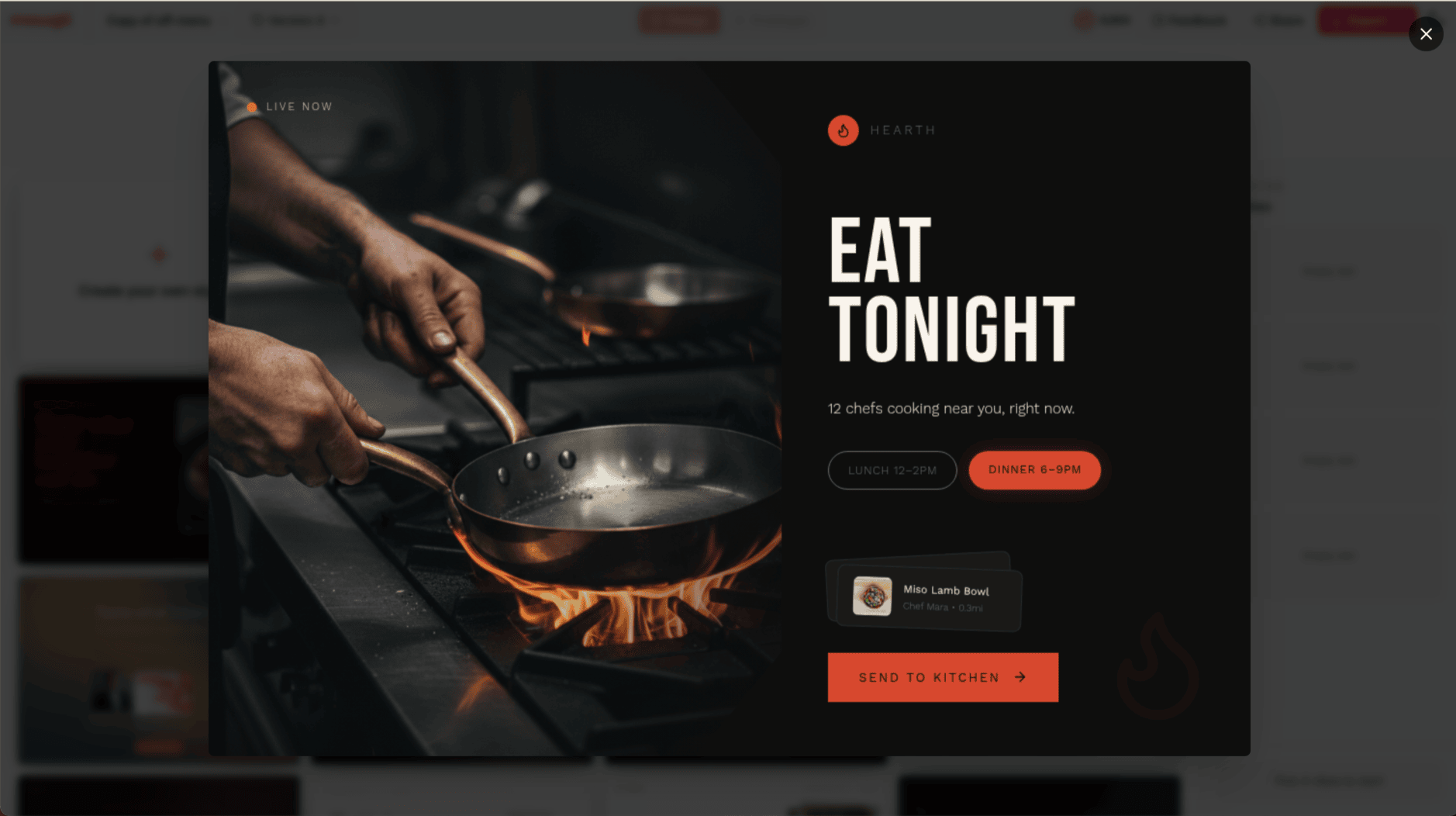
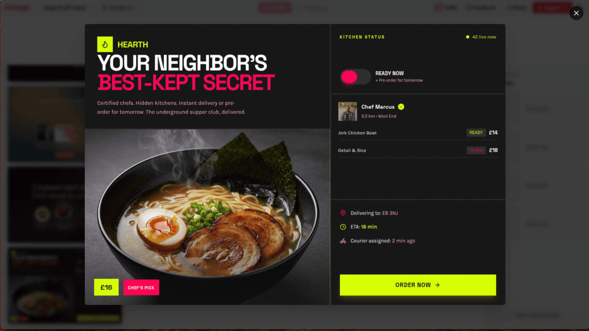
A single direction expanded. Hero imagery, typography, colour palette, and real product content — all applied together before a single layout decision is made.
"YOUR NEIGHBOR'S BEST-KEPT SECRET" — dark with neon yellow accents. One direction among 16+ for the same product.
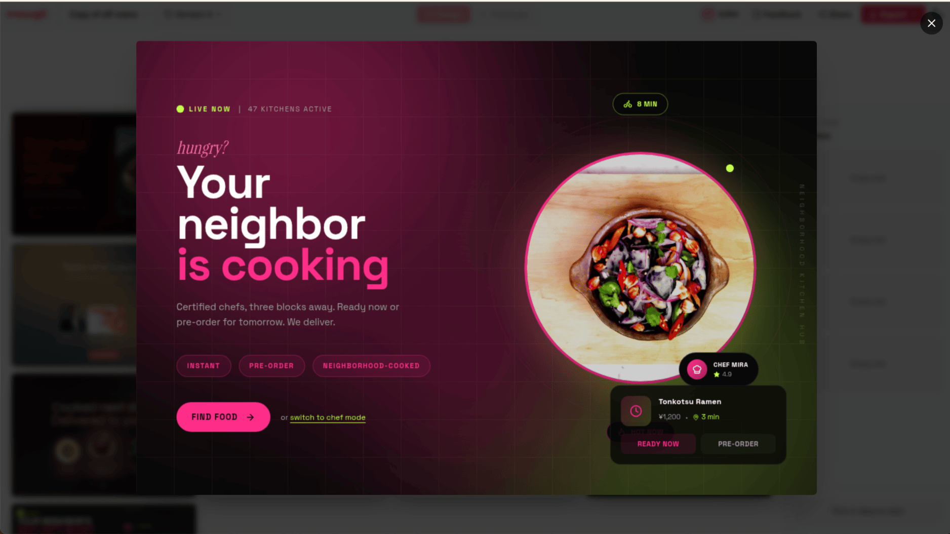
The same product, a completely different register. Deep magenta gradient, intimate and warm.
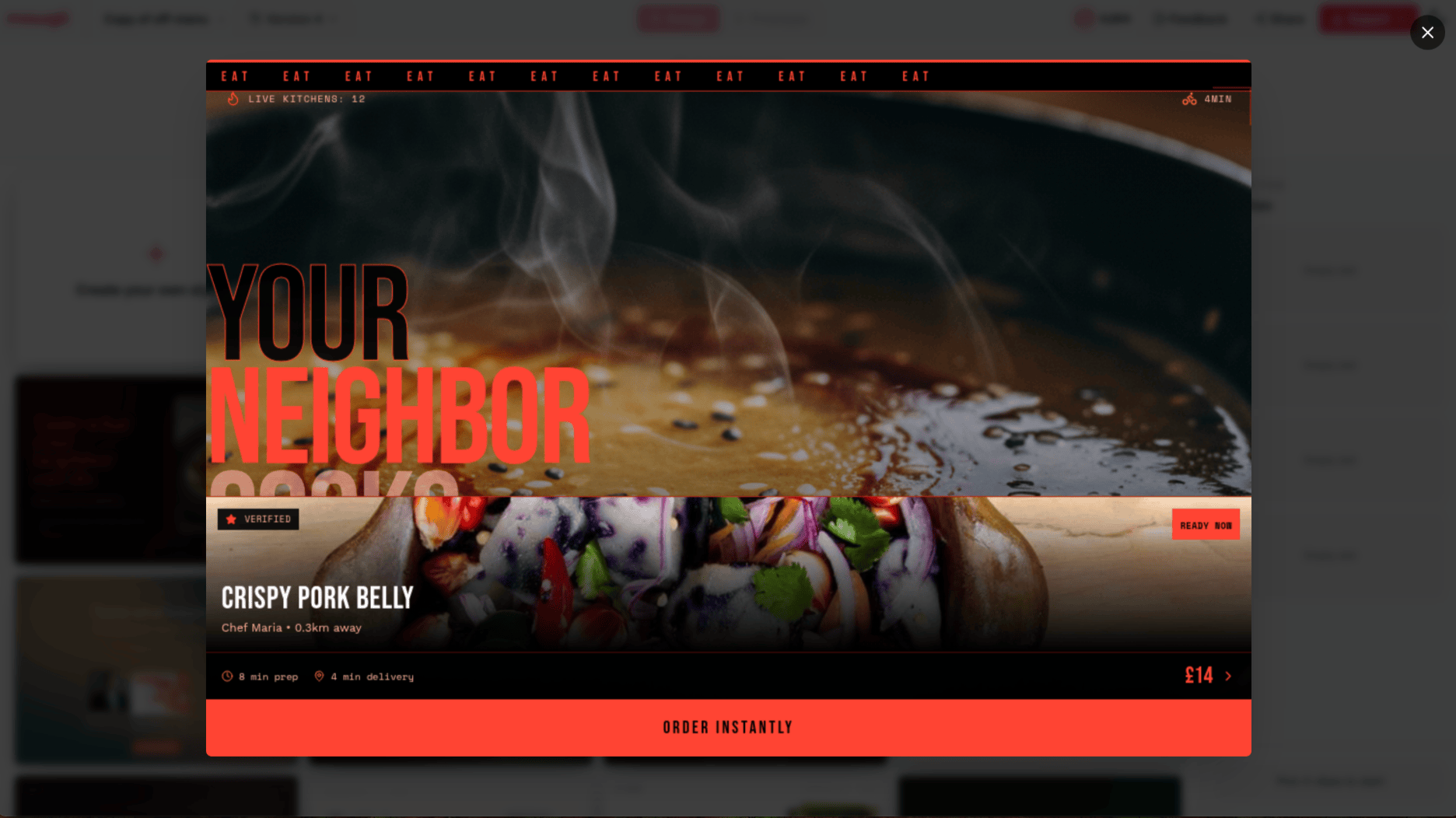
Full-bleed food photography, marquee typography, coral red. Four directions. Same product. None of them look like each other.
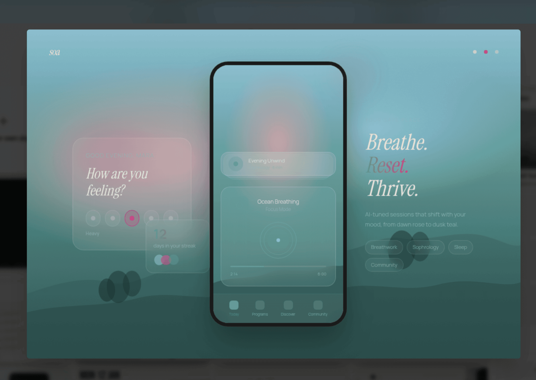
A different product entirely — a meditation app. Misty teal, soft glassmorphism, completely different in tone. The moodboard doesn't converge on a house style; it finds what's right for what you're building.
The research on why this works is not new. Peer-reviewed work on moodboards in design processes has long documented their function as alignment tools — not because they prescribe an answer, but because they create a concrete shared reference that allows both teams and clients to respond with genuine reactions rather than abstract preferences. The same cognitive dynamic applies here: seeing a direction applied to real content triggers a more honest response than reading a description of it.
For power users: you can steer the moodboard before the questionnaire even begins. Add specific colours, upload your brand guidelines, drop in screenshots of existing designs and explain what's wrong with them. This is exactly the brief you'd bring to a designer or art director — specific requirements, existing constraints, a point of view on what's not working — and the moodboard generation responds to all of it.
This is the exploration phase. You are not picking a design. You are finding your direction.
Browse the full grid, upload references — a brand you admire, a screenshot that nails a feeling, a photo that captures a mood — specify colours, mix cues from different directions, or create your own style from scratch. The moodboard responds to what you give it. When something catches your eye, select it: up to four directions stack in your shortlist panel, ready to take to the preview step. The creative conversation is happening at the aesthetic level, before a single layout decision has been made.
When you've made your shortlist, the second step begins: preview. Mowgli takes your selected directions and applies each one to a flagship screen from your actual app — your real layout, your real content, your real information hierarchy — so you can see what each direction actually looks like as a live product, not a poster. The screens sit side by side. You can toggle between them, go back to the moodboard, swap one direction out for another, keep refining.
This is the look before the commitment. Not a mood image. Not a colour palette swatch. Your app, in a curated theme, before you've generated the full build. Ideating on a few moodboard cards and a single screen of yours costs a fraction of generating your entire app — which, once you hit generate, draws on your full product spec to holistically produce every screen your app needs: 20, 30, 40, 50+ screens, however many your product requires, all in the theme you chose. Getting the aesthetic right at this stage, cheaply, is precisely the point.
Only when you've seen it on a real screen and said yes, that one do you hit generate. The full build happens from that point, with the aesthetic decision already made — deliberately, by you, from options you actually explored. Read more about how the spec drives the full build →
Read the moodboard announcement →
Putting your taste back in the loop
The human-in-the-loop conversation in AI design has so far been about accuracy — getting the AI to produce what you described. We think the more important conversation is about taste — getting the AI to produce something that reflects who you are, not just what you typed.
We don't pretend to know what you want. Nobody does, at the start — including you. What we can do is give you enough to react to: directions that are varied enough to spark something, grounded enough in your product to feel real, and fast enough to iterate that your mind can actually explore rather than just approve or reject. Good taste is found, not specified. The moodboard is built around the idea that the right design is something you recognise when you see it — and our job is to get you there, not to guess it for you.
Taste isn't a setting you configure. It's a response. You see something and you know whether it's right. Mowgli's moodboard is built around this: show you enough variations, in enough fidelity, that your eye can tell you what's working. Add your references. Steer the generation. See it on the real product. Go back and try again. The loop is fast enough that you're not making abstract decisions — you're reacting to real things.
The output, because it comes from a process that included your actual aesthetic responses, doesn't look like everything else. It looks like yours.
We built this because we kept seeing the same outcome when people used AI design tools: technically fine, creatively blank. The tools were doing all the aesthetic work and leaving users with something they could use but didn't love. Mowgli's moodboard is an attempt to put the designer — even if that person has never opened Figma — back in the creative driver's seat.
Sources and further reading
- AI visual homogenisation — autonomous generation loops converging to 12 generic motifs: Autonomous language-image generation loops converge to generic visual motifs — Cell Patterns (2025)
- Vibe coding amplifying design homogenisation in web UI: Interrogating Design Homogenization in Web Vibe Coding — arXiv
- Parallel design exploration producing higher usability outcomes than single-path iteration: Parallel & Iterative Design + Competitive Testing = High Usability — Nielsen Norman Group
- AI without human direction causing premature convergence and narrowed exploration: AI-assisted design synthesis and human creativity in engineering education — Frontiers in AI (2026)
- Moodboards as creative alignment tools in design processes: Visual organizing: Balancing coordination and creative freedom via mood boards — ScienceDirect
- Visual identity and brand differentiation: What Is a Visual Identity and Why Does It Play a Crucial Role in Branding? — The Branding Journal
- The cost curve of late-stage design changes: The High Cost of Late-Stage Design Changes
- The emerging countermovement against AI aesthetic convergence: AI and the Sea of Sameness: Why Design's Next Frontier Is Rebellion — Fazer Agency
Try it
The moodboard is available now in Mowgli. Start a new project, go through the questionnaire, and the moodboard appears before generation. Upload references, steer freely, and preview on your actual app before you commit to the full design build.
If you have an existing project, open it, click the project name in the top bar, and hit Redesign. The full moodboard flow applies your chosen theme to the existing project — including Figma imports.