May 29, 2026
Moodboard, Preview, Build: The Compound Logic
Most AI design tools front-load the aesthetic risk — you commit to a direction, generate everything, then discover it's wrong. Mowgli's three-stage flow inverts this: explore freely, validate cheaply on your actual app, then build once with confidence.
There's a structural problem in how most design processes handle aesthetic decisions. The first version of the product — the one built to test the direction — is also the most expensive version to get wrong. It takes the most time to produce, the most effort to evaluate, and the most work to redo if it turns out to be the wrong call. The decision about what the product should look and feel like is made at the point of maximum commitment and minimum information.
This isn't unique to AI design tools. It's been the default in design for a long time. You describe what you want, someone builds it, you see whether it's right. The feedback loop runs in one direction: commit, build, evaluate, revise.
Mowgli's three-stage flow — moodboard, preview, build — was built specifically to break this pattern. The logic is compound: each stage does real work, costs very little given what's already been done, and makes the next stage significantly cheaper to get right.
Stage one: the spec, done once
Before the moodboard opens, you go through the product questionnaire. This is where Mowgli builds its understanding of your product: who uses it, what the core flows are, what happens at the edge cases, what screens the product actually needs. The output is a structured spec — a complete product model.
The spec is the infrastructure everything else runs on. It's what makes the moodboard directions feel product-specific rather than generic. It's what makes the preview step nearly free. And it's what makes the full build coherent rather than a collection of loosely related screens.
You do this work once. More on how the spec works and why it matters →
Stage two: the moodboard
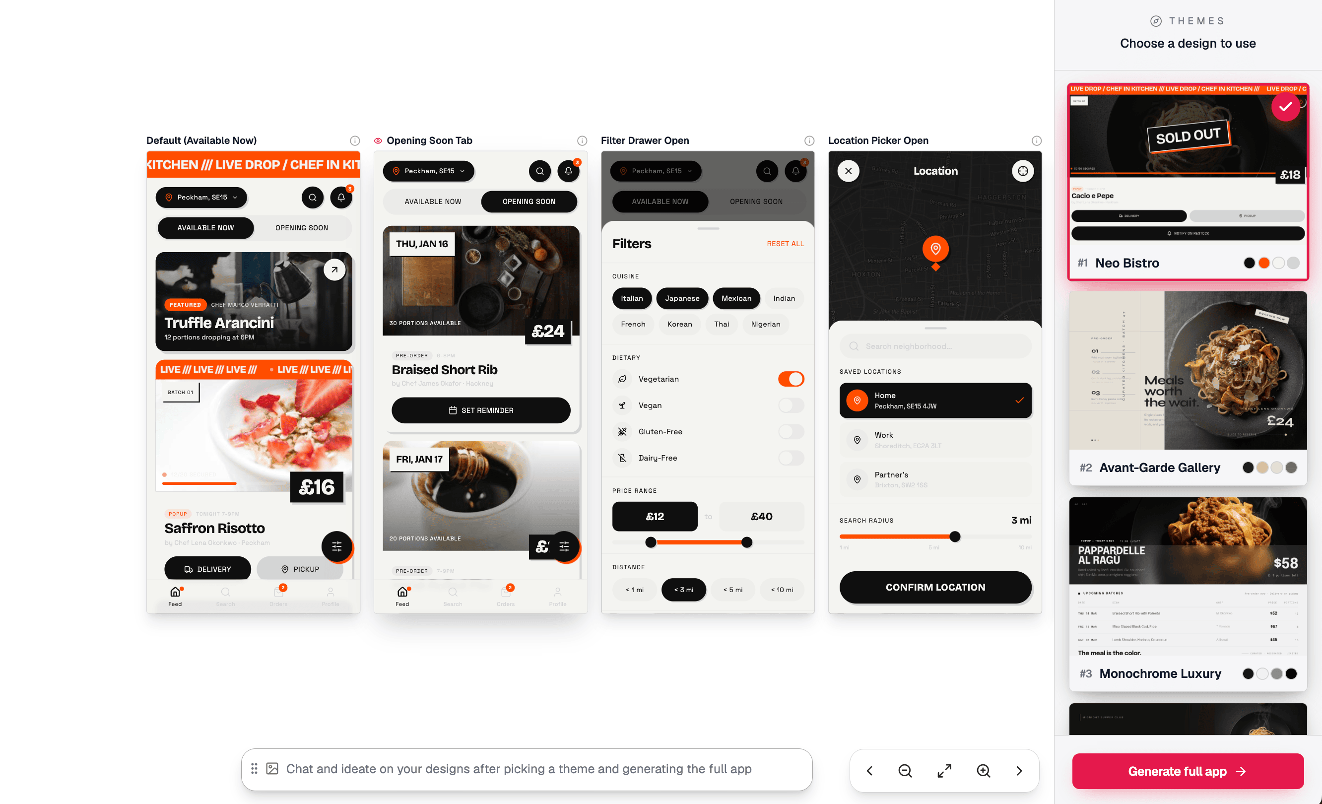
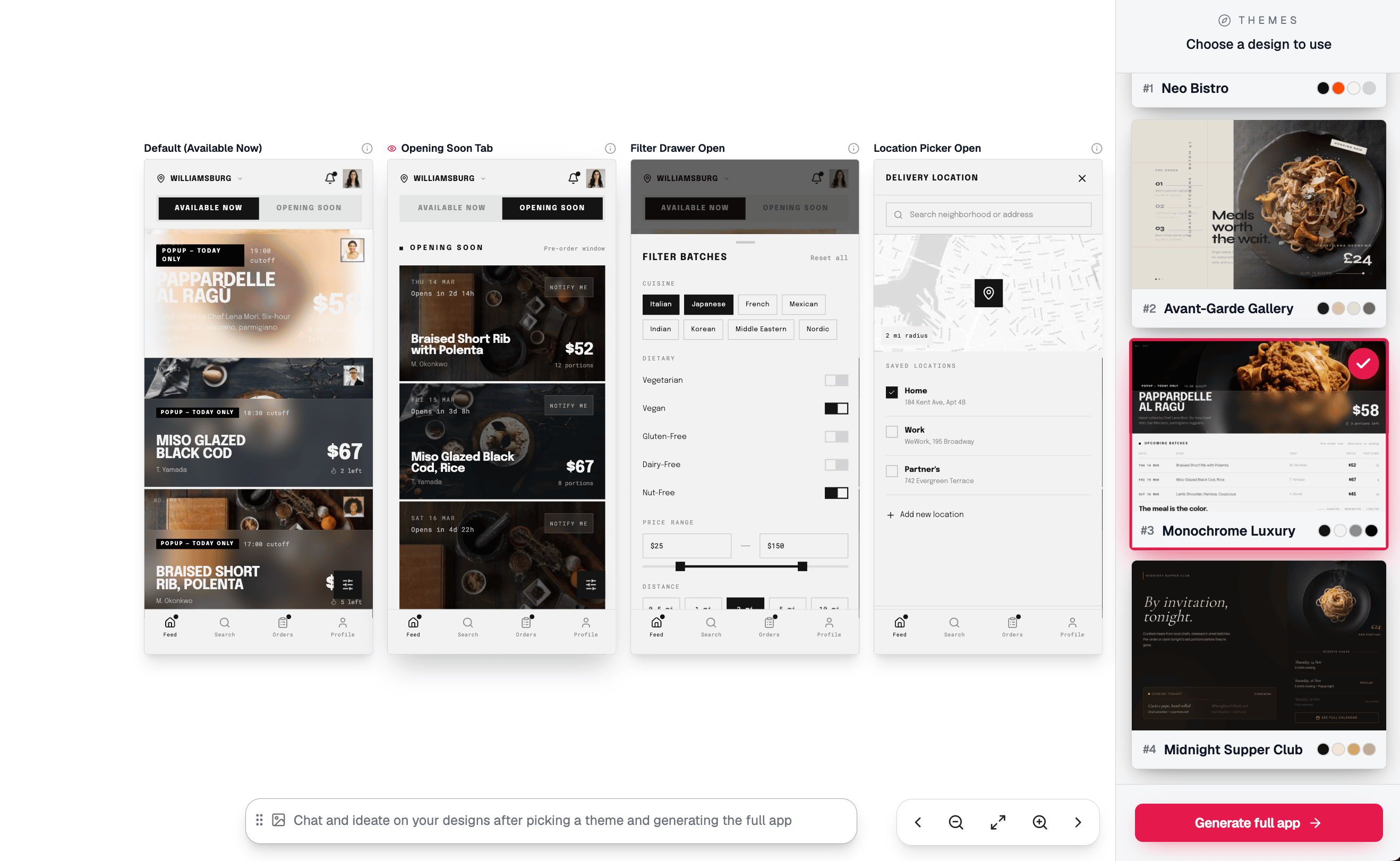
After the questionnaire, before any screens are generated, Mowgli surfaces 16+ distinct design directions — each one applied to real content from your product. Not abstract palette swatches. Not wireframes. Fully realised visual languages: typography, colour, spacing, tone, imagery style — all applied together, all to your actual product data.
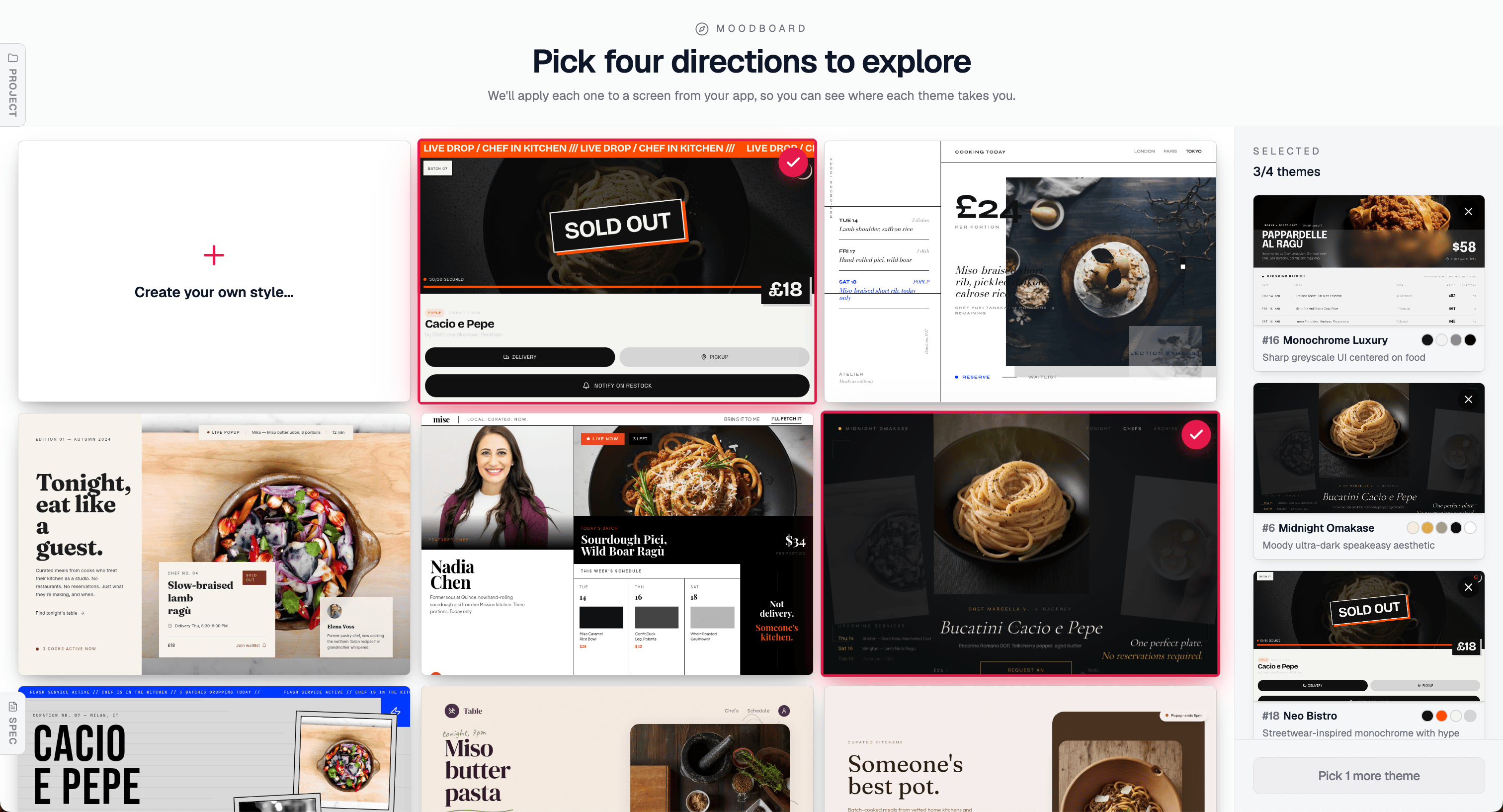
You browse the grid and select up to four directions to take forward. The selection is low-commitment by design: you're not choosing a final direction, you're choosing what to evaluate next. If none of the generated directions are quite right, you can remix any of them — describe a twist on an existing card and get a new direction built from that base.
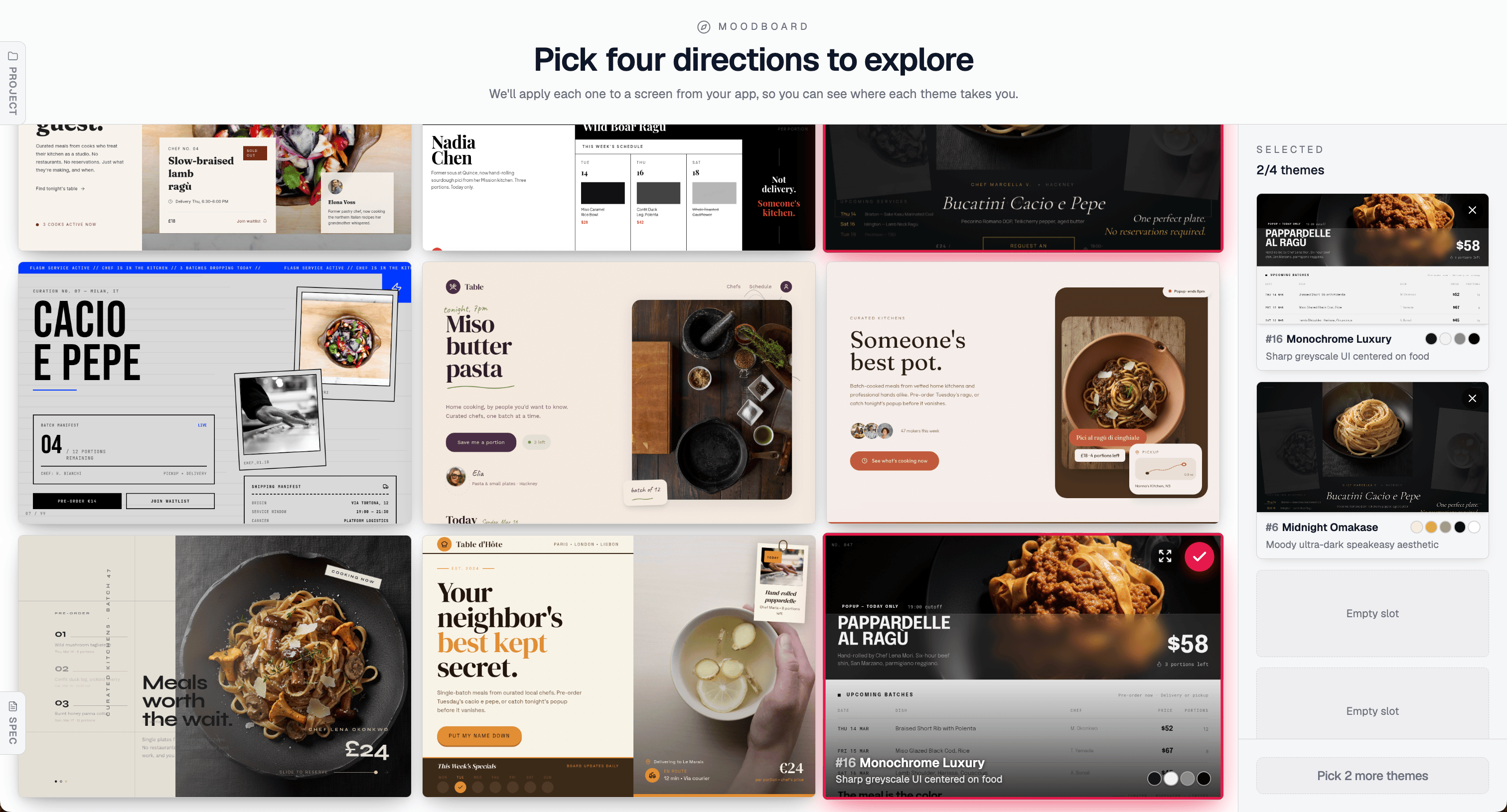
2 of 4 directions selected — including Monochrome Luxury, which gets remixed into something sharper in the next image. Every direction in the grid is applied to your product's real content; you're reacting to actual screens, not abstract descriptions.
Building a shortlist. Each selected direction queues up for the preview step — you see all four side by side before committing to any of them.
Beyond the generated directions, you can also remix any of them. The top-left card on the moodboard — "Create your own style…" — lets you take an existing direction and steer it with a description. In the shortlist above, the third selected theme is exactly this: Monochrome Luxury (#16) was taken as the base and regenerated as "theme 16 but more hip and trendy," producing Neo Bistro (#18) — same greyscale-centred DNA, same product focus, but with a streetwear-inflected, high-urgency energy that reads completely differently. Same source direction, different brief, different outcome. This is how you get to a direction the grid didn't surface on its own — not by starting from scratch, but by taking what's close and pushing it in the direction you want.
The cost of this stage is low. You're not generating a product. You're browsing a range and picking what resonates. The range is wide by design — the model is trained to maximise aesthetic distance between directions while keeping every one of them grounded in what you're actually building.
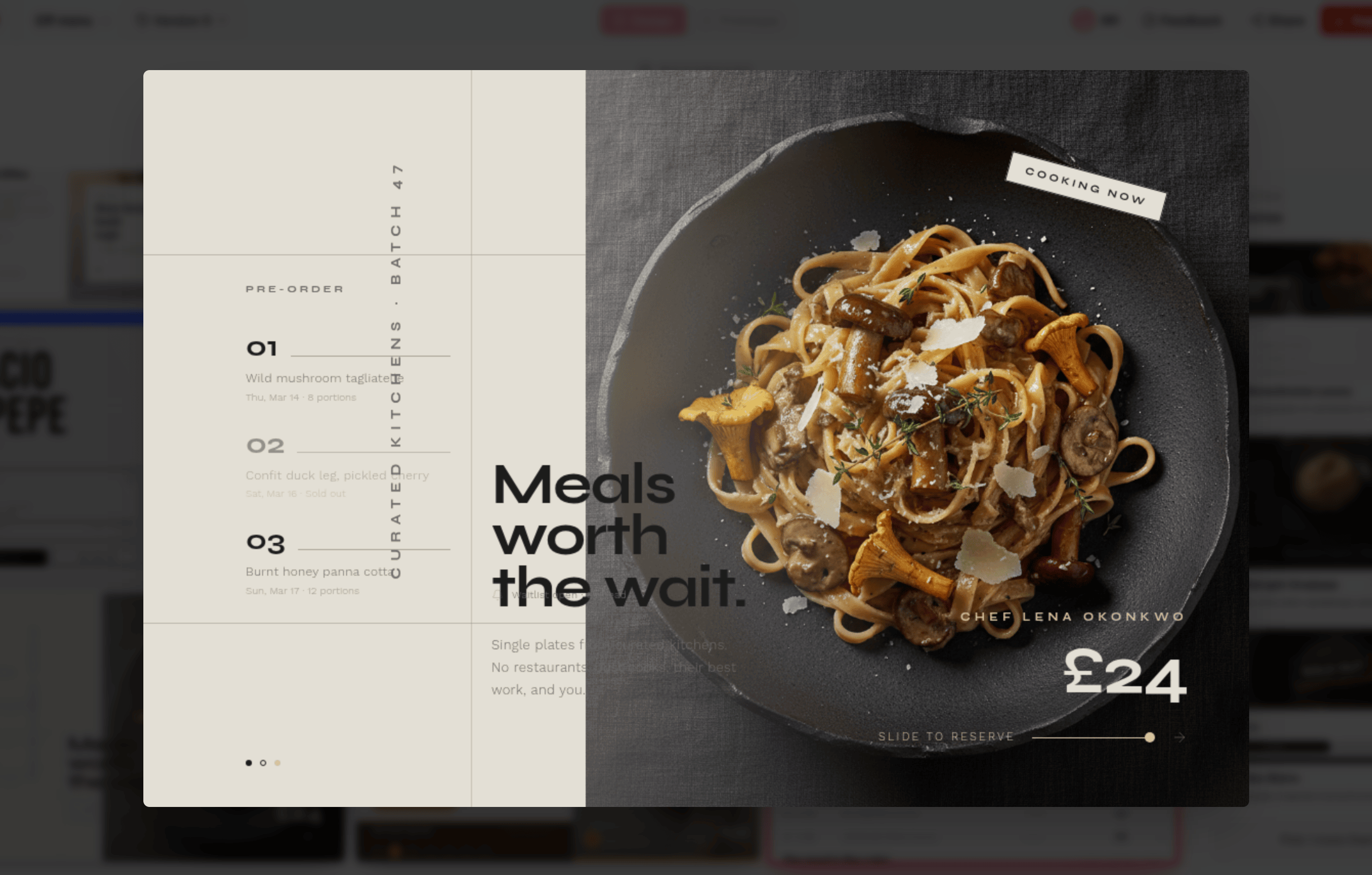
To make this concrete: the same food marketplace product, rendered in five distinct directions from the moodboard —
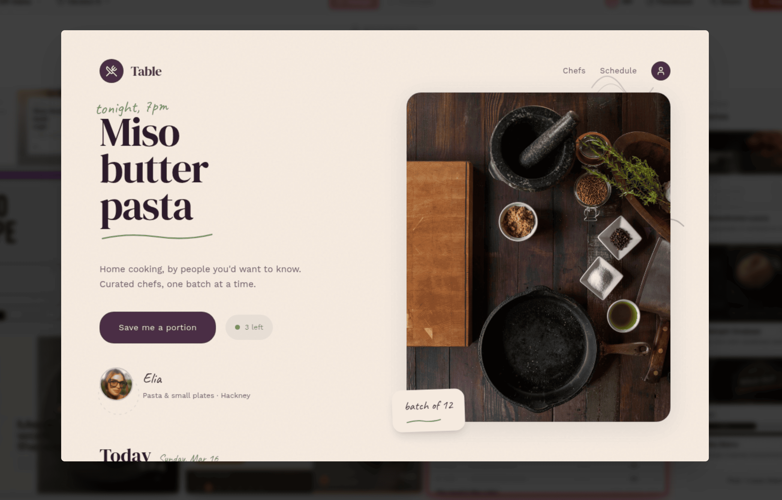
"Table" — warm cream, deep aubergine, handwritten accent typography. Intimate, editorial, chef-led.
"Avant-Garde Gallery" — stark light backgrounds, oversized food photography, "Meals worth the wait." Elevated, considered, gallery-adjacent.
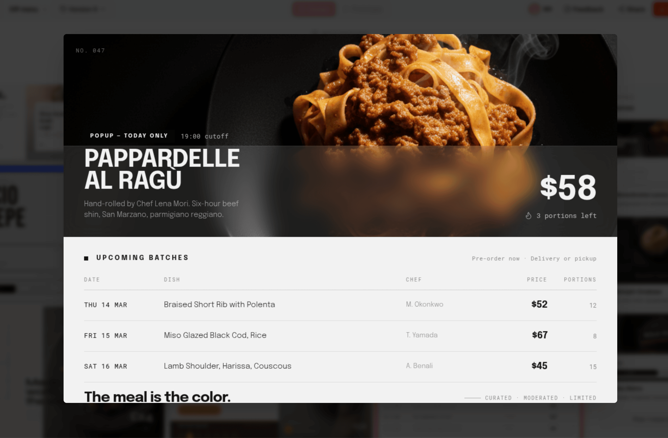
"Monochrome Luxury" — deep dark surfaces, bold all-caps type, high-contrast tabular data. The meal is the color.
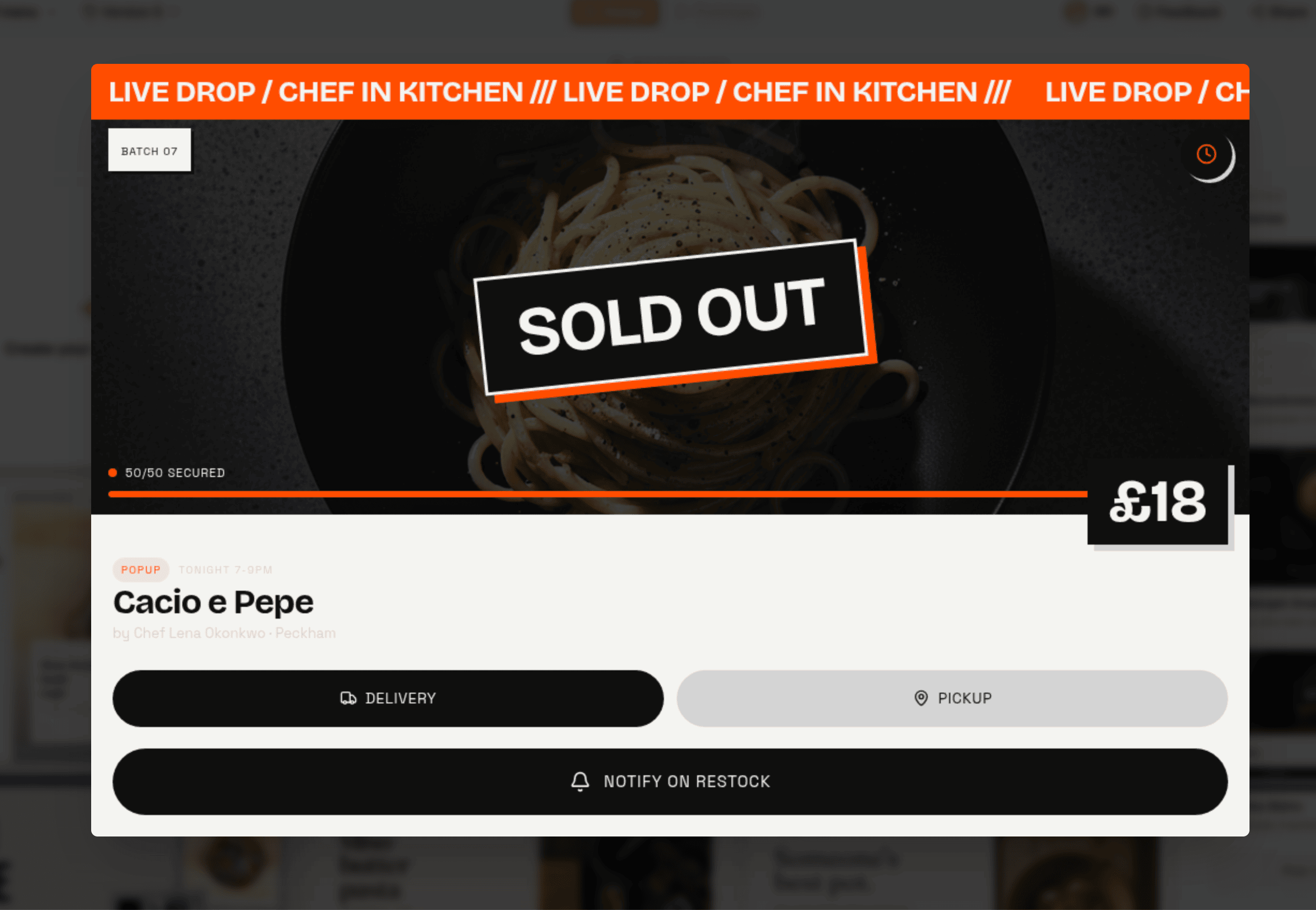
"Neo Bistro" — live-drop energy, orange urgency ticker, SOLD OUT as a design element. This direction didn't come from the grid — it was remixed from Monochrome Luxury above, regenerated as "theme 16 but more hip and trendy." Same greyscale DNA, completely different energy.
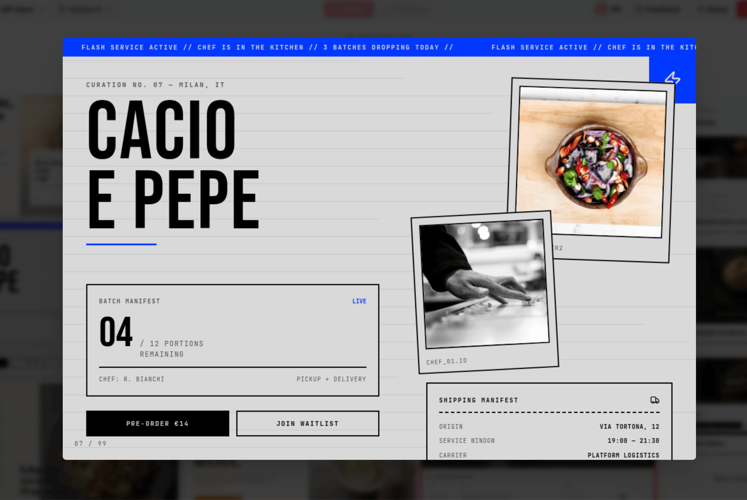
A fifth direction — newspaper-style editorial grid, massive typography, Polaroid inserts, logistics-manifest UI. The same product, an entirely different register.
Same product. Same content. Same flows. Five completely distinct visual identities. This is the range you're choosing from before a single layout decision is made.
Stage three: the preview
Here is where the compound logic becomes visible.
Because the spec already exists, applying a visual direction to your flagship screen costs almost nothing. The product is already understood: its data model, its content hierarchy, its core user flows. Rendering that one screen in a chosen aesthetic is the marginal step.
So instead of building the whole product to find out whether a direction works, you get four versions of your most important screen — your real screen, your real data, your real layout — in the four directions you shortlisted. Side by side. Before you've committed to anything.
The preview step. Four directions applied to your actual flagship screen — real layout, real content, real information hierarchy. Neo Bistro is selected; the other three are waiting to be compared.
The same screen, a completely different world. Where the first preview is all orange urgency and live-drop energy, this one is clean and light — stark white surfaces, food as protagonist, "The meal is the color." Same product, same layout, same content. The aesthetic is doing entirely different work.
This is not a mood image applied to a template. It is your product. The navigation structure is yours, the content labels are yours, the state logic is yours — all of it rendered in the aesthetic you're evaluating. The thing you're looking at is as close as you can get to the full product without building the full product.
What the preview surfaces — and what descriptions, prompts, and reference images cannot — is whether a direction actually works for your specific product. A direction that looks striking in the abstract might obscure your core content in practice. A direction that seems safe might come alive when it's applied to your actual hierarchy. You can't know without seeing it.
The preview is that seeing. For almost no additional cost, because the spec already did the heavy lifting.
Stage four: the full build
When you've seen it on a real screen and made your choice, you hit generate. The full build takes the selected direction and applies it comprehensively: every screen the spec defined — the core flows, the empty states, the error handling, the role variants — all rendered in the theme you chose, all coherent with each other.
The generation is not exploratory at this point. The aesthetic decision has been made. The spec already defined everything the product needs. The build is execution: thorough, consistent, and grounded in a direction you already validated.
The number of screens depends on the product — 20, 30, 40, 50 or more. All of them in the theme. None of them requiring you to revisit the aesthetic decision you've already made.
Why the order matters
The compound logic is this: each stage is cheap relative to the work that's already been done.
The spec is the expensive step, in the sense that it requires the most thinking. But it's also the step that makes everything else cheap. The moodboard directions are generated from the spec — they know your product, which is why they feel specific rather than generic. The preview is rendered from the spec — which is why it shows your actual screens rather than a template. The full build is generated from the spec — which is why every screen exists and every state is handled.
Without the spec, you'd have to do exploratory generation to find out what works. That means generating the whole product in one direction, deciding it's wrong, and regenerating from scratch. This is the default experience in most AI design tools, and it's why users describe them as expensive to iterate on aesthetically.
With the spec, the exploration happens before the commitment. The moodboard is the range. The preview is the validation. The build is the execution. None of these stages are redundant — each one does something the others can't. And the cost of getting the aesthetic wrong is paid at the preview stage, where it's cheap, rather than at the build stage, where it isn't.
The token cost structure, broken down. Each moodboard direction card is generated by applying a style to a compact, representative slice of your product content — enough to trigger a genuine aesthetic reaction, not a full screen render. The preview step then renders one complete screen per shortlisted direction — four screens total. Four screen-generations, not four full app-generations. Then the full build: 30, 40, 50+ screens, generated once.
Compare this to the default path in tools without a spec: generate a full app to test a direction, decide it's wrong, generate again. Each of those generations is paying full token cost for every screen — and doing it multiple times because there was no cheap way to validate the direction first. In practice, getting to a design you're happy with through that loop means two or three full builds. The moodboard-preview-build sequence replaces those repeated full builds with 16 low-cost cards and 4 single screens, reserving the expensive generation for the one time you're already confident in the direction.
This is also where the spec's cost amortises. The spec is computed once and cached as the shared context for every downstream generation. The moodboard reads from it — the per-direction spec overhead is negligible spread across 16 cards. The preview reads from it — same context, four screen renders. The full build reads from it — the entire product generated with the spec as the persistent source of truth, no redundant re-derivation of what the product is at each screen. Without the spec, every generation stage re-infers the product from whatever prompt or description is in scope, which means token cost is paid repeatedly for context that could have been established once.
The spec inverts the traditional risk curve. In most tools, token cost and aesthetic risk compound together: the further you go before discovering the direction is wrong, the more you've spent to find out. With this flow, the highest-risk question — does this aesthetic actually work on this product? — is answered at the preview stage, at the cost of four screens. Not forty.
This is the compound logic. The spec enables the moodboard. The moodboard enables the preview. The preview enables the build. The whole sequence runs in the order that minimises the cost of being wrong — and maximises the chance of the final build being something you actually wanted.