Backend Dev, Need a Frontend? A Side-Project Design Playbook
Derive screens and states from your data model, choose one component library, apply 10 mechanical UI rules, or design the full app with Mowgli.
The frontend design playbook at a glance
Treat frontend design like schema design. Start with your data model and three to five user jobs, derive every screen and state, then choose one component library and apply consistent visual rules. Copy layout patterns from shipped products. If you use AI, give it a specification, UI rules and a visual reference, not only "make it look modern."
Consider a small self-hosted uptime monitor. The process is:
- Write its entities, fields and user jobs in a text file.
- Build a screen and state inventory.
- Choose shadcn/ui, Mantine, Radix Themes or daisyUI.
- Define tokens and apply the 10-rule checklist.
- Save three to five shipped references for each screen type.
- Give Claude Code, Codex, Cursor or another coding agent a rules file and visual target.
See the full screen-inventory method for a deeper version of the first two steps.
Step 1 - Start with the data model and user jobs
A screen is a view over data plus the actions available on that data. Entity fields determine what you can show. User jobs determine what deserves the strongest hierarchy.
Capture enums, nullable timestamps, foreign keys and counts. They create visible interface states.
Monitor       id, name, url, interval_s, timeout_ms, paused, created_at
Check         id, monitor_id, started_at, duration_ms, status_code, ok, error
Incident      id, monitor_id, opened_at, acknowledged_by?, resolved_at?, cause
AlertChannel  id, kind (email | slack | webhook), target, verified_at?
StatusPage    id, slug, title, monitor_ids[], public
User          id, email, role (owner | member)
Now list the main user jobs:
- Receive an endpoint failure notification within a minute.
- See what is down immediately, without scanning a wall of green.
- Find an incident's timing and cause, such as a status code, timeout or DNS failure.
- Publish a status page that reduces support email during failures.
- Add a newly deployed service as a monitor in under a minute.
These jobs already settle an important design question. The home screen should be a down-first list, not a chart-led dashboard. Charts may support investigation, but they should not delay the answer to "What is broken?"
For a reusable derivation process, read App idea to user flows and screen list.
Step 2 - Compile entities and actions into screens and states
Apply mechanical derivation rules before drawing layouts:
- A browsable entity needs list and detail views.
- A create or edit action needs a form.
- Use a dialog for up to five fields and a page beyond five.
- An enum often becomes a badge, filter and distinct state.
- A nullable timestamp creates a state. A missing
resolved_atmeans an open incident. - A collection needs first-run empty and no-results states.
- An async request needs loading and error states.
- An integration needs not-connected and failing states.
- A role needs permitted and read-only views.
- A destructive action needs confirmation.
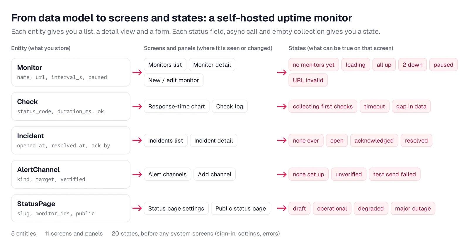
Caption: Each entity yields its screens, and each status field, async call and empty collection yields a state.
The uptime monitor produces this inventory:
- Monitors/home: no monitors yet, loading, all up, some down sorted first and fetch failed.
- Monitor detail: collecting first checks, up, down with an open incident and paused.
- New/edit monitor: empty, invalid URL, test running, test failed and saved.
- Incidents: none ever, open and resolved only.
- Incident detail: open, acknowledged and resolved.
- Alert channels: none set up, unverified and test send failed.
- Status page settings: draft, published and no monitors selected.
- Public status page: operational, degraded and major outage.
- Sign in/first run: first admin setup and wrong password.
- Team: member view with read-only actions.
The result is 10 screens and 32 states. Track them in a screen x state table. For every screen, check up to ten categories: first run, no results, loading, error, success, partial data, permission, integration, destructive confirmation and domain-specific status.
Use the empty, error and loading states checklist to catch missing paths.
Step 3 - Choose one component library
One library gives you shared buttons, inputs, dialogs, tables and tokens. It also supplies keyboard, focus and ARIA behavior. Mixing libraries often leaves you with competing spacing systems, button styles and date pickers.
Choose by implementation context:
- shadcn/ui says, "This is not a component library. It is how you build your component library." Its CLI copies source into your repository. It uses Tailwind and CSS-variable tokens. It fits React, Tailwind and coding-agent workflows. Its docs describe it as AI-Ready, and v0 defaults to it.
- Mantine provides more than 120 components and 70 hooks, including packages for forms, dates, charts and notifications. It is MIT licensed and uses plain CSS files, so Tailwind is not required.
- Radix Themes is "a pre-styled component library that is designed to work out of the box with minimal configuration." Add its stylesheet and a
Themewrapper, then configure accent, gray, radius and scaling. - daisyUI is a Tailwind CSS plugin with classes such as
btnandcard. Its docs say, "Pure CSS. No JS dependency." Its 35 built-in themes suit server-rendered HTML with Django, Rails, Go templates or htmx.
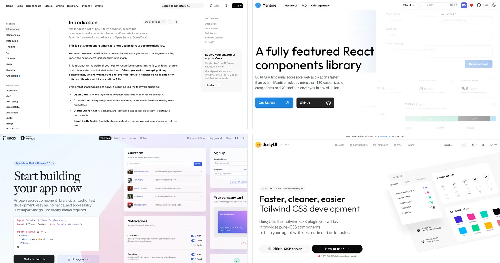
Caption: Source: shadcn/ui, Mantine, Radix and daisyUI websites, captured October 2026.
Theme the library once. Set tokens such as shadcn/ui --primary and --radius, or Radix Theme props. Do not restyle standard components per page. Build missing pieces from the selected library's primitives.
If you choose Radix Themes, change its default indigo accentColor. See why AI-built apps look the same for the broader pattern.
Step 4 - Apply 10 mechanical design rules
These rules work as a reusable checklist and a lint-style review. Several align with Refactoring UI.
Rule 1: Use a spacing scale and group by relationship
Use multiples of 4 px. Tailwind's default --spacing is 0.25rem, so gap-1 is 4 px and gap-6 is 24 px.
Use about 4 px from label to value, 16 px between fields and 24 to 32 px between sections. Related and unrelated elements should not receive identical spacing.
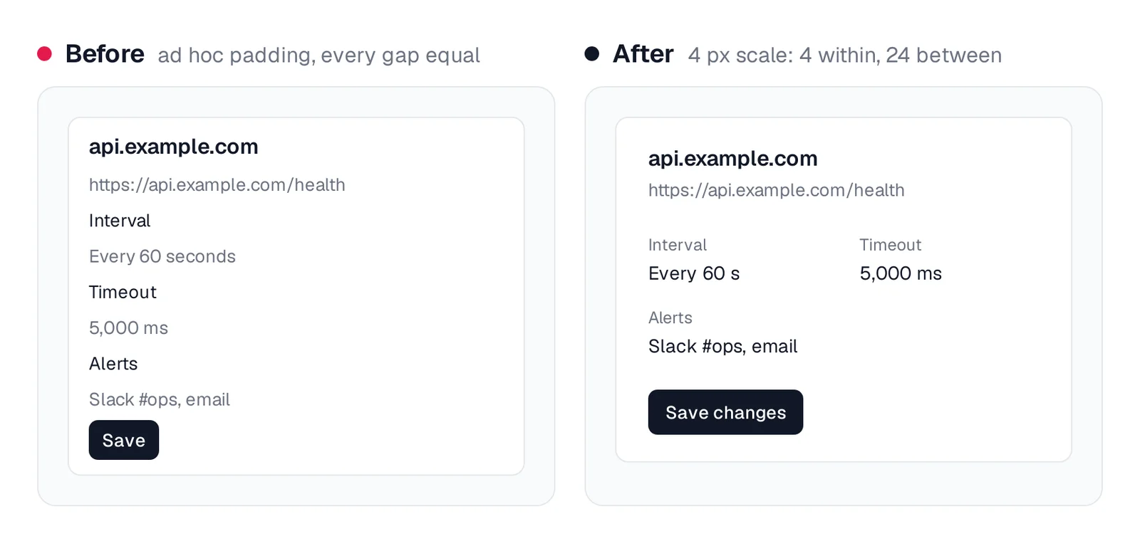
Caption: Same fields. The grouping comes from spacing alone.
Rule 2: Limit typography to four sizes and two weights
Use 12, 14, 16 and 24 px, or Tailwind's text-xs, text-sm, text-base and text-2xl. Limit weights to 400 and 600.
Use size to emphasize important values instead of making every label bold.
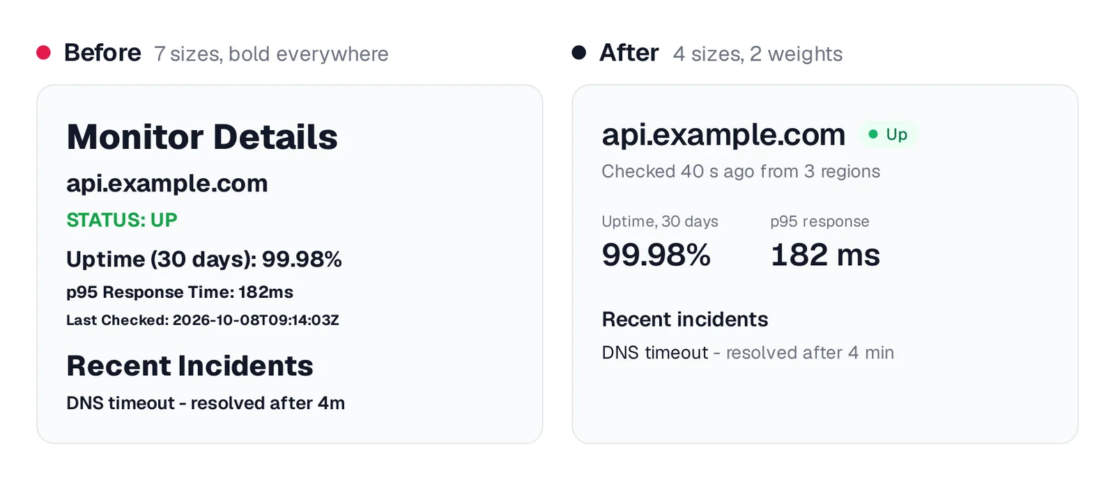
Caption: Before: seven sizes, all bold. After: four sizes, and the numbers carry the weight.
Rule 3: Use one accent color and reserve status colors
Use grays for most surfaces and text. Reserve one accent for links and primary actions. Use red, green and amber only for statuses.
Body text needs contrast of at least 4.5:1. Large text needs at least 3:1, following WCAG 1.4.3.
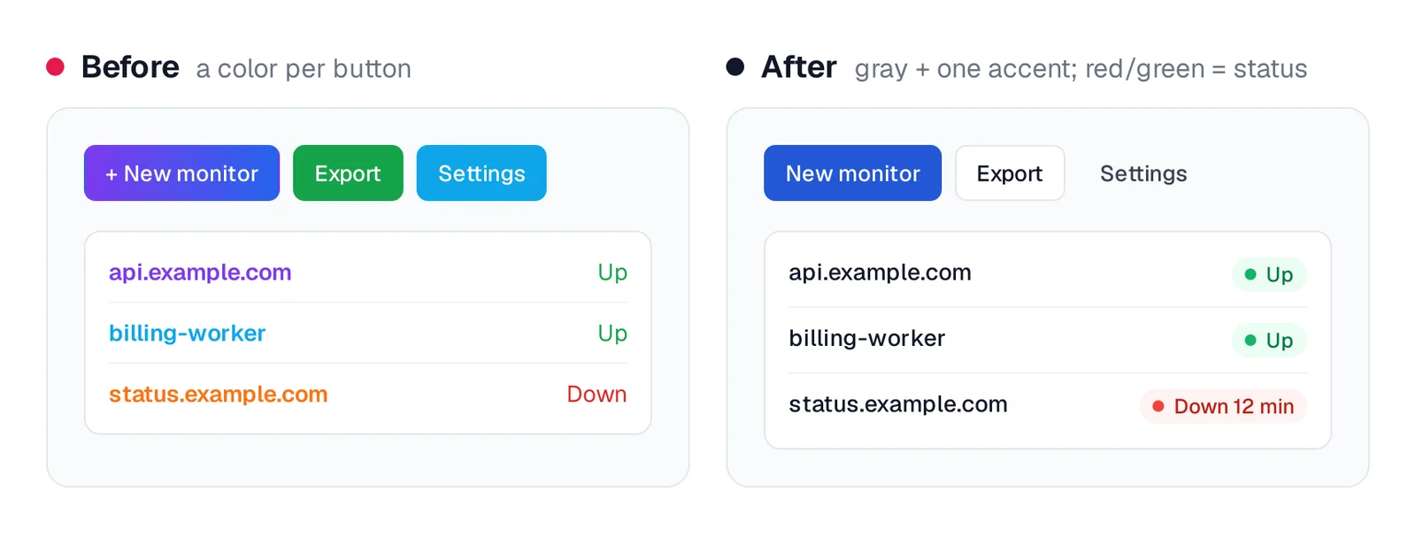
Caption: After, the only red on screen is the monitor that is down.
Rule 4: Align the interface to one left edge
Left-align text. Put headings, cards and fields on one shared edge. Place actions on the right side of the header they affect.
Reserve centered layouts for single-message screens such as empty states.
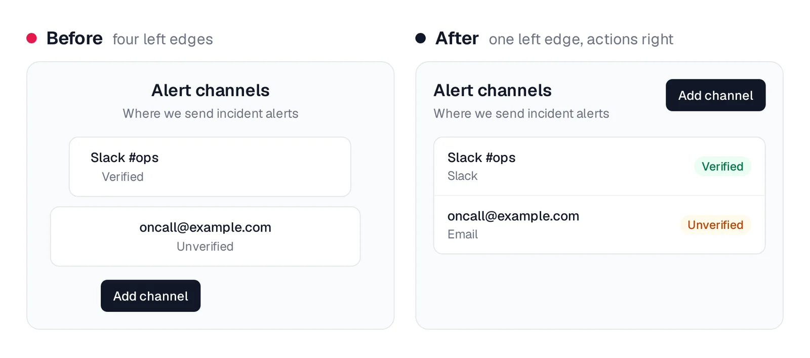
Caption: Four left edges become one.
Rule 5: Give each screen one primary action
Derive the primary action from the screen's main user job. Only that action gets a filled button. Use outline or ghost styles for secondary actions.
Put destructive actions in an overflow menu and require confirmation. Make values visually stronger than labels.
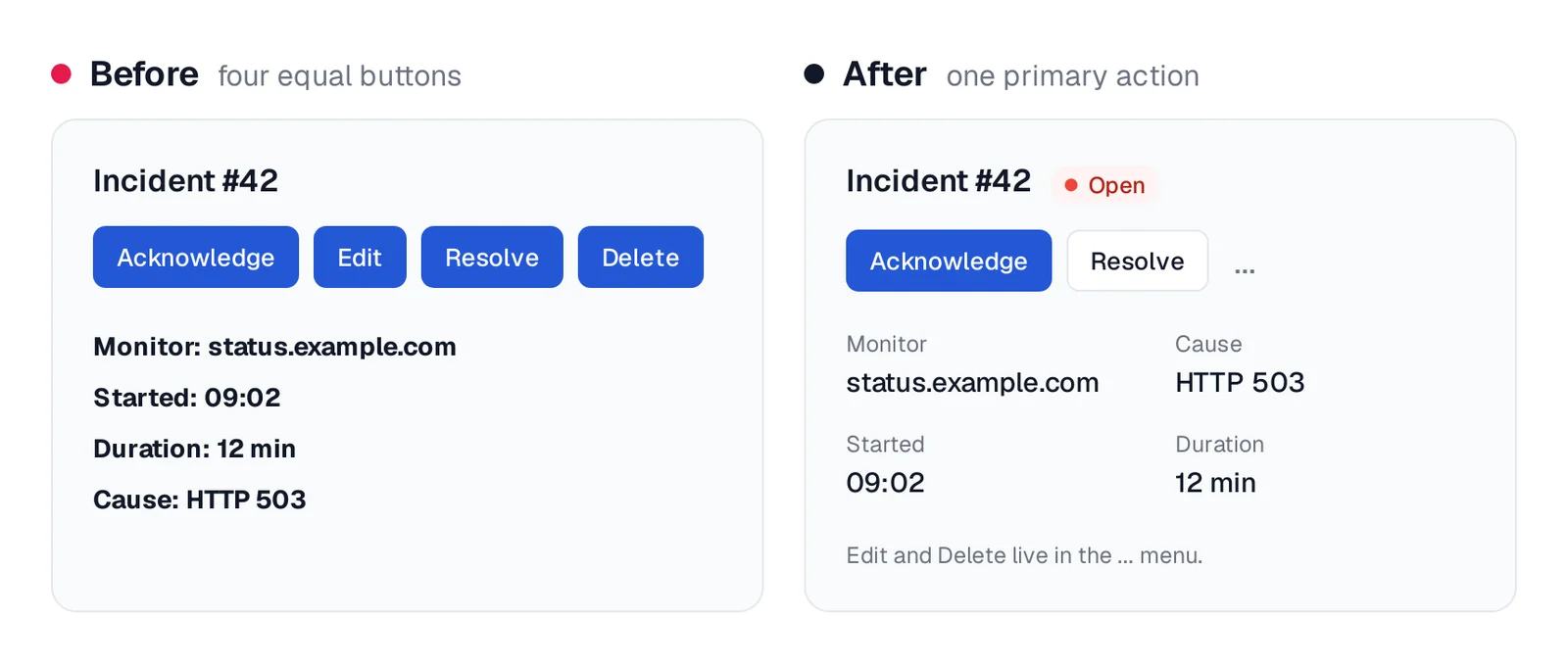
Caption: The incident's job is acknowledge, so that is the only filled button.
Rule 6: Match density to the job
Keep operational-list rows between 32 and 40 px so users can see the fleet at once. Give onboarding and settings more space.
Use cards for images or mixed content, not routine monitor lists.
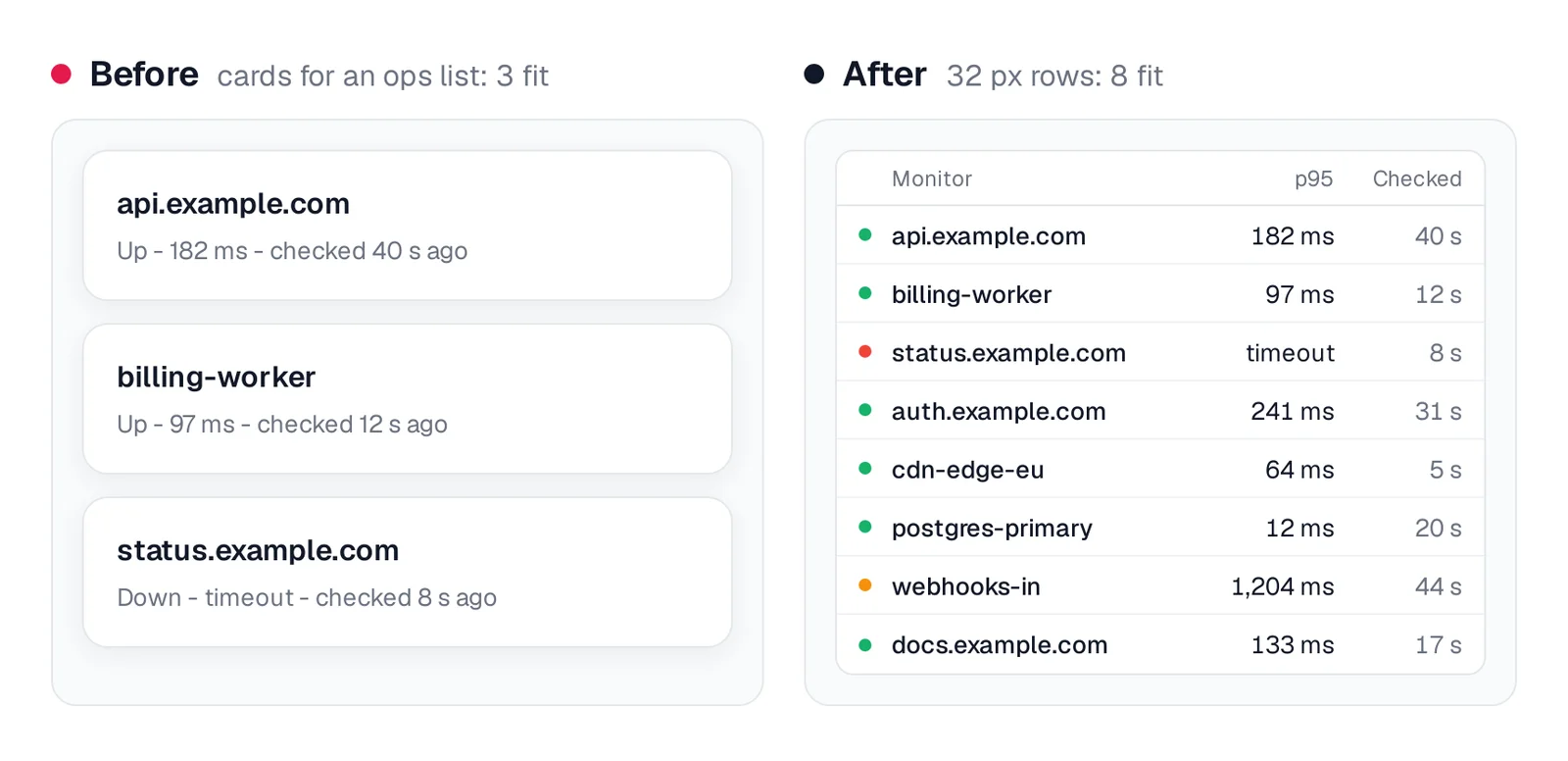
Caption: Before: 3 monitors fit. After: 8 fit, and the down one is easy to spot.
Rule 7: Format table cells for people
Right-align numbers and use tabular-nums, as documented in Tailwind's numeric typography guide. Include units in cells, such as "182 ms."
Replace raw booleans with status badges. Shorten timestamps and expose full values on hover. Prefer horizontal dividers only. The shadcn/ui Data Table supports sorting and pagination through TanStack Table.
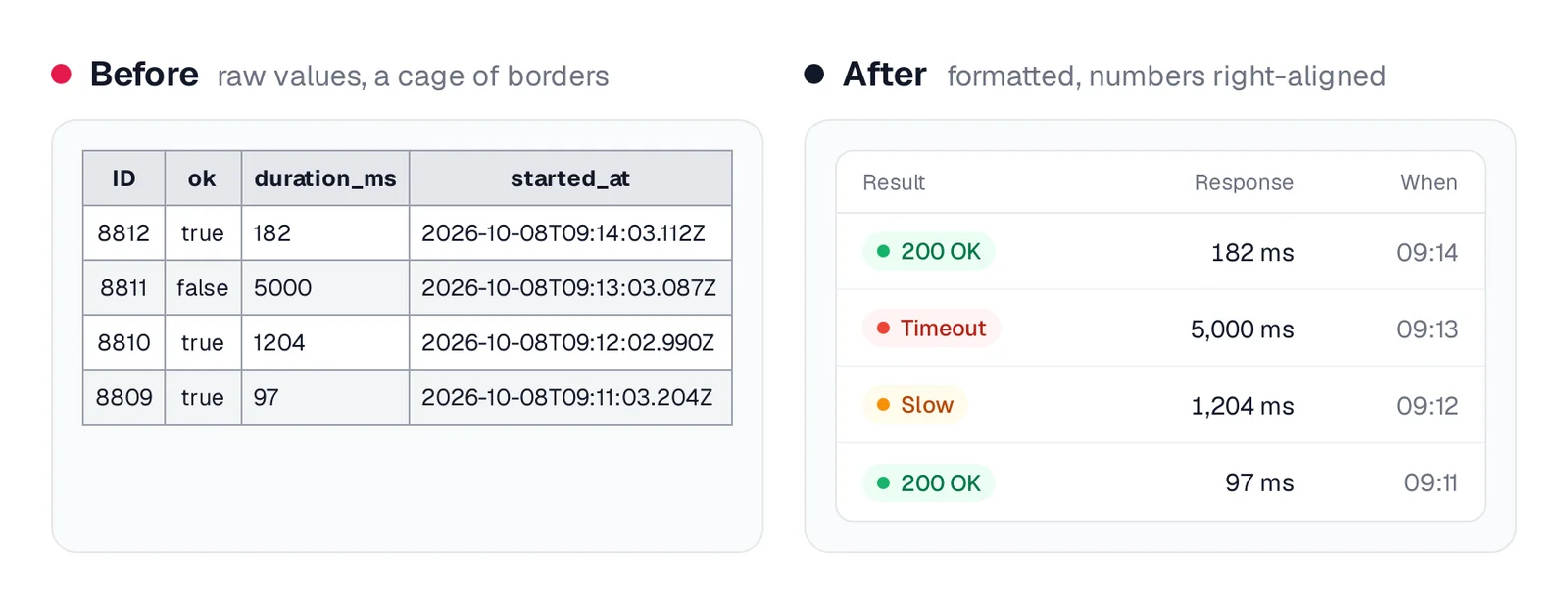
Caption: Same four rows of the Check table. The database values never reach the screen raw.
Rule 8: Put labels above fields and errors beside their cause
Use visible labels above fields, not placeholders as the only labels. Keep forms in one column. Put each error below the field that caused it and explain how to fix it.
Name buttons with verbs, such as "Create monitor" instead of "Submit." The shadcn/ui Field combines a label, control and help text.
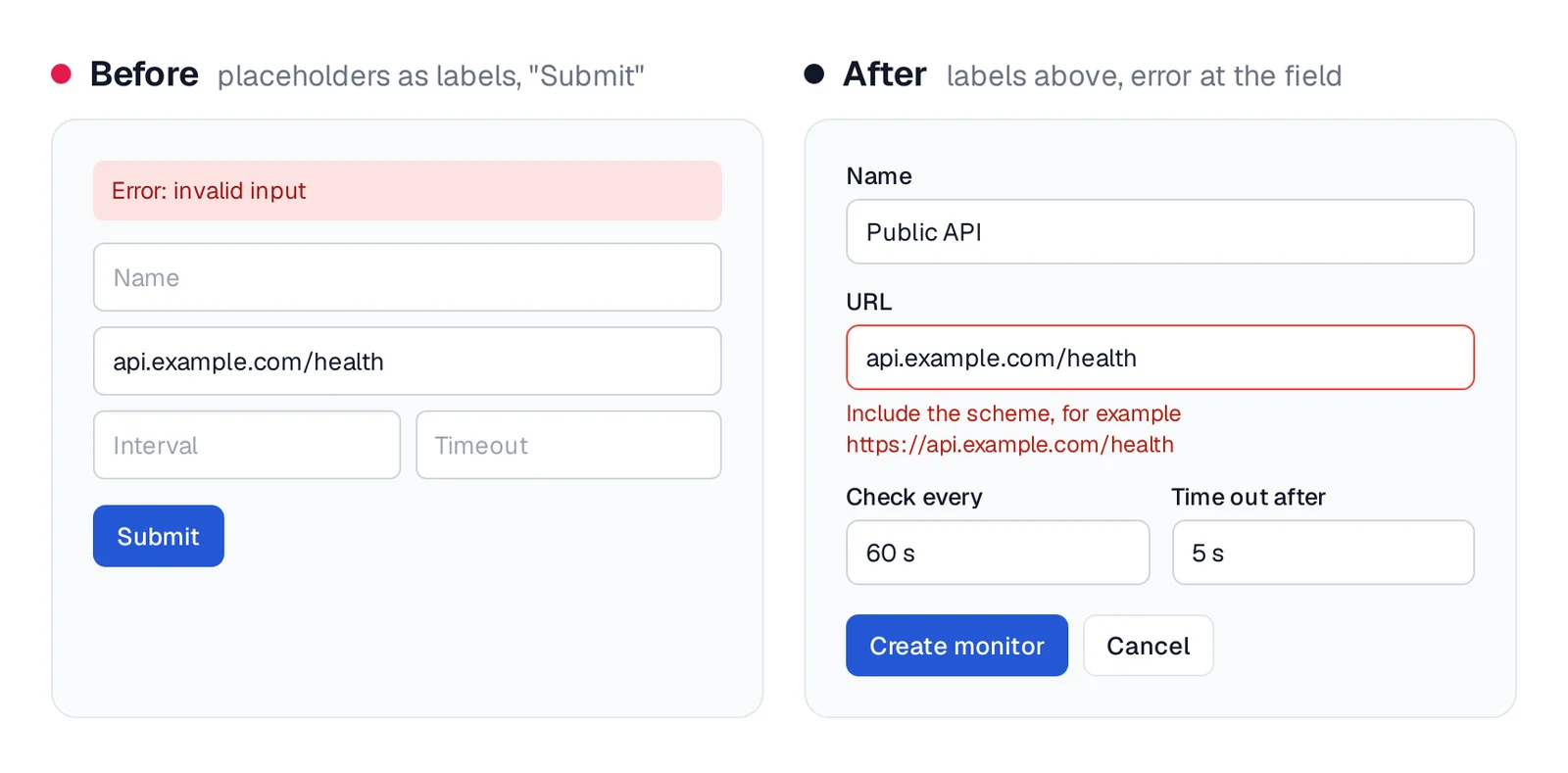
Caption: The error moves to the field that caused it and says how to fix it.
Rule 9: Treat the empty state as a full screen
Include a title, one sentence explaining future content and one primary action.
Distinguish first run from a filter miss. "No monitors yet" should explain how to add one. "No monitors match 'eu'" should help clear or change the filter.
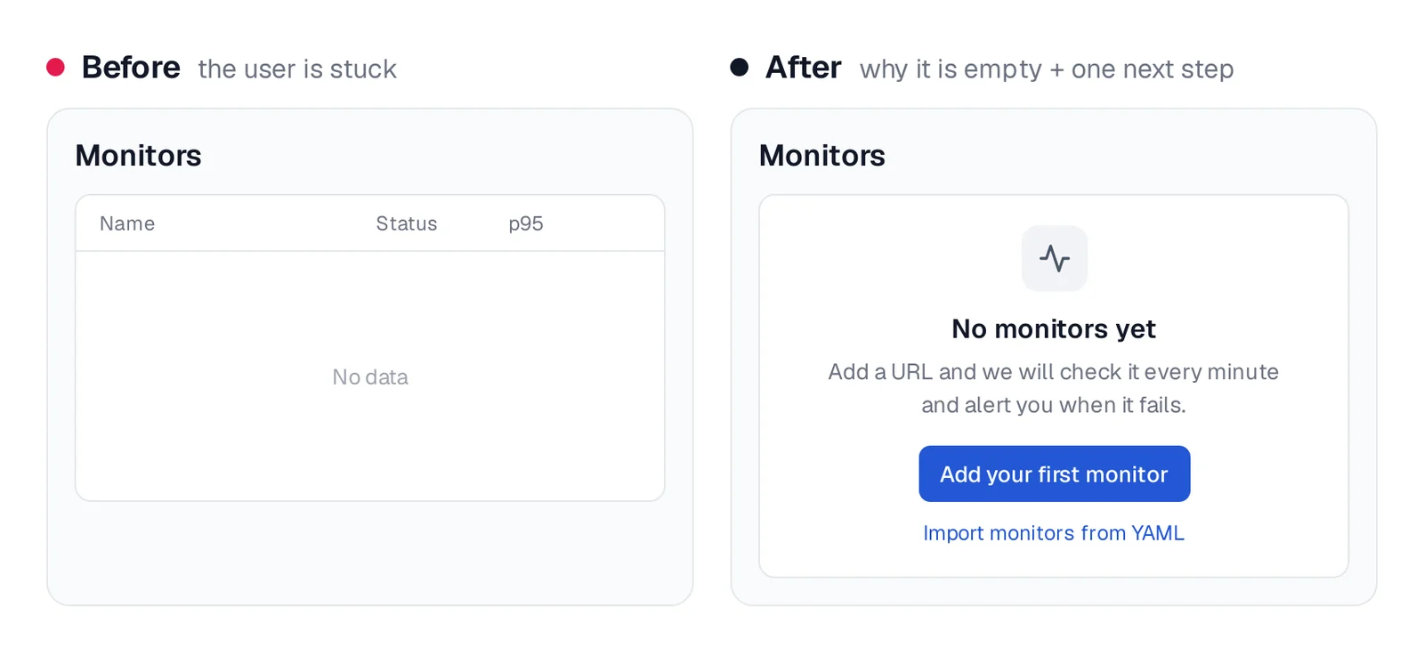
Caption: The empty state is the first screen every new user sees.
Rule 10: Design dark mode as its own palette
Avoid pure black and pure white. Material's dark-theme guidance uses a dark gray base and makes raised surfaces lighter instead of depending on shadows.
Use lighter, less saturated accent and status colors, then recheck contrast. With shadcn/ui, override the same tokens inside .dark as described in its theming documentation.
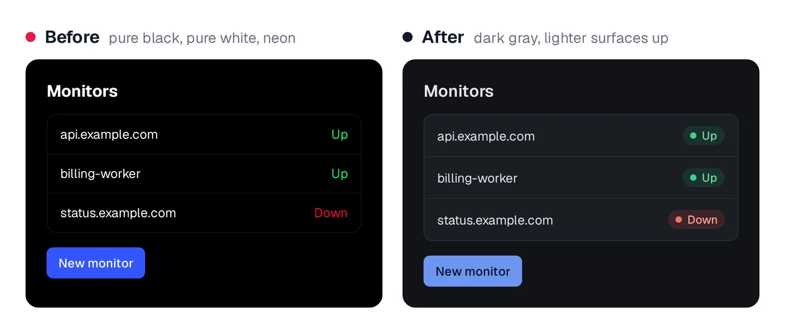
Caption: After, the card sits above the page because it is lighter, not because of a shadow.
Step 5 - Borrow structure from shipped products
Reuse established layout and hierarchy while keeping your branding and tokens original. A reference can determine where the filter bar sits; your tokens determine how it looks.
Mobbin is a searchable collection of real mobile apps, web apps and websites. Its free account has limited access. Search for screen types such as "empty state" and "status page," then save three to five examples for each inventory row.
Refactoring UI is a 218-page PDF by Adam Wathan and Steve Schoger, the creators of Tailwind CSS. It is written "from a developer's point-of-view." Essentials costs $99, the Complete Package costs $149 and two chapters are free.
shadcn/ui Blocks provides free copy-paste layouts for dashboards, sidebars, login and signup flows. GitHub, Grafana and cloud consoles also provide useful references for operational tables, filters and incident timelines.
Prices are from each vendor's pricing page, October 2026.
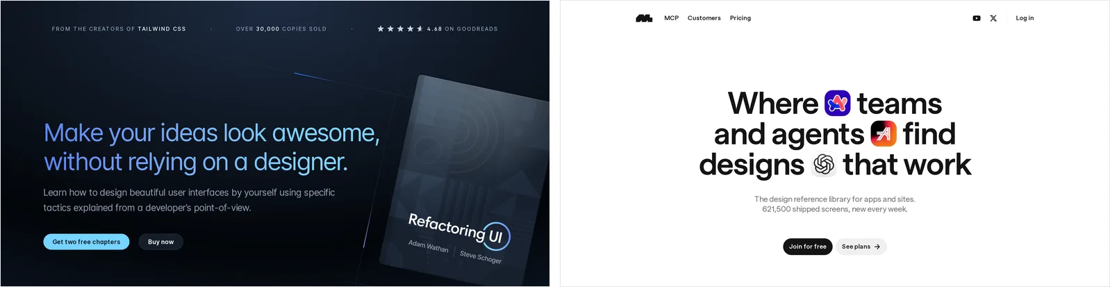
Caption: Source: Refactoring UI and Mobbin websites, captured October 2026.
Step 6 - Give coding agents a spec and visual target
Give Claude Code, Codex, Cursor or another coding agent four inputs: the complete screen/state inventory, one component library, your visual rules and one reference per screen.
Persist the rules in CLAUDE.md for Claude Code or AGENTS.md for Codex.
## UI rules
- Components: shadcn/ui only. No second component library.
- Spacing: Tailwind scale only (1, 2, 4, 6, 8). No arbitrary values.
- Type: text-xs, text-sm, text-base, text-2xl. Weights 400 and 600.
- Color: one accent (--primary). Red/green/amber only for status badges.
- Tables: numbers right-aligned with tabular-nums, units in cells.
- Forms: labels above fields, errors under the field, verb buttons.
- One filled button per screen. Destructive actions behind a confirm.
- Every screen implements every state listed in docs/screens.md.
Store the reference image at design/monitors.png. Make every state reachable through ?state=<name> so the agent can screenshot and audit each result. Add Playwright MCP with claude mcp add playwright npx @playwright/mcp@latest.
Read docs/screens.md and the UI rules. Build the Monitors screen with
shadcn/ui. Implement every state listed for it, each reachable with
?state=<name>: no-monitors, loading, all-up, some-down, fetch-error.
Match the layout of design/monitors.png. When done, screenshot each
state and list anything that breaks a UI rule, then fix it.
See the Claude Code UI design workflow and Codex frontend design guide for agent-specific implementation steps.
Use Mowgli to design every screen and state together
We make Mowgli.
Mowgli turns a product idea into a full multi-screen app design: it writes the spec first, then designs every screen. A short questionnaire produces a product spec covering user journeys, constraints and the data model. The spec stays synchronized with the design.
You choose a visual theme before full generation. The result places every screen and state, including loading, empty and error states, on an infinite canvas. You can edit through chat, build an interactive prototype and hand off React + Tailwind, Figma or an agent-ready package.
For a cloud-cost dashboard aimed at engineering and finance leads, the questionnaire asks 11 questions. Its first question distinguishes a multi-tenant SaaS product from an internal tool.
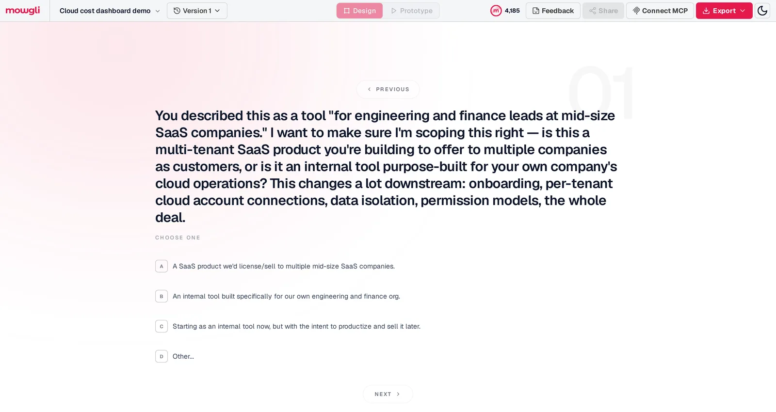
Caption: "This changes a lot downstream: onboarding, per-tenant cloud account connections, data isolation, permission models."
The resulting spec includes user journeys and a 17-entity data model ranging from Organization through AnomalyAlert, with typed fields, enums and relationships.
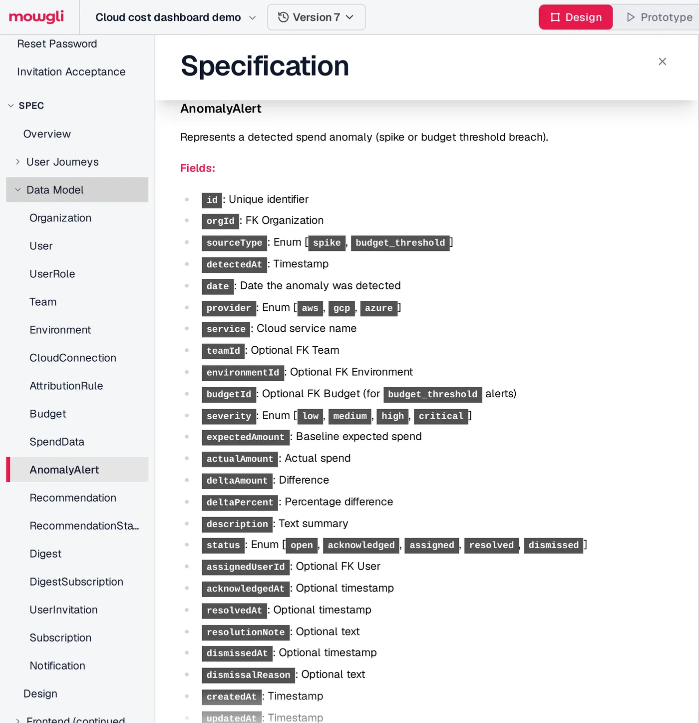
Caption: The status enum (open, acknowledged, assigned, resolved, dismissed) is exactly what Step 2 turns into states.
The generated design contains 13 screens. Its Overview Dashboard has six states: default, loading, empty/no cloud connections, partial data/sync in progress, team view and over budget.
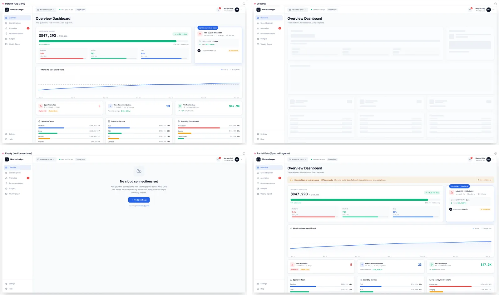
Caption: Four of the Overview Dashboard's six states, as generated, in the Mowgli demo project.
Each screen is a React + Tailwind component using lucide-react icons and a single state prop for switching states. Through the Mowgli MCP, CLI and agent skill, Claude Code, Cursor and Codex can read every screen, state and product specification. Code changes can also be pushed back into the design.
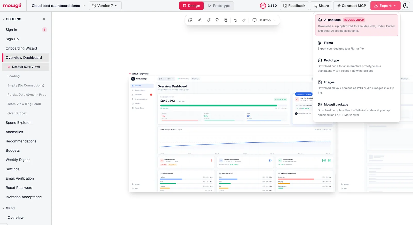
Caption: Screens and states in the sidebar; export to an AI package, Figma, a Vite + React + Tailwind prototype, images, or code plus spec.
Mowgli designs and prototypes; to host and ship, you hand off to a builder or coding agent (Claude Code, Codex, Cursor, Lovable).
Free to start with 300 credits; credit packs from $12; plans from $15/mo. You can also turn a PRD into designs or export to code.
Choose the workflow that fits the project
If you need every screen and state designed before frontend implementation, use Mowgli. It works from the data model and journeys, then hands the screens and spec to Claude Code, Codex, Cursor or another coding agent.
For an internal tool used only by its creator, stop after choosing and theming one component library.
For a weekend project with a learning goal, complete Steps 1 through 5 manually. shadcn/ui plus Refactoring UI is a practical combination.
For an existing Claude Code or Codex workflow, convert Steps 1 through 4 into a persistent rules file and add one visual reference per screen.
For backend-rendered HTML, use daisyUI with Mobbin references. You do not need React.
FAQ
How should a backend developer approach frontend design for a side project?
Start with the data model and three to five user jobs. Derive the complete screen/state inventory, choose one library, then apply fixed spacing, typography, color and hierarchy rules.
How can a developer with no design skills make a good-looking UI?
Use the defaults from shadcn/ui, Mantine or Radix Themes. Work from a 4 px spacing scale, four type sizes and one accent color, then reference layouts from shipped products through Mobbin.
Should I use shadcn/ui or Mantine for a side project?
Use shadcn/ui for React, Tailwind, source owned inside the project and coding-agent workflows. Use Mantine when you want more than 120 components and 70 hooks, including forms and dates, without requiring Tailwind.
Is Refactoring UI worth it for developers?
Yes, if you want developer-focused design rules from Adam Wathan and Steve Schoger, the creators of Tailwind CSS. It contains 218 pages; Essentials costs $99, the Complete Package costs $149 and two chapters are free. Prices are from each vendor's pricing page, October 2026.
Can AI design the frontend for my backend?
Yes. Claude Code, Codex and Cursor work best from a rules file, complete state inventory and visual target per screen. Mowgli produces the spec and data model, then designs every screen and state for handoff to coding agents.
What frontend states should a side project include?
Include first-run empty, no-results, loading, error and success/content states at minimum. Add domain states from enums and nullable fields, integration failures, permissions and destructive-action confirmation. Track coverage in a screen x state table.
Sources
- shadcn/ui
- shadcn/ui documentation
- shadcn/ui CLI
- shadcn/ui theming
- shadcn/ui Data Table
- shadcn/ui Field
- shadcn/ui Empty
- shadcn/ui Blocks
- Mantine
- Mantine getting started
- Radix Themes
- Radix Themes getting started
- Radix Themes Theme component
- daisyUI
- daisyUI themes
- Tailwind theme variables
- Tailwind font variant numeric
- WCAG contrast minimum
- Material Components dark theme
- Refactoring UI
- Mobbin
- v0 screenshots documentation
- Microsoft Playwright MCP
- Claude Code memory
- Codex AGENTS.md configuration
- Mowgli
- Mowgli pricing
- App idea to user flows and screen list
- Empty, error and loading states
- Why AI-built apps look the same
- Claude Code UI design workflow
- Codex frontend design guide
- Mowgli MCP
- Export to code
- PRD to designs