How to Make Your App Look Professional for an Investor Pitch
Use 3-5 realistic screens, a consistent device frame and a 60-second demo to make an app idea clear and credible before an investor pitch.
The investor-ready answer: 3-5 screens and one clear path
You do not need a complete product. Show investors 3-5 screens from one understandable user path: the promise, setup, core action, aha moment and reason to return. Use real copy, plausible numbers, one visual system and one consistent device frame. Then record a 60-second narrated click-through.
An investor pitch needs clarity and narrative. A product build needs complete flows, working infrastructure and every necessary state. Do not confuse those jobs.
If you need to design the full product before choosing the pitch sequence, Mowgli is a strong option. For the habit-tracker example in this guide, it produced 12 screens and 46 states through a prompt-to-design process that took about 25 minutes.
We make Mowgli.
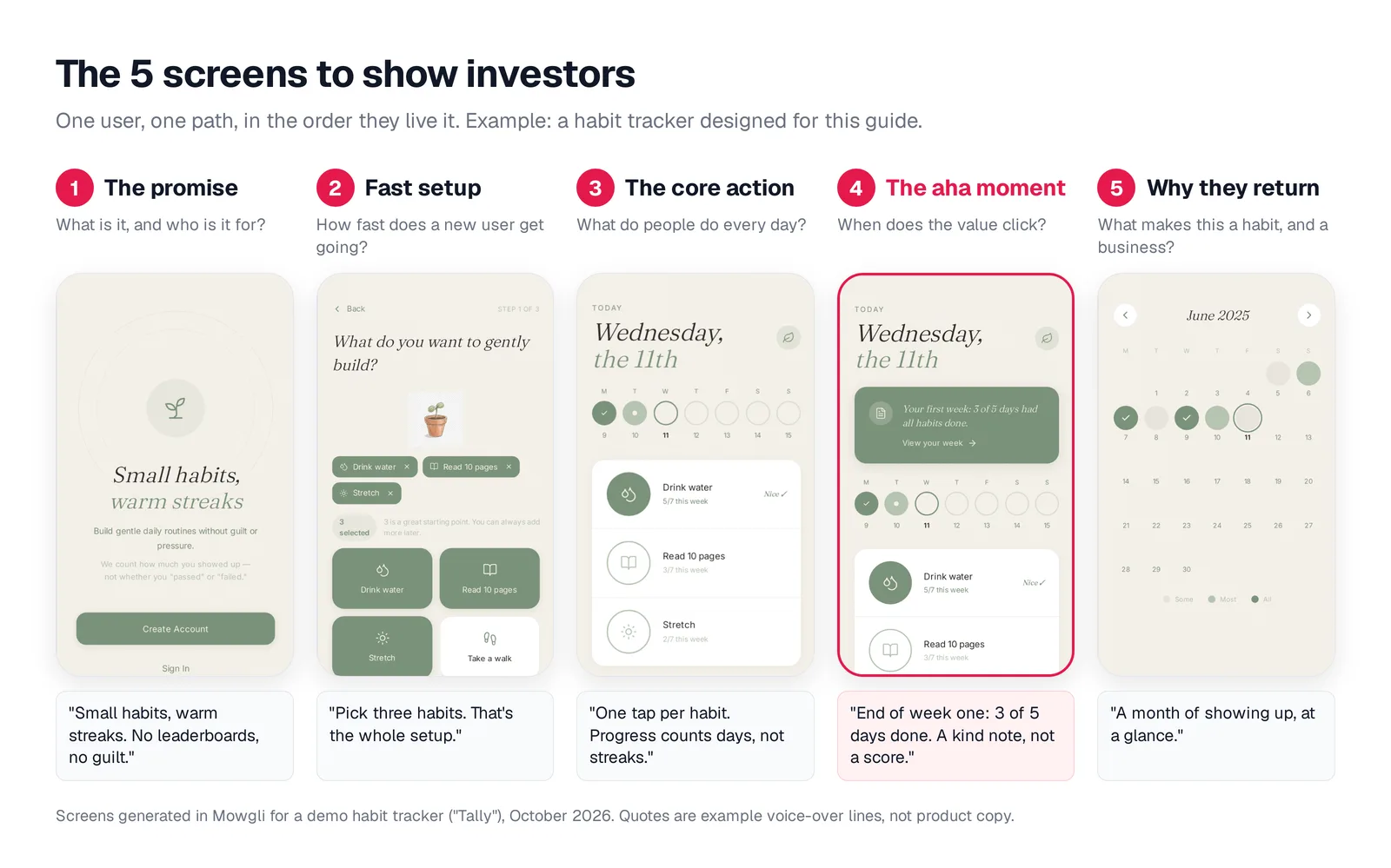
Caption: One user path in five screens, each answering an investor question. Screens generated in Mowgli for a demo habit tracker; original illustration by Mowgli.
What investors need to understand from the product
Your product screens should establish five things quickly:
- What the product does and who it serves.
- What concrete benefit the user receives.
- What the user does repeatedly.
- When the value becomes visible.
- Why the user returns or why the product has commercial potential.
Sequoia's business-plan guidance asks founders to "Explain your eureka moment." Its discussion of Airbnb also notes that "it wasn't really the slides we liked--it was their ideas."
YC advises founders to "explain what you do very clearly, in as few words as possible. Describe the concrete benefits you provide." Geoff Ralston says that "demos are almost a requirement nowadays," while YC's leave-behind guidance says, "Graphics, charts, screenshots are more powerful than lots of words."
That does not mean adding more screenshots. Kevin Hale warns that screenshots "are almost always illegible, complex, and non-obvious" and recommends using "the most simplified version of it."
DocSend analyses covering 2023 to mid-2024 report average investor review times between 2 minutes 18 seconds and 2 minutes 30 seconds. Each screen therefore has seconds to communicate its point.
Product slides support the larger business story. They do not replace your team, insight or traction.
Choose the 3-5 screens that tell the strongest story
Start by completing this sentence:
"A user gets it the moment they ___."
Then choose screens that build toward that moment:
- Promise: Identify the product, audience and intended result.
- Fast setup: Show the shortest route to initial value.
- Core action: Show the behavior the user repeats.
- Aha moment: Make the benefit visible.
- Return reason: Show progress, history, collaboration, reporting or another retention mechanism.
For a habit tracker, checking off one habit is only an action. A week-one summary saying "3 of 5 days had all habits done" shows the result. That is a stronger aha moment.
Replace the fifth screen with a paywall when monetization is the central investor question. For a two-sided product, add one screen from the second participant's perspective. Exclude login, settings and admin screens unless they contain the product innovation.
If you have not mapped the experience yet, turn the idea into user flows and a screen list before designing it.
Make the mockup credible before polishing the visuals
Run a realism pass before adjusting shadows, colors or typography.
Replace placeholder copy with product-specific names, labels and instructions. A button labeled "Start my 3 habits" explains more than "Submit."
Use plausible, specific values. "$847,293 of $920,000" feels more considered than "$1,000,000." Reconcile every number with the deck. Do not claim 1,200 users on one slide while the interface shows 48,000 members.
Add "Product mockup, illustrative data" to the slide footer. Use dates matching the pitch month, and never present mock usage as live traction.
Keep one persona, font family, accent color and device frame across the sequence. Prepare an empty first-run state so you can answer questions about what a new user sees.
For more detail, read why real copy matters and review the states AI tools skip.
Build slides that can be understood from the back row
Give each slide one product idea, one dominant screen or crop, a short takeaway headline and one annotation.
Avoid grids of tiny screenshots. Avoid paragraphs that explain what the audience should have understood from the image. If the important detail is a weekly review card, crop tightly and highlight that card.
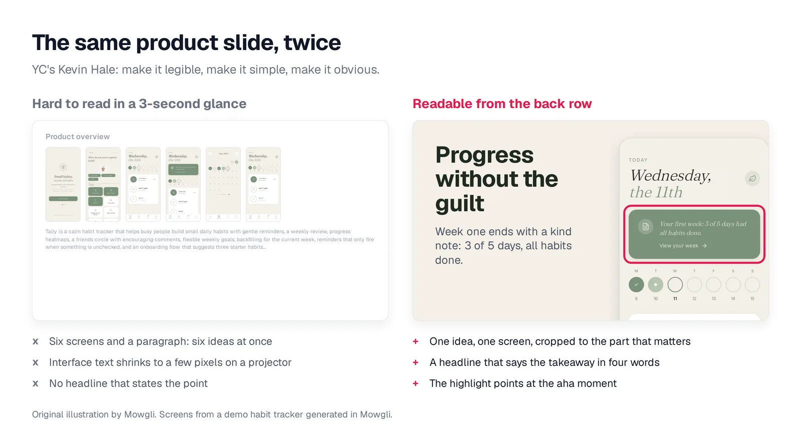
Caption: Six screens and a paragraph, then one cropped screen with a four-word headline. Original illustration by Mowgli.
Use one device frame throughout the deck. Apple Design Resources provides free official iOS 27 UI kits and Product Bezels. Check Apple's marketing guidelines before using the bezels.
Shots.so is a browser editor for frames, layout presets, PNG export and animation. The AI mockup generators roundup covers more production options.
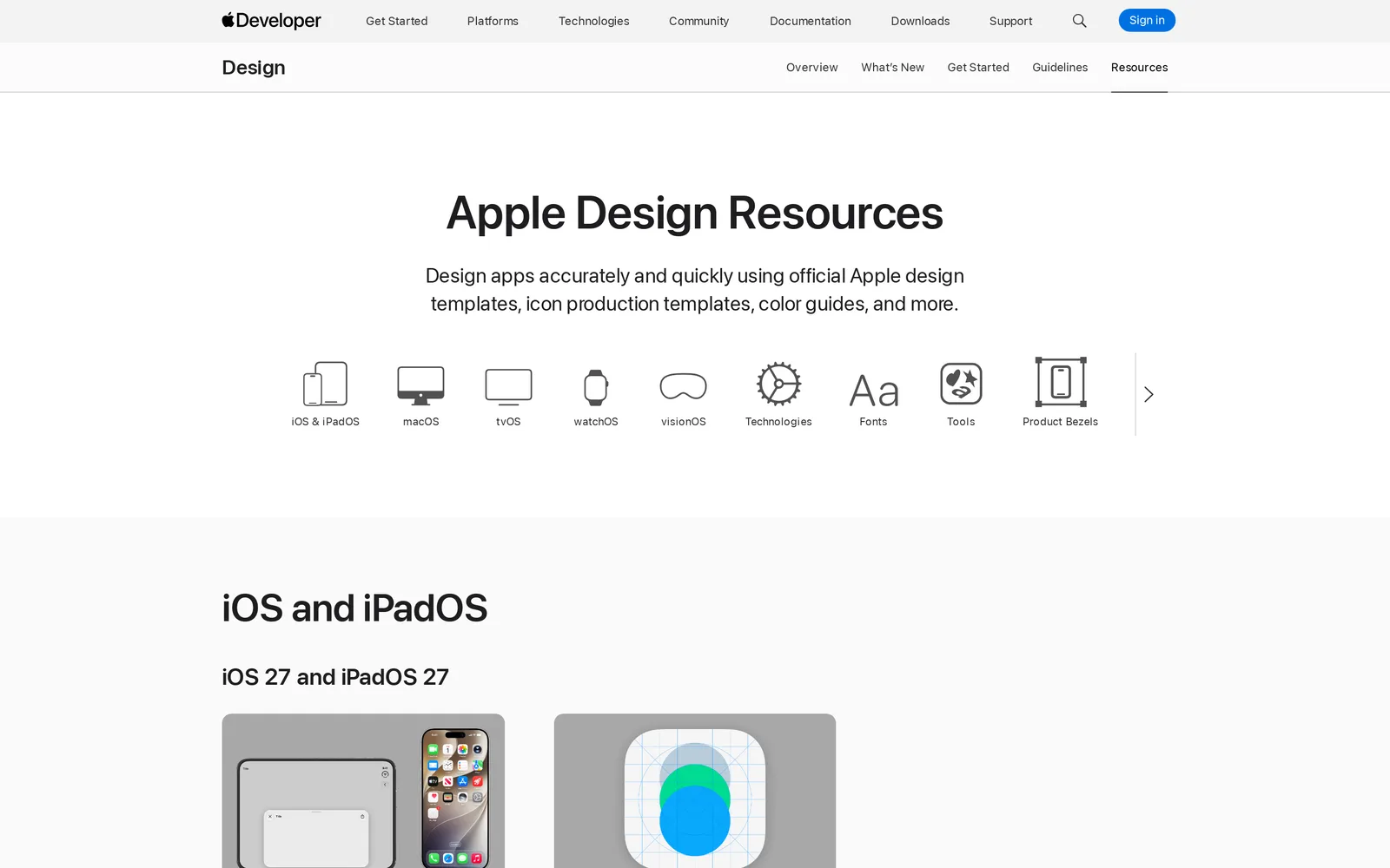
Caption: Official UI kits and Product Bezels on one page. Source: Apple Developer website, captured October 2026.
Record a 60-second product demo
Use the recording during the meeting, send it as a follow-up and keep it ready if the live demo fails.
Follow one user through one path. Show screens in narrative order. Do not open settings, explore menus or move the cursor without purpose. Pause on the aha moment. Record a clickable prototype, not a static slideshow.
0:00-0:05  WHO + PAIN       "[Name] is a [user] who [pain, in their words]."
0:05-0:15  PROMISE + SETUP  Open the app. "[Product] [does X]. Setup is [N] taps."
0:15-0:30  CORE ACTION      Do the main thing once, slowly. Say what just happened.
0:30-0:45  AHA              Show the moment it clicks. Pause 2 seconds on it.
0:45-0:55  WHY THEY RETURN  Show history, progress or the team view.
                            "[Name] is back every [day/week] because [reason]."
0:55-1:00  CLOSE            "[One-line pitch]. We're raising [amount] to [milestone]."
For the habit-tracker example, Maya has quit four habit apps after breaking streaks. Tally focuses on days completed instead of unbroken streaks. The demo shows a three-habit setup, one-tap completion and a Sunday summary: 3 of 5 days with all habits done.
On a Mac, press Shift-Command-5. On an iPhone, use the Record button in Control Center.
Make it in a week or show the idea in one hour
Use this schedule when the pitch is seven days away:
| Day | Do this | Output |
|---|---|---|
| 1 | Write the one-line pitch, name the user, finish the aha sentence, pick the 5 screens | One-page brief |
| 2 | Make the screens (Mowgli path and options below) and settle on one visual direction | 5 screens, one style |
| 3 | Realism pass: names, numbers, dates, match the deck. Brief a freelancer now if you use one | Final copy and data |
| 4 | Wire the click path into a prototype; ask 3 people who don't know the idea "what does this do?" | What confused them |
| 5 | Fix what confused them. Put screens on slides, one frame, one idea per slide | Product slides |
| 6 | Record the 60-second demo; rehearse the live demo 5 times | Demo video plus backup |
| 7 | Buffer. No new screens, no new features | Rest |
Ask three people unfamiliar with the idea what the product does. If they remain unclear after screen 3, revise the headline and sequence before changing the visual style.
For a same-day discussion, spend 10 minutes on the one-line pitch and five screen roles, 30 minutes making paper sketches or AI-generated screens, 10 minutes rehearsing the click path and 10 minutes collecting answers to three questions: What is it? Who is it for? What should change first?
Use paper for flow discussions. Use an AI design tool when visual direction affects the decision. You can also follow the 30-minute stakeholder mockup workflow.
Use Mowgli to design the full app, then select the pitch
Mowgli turns a product idea into a full multi-screen app design: it writes the spec first, then designs every screen.
It fits founders who need a coherent product system, all screens and states, and a prototype rather than isolated pitch images.
The workflow is direct:
- Describe the product and answer the guided questionnaire.
- Review the PRD/spec, user journeys and data model.
- Explore 16+ moodboard styles and select a direction.
- Generate every screen and state.
- Select the 3-5 screens that tell the investor story.
- Apply copy, data and style changes through chat.
- Present the flow in prototype mode.
- Export images for the deck or native Figma for a designer.
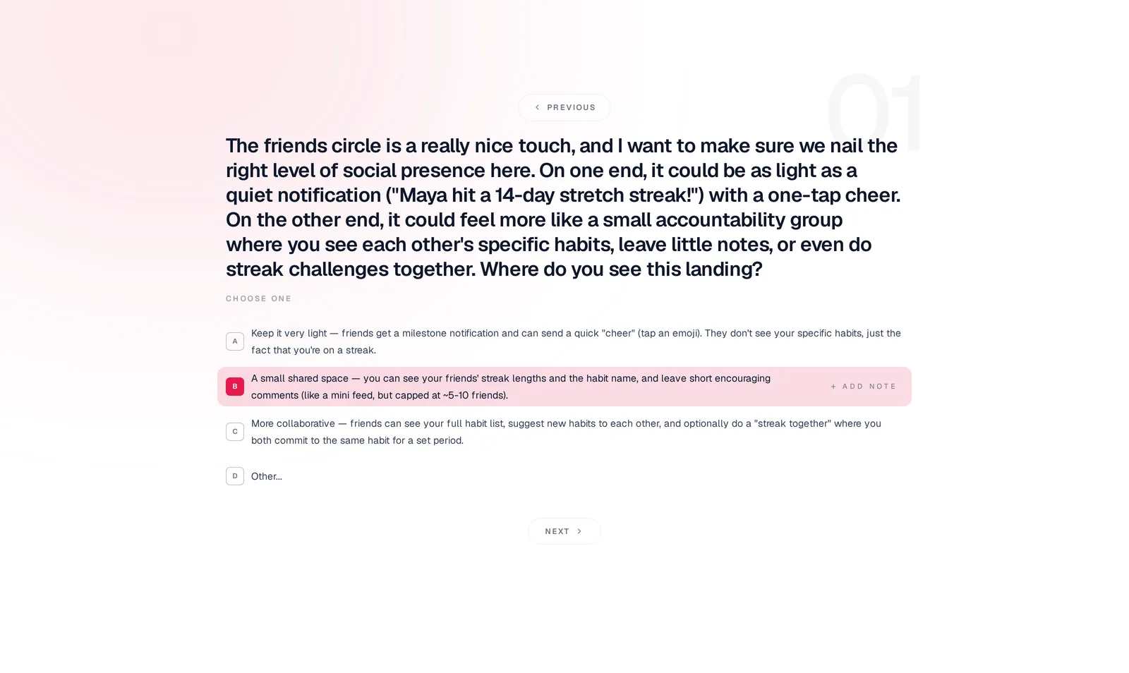
Caption: A scoping question for this post's habit tracker. Mowgli, captured October 2026.
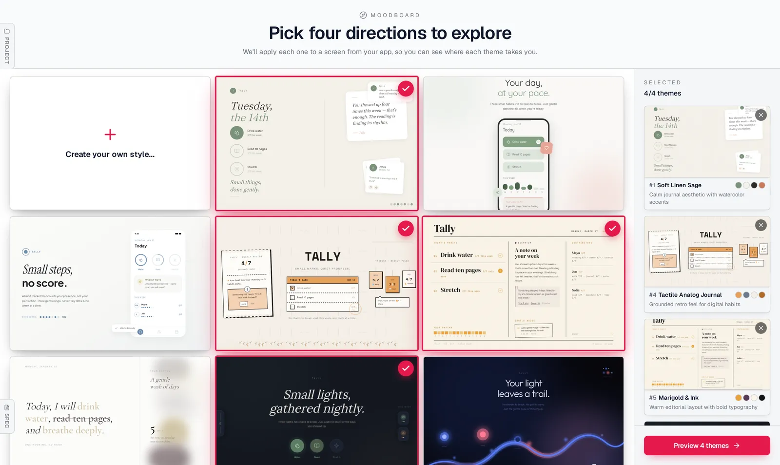
Caption: Four of the generated directions selected for preview. Mowgli, October 2026.
The habit tracker produced 12 screens and 46 states on one canvas. A cross-state request updated all three onboarding states:
"Make the onboarding feel warmer and more personal: a friendlier headline, a small hand-drawn illustration at the top, and softer, rounder habit cards."
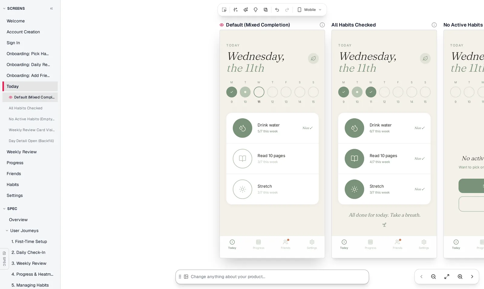
Caption: Every screen in the sidebar, and the Today screen's states on the canvas. Mowgli, October 2026.
Learn how the moodboard works, see how multi-screen generation works or review prototyping.
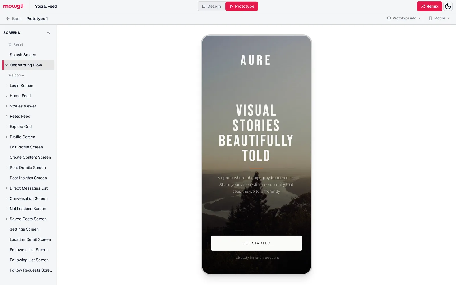
Caption: Prototype mode on Mowgli's public Social Feed example. Mowgli, October 2026.
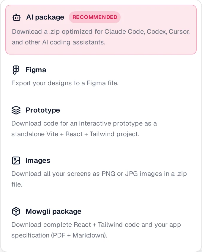
Caption: Export images for your deck, a Figma file for a designer's polish pass, or a clickable prototype for the live demo.
Mowgli designs and prototypes; to host and ship, you hand off to a builder or coding agent (Claude Code, Codex, Cursor, Lovable).
Generate your app mockup. Pricing is free to start (300 credits); credit packs from $12; plans from $15/mo.
Pick the production route by job, time and budget
Prices are from each vendor's pricing page, October 2026.
| Option | Skill needed | Cost | Best when |
|---|---|---|---|
| Paper or Balsamiq | None | Free; Balsamiq from $16/editor/mo (annual), 14-day trial | Agreeing the flow with a cofounder |
| Figma + a UI kit | Figma basics | Figma Starter and Apple UI kits free | You have days and want control |
| AI screen generators | Describing the app | Free tiers; paid from $12/mo | You need consistent screens fast |
| AI app builders | Prompting, some debugging | Free credits; paid by usage | The demo should run on real data |
| Freelancer polish pass | Writing a brief | Upwork median $20-$40/hr (UI designers) | You have screens and a few days |
Paper or Balsamiq
Use these for early flow decisions. Balsamiq Starter includes 500 AI credits per month, described as "around 31 wireframes or 10 prototypes." It costs $16/editor/month when billed annually and includes a 14-day trial.
Figma plus a UI kit
Choose this route when you want hands-on control and have time to learn. Use Apple's iOS 27 kit for native components and Mobbin for real-app layout references. Figma Professional costs $16/month per Full seat. Mobbin Pro costs $10/month billed yearly.
See Figma alternatives for non-designers.
AI screen generators
Choose these for multiple visually consistent screens. Mowgli leads this category for designing a whole multi-screen app from a spec, including every screen and state, a prototype and Figma export.
Google Stitch is free with a daily credit limit and supports Figma export. Uizard offers templates, with Pro at $12/month billed annually. Figma Starter includes 150 AI credits a day, up to 500 a month.
Read why AI apps look alike before choosing a visual direction.
AI app builders
Use an app builder when investors need a working web app with real data. v0 Plus costs $30/user/month. Lovable's free plan includes 5 build credits a day, up to 30 a month.
Keep the recorded demo available as a backup.
Freelancer polish pass
Hire a freelancer when you already have screens and need bounded refinement. Provide the screens, final copy, deck, device frame and a deadline two days before the pitch.
Upwork reports a $20-$40/hour median for UI designers. At 10 hours for five screens, that implies $200-$400. Review app design costs in 2026 before setting the brief.
Verdict: which route should you use?
For a pitch in one week with no design skills, use Mowgli to create the full screen-and-state system and shareable prototype. Select the strongest 3-5 screens, add a Shots.so frame and record the demo.
For a same-day cofounder conversation, use paper for flow. Use an AI design tool when visual feel affects the decision.
If investors need hands-on access, provide an AI-built app or clickable prototype. If existing screens need refinement, commission a freelancer polish pass using an editable Figma file. If you want direct control, use Figma, Apple's UI kit and Mobbin.
Start with a clear user story. Visual polish supports clarity; it cannot replace it.
FAQ
How many app screens should I show investors?
Show 3-5 screens from one user path. Cover the promise, setup, core action, aha moment and return reason. Use one screen per slide or one carefully cropped focal screen.
Do I need an app mockup to pitch investors?
No, a mockup is not mandatory in every meeting. Geoff Ralston says that "demos are almost a requirement nowadays," however. A mockup clarifies the product but does not replace your team, insight or traction.
Should an investor pitch use a clickable prototype or video?
Use the clickable prototype during the meeting. Keep a 60-second narrated recording for follow-ups and as a technical backup.
How do I make an app mockup without Figma?
Use paper or Balsamiq for flow, or use Mowgli, Google Stitch or Uizard for designed screens. Shots.so can place the results in consistent device frames.
Can I use fake data in an investor demo?
Yes, if you clearly mark it as illustrative. Use plausible values that remain consistent with the pitch deck. Never imply that mock usage data represents live traction.
How much does an investor-ready app mockup cost?
You can make one for $0 with free tools and manual framing. Paid routes range from an AI design plan to a freelancer polish pass. Upwork's median is $20-$40/hour for UI designers, so a 10-hour, five-screen pass would cost $200-$400.
Sources
- Sequoia Capital: Writing a Business Plan
- Y Combinator: How to Build Your Seed Round Pitch Deck
- Y Combinator: How to Design a Better Pitch Deck
- Y Combinator: A Guide to Seed Fundraising
- DocSend Pitch Deck Metrics
- Apple Design Resources
- Apple: Take a Screenshot or Screen Recording on Mac
- Apple: Record the Screen on iPhone
- Upwork UI Designer Hourly Rates
- Balsamiq Pricing
- Mobbin Pricing
- Figma Pricing
- Uizard Pricing
- v0 Pricing
- v0 Screenshots
- Lovable Pricing
- Shots.so
- Mowgli Pricing