April 30, 2026
Why We're Firmly Canvas-First
Mowgli builds prototypes. But the canvas — not the prototype — is where the real design work happens. Here's the technical and cognitive case for why, and what you can do on a canvas that a prototype simply can't give you.
Mowgli builds prototypes. You can link screens, create navigable flows, and share a clickable product with anyone. That's not the question.
The question is what the primary interface should be — and where the most valuable design work actually happens. Most tools put the prototype at the centre: you generate a screen, link it into a flow, click through it, evaluate from there. We think that's the wrong order. The canvas comes first — not because prototyping is unimportant, but because the design decisions that matter most can't be evaluated in a sequential click-through. They require seeing the whole product at once.
Here's the technical and cognitive case for why.
Prototypes are linear. Products aren't.
A click-through prototype is a simulation of one path through a product. You follow the links, you complete the flow, you reach an end state. The simulation is useful for a specific kind of evaluation: does this particular journey feel right for a user who does exactly these things in exactly this order?
It is not useful for the other questions that product design needs to answer:
- Does the information hierarchy hold up across screens?
- Are the navigation patterns consistent across different parts of the product?
- Is the visual rhythm coherent — spacing, sizing, colour use — across the whole?
- Do the empty states match the filled states in a way that makes sense?
- If you look at the onboarding flow and the core feature flow side by side, do they feel like the same product?
These are spatial questions. They require seeing multiple screens simultaneously and comparing them — not experiencing them sequentially. A canvas answers them; a prototype doesn't.
The design problems that get caught on a canvas are different from the problems that get caught in a prototype. On a canvas, you see misalignment, inconsistency, visual imbalance, structural discrepancies between flows. In a prototype, you experience the flow. Both are useful. The canvas comes first because it catches more — and because fixing things on a canvas is faster than fixing them after they've been linked into a prototype structure.
Spatial comparison is irreplaceable
When a designer lays out all the screens of a product on a canvas and steps back, they're doing something cognitively that you can't do in a sequential prototype: holding the whole product in view at once.
This isn't just aesthetically useful. It's structurally diagnostic.
You see immediately if two screens that should feel like siblings don't. You see if an edge case screen was built to a different standard than the happy path screens. You see if the header treatment in the settings flow is subtly different from the header treatment in the main product flow. You see if the data tables are consistently styled. You see if the onboarding is using components from a different design generation than the dashboard.
None of this is visible in a prototype, because you're only ever seeing one screen at a time. The inconsistencies exist — they'll be felt by users — but you can't see them in the tool.
The spatial overview is also where you catch the missing states. A canvas that has 30 screens and is supposed to represent a complete product with 40 states is immediately, visibly incomplete. The gaps in the layout are evidence of decisions that haven't been made. A prototype of the same product has no equivalent signal — you can only discover the missing states by trying to navigate to them and finding no link.
This effect is consistent with what cognitive science calls the benefit of simultaneous over sequential presentation: research by Perrin (1969) established that learners make significantly better cross-referential connections when information is presented simultaneously than when it is presented successively. The same cognitive principle applies to design review — you can only evaluate the relationship between two screens if you can see both at once.
Variations without a stack
One of the most valuable things you can do on a canvas is run variations: generate multiple interpretations of the same screen, lay them side by side, and compare them.
This is essentially free on a canvas. You generate a dashboard layout, ask for a variant with a different information hierarchy, and put both on the canvas. You look at them together, one on the left and one on the right, and you see which one holds up. Then you throw away the one that doesn't.
In a prototype, variations are expensive. Each variation is an alternative navigation graph. Switching between them requires navigating to the right starting point. Comparing two versions of the same screen means having two separate prototype files open and switching between them — a fundamentally worse comparison mechanism than putting them next to each other.
More importantly: on a canvas, you're generating and comparing at the design layer, not building out a functional flow. The cost of a variation is a generation, which takes seconds. Because Mowgli generates at the frontend layer only — no backend, no database — each variation is a fast, contained render. You're not waiting for a full stack to rebuild; you're getting a rendered screen. The cost per variation, in both time and compute, is low enough that exploration is genuinely free in practice.
This matters structurally. It means you can genuinely explore — try five approaches, discard four, understand why the fifth works — without the exploration being expensive enough to discourage. In practice, teams that work from prototypes first don't explore variations because rebuilding a navigable flow for each alternative is friction enough to skip it. The result is that they build the first thing that seemed reasonable, not the best thing they could find.
The research on this is consistent and has been for decades. Nielsen's parallel design study (published in IEEE Software, 1996) found that usability improved by 70% when multiple independent designers generated alternatives before converging on a final design — compared to just 18% improvement from traditional single-path iterative design. Goldschmidt's foundational 1991 paper on design sketching, "The Dialectics of Sketching," documented the cognitive mechanism behind this: visual exploration works through a rapid oscillation between generating and evaluating candidate forms, with each iteration transforming the designer's mental model. This process only works at speed — which is why a canvas that generates variations in seconds enables a fundamentally different quality of design thinking than one where each variation requires rebuilding a navigation graph and re-linking every screen.
FE-layer only: fast, contained, disposable
Mowgli generates at the frontend layer. What you're seeing is a rendered design — component-quality, with real layout and real content — not a deployed application. There's no backend, no database, no API, no state management to maintain.
This has a precise implication: every design decision is cheap to reverse.
If you change the entire information architecture of the product — decide that the navigation should be top-level tabs instead of a sidebar, or that the dashboard should be personalised instead of universal — the cost is a regeneration. No migration, no refactor, no API changes. The design updates because the spec updates, and the spec updates through a conversation.
Compare this to a stack-level prototype — a functional Lovable or Bolt build used as a design exploration tool. When you change the architecture at that level, you're changing code. Functions, routes, database schemas, component trees. The friction of the change is proportional to how deeply the assumption is embedded in the implementation. Architectural decisions made early become increasingly expensive to revise as the build accumulates around them.
Canvas-first keeps the design phase at the layer where change is cheap. Because Mowgli is frontend-only — no backend, no database, no state management — generation is fast. A full product with 30+ screens generates in seconds, not minutes. A variation on a single screen is near-instant. This speed is what makes the canvas viable as an exploration tool: you can try five directions, compare them side by side, and discard four before a prototype-first tool would have finished its first build. You're exploring at the design layer, where everything is fast and reversible, and committing to the build layer only once the design is right. This is the correct order: cheap decisions first, expensive decisions second.
Prototyping has its place — and Mowgli does it
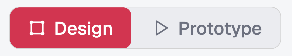
Two modes, one product. Switch seamlessly between Design and Prototype — if something feels off in the live flow, flip back to the canvas to see that screen in its spatial context, surrounded by everything around it.
Once the canvas work is done, prototyping is the right next step. Mowgli builds navigable prototypes directly from the canvas: link your screens, and the whole product becomes clickable and shareable.
There's a less obvious implication here too. Mowgli supports Figma import — bring in your existing Figma frames and they land on the same Mowgli canvas. Which means you can prototype your Figma designs in Mowgli, with the same linking flow, without having to set up Figma's prototyping layer manually. Figma's native prototyping is powerful but fiddly — every connection between screens is a manual interaction. The Mowgli canvas handles it in the same way it handles everything else: spatially, with the full product in view. Click-through prototypes are genuinely the right tool for:
-
Usability testing with real users. If you want to observe a user completing a task, a navigable prototype is the right artefact. Asking them to "imagine clicking through" a canvas doesn't produce real behavioural data.
-
Communicating flows to stakeholders. Some audiences understand flows better through experience than through visual inspection. A prototype lets them feel the product rather than read it.
-
Validating transitions and micro-interactions. Animation, timing, and motion design live in the prototype layer. A static canvas shows the states; a prototype shows the motion between them.
The two modes are designed to be used together, not in isolation. Switch to prototype mode to experience the live clickable flow — then switch back to the canvas at any point to see a screen centred in its spatial context, surrounded by the screens before and after it. If something feels off in the prototype, the canvas is one click away to show you why. The transition is seamless: you're not moving between tools or files, just between two lenses on the same product.
The point is not that prototyping is unimportant. It's that the canvas comes first — and a prototype built from a well-designed canvas is a prototype of something coherent. A prototype built before the canvas work is done is a prototype of whatever the first pass looked like, with all the structural inconsistencies baked in before you could see them. Canvas first, prototype after. In that order, both are better.
What canvas-first means for AI-assisted design
There's a specific reason canvas-first matters more in the AI-assisted context than it did in the manual design era.
AI generation is fast. Mowgli can produce 30 screens in the time it took a human designer to produce one. This speed is enormously valuable, but it creates a new problem: you can accumulate design decisions faster than you can evaluate them.
If the evaluation happens one screen at a time, in a sequential prototype, the inconsistencies between screens accumulate invisibly. By the time you've clicked through the tenth generated screen, you've accepted decisions made in the first one that might not hold up — but you can't see them because you're not looking at them simultaneously.
The canvas forces evaluation to keep pace with generation. Every new screen lands on a surface where you can immediately compare it to the screens that came before it. The spatial overview is the quality control mechanism. It's how you maintain coherence across 50 screens of AI-generated output, when the alternative is trusting that 50 independent generation decisions all pointed in the same direction.
They won't. The canvas is how you find out.
Sources
- Parallel design producing 70% usability improvement vs 18% from iterative single-path design: Nielsen, J. (1996). Applying discount usability engineering. IEEE Software, 13(1) — referenced in Nielsen Norman Group
- Multiple design alternatives generating stronger, more honest feedback than a single design: Tohidi, M., Buxton, W., Baecker, R., & Sellen, A. (2006). Getting the right design and the design right. CHI 2006 — ACM Digital Library
- The dialectics of sketching — how visual exploration works through rapid generation and evaluation of candidate forms: Goldschmidt, G. (1991). The dialectics of sketching. Creativity Research Journal, 4(2), 123–143 — Taylor & Francis
- Change blindness — why people miss visual inconsistencies when viewing things sequentially rather than simultaneously: Change Blindness in UX — Nielsen Norman Group
- Low-fidelity prototypes uncovering the same usability problems as high-fidelity, at lower cost: Virzi, R. A., Sokolov, J. L., & Karis, D. (1996). Usability problem identification using both low- and high-fidelity prototypes. CHI 1996 — ACM Digital Library